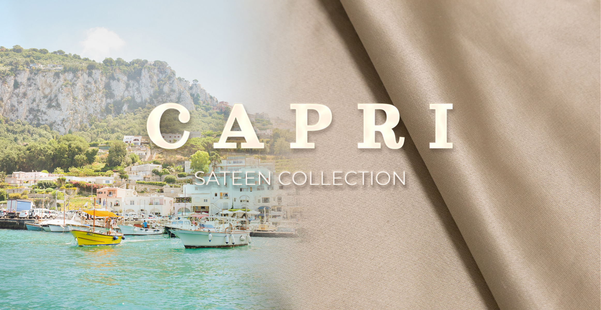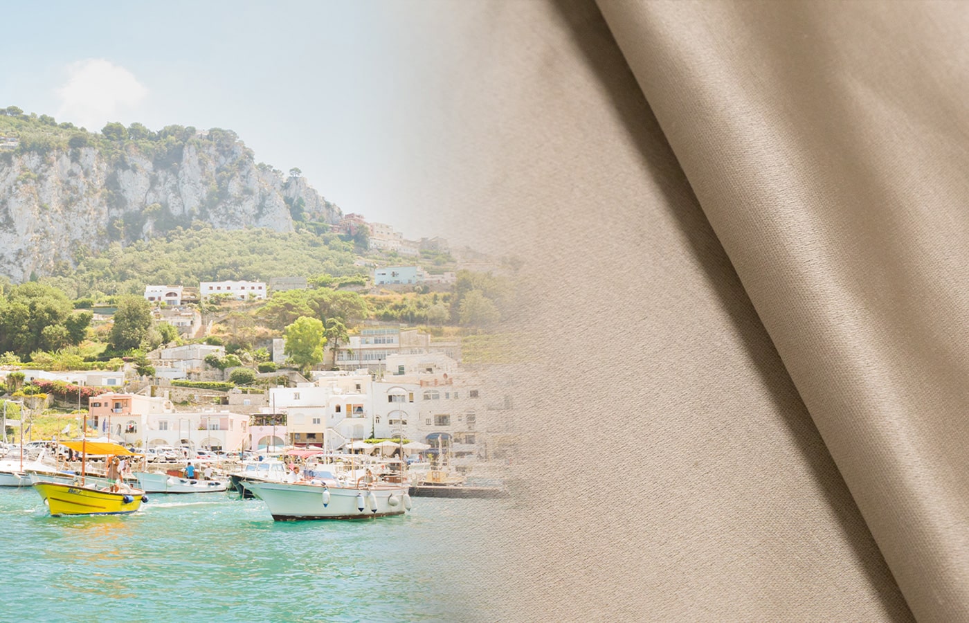

The story is in the threads
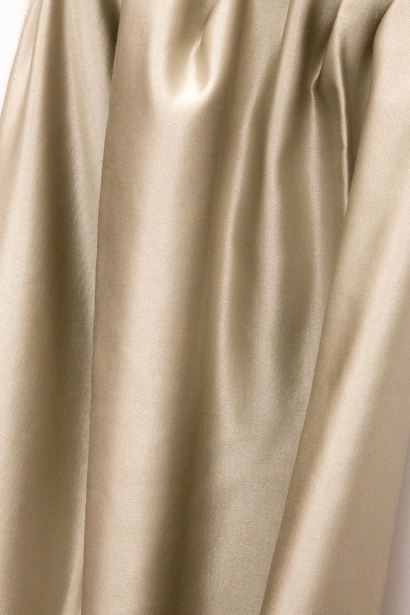
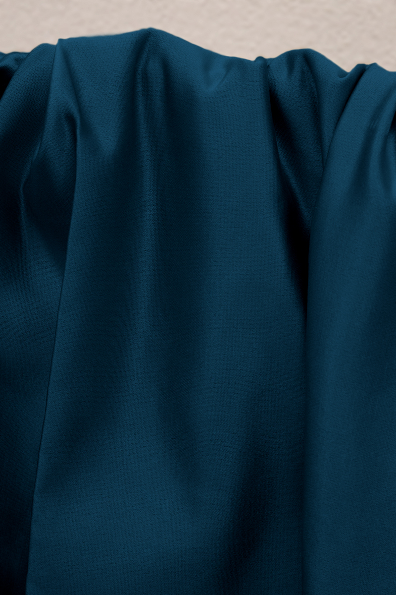
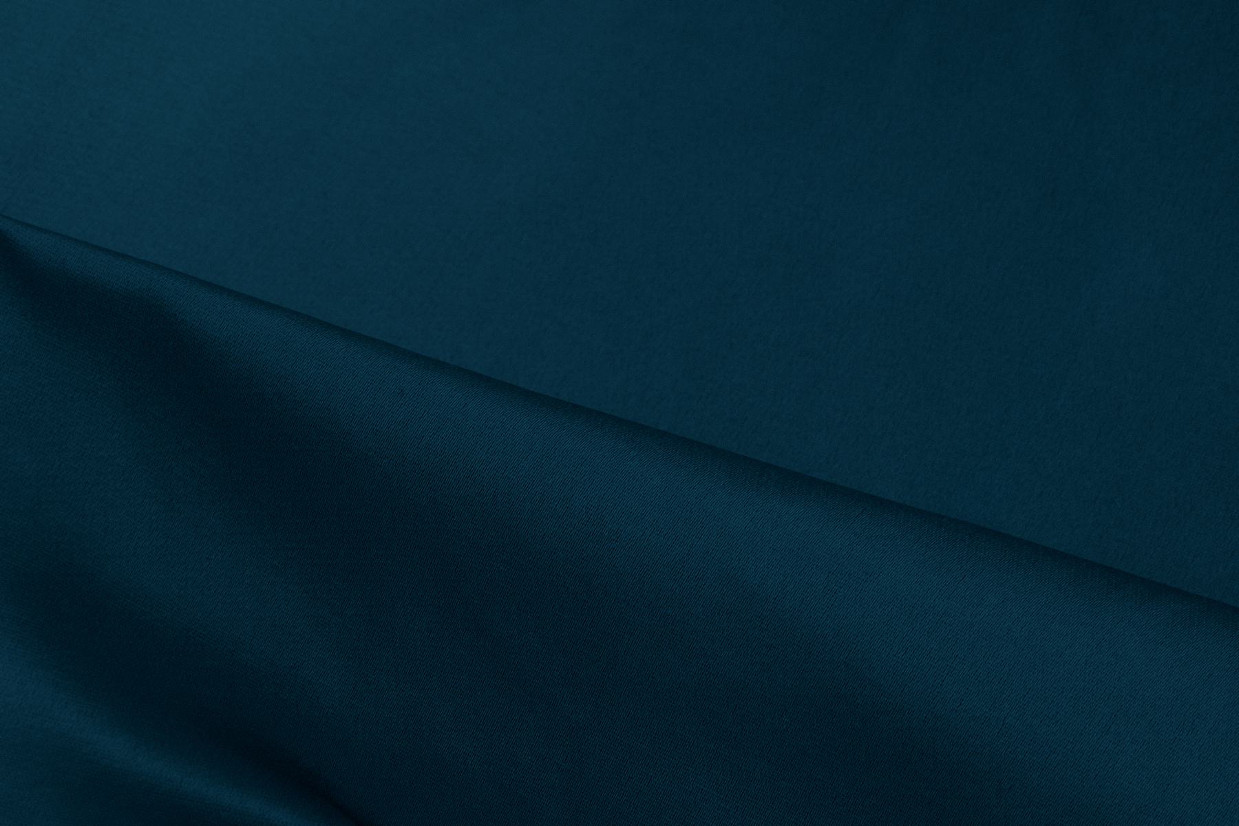
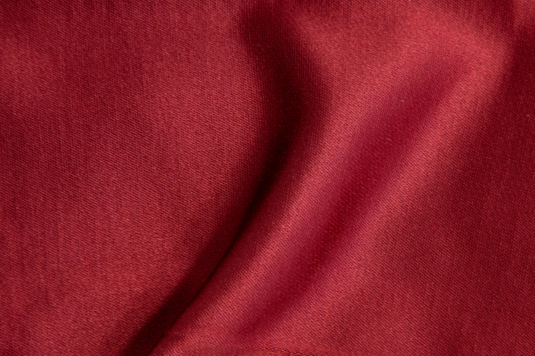
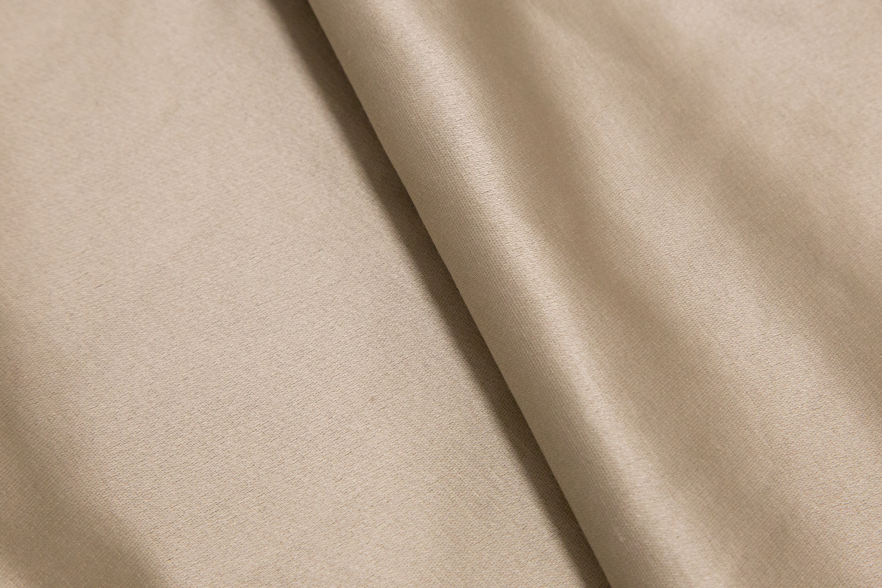
Light and smooth, the fabric is well draped and reminiscent of the brocade, recalling the historical past that reigns invisibly in Italy and blurring the boundaries of time on the island of Capri.

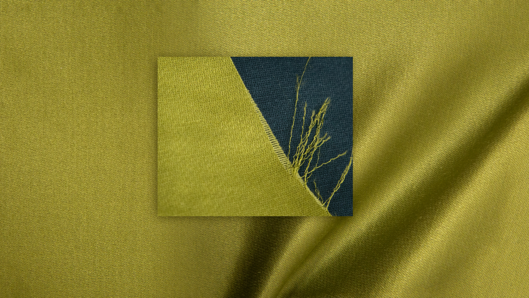
Particular structure
The deft double twisting creates a dense, elaborate texture, while the faint sheen, the underlying pearlescent sheen of the front side and the matte finish of the backside emphasize the refined contrast of textures.

Enchanting texture
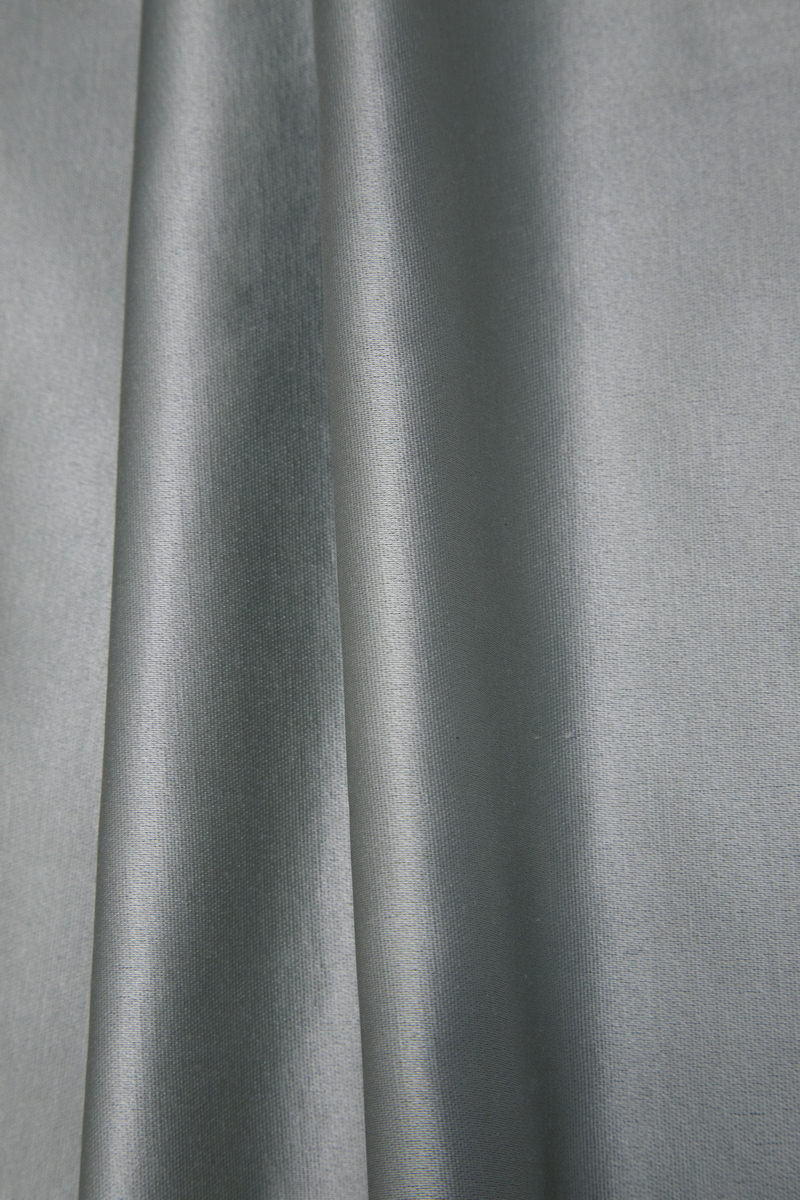
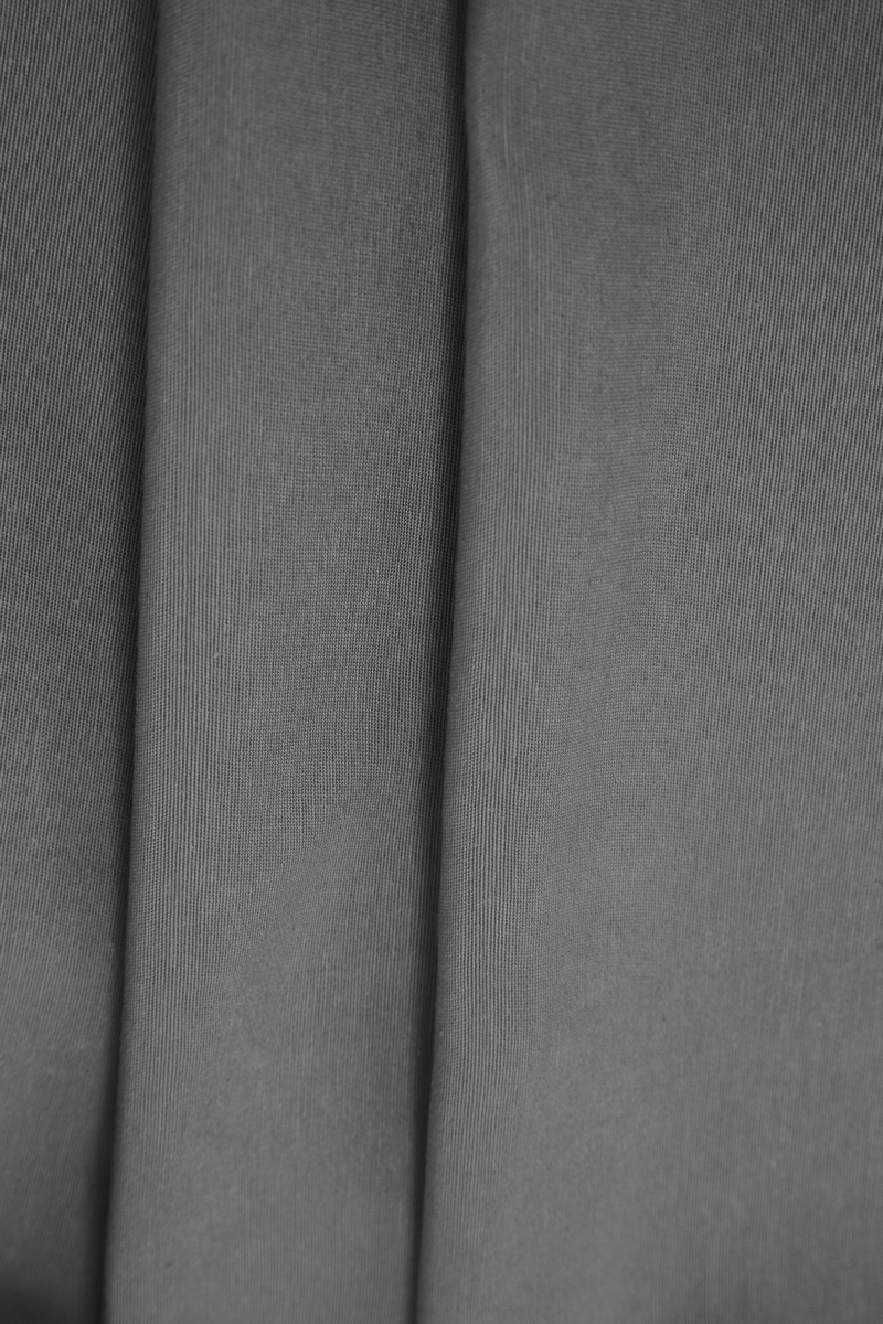
The backside has the texture of a fine burlap, it's rough and has knots. The textile wants to be touched in order to feel its character.

Ideal for the home
The 65% cotton composition gives the fabric tactility and warmth, making it ideal for use in home interiors, and the 300 cm width becomes an additional advantage, extending the possibilities of using Capri.

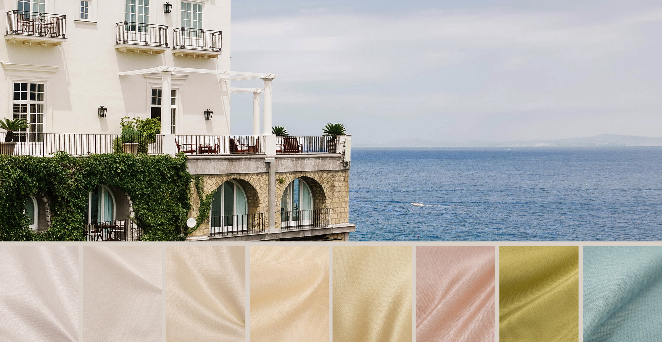
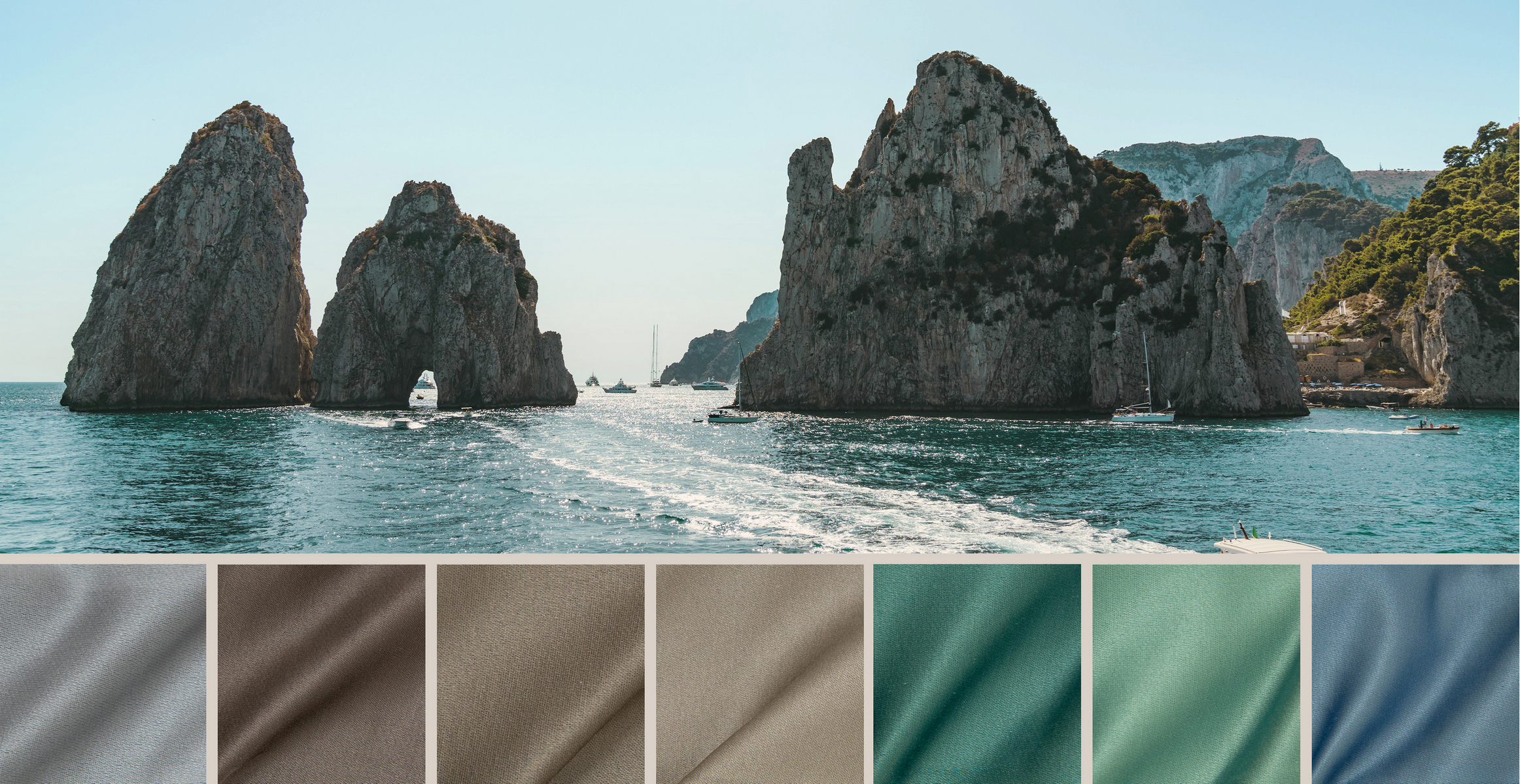
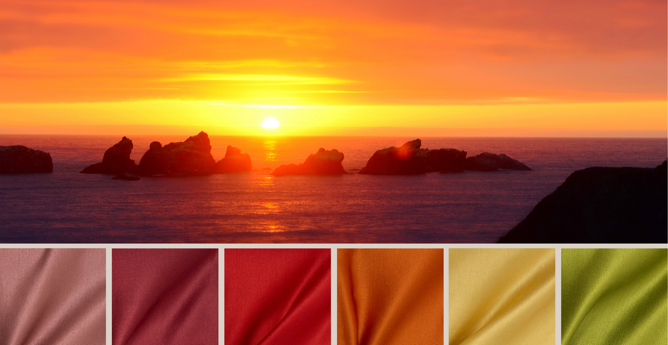
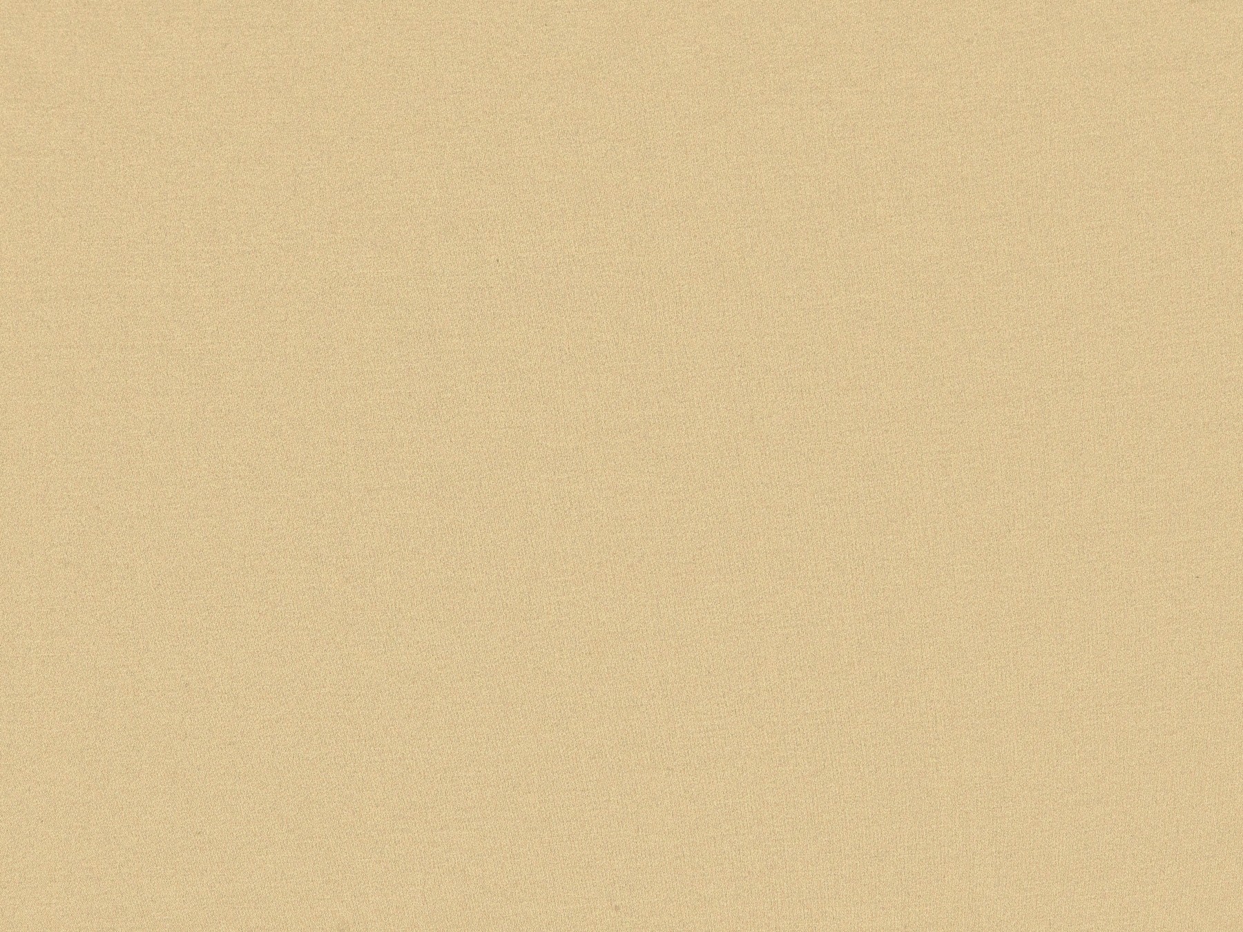
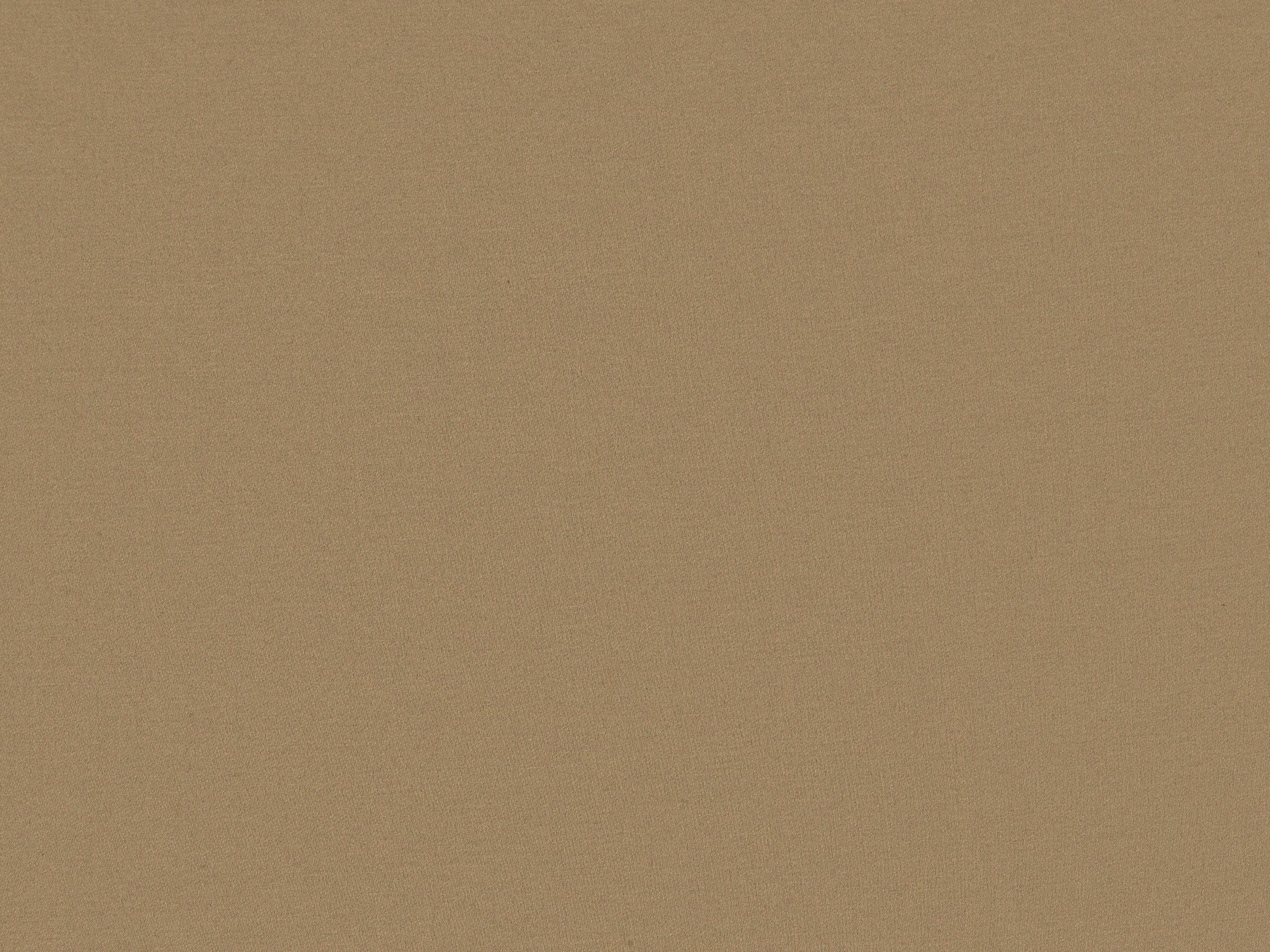
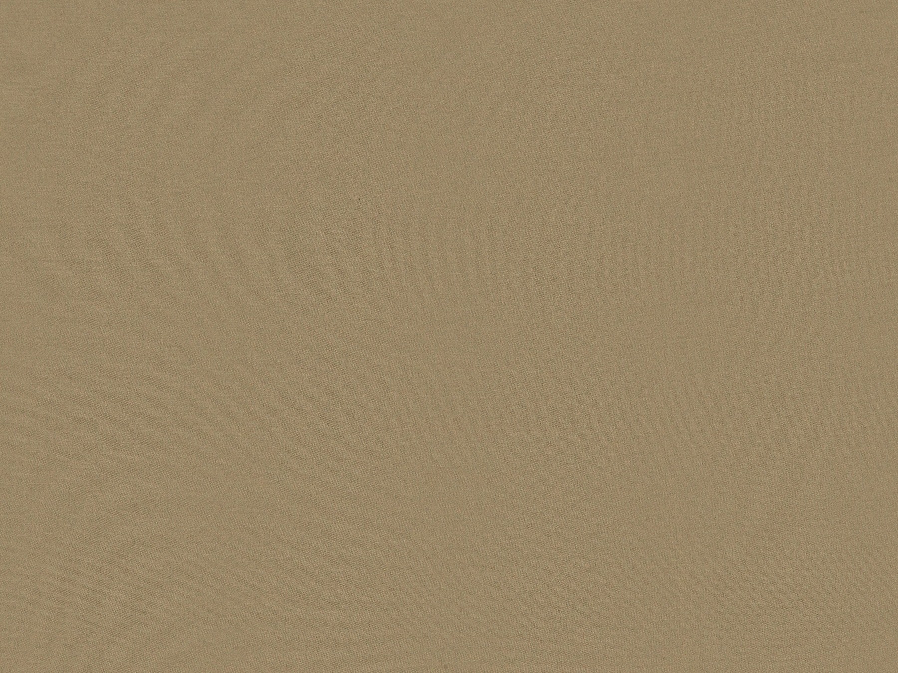
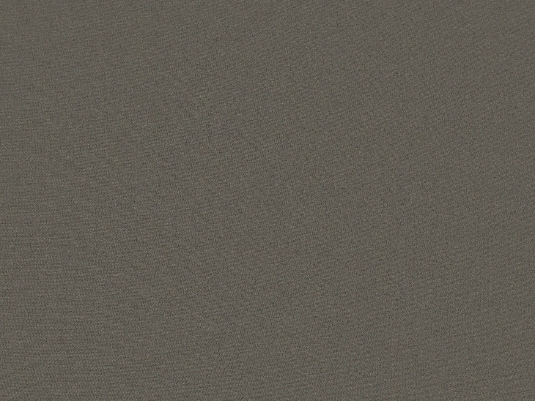
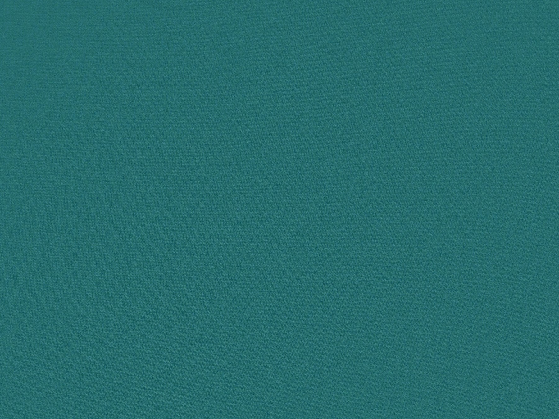
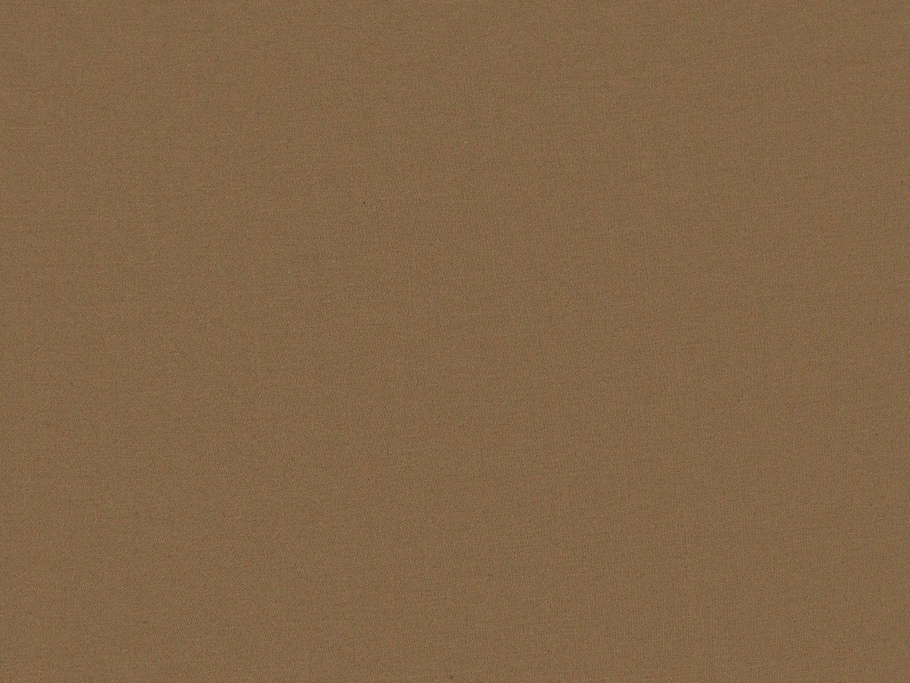
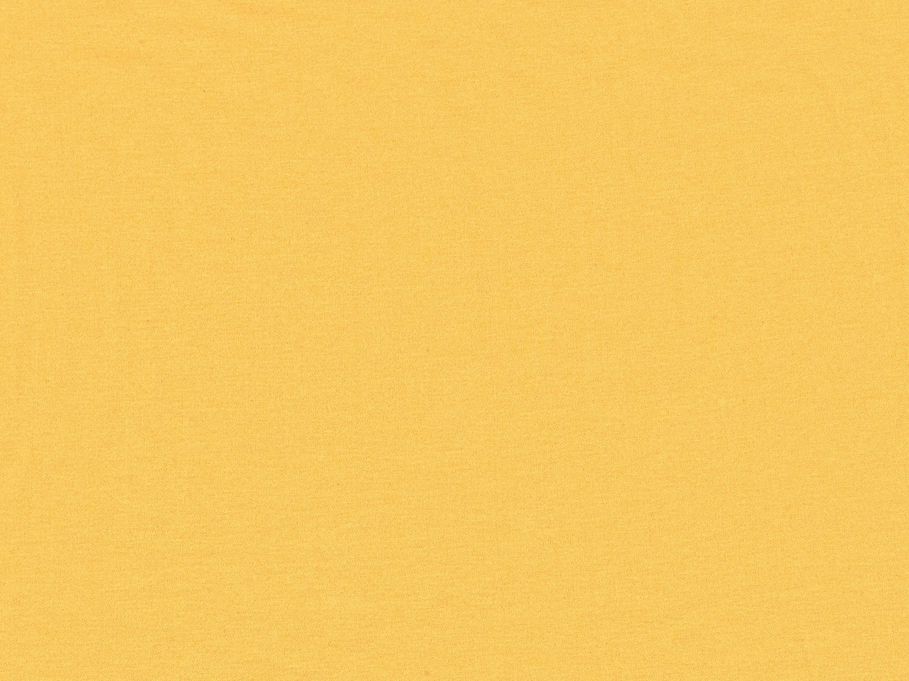
A sophisticated palette
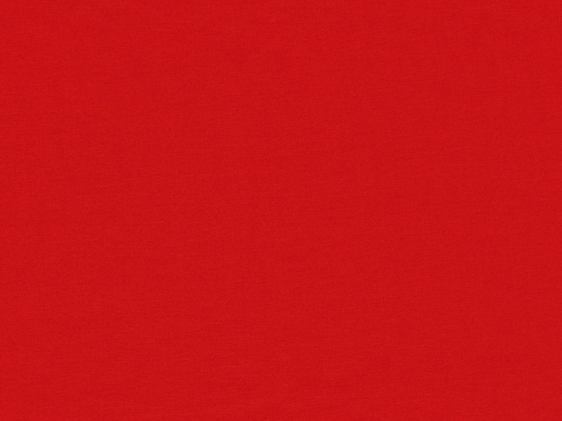
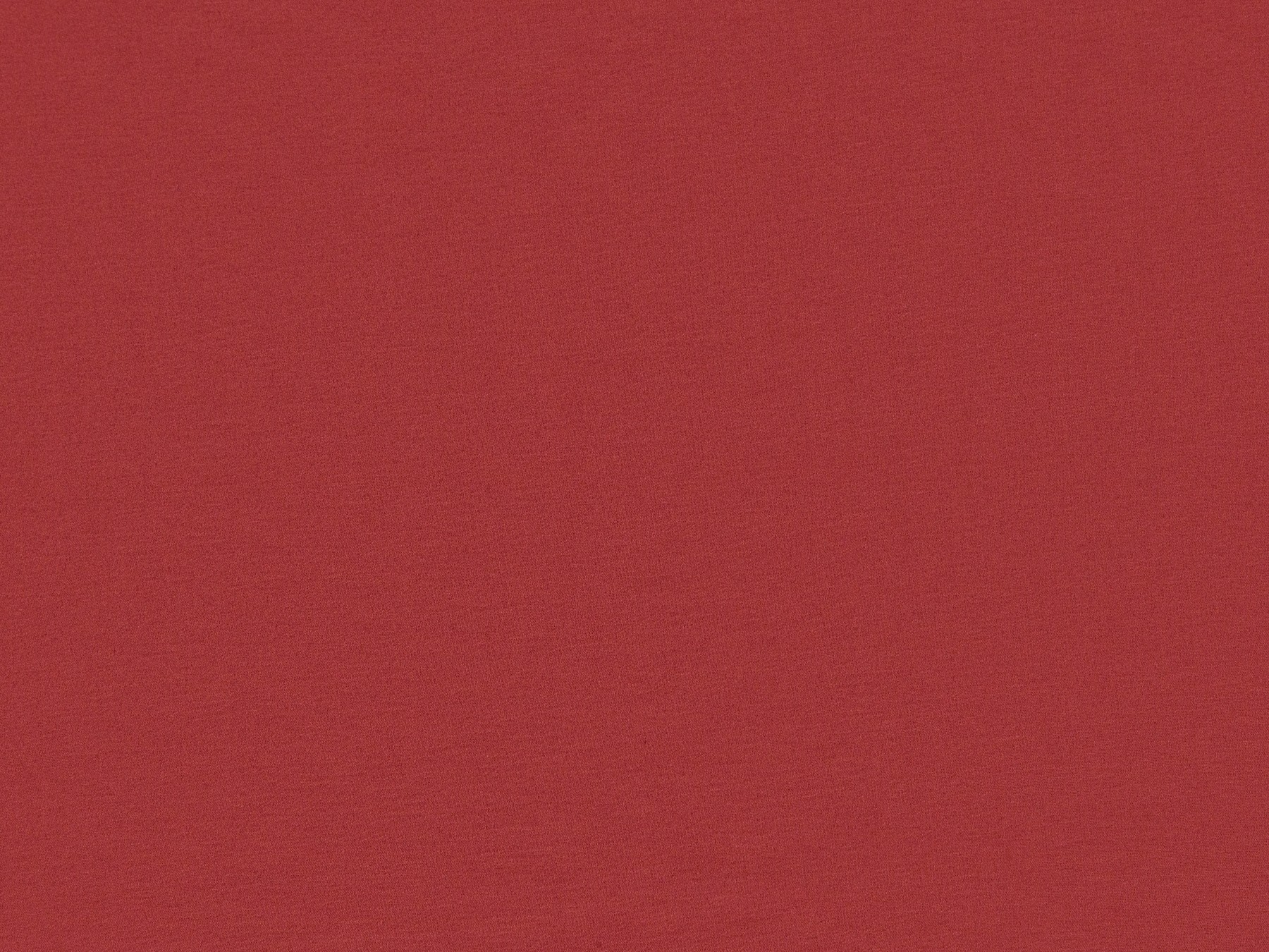
One of the highlights of the palette is the Pantone color of the year, a sumptuous carmine red, which symbolizes the courage to experiment, the openness to ideas and the freedom to create.

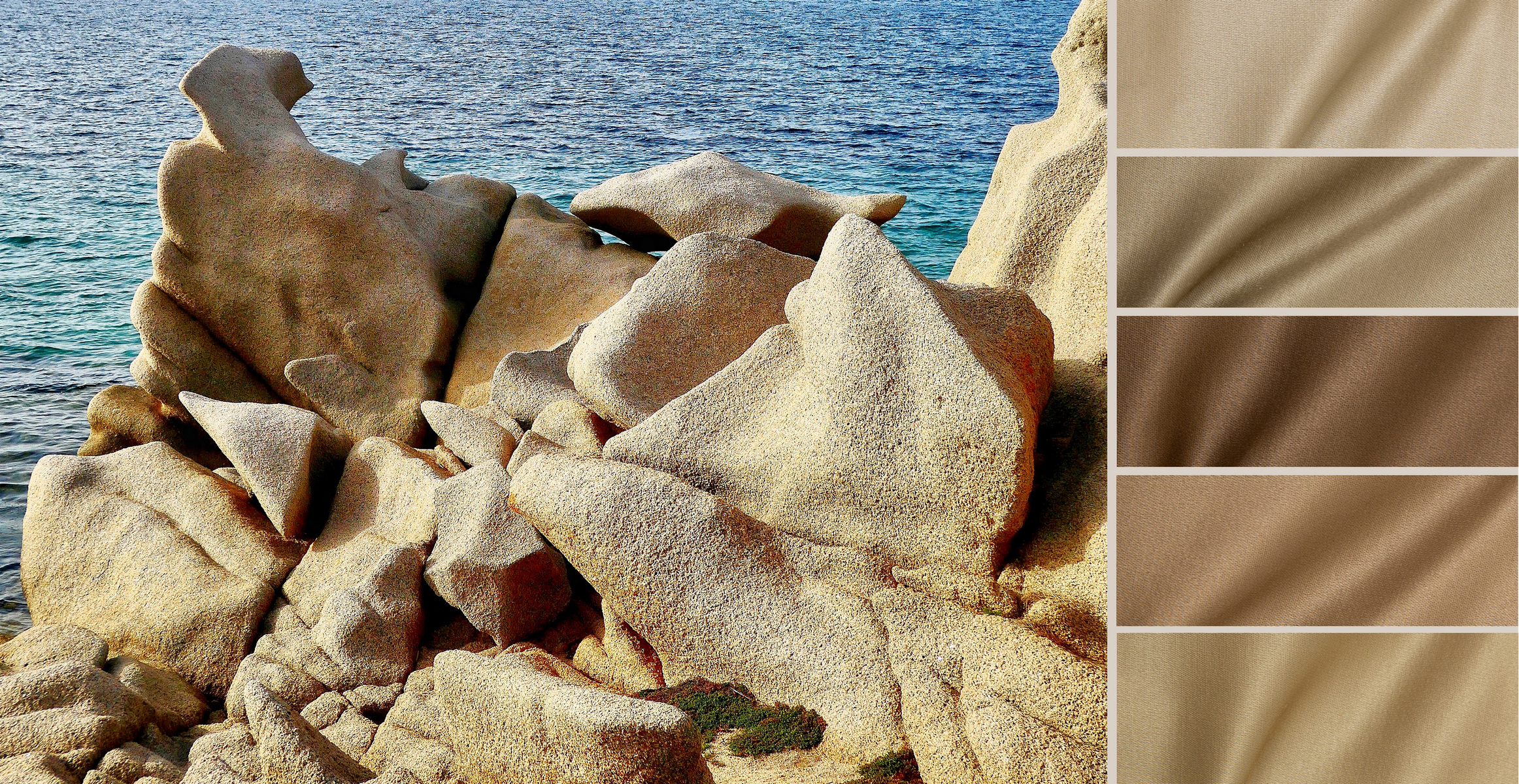
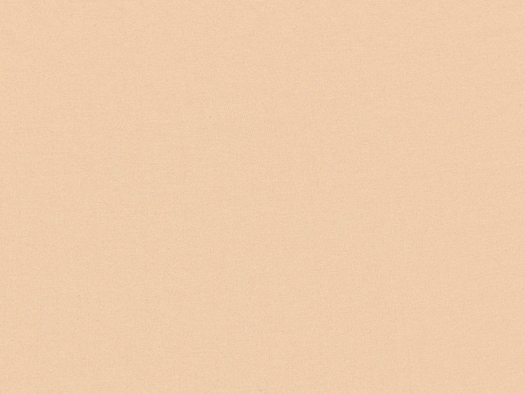
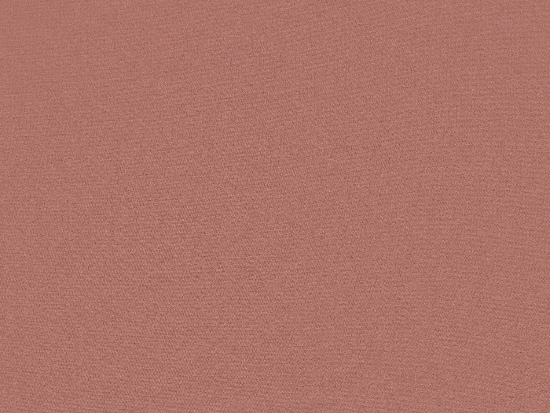
It is also accompanied by other Pantone colors: complex gray-blue, pearly-powdery, beige presented in several trendy shades. Thus, Capri palette supports the Pantone concept of turning to nature and the search for creative energy within oneself.

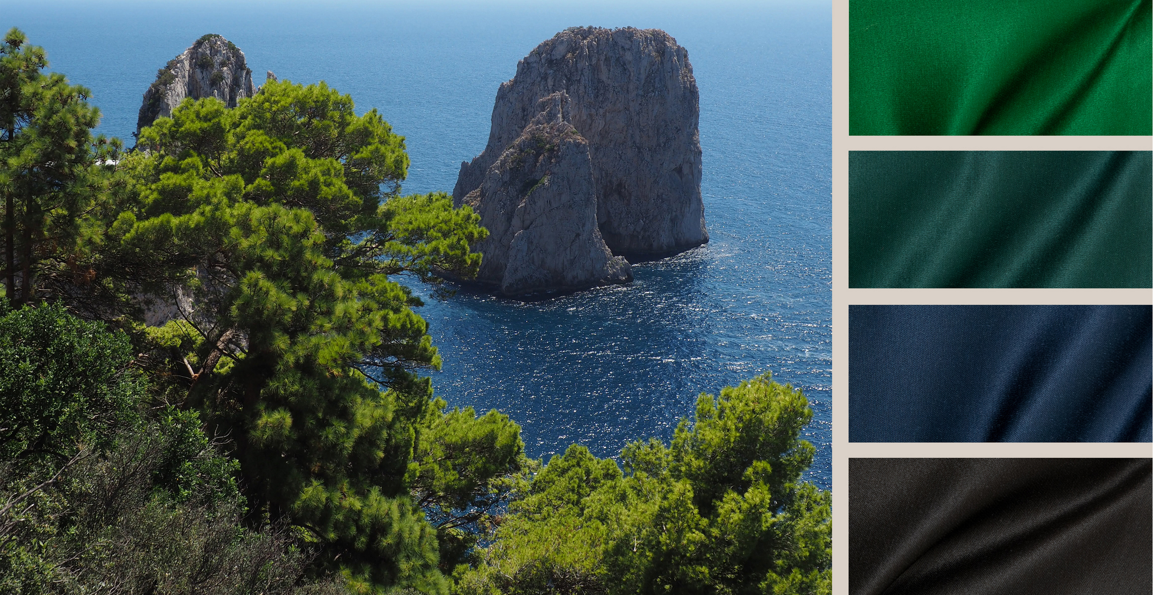
The vivid colors of the collection continue the theme of newly-considered shades touched upon by Heimtextil: lemon, emerald, intense blue challenge the assumption that only quiet, "unshouting", muted shades can bring nobility and style.