
About the collection
"Mono" is a self-contained book in deep soothing hues. It will help designers with "every day" projects and when creating special stories. The palette is chosen in such a way that the shades can be easily combined with each other or choose a monochrome solution. The matt pearlescent sheen offers an exceptional contrast to the fabric in natural or artificial light.

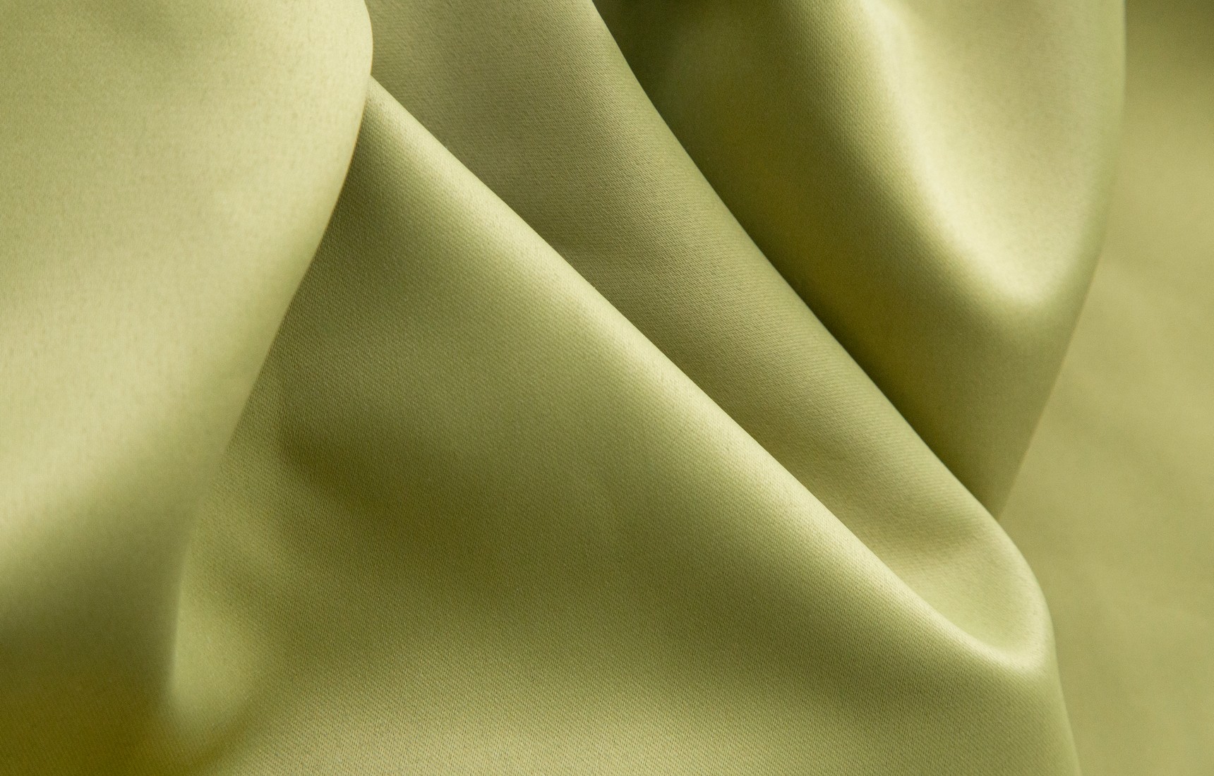
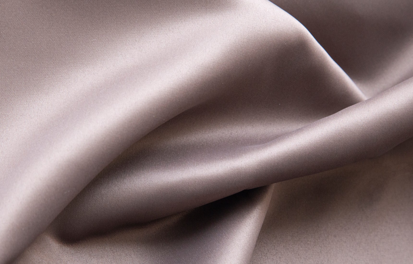
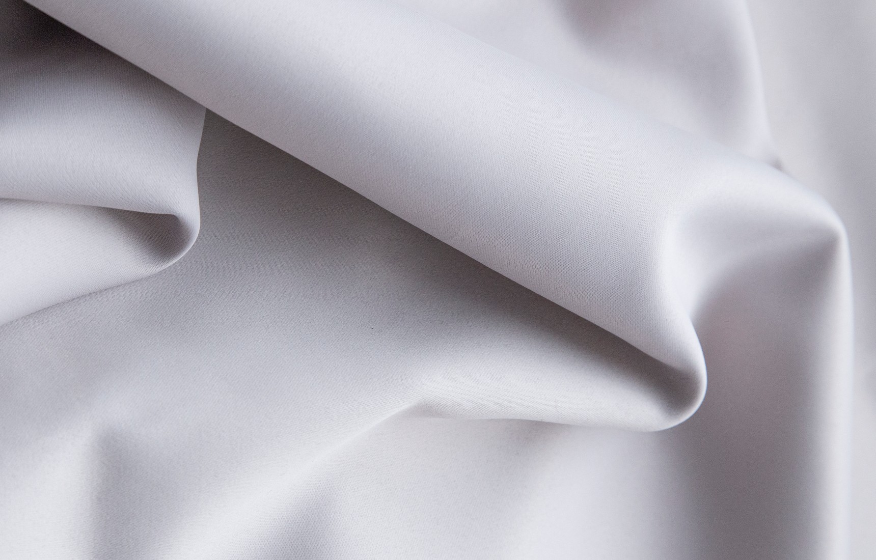
A noble texture
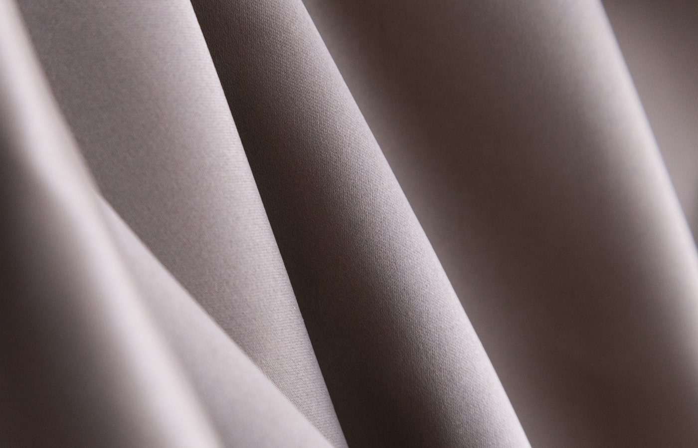
Smooth to the touch with a noble sheen - in ancient times sateen was the epitome of wealth and luxury. It is thought to have originated in China as early as the 12th century and to have been used for festive dresses. Nowadays sateen has its rightful place in the projects of interior designers around the world. Mono" is a worthy frame of your space, giving it a noble luster and subtle metallic shine.

Play of color
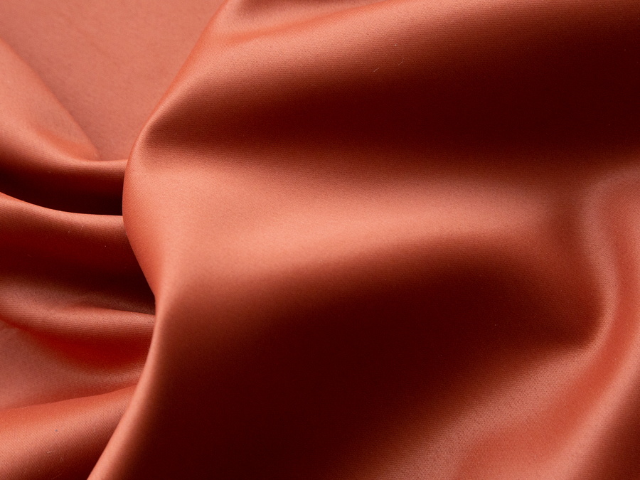
Due to its ability to reflect light, Mono Satin can look differently, depending on the time of day. The natural sun will give the fabric a lively and bright shine, the evening artificial light will shroud the space in mystery. The chosen shade for the project will reveal its tones in a new way every day, giving the window decoration a play of light and color.

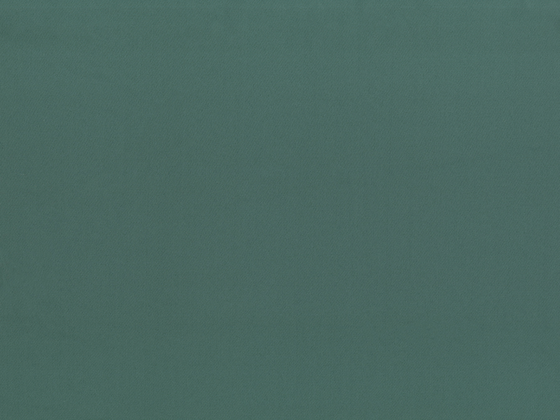
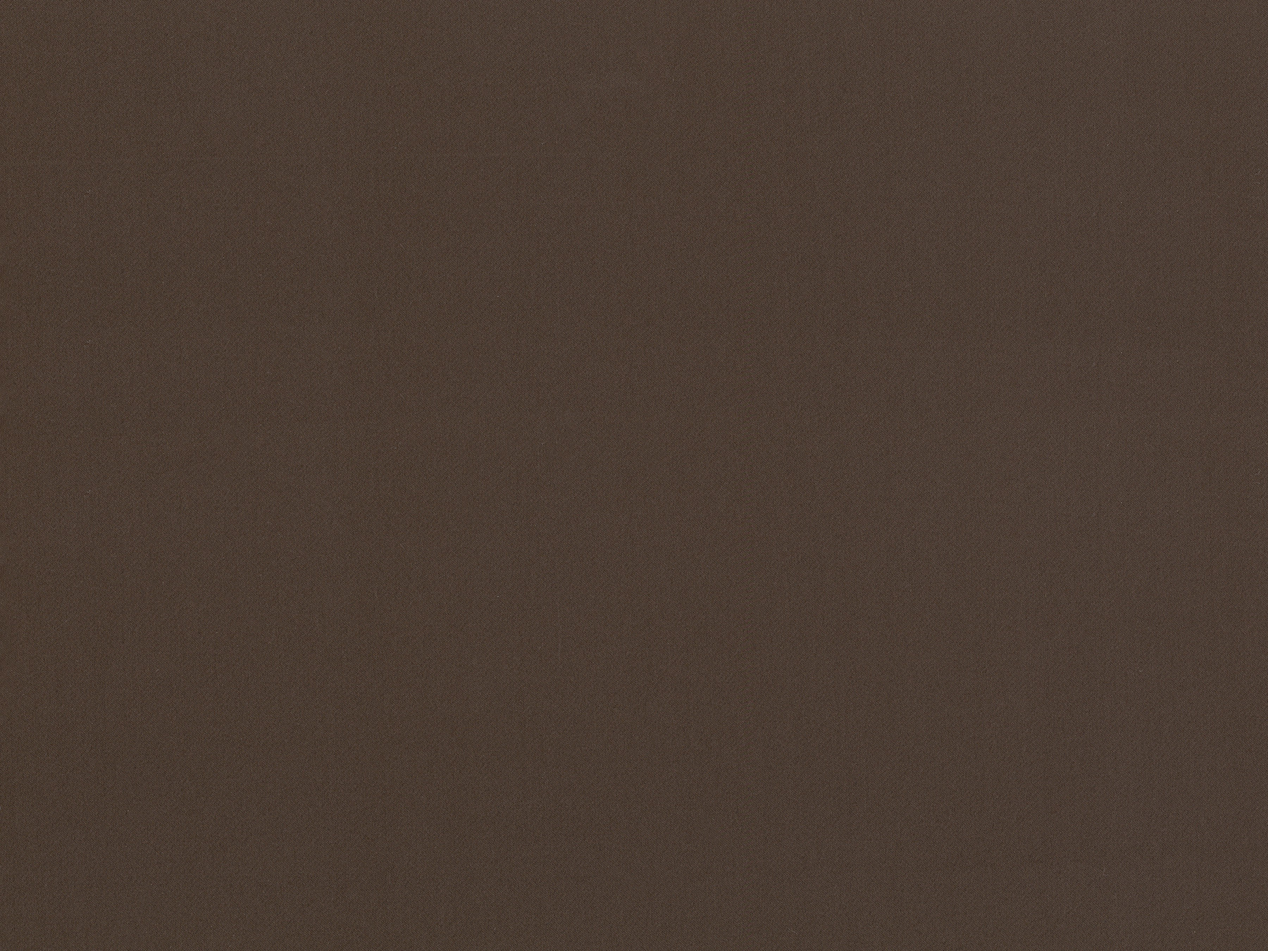
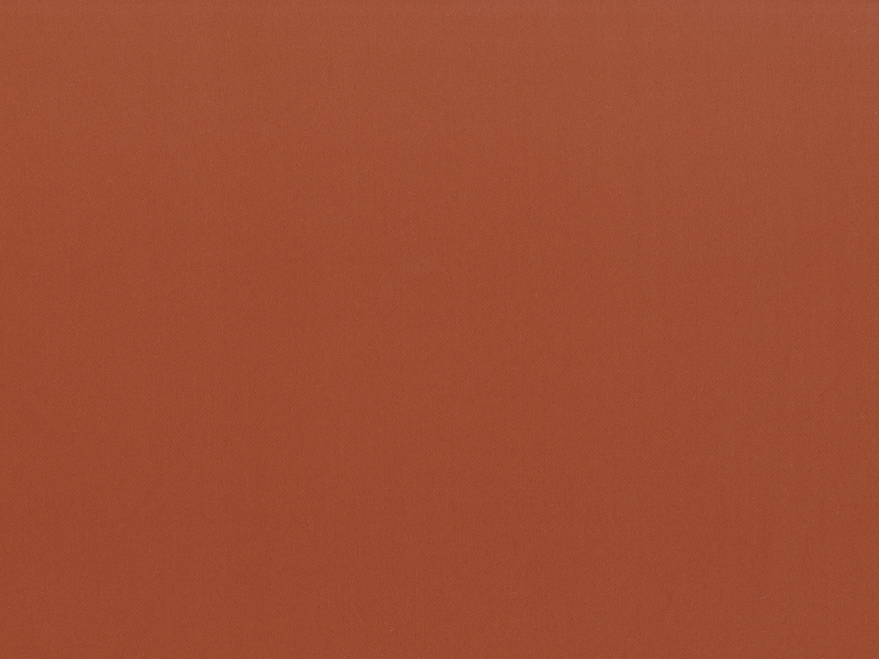
Multifaceted palette
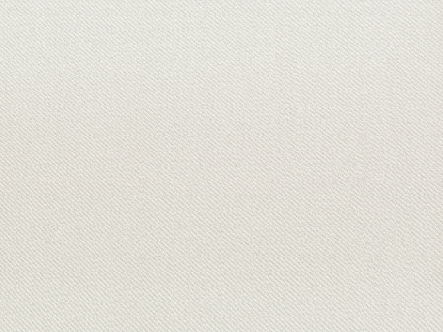
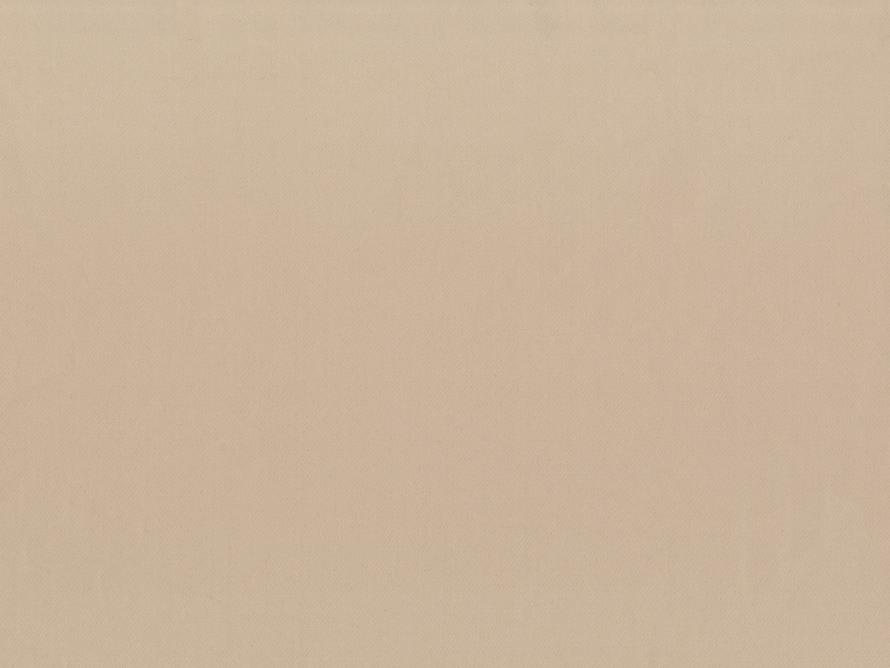
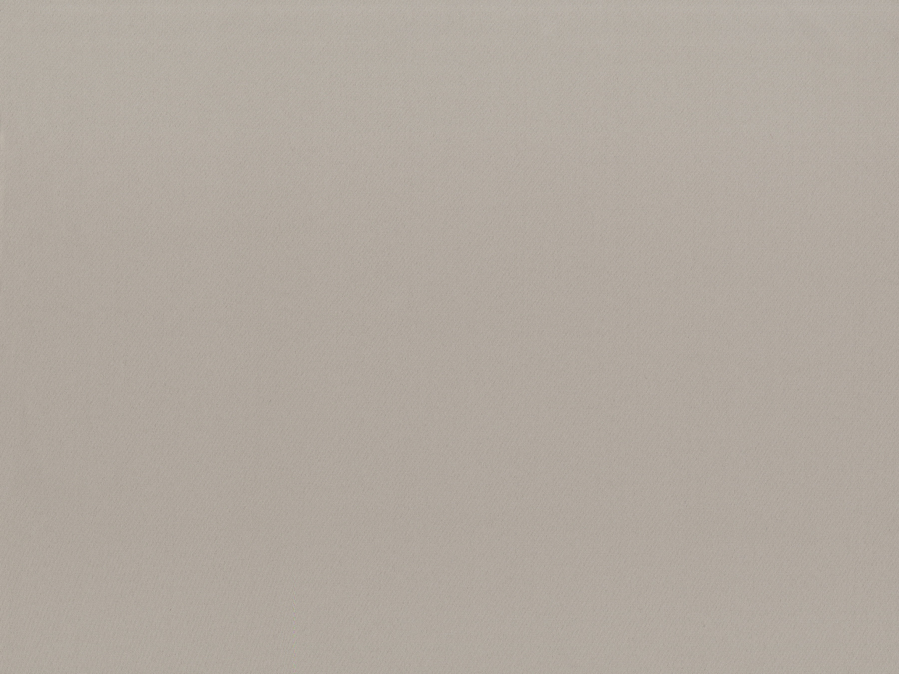
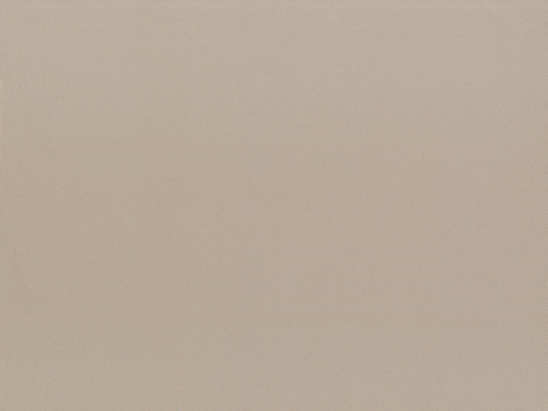
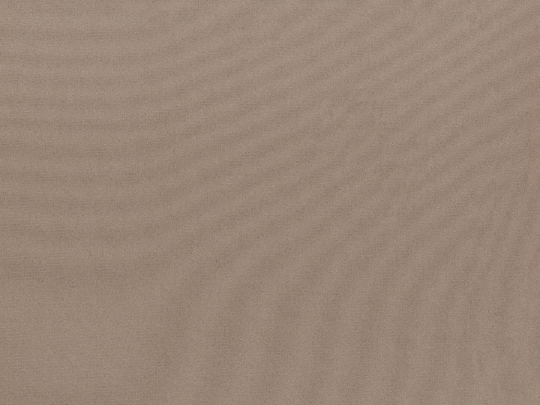
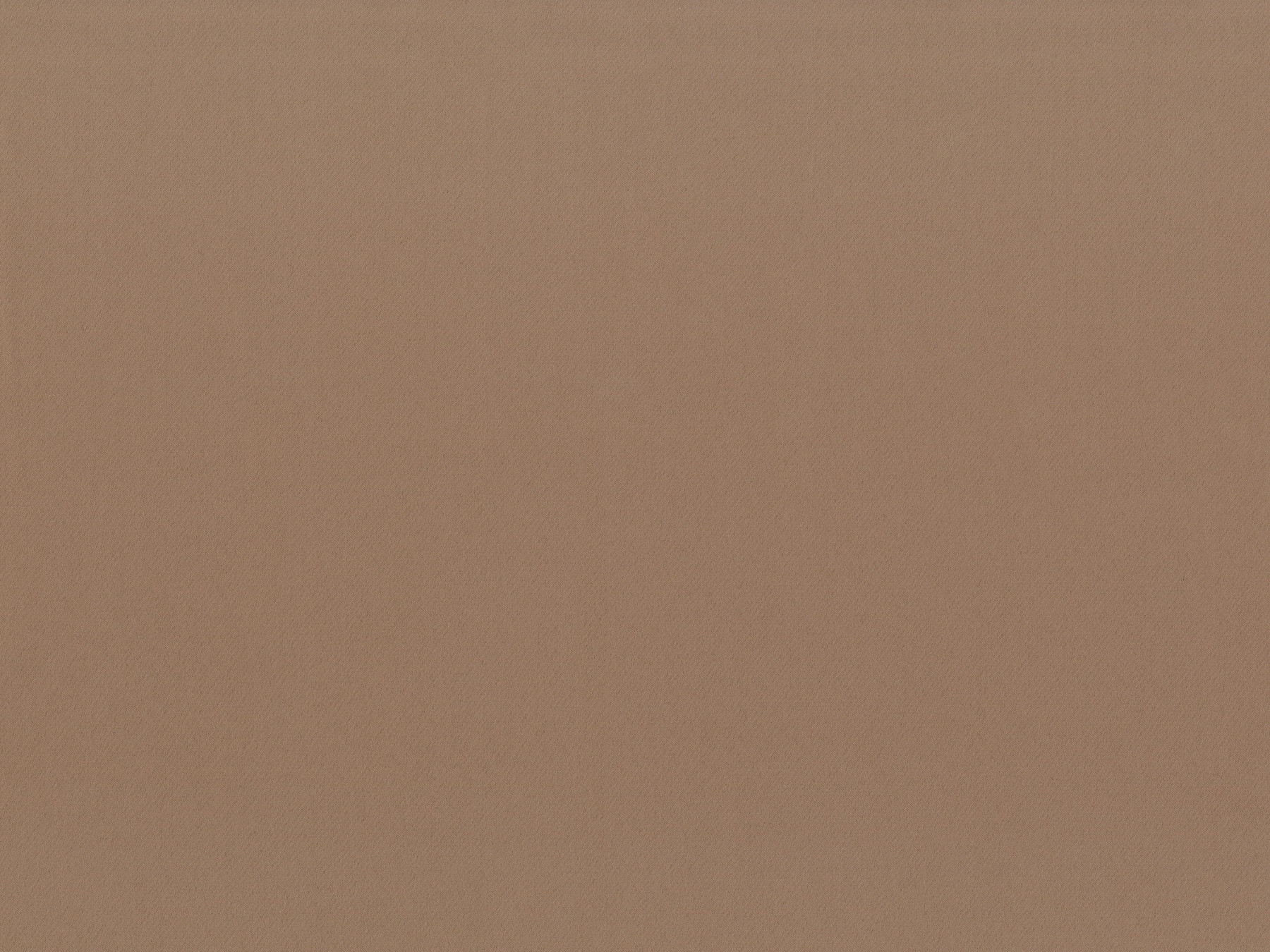
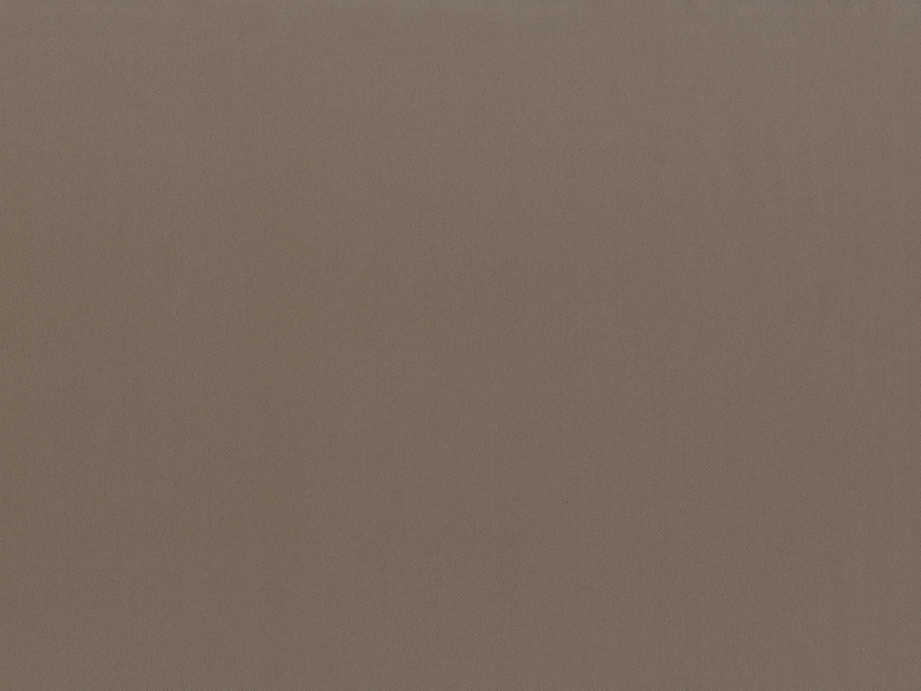
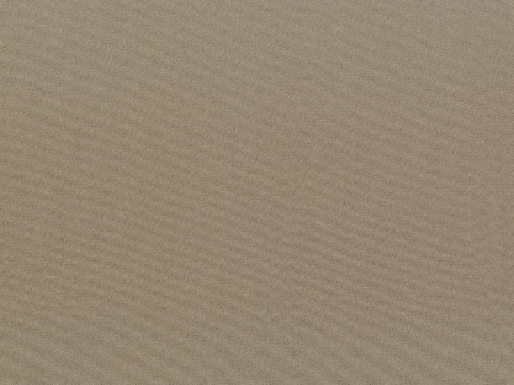
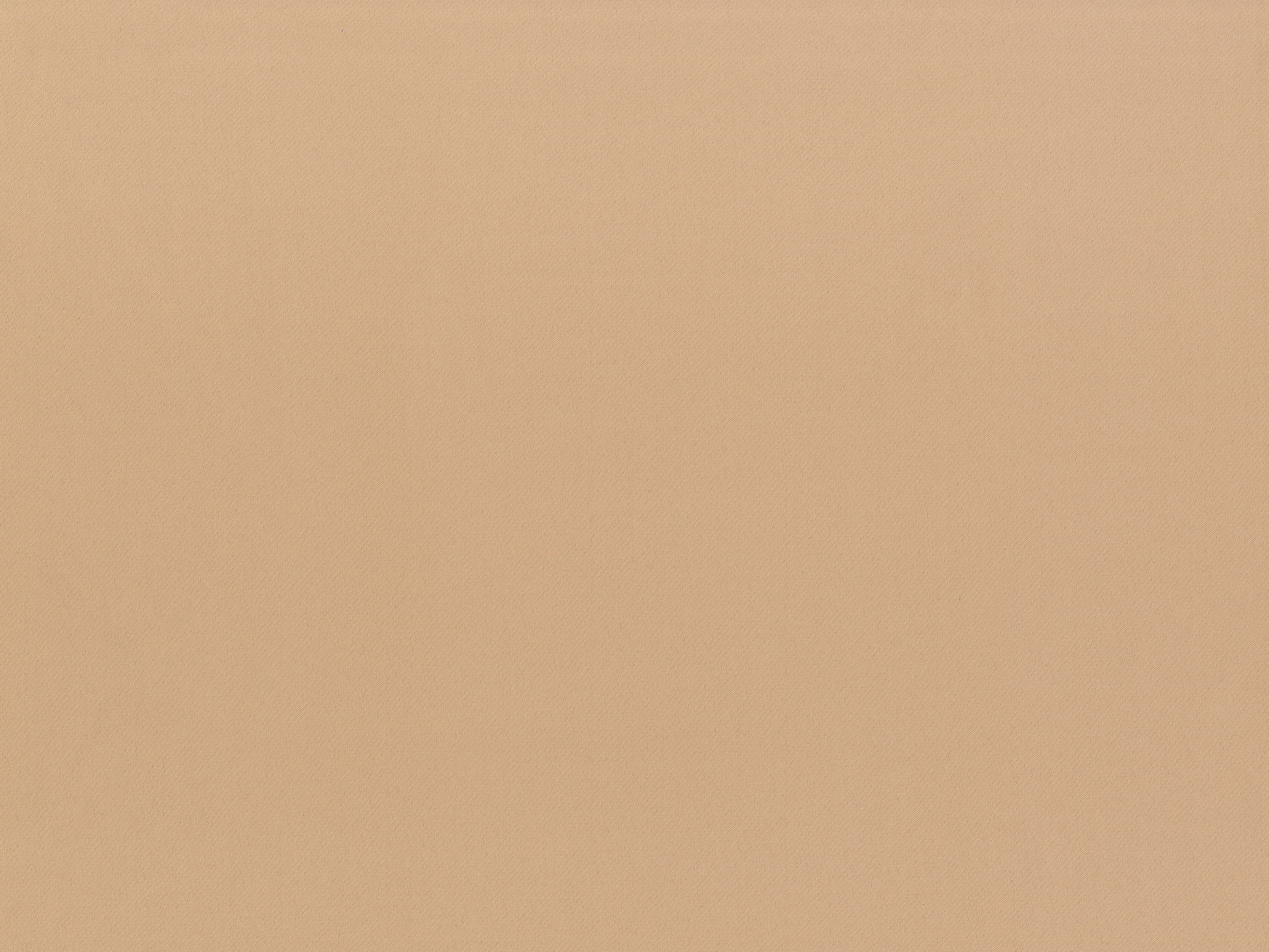
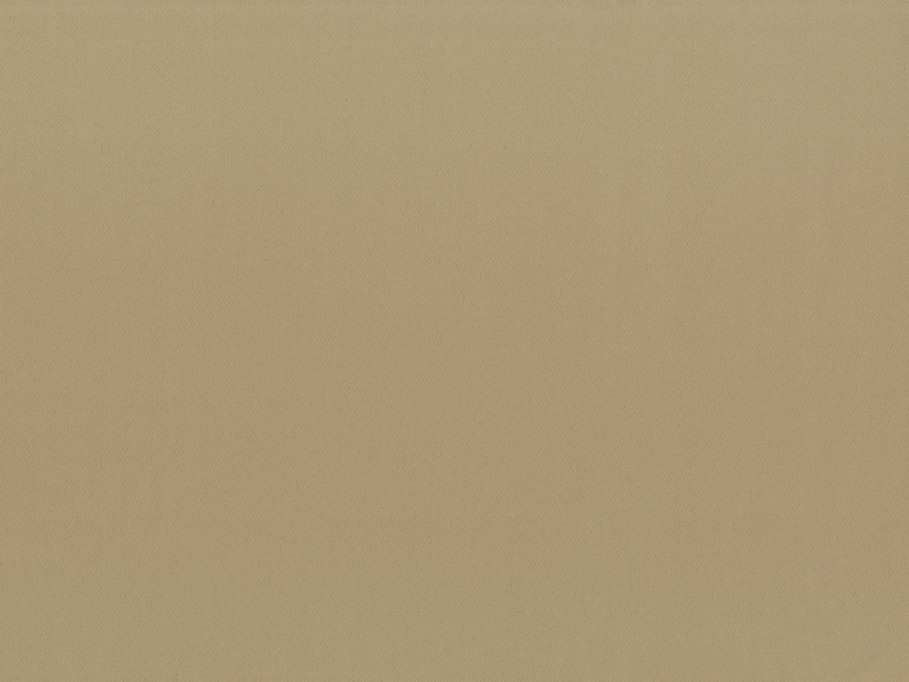
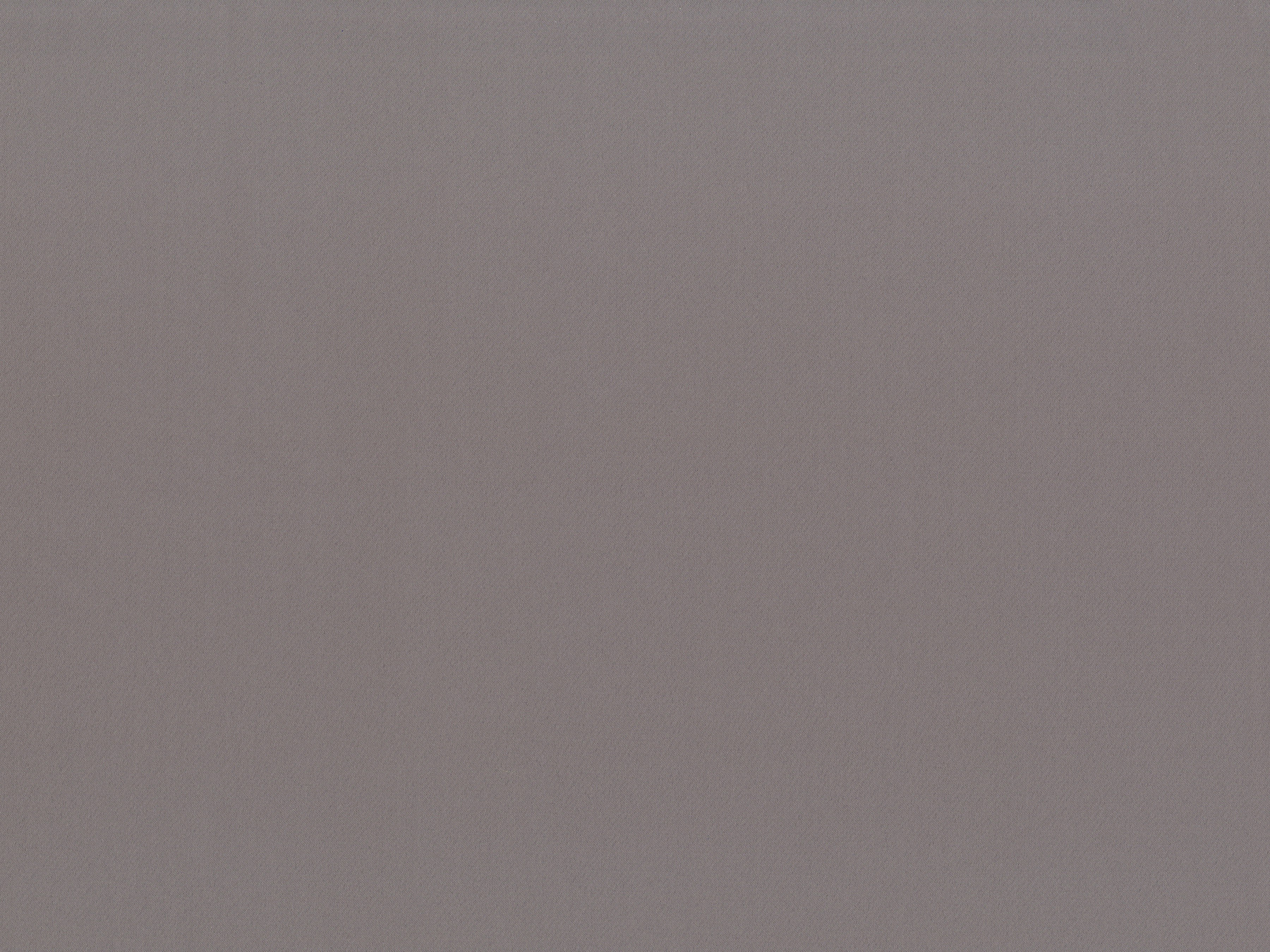
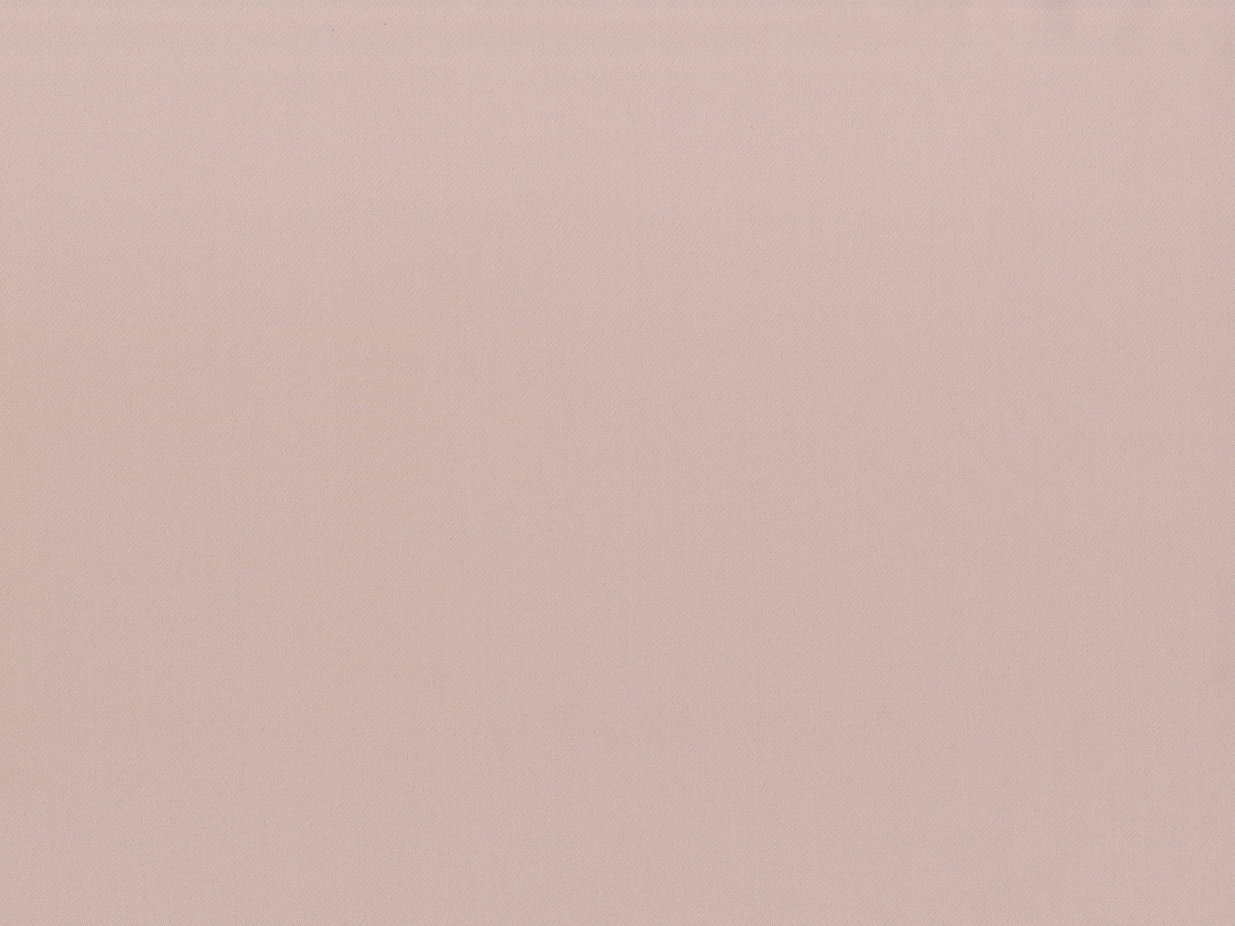
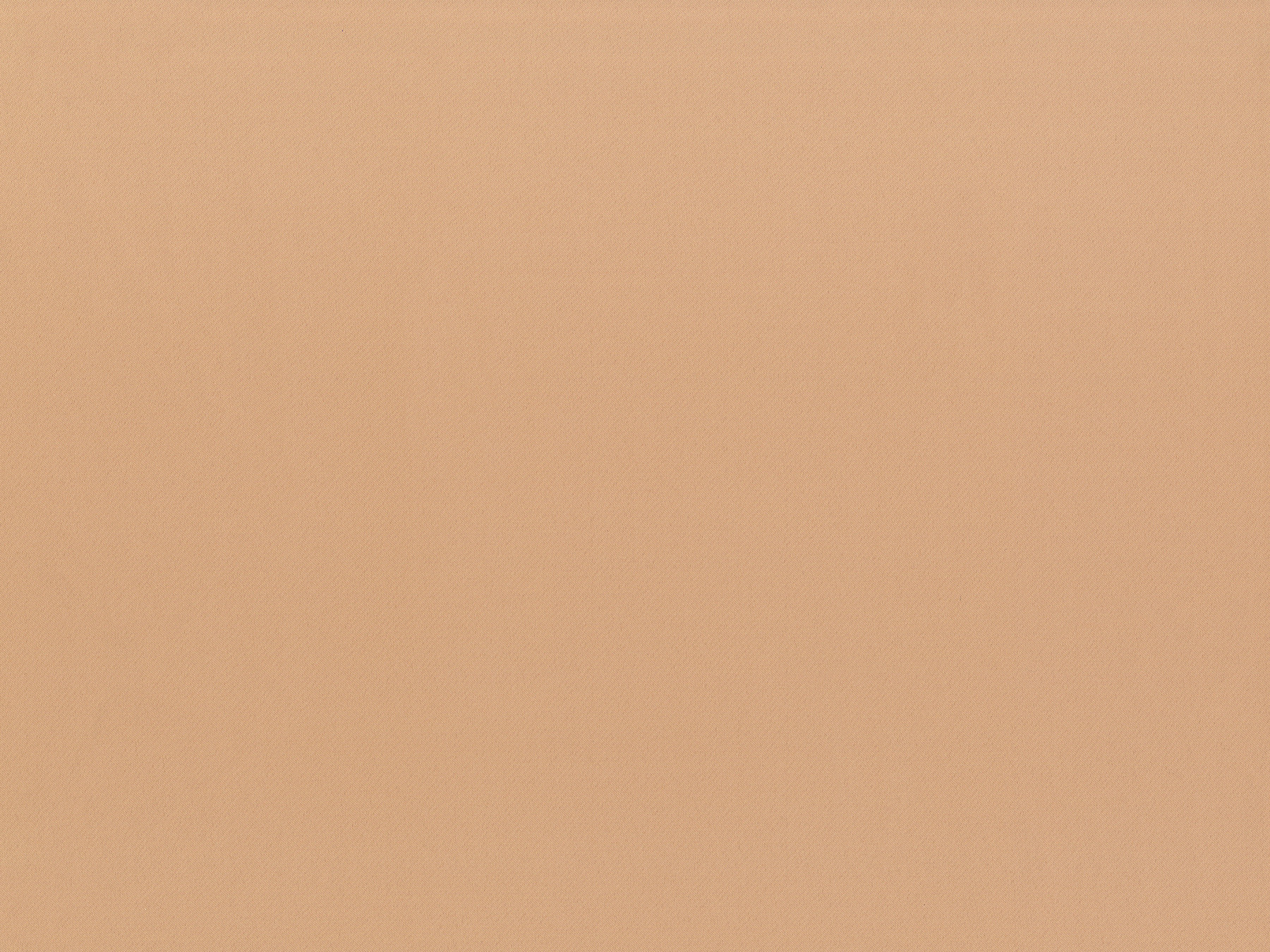
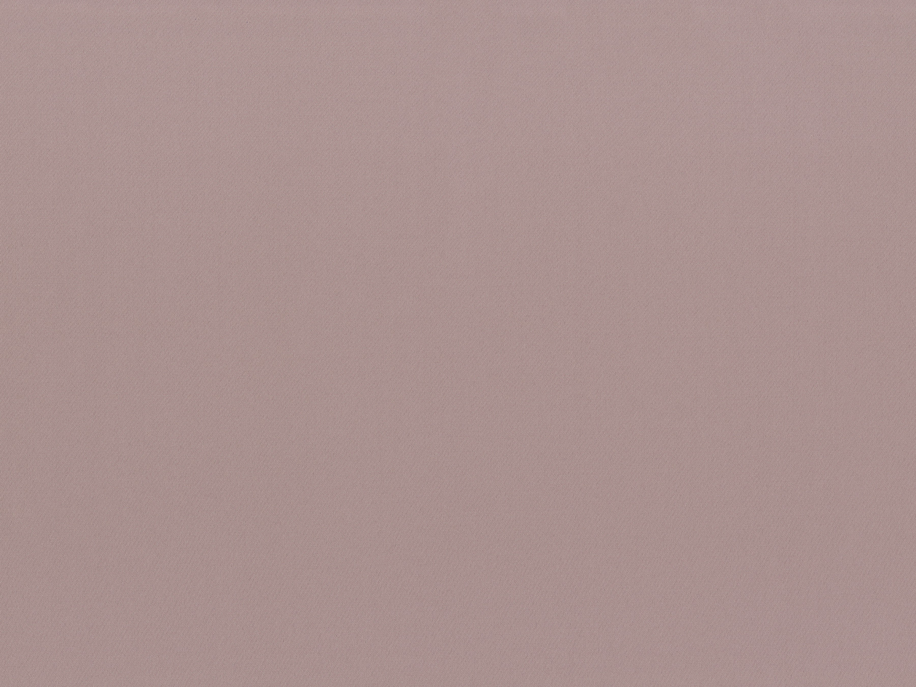
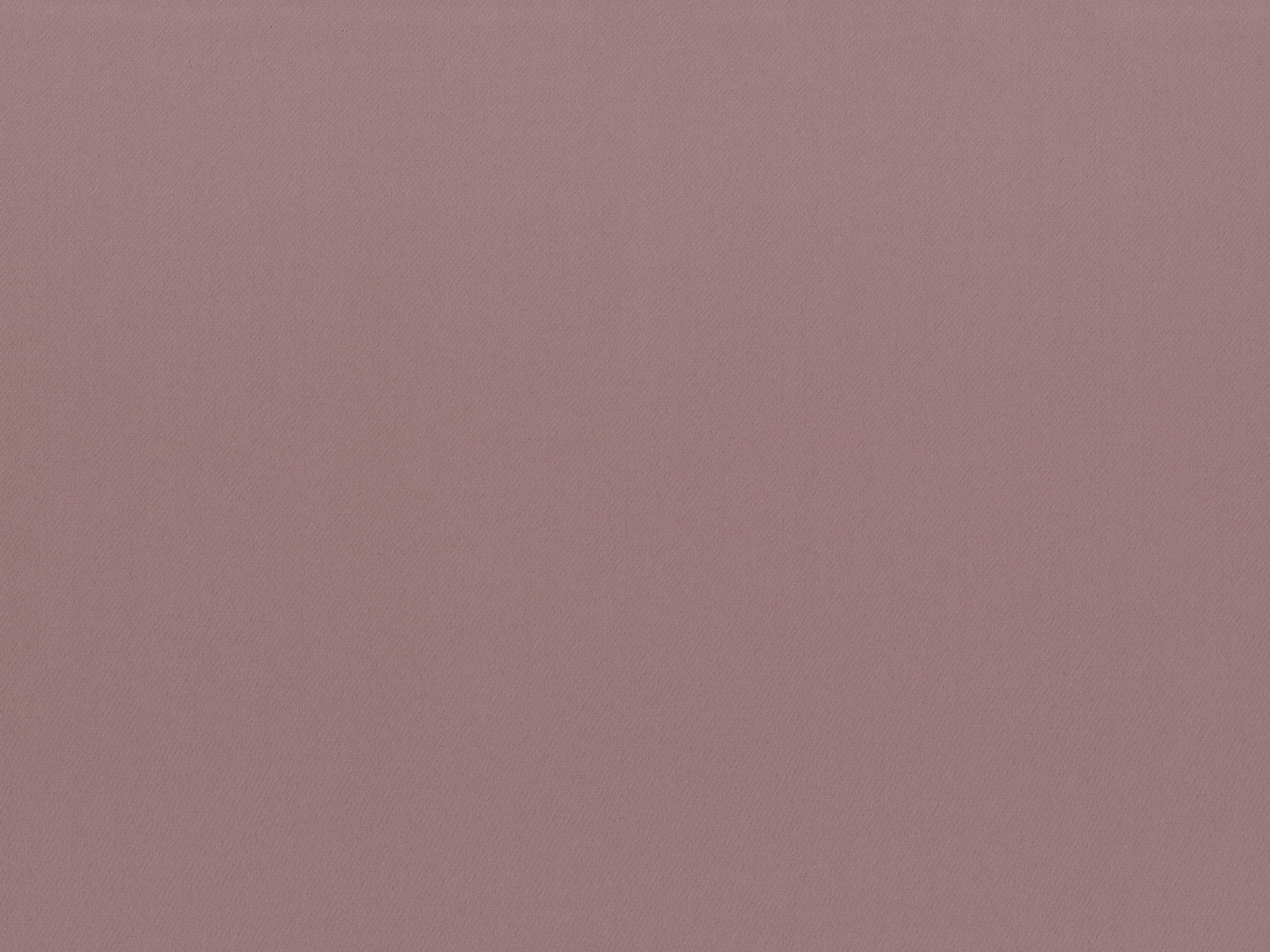
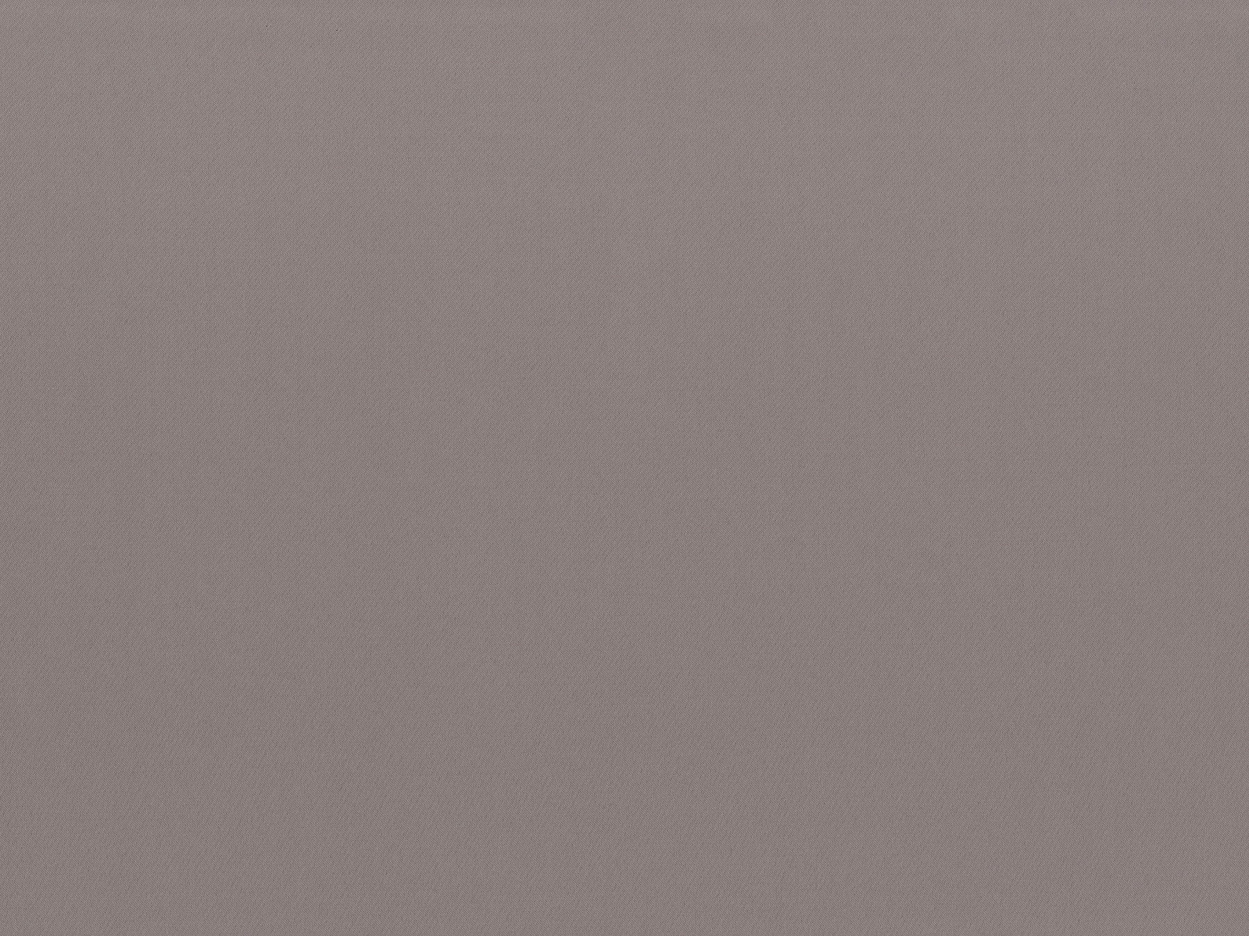
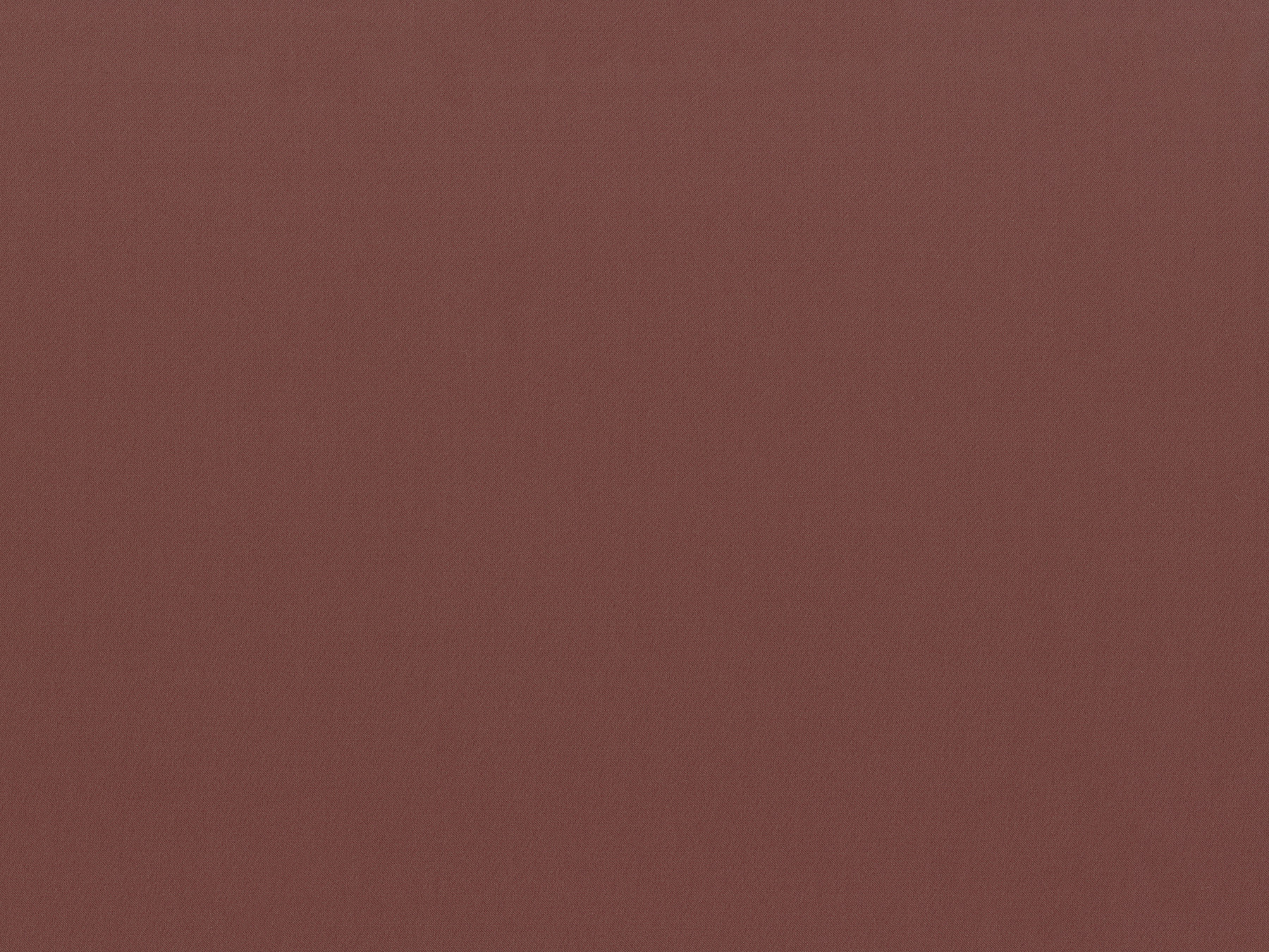
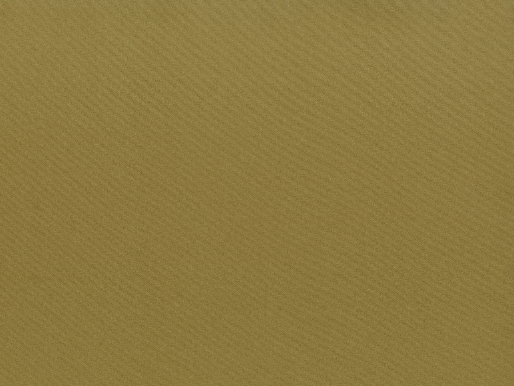
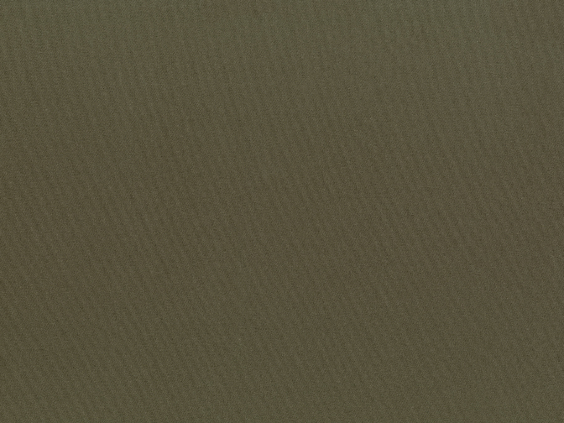
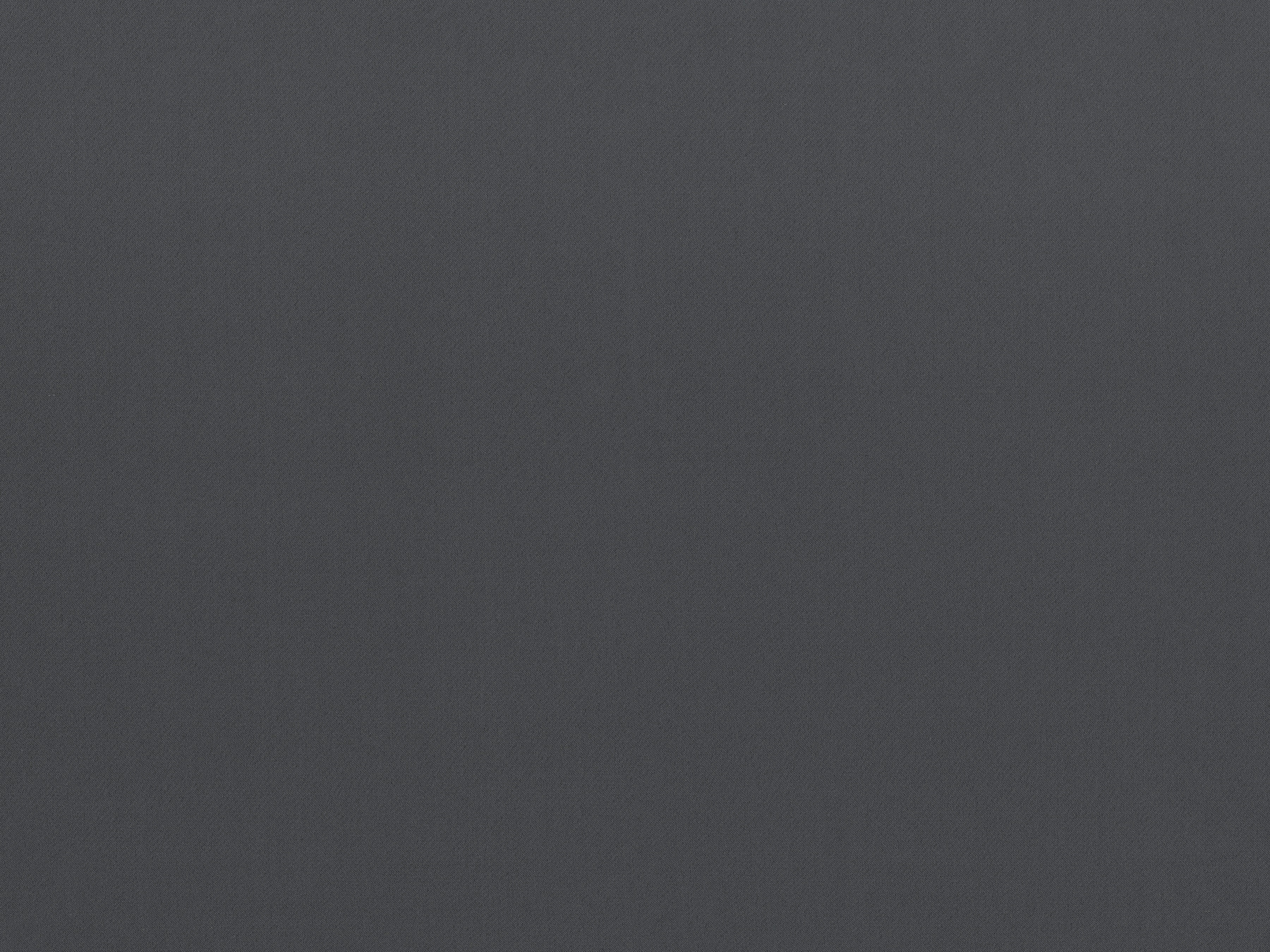
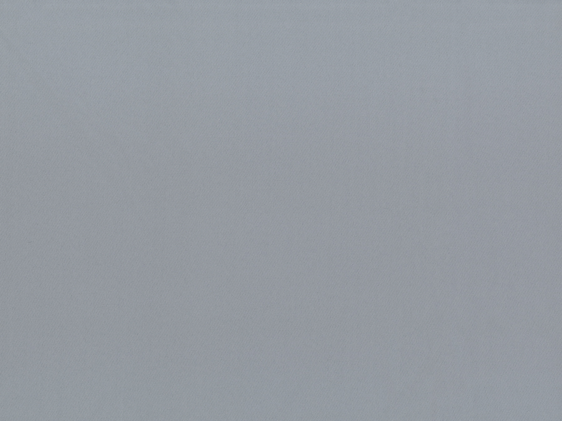
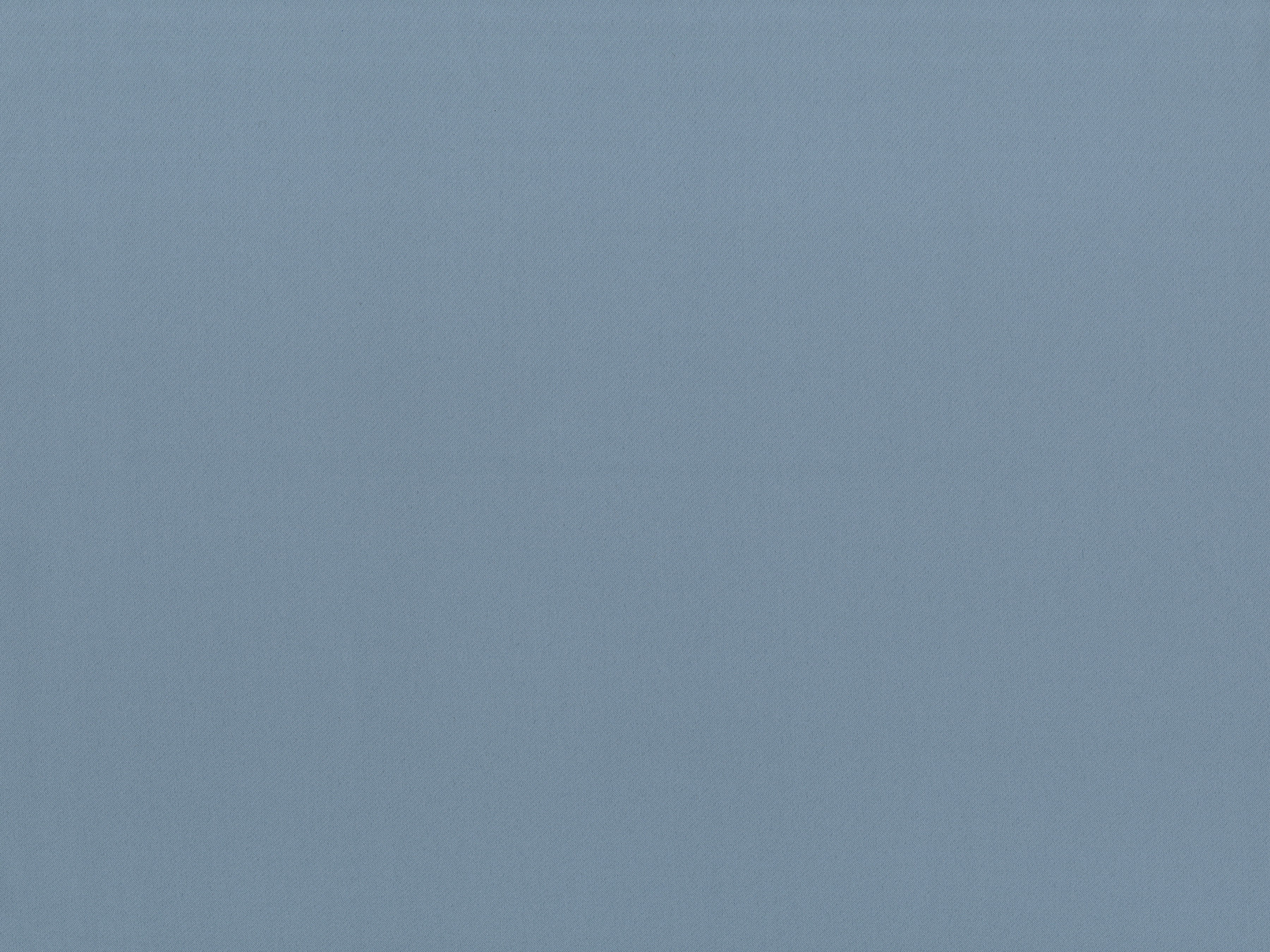
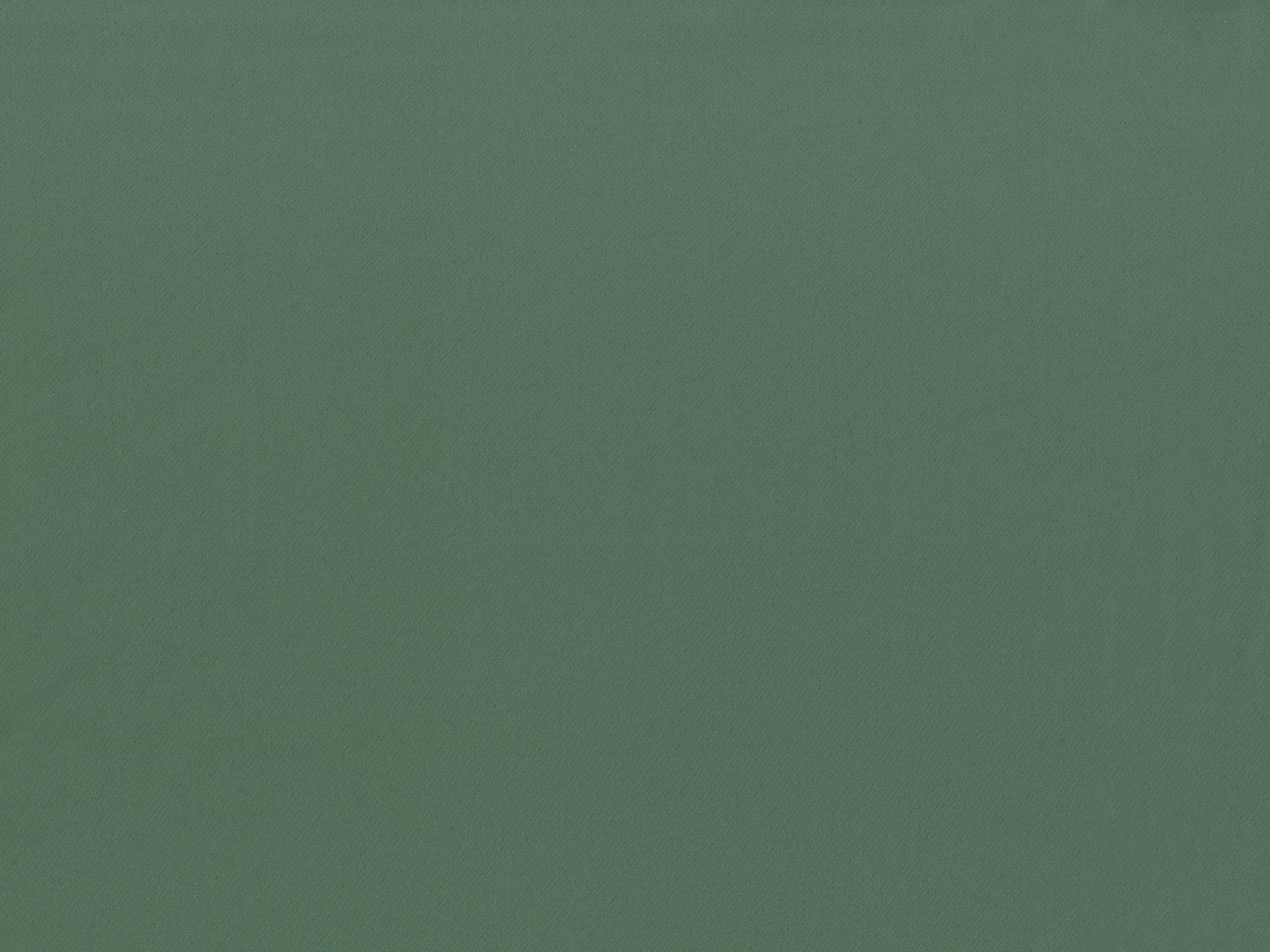
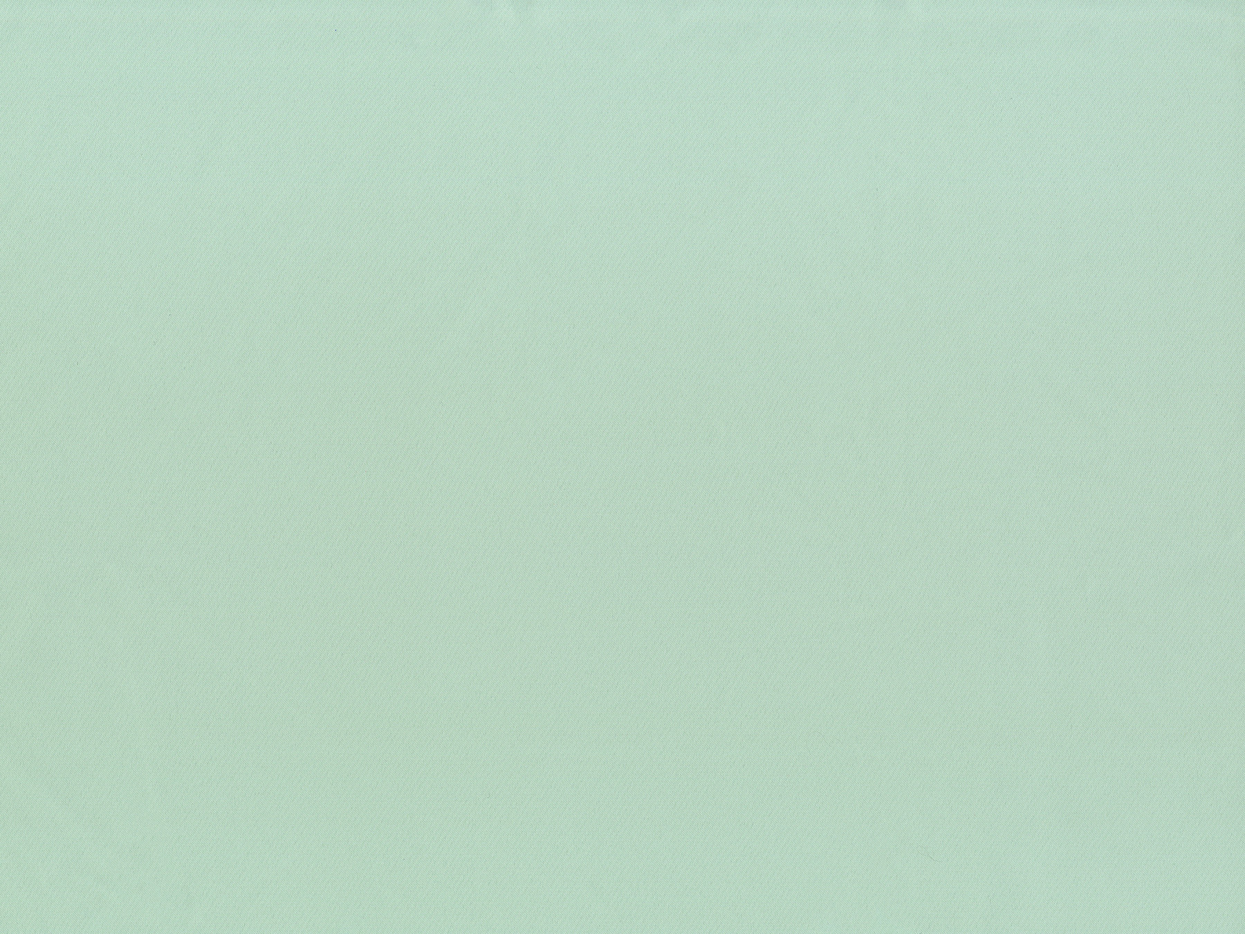
The colors of the collection spread across the palette in smooth gradations, from beige, gray and brown to pink and blue. Warm terracotta shades reminding of the sunset play and soft tiffany for the lovers of subdued turquoise deserve special attention. There are 42 shades in all in Mono, which perfectly match the other Eustergerling collections.