
About the Collection
The art of opera is the art of the chosen few. It unites creativity and high society, aristocrats and poetry, the powerful and the great. Ingenious music consists of just seven notes. The magic of the number seven is the seven wonders of the world, the seven notes, the seven colors of the rainbow. Opera is the assembled symbols of our time. Take on the role of a creator. Combine, create something new in your interior, with Opera colors!

Tradition and modernity
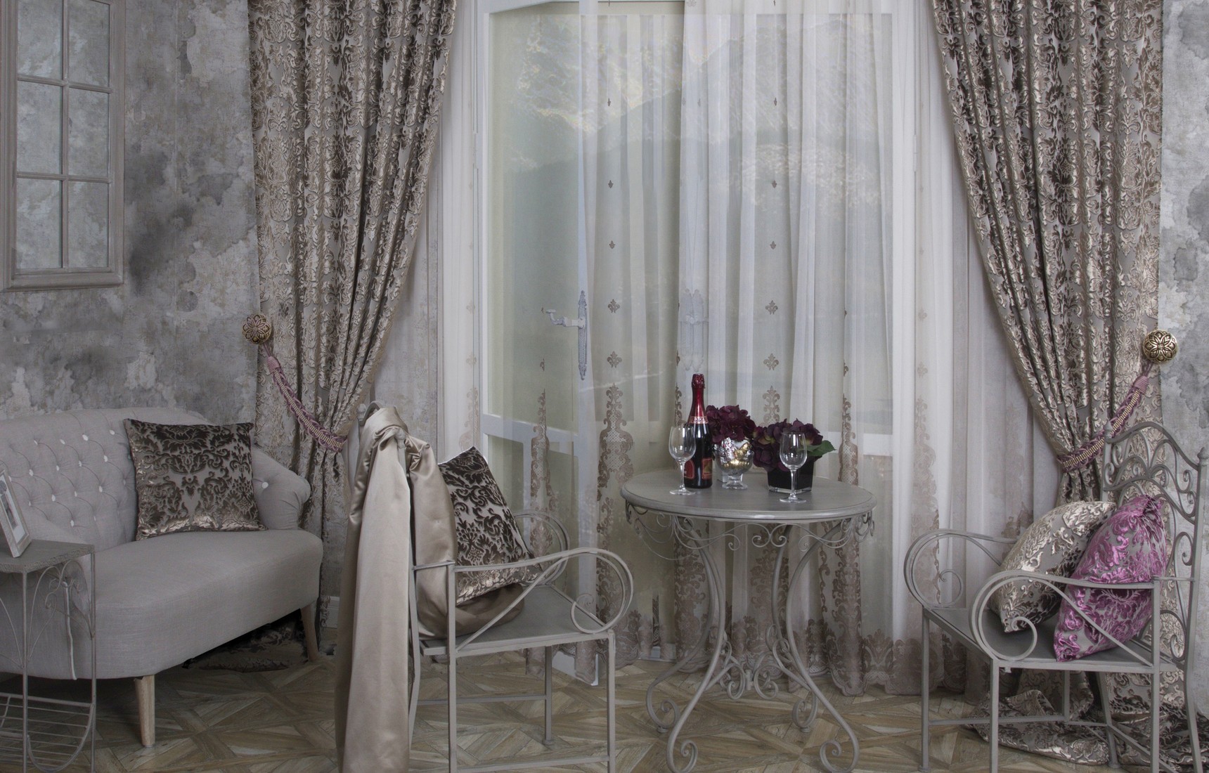
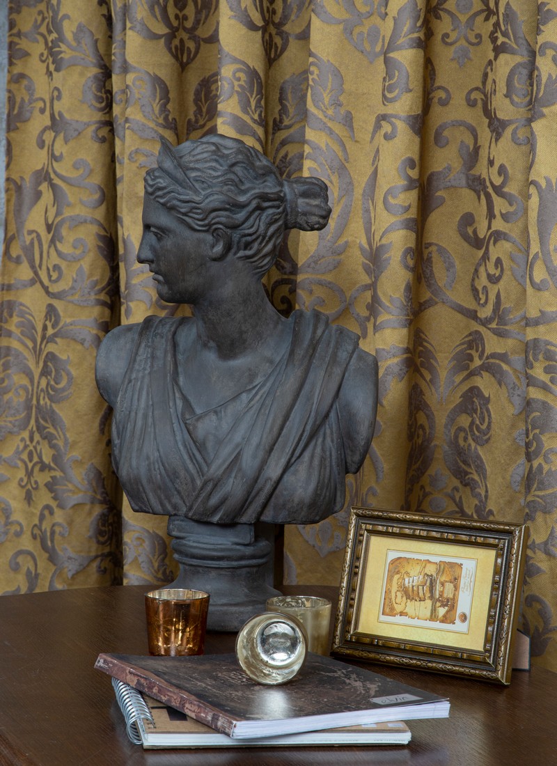
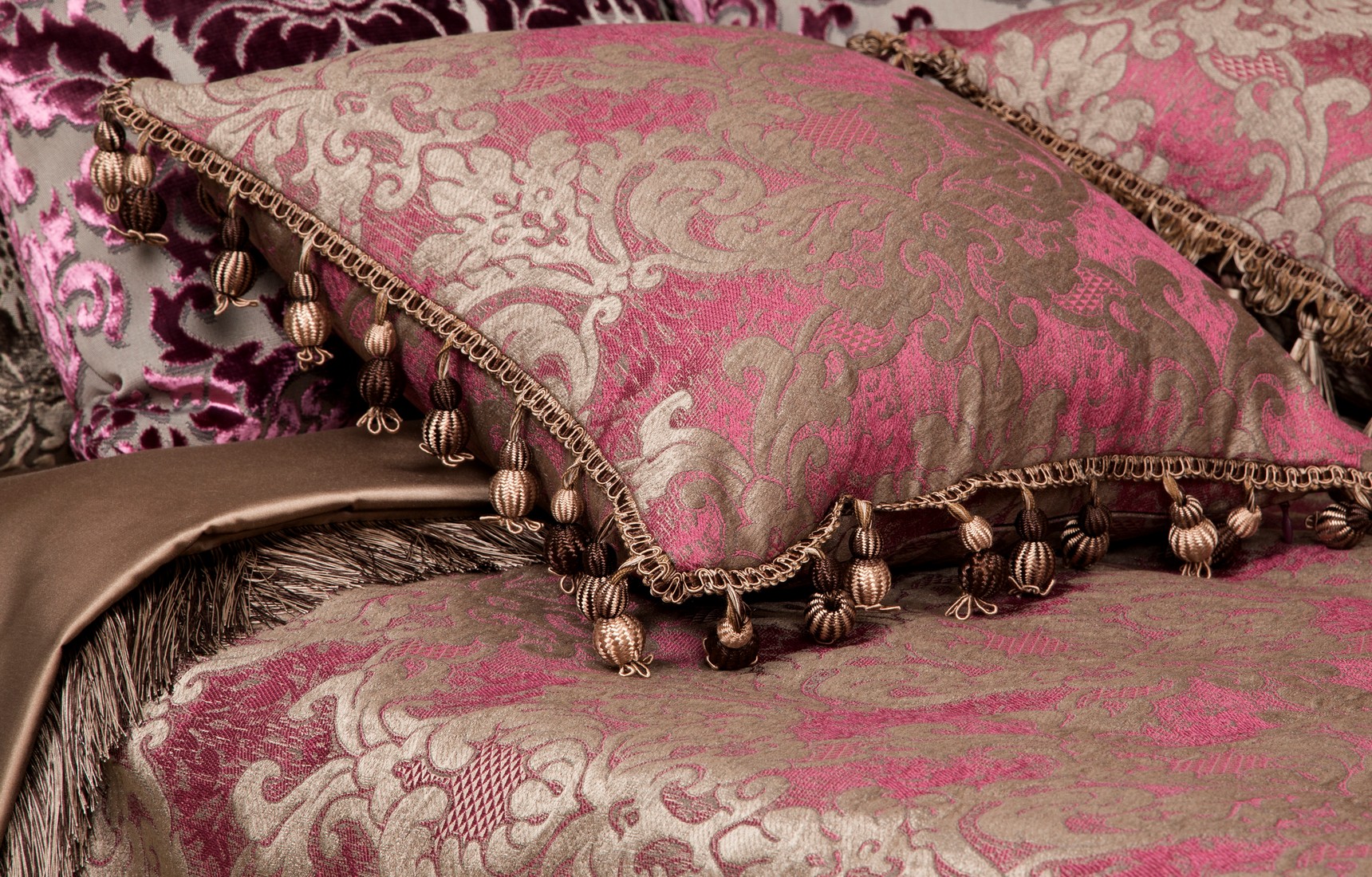
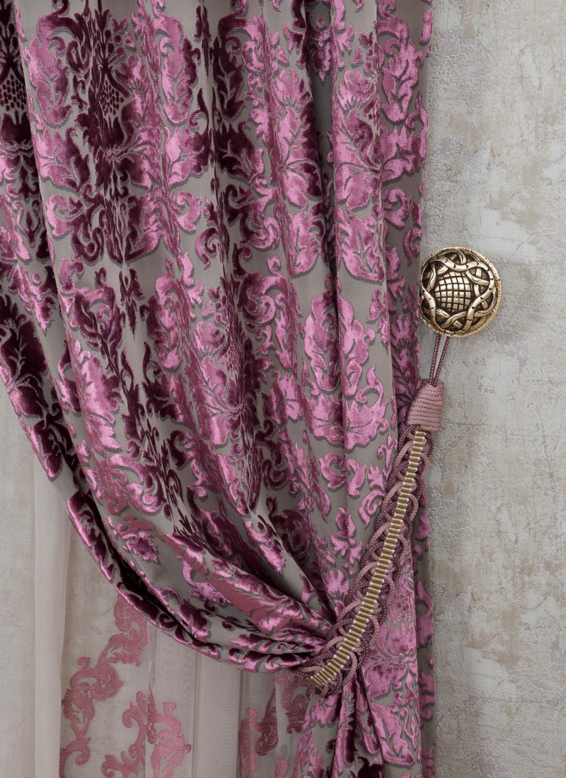
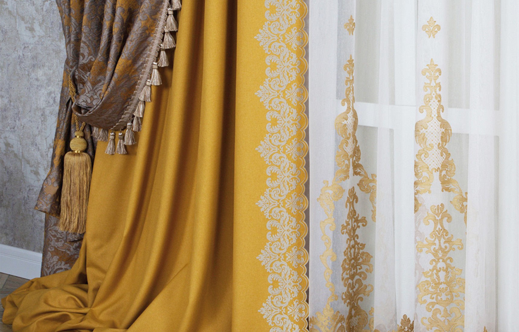
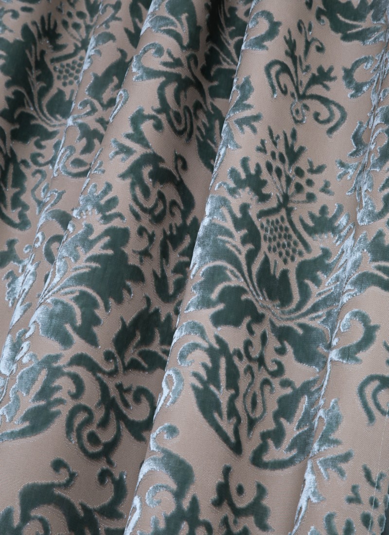
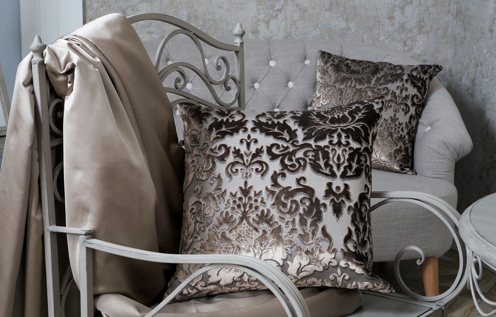
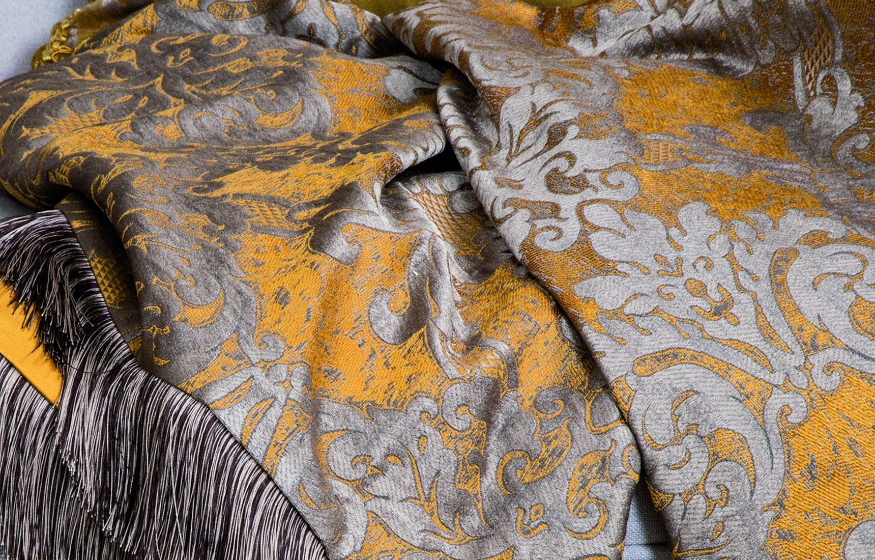
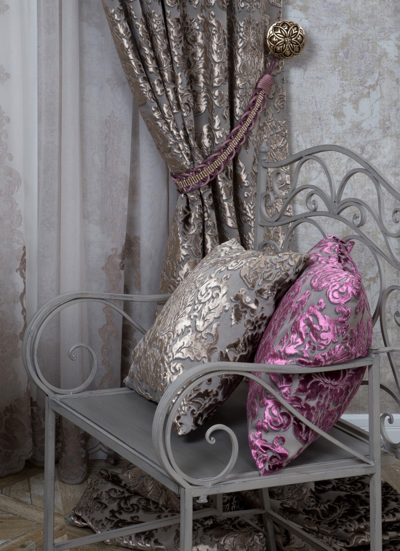
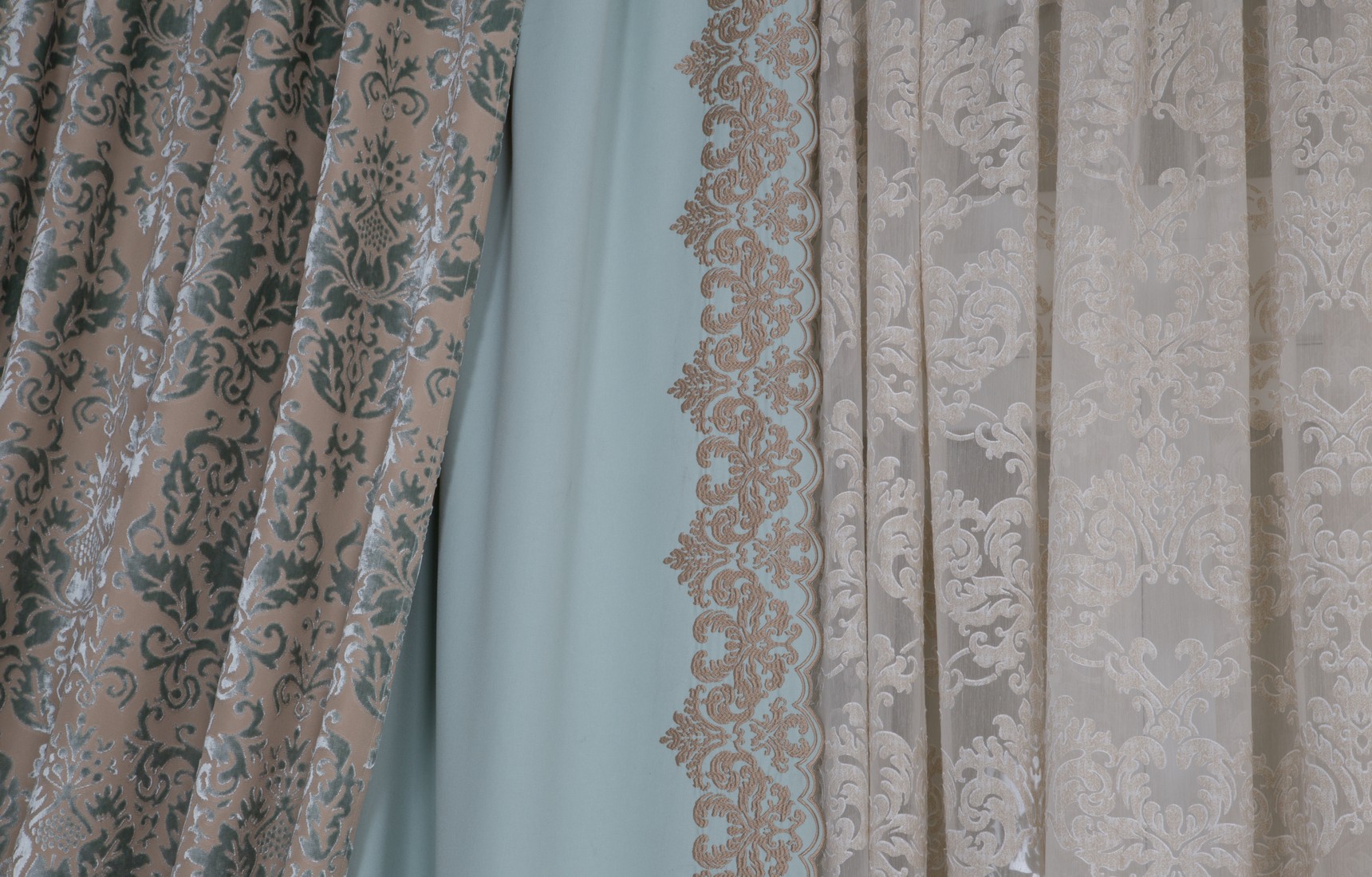
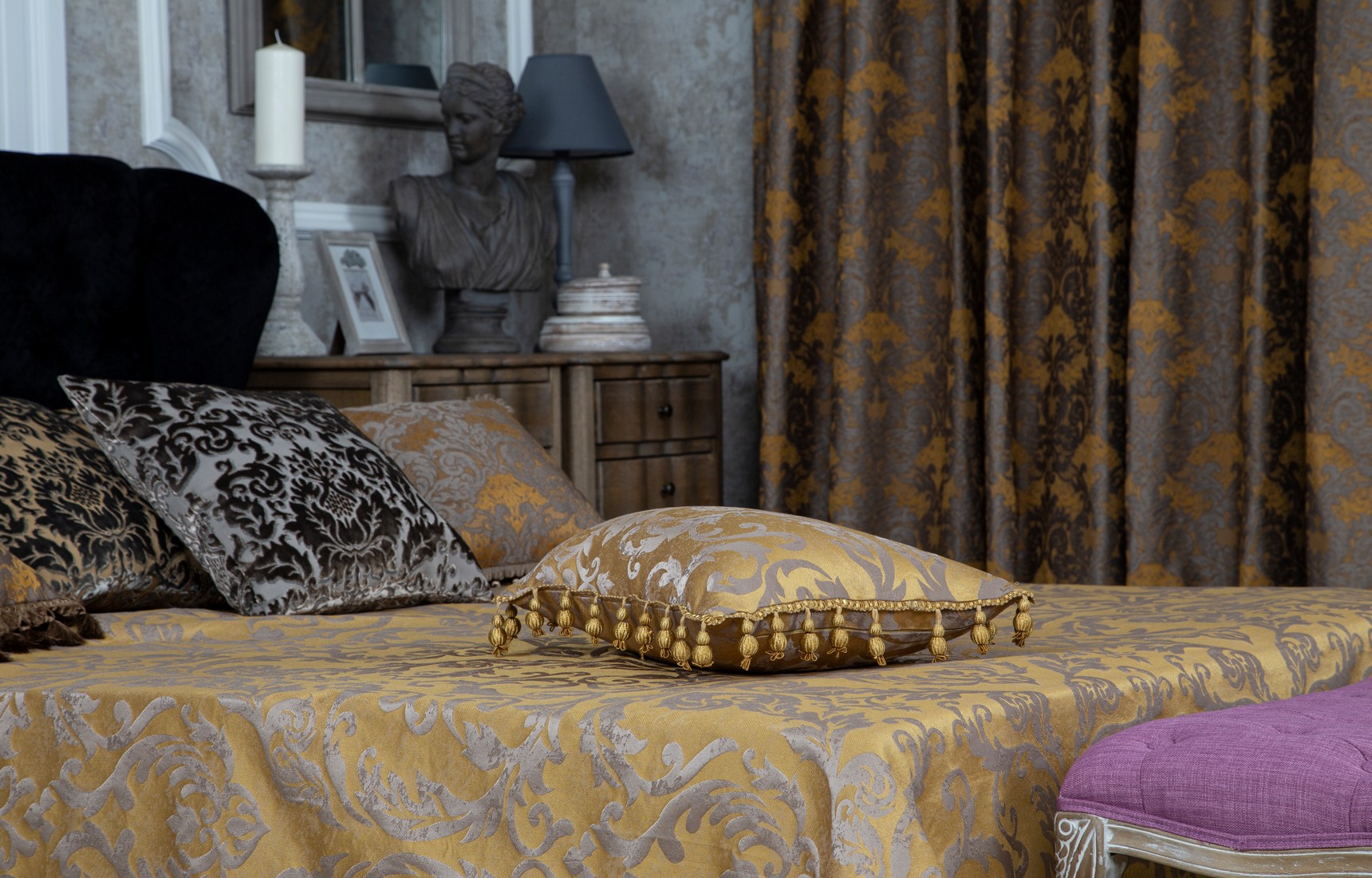
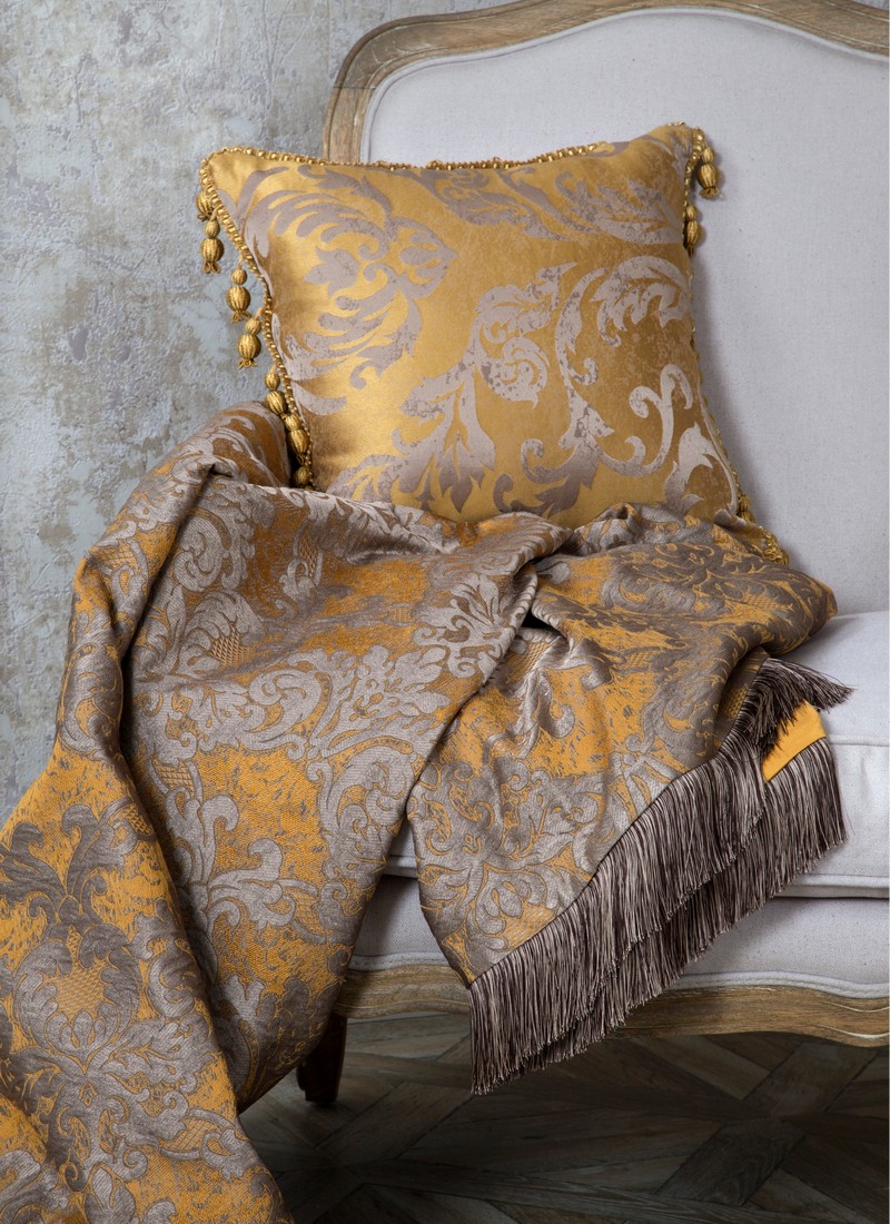
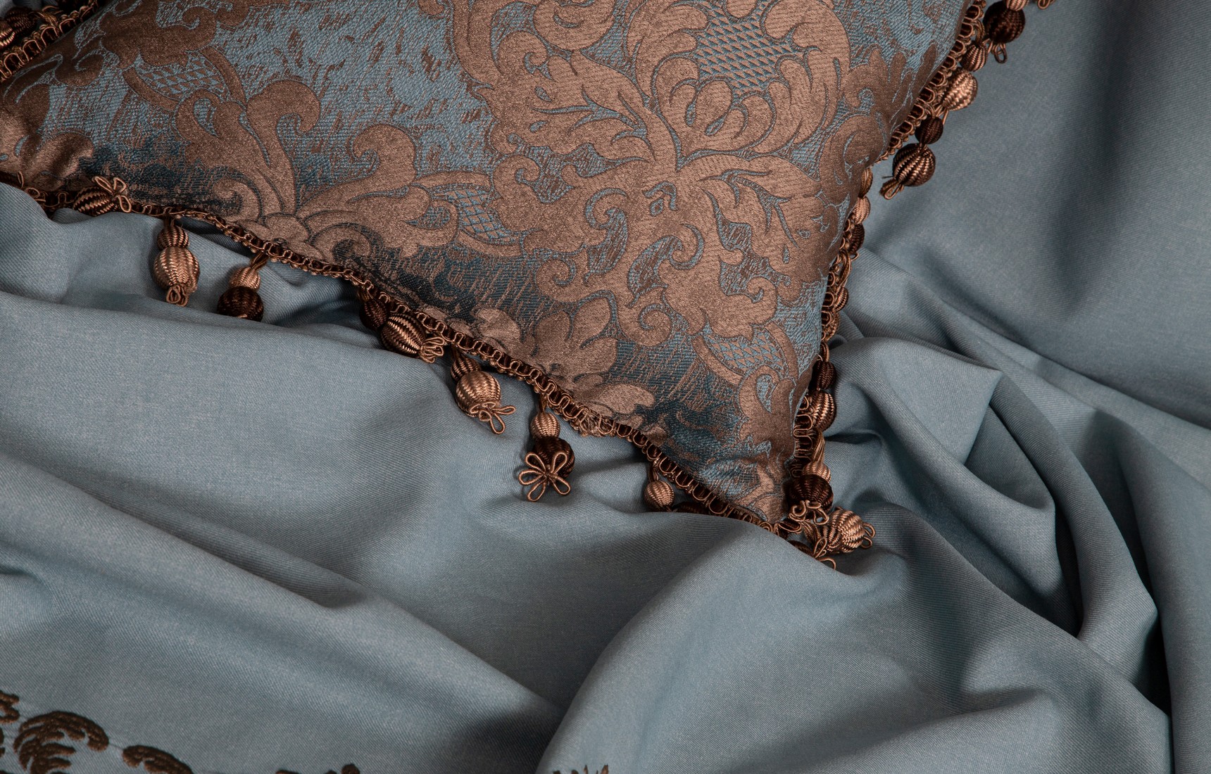
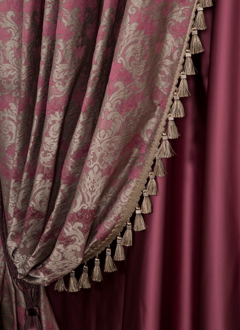
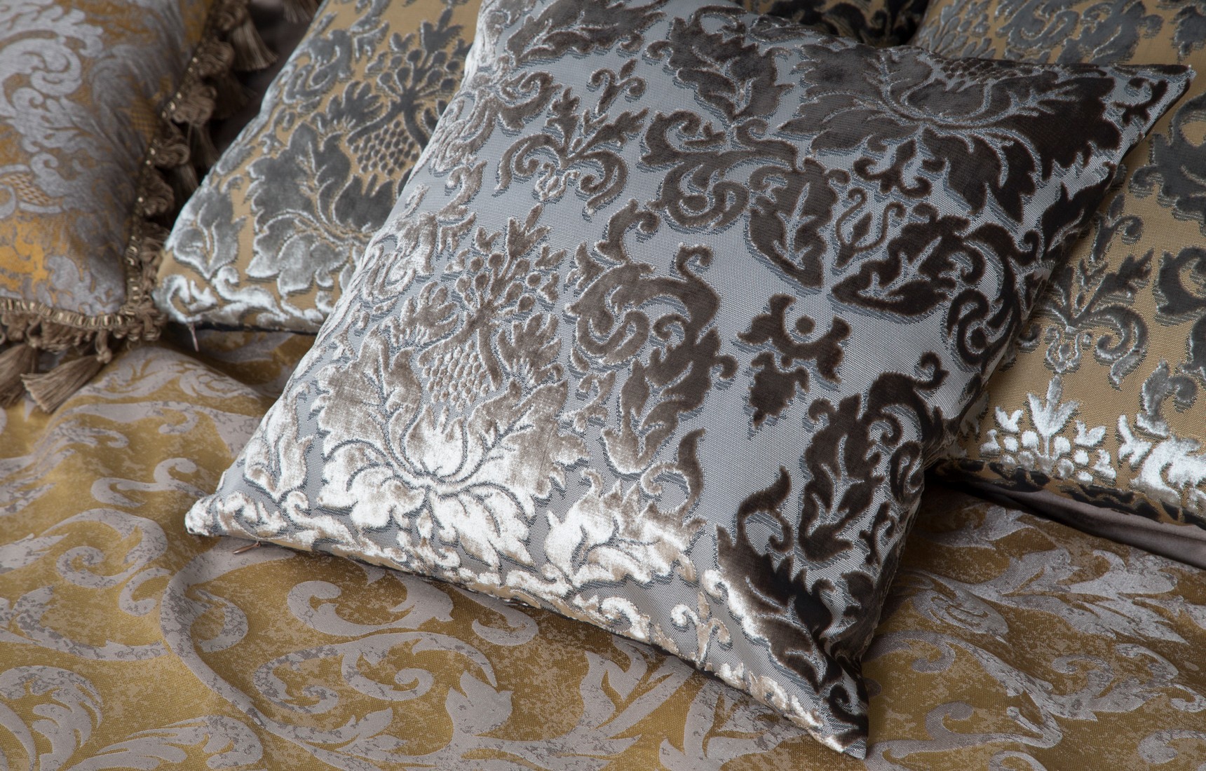
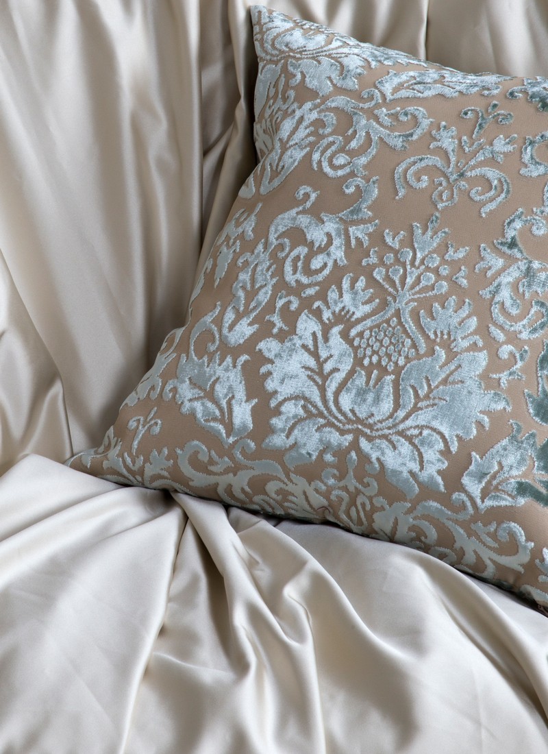
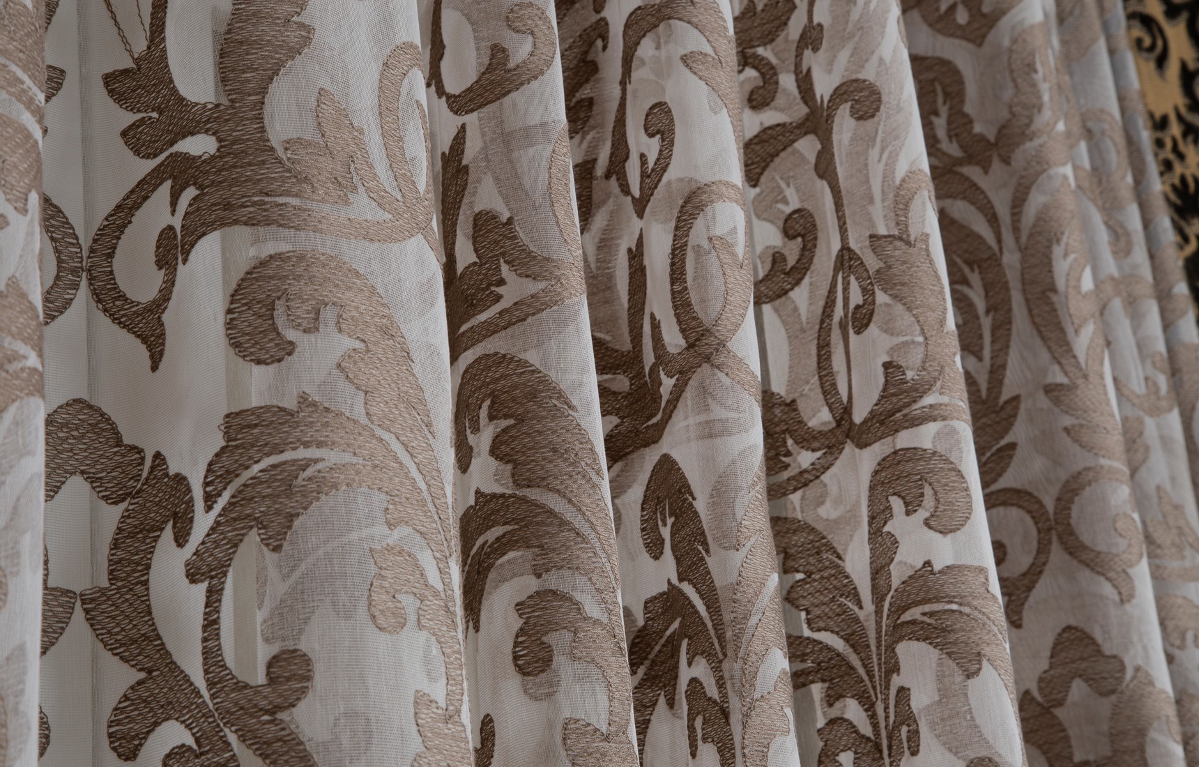
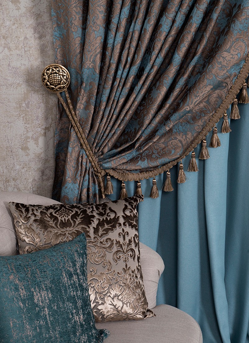
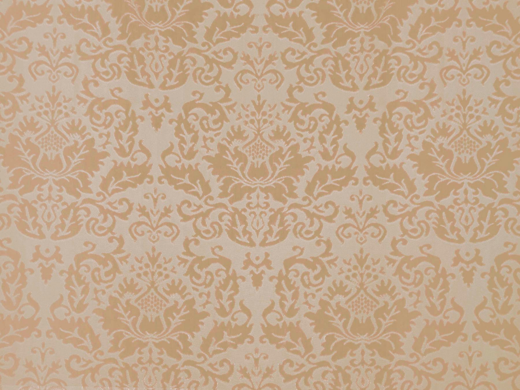
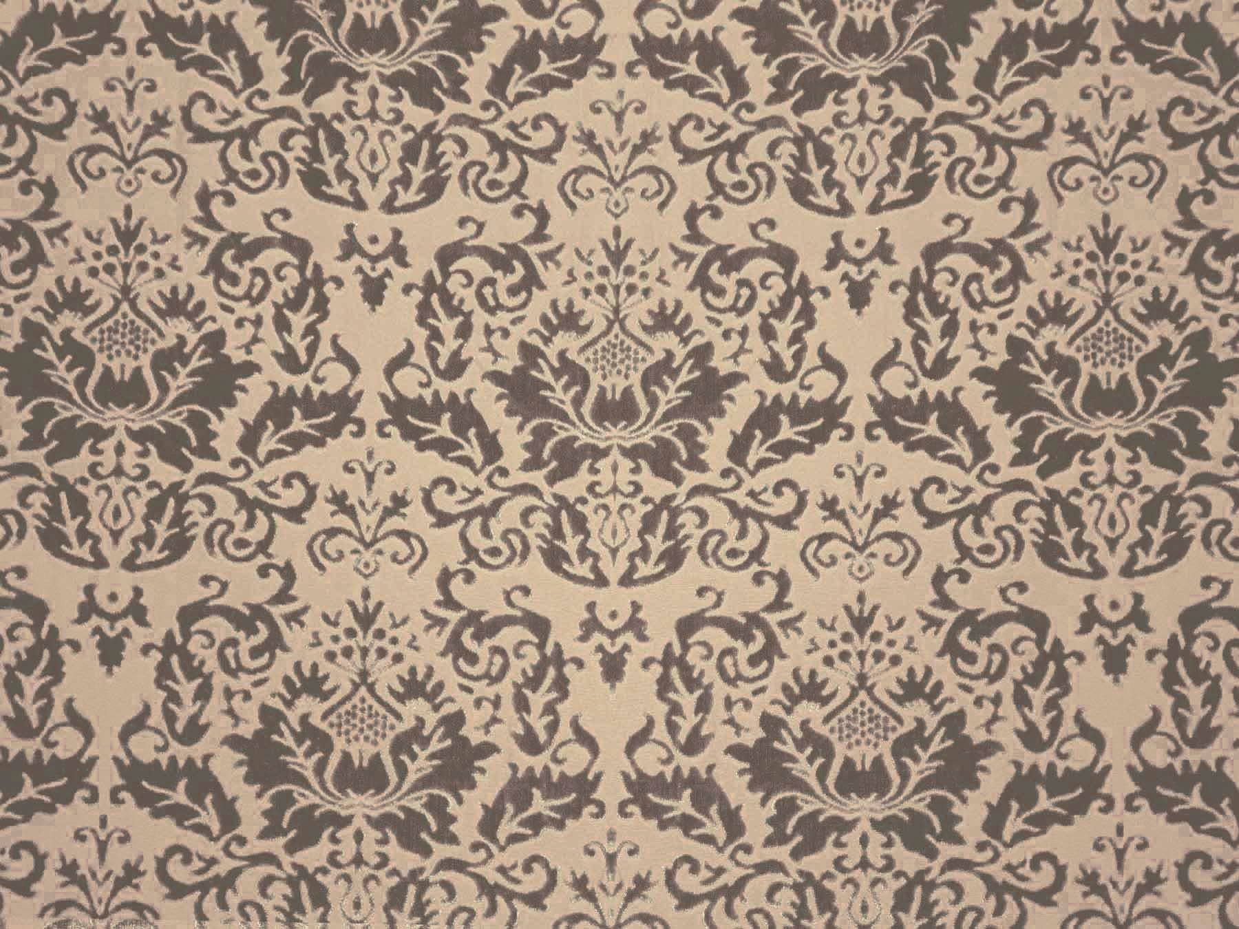
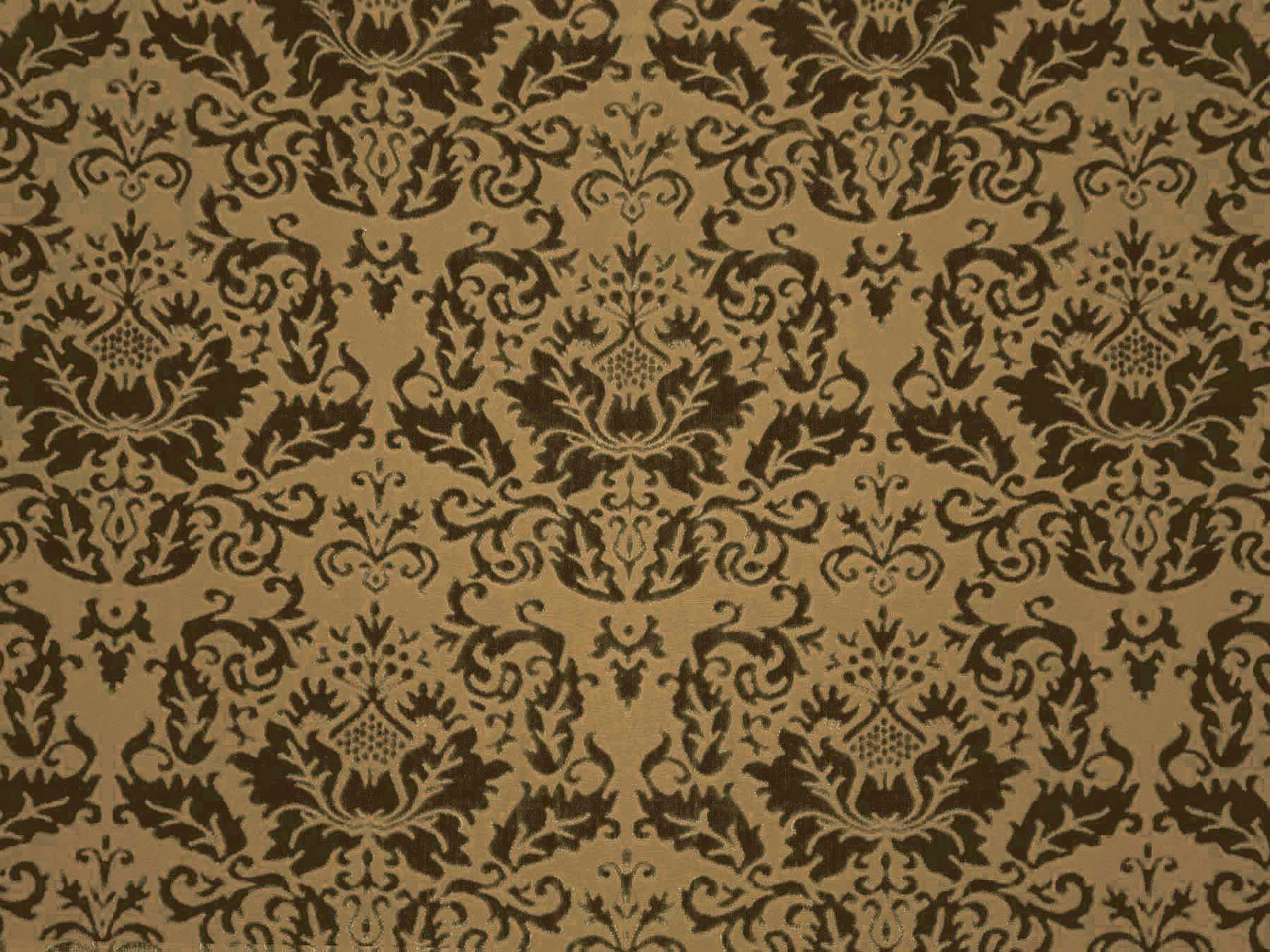
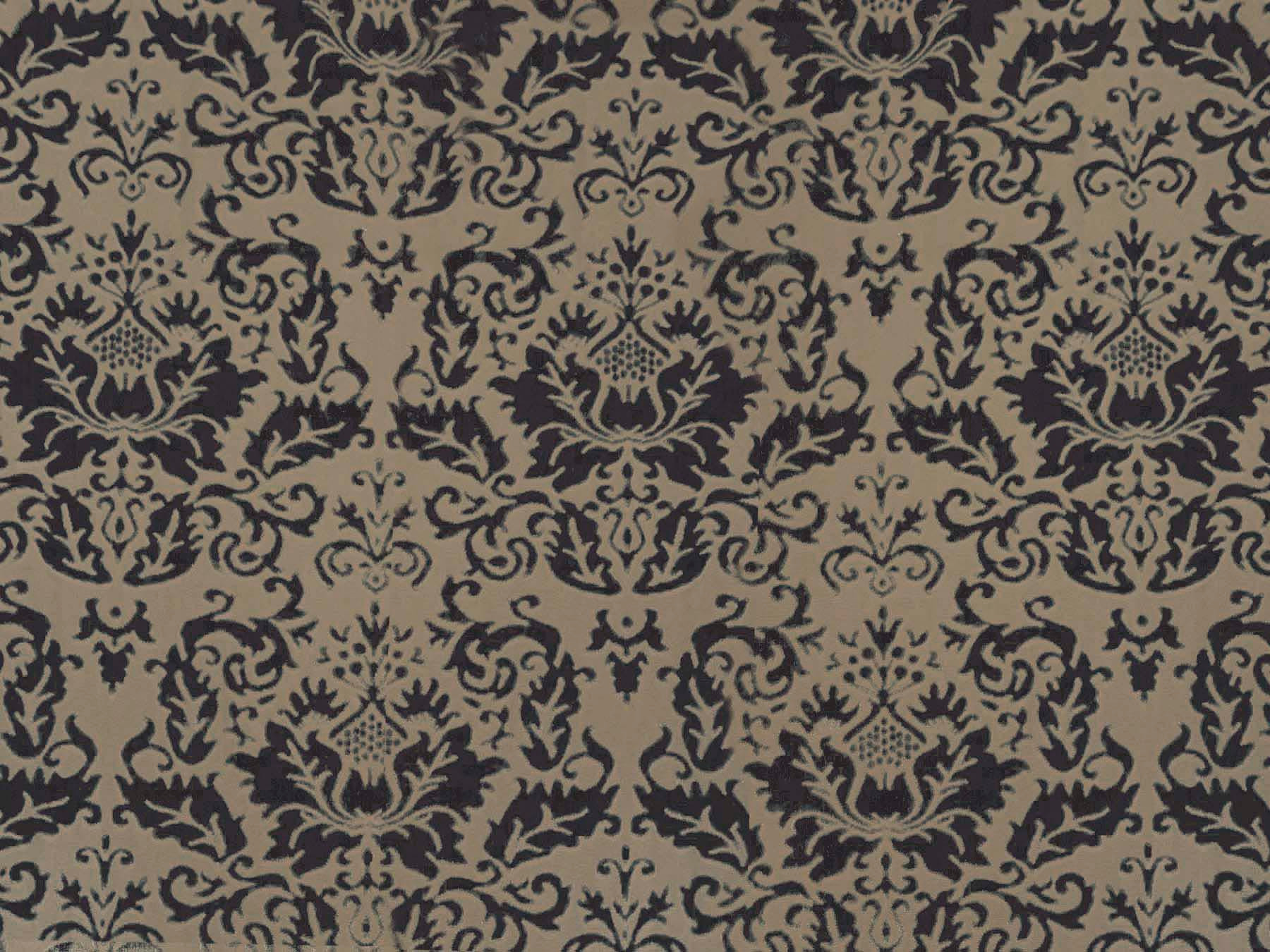
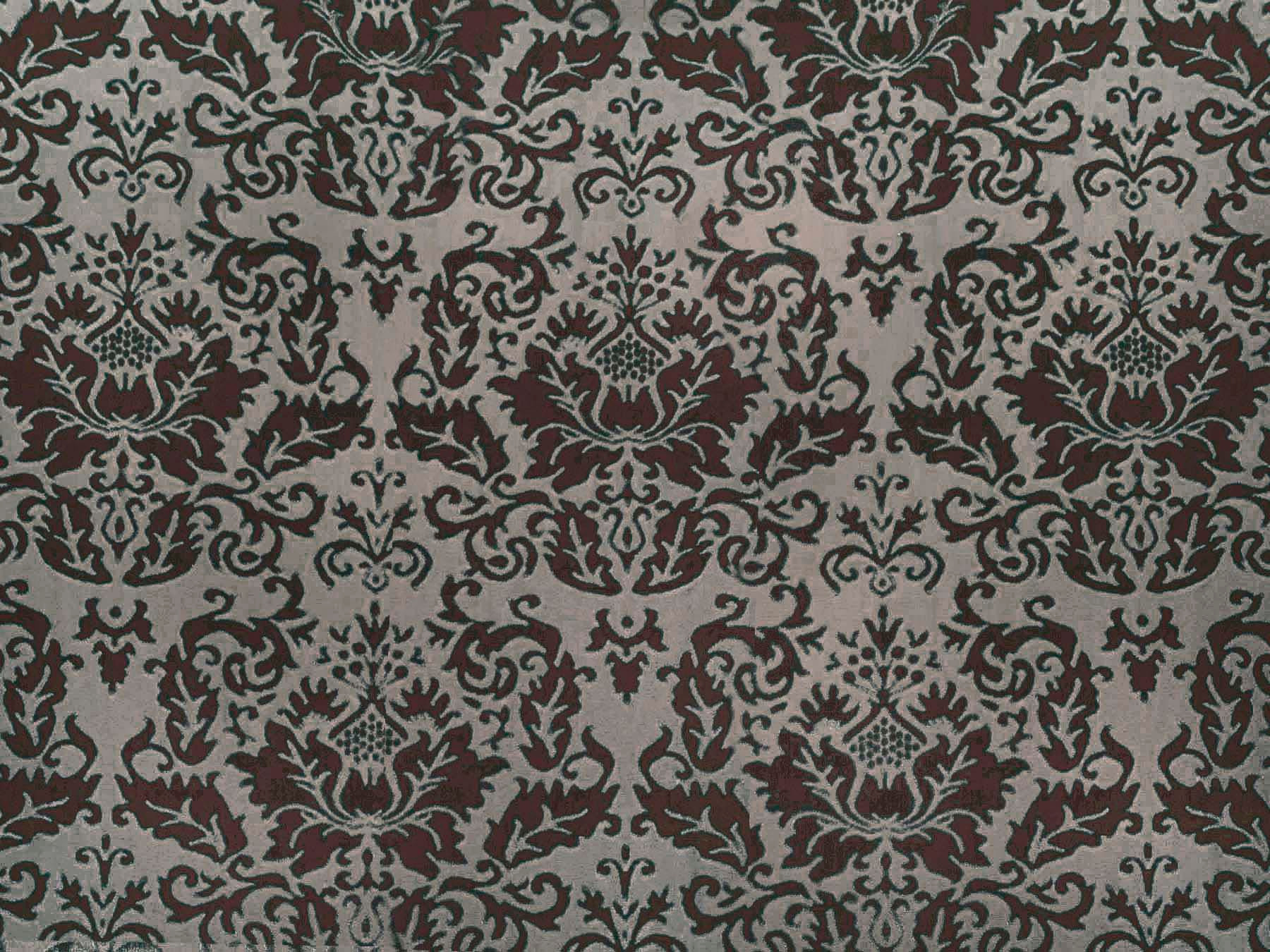
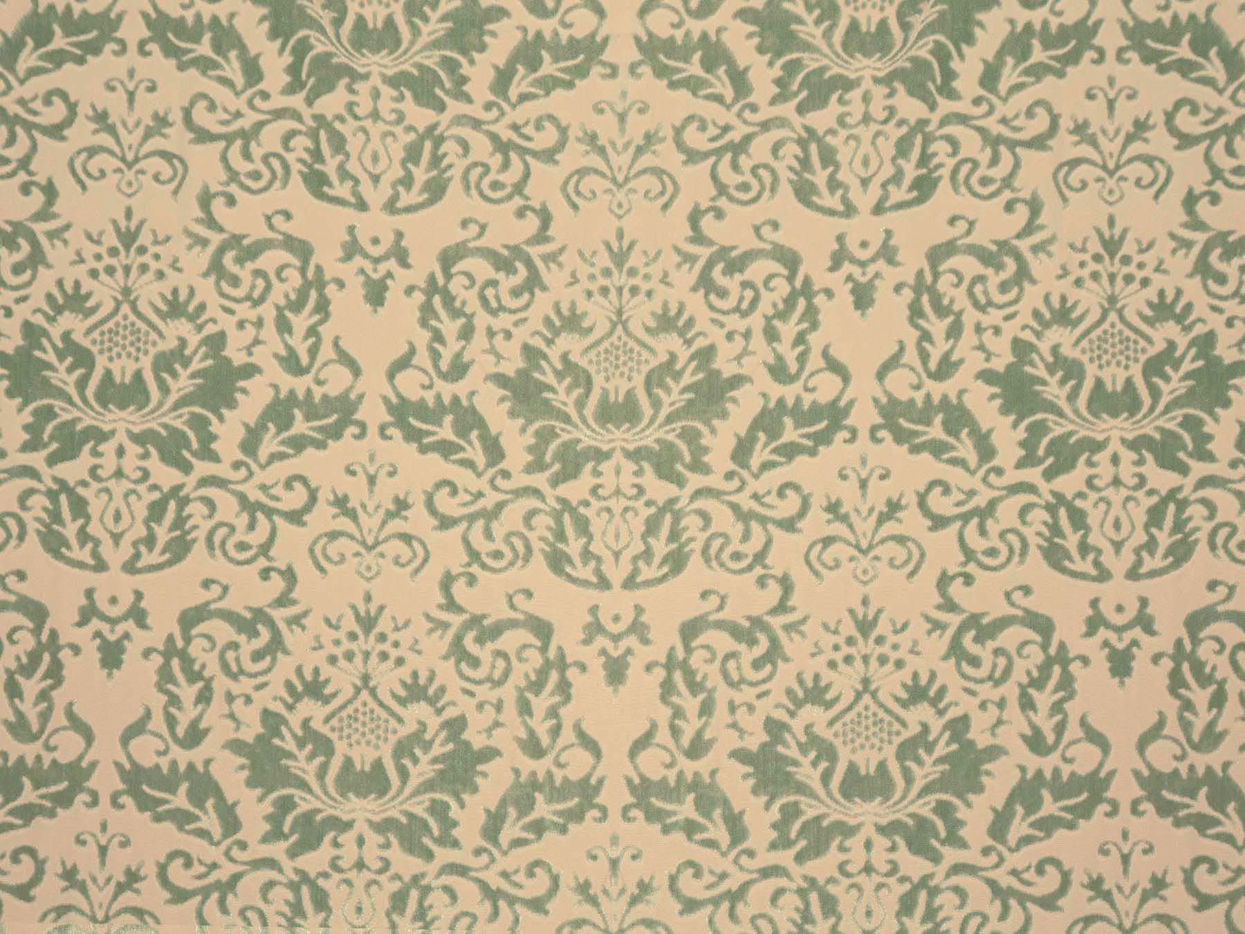
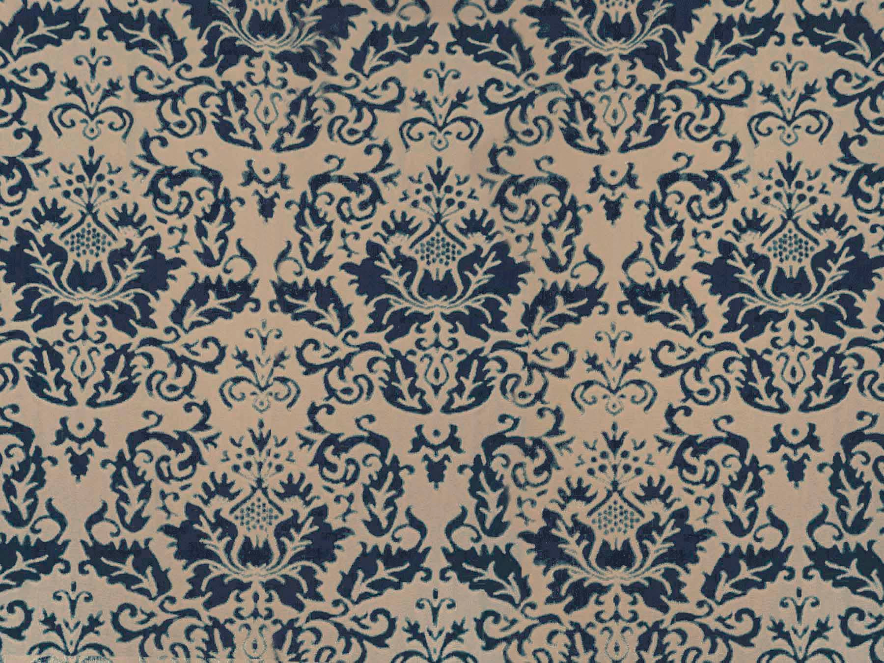
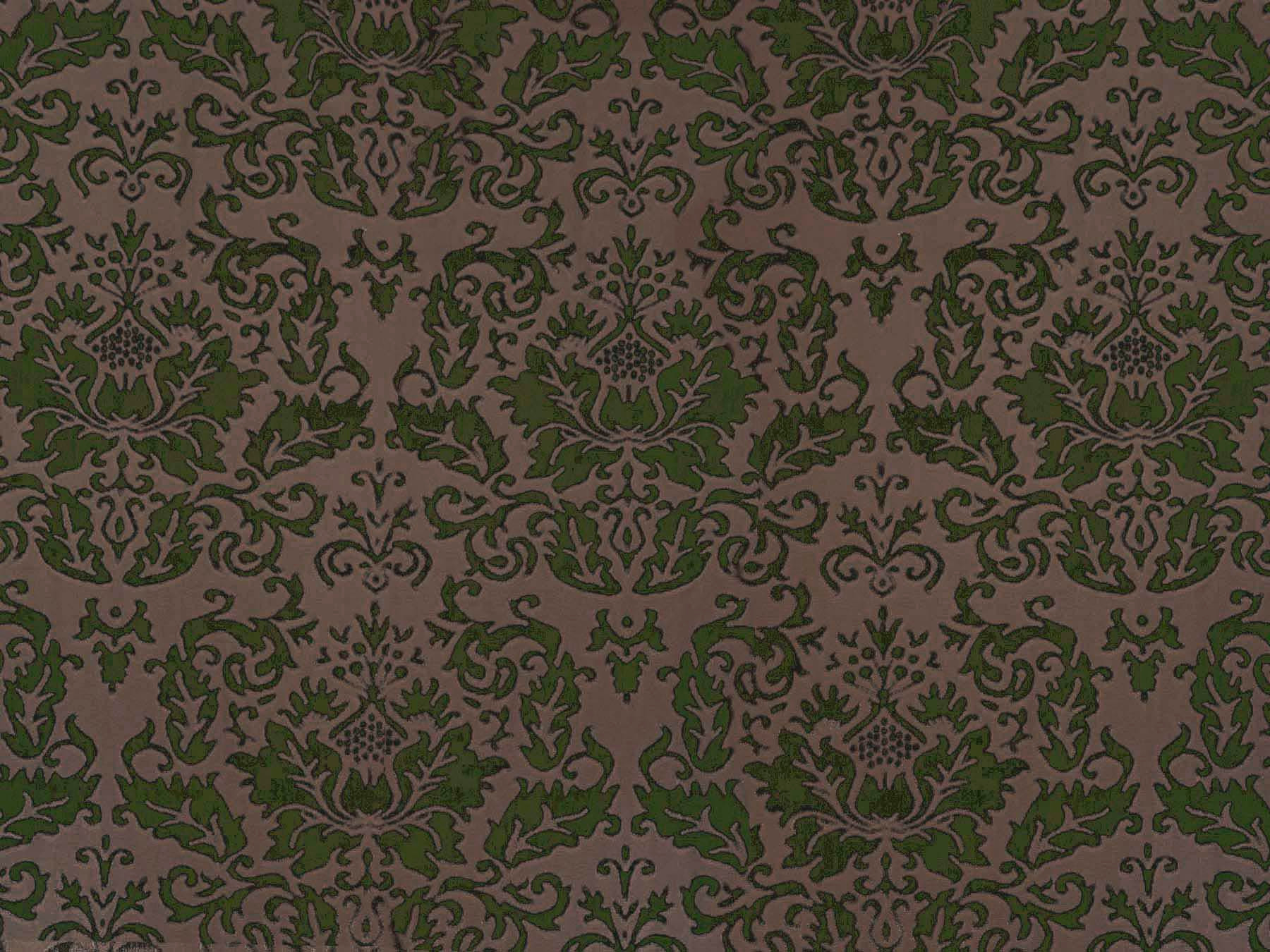
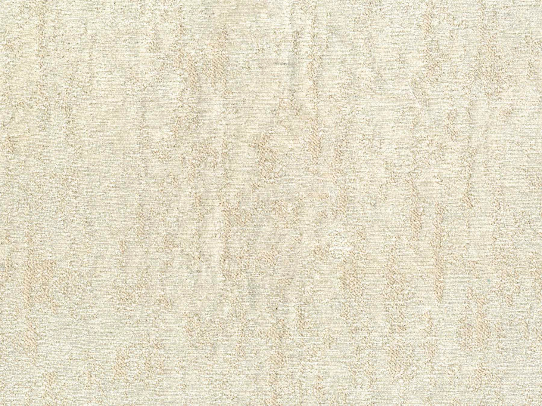
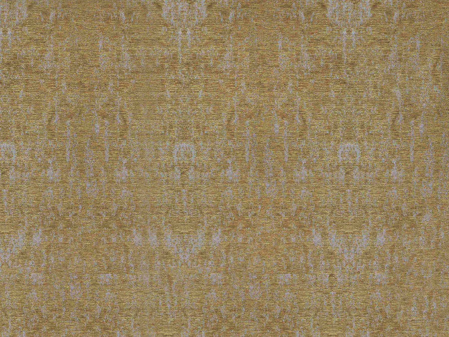
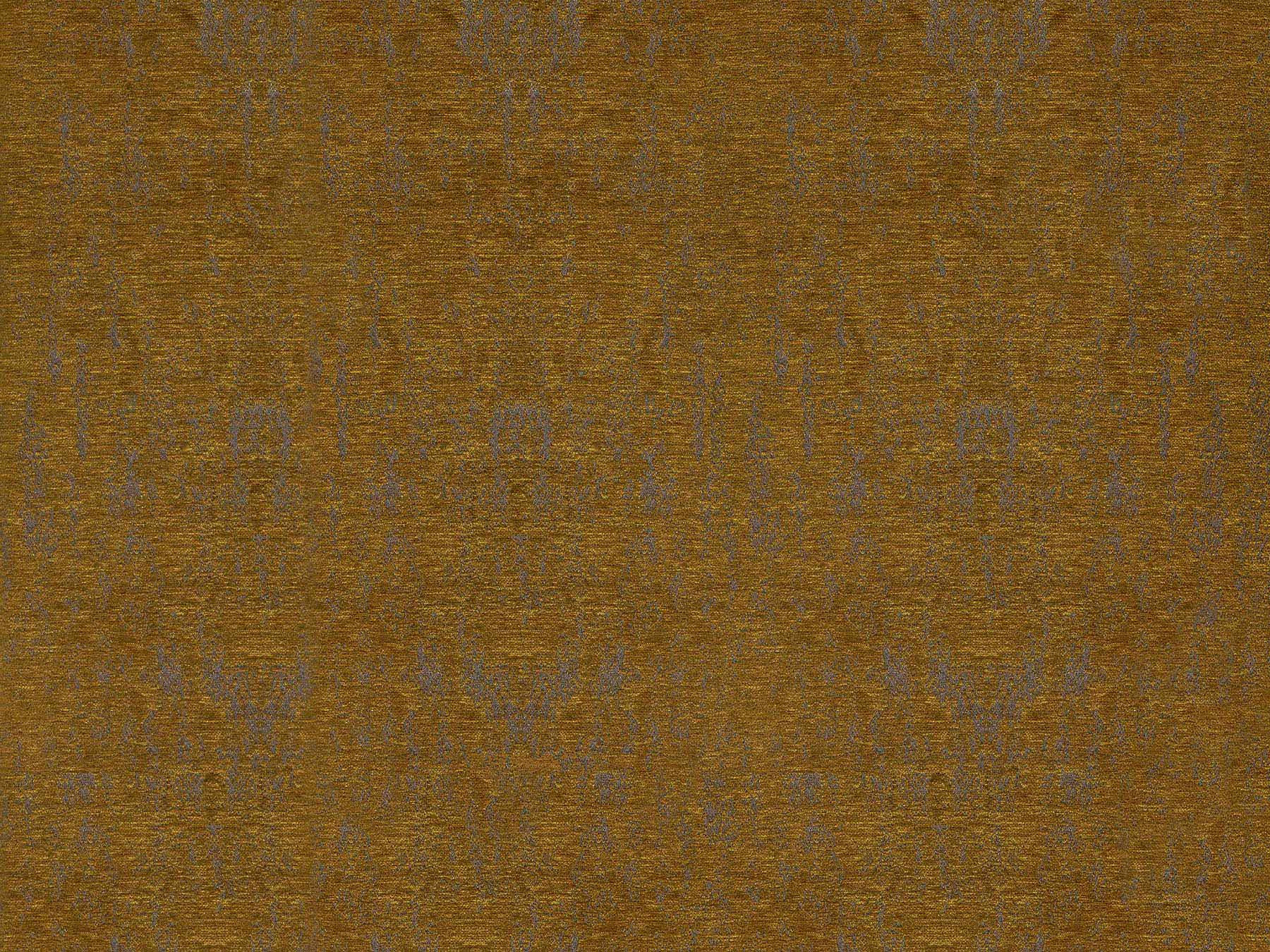
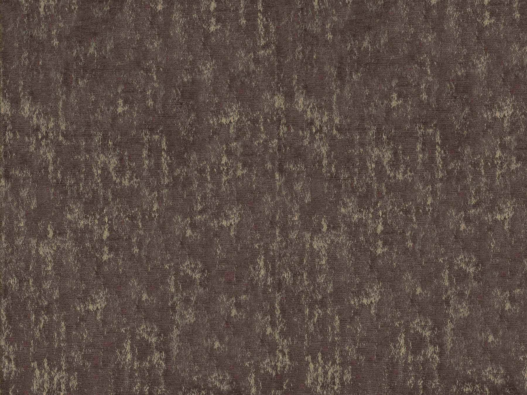
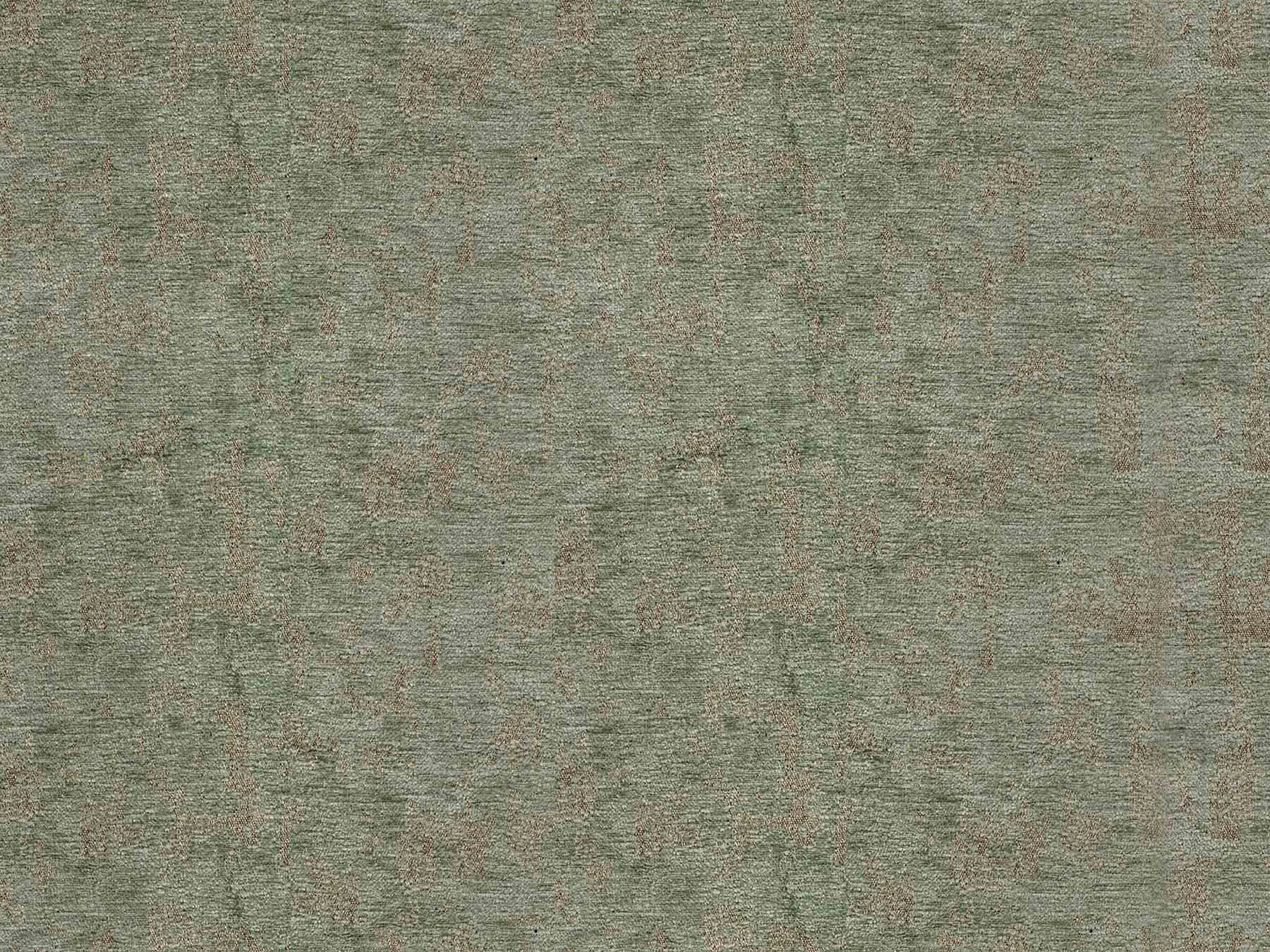
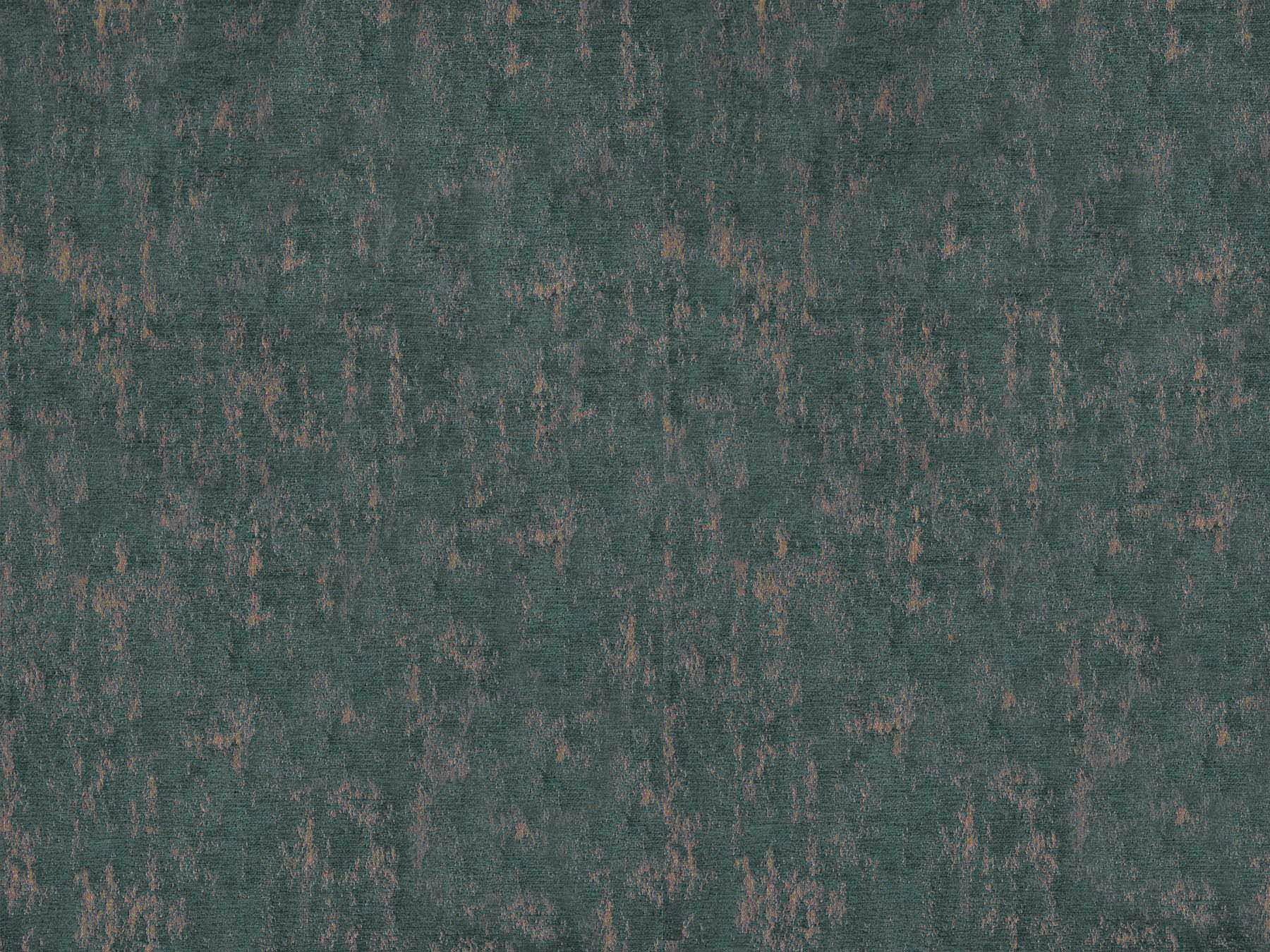
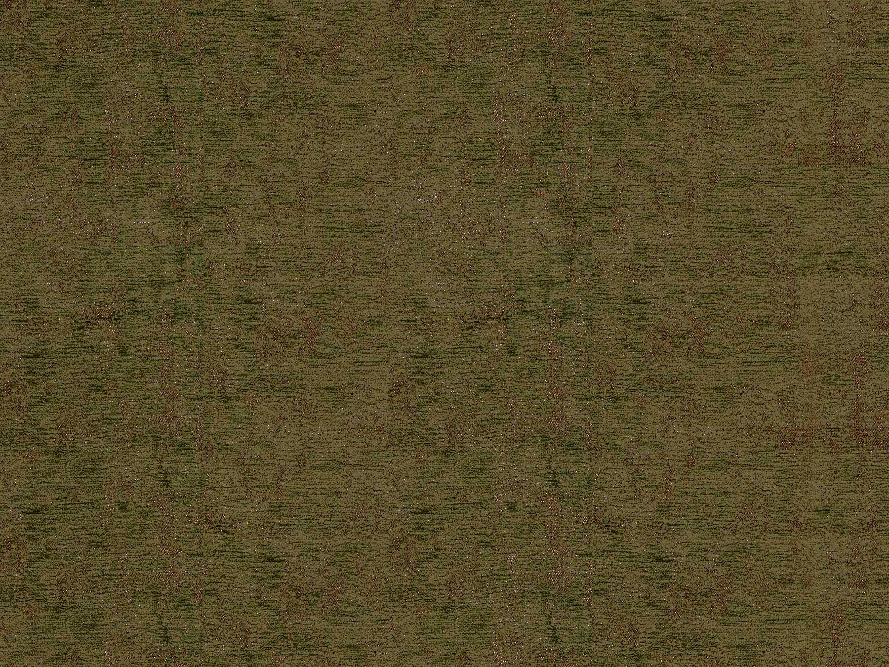
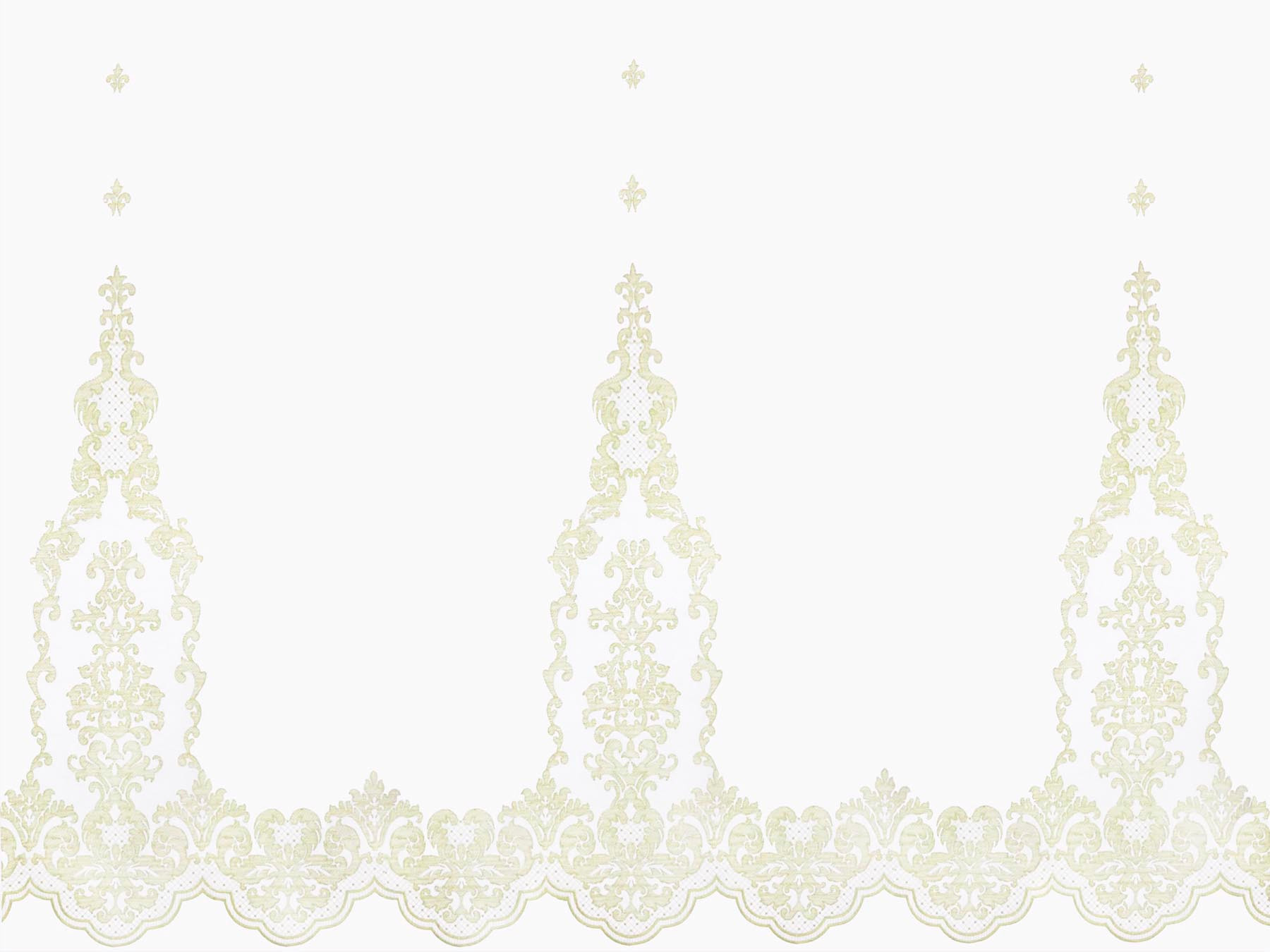
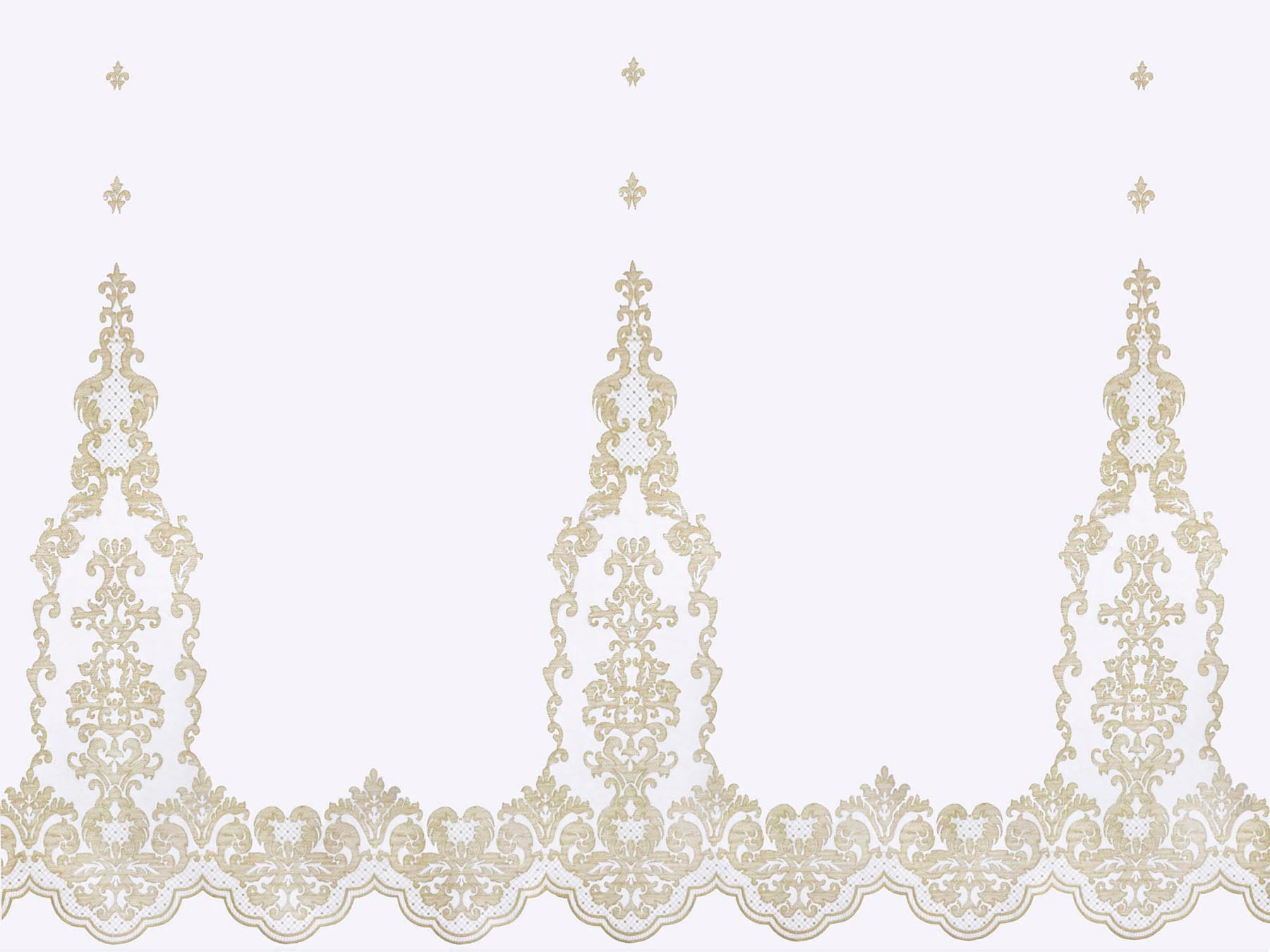
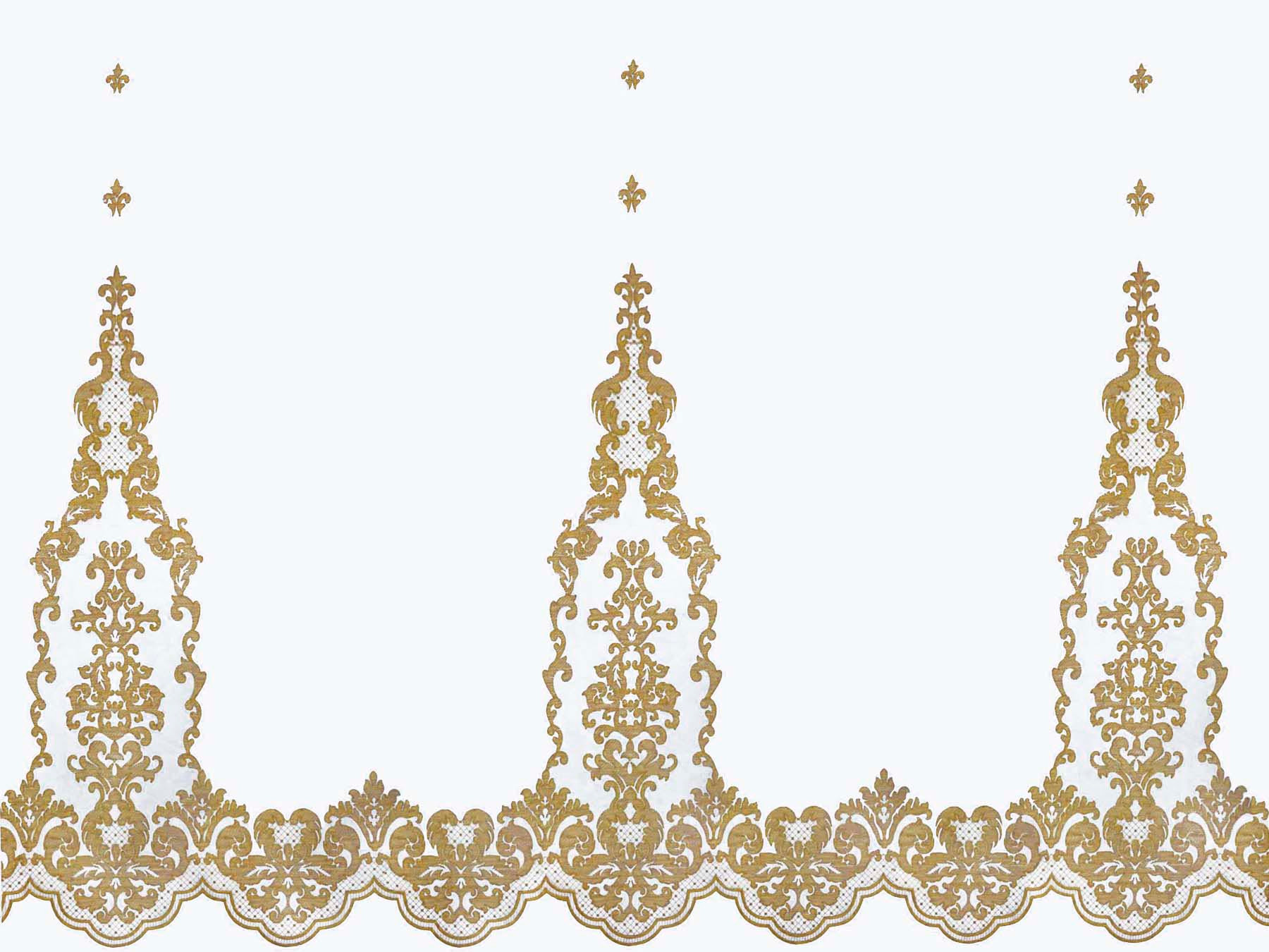
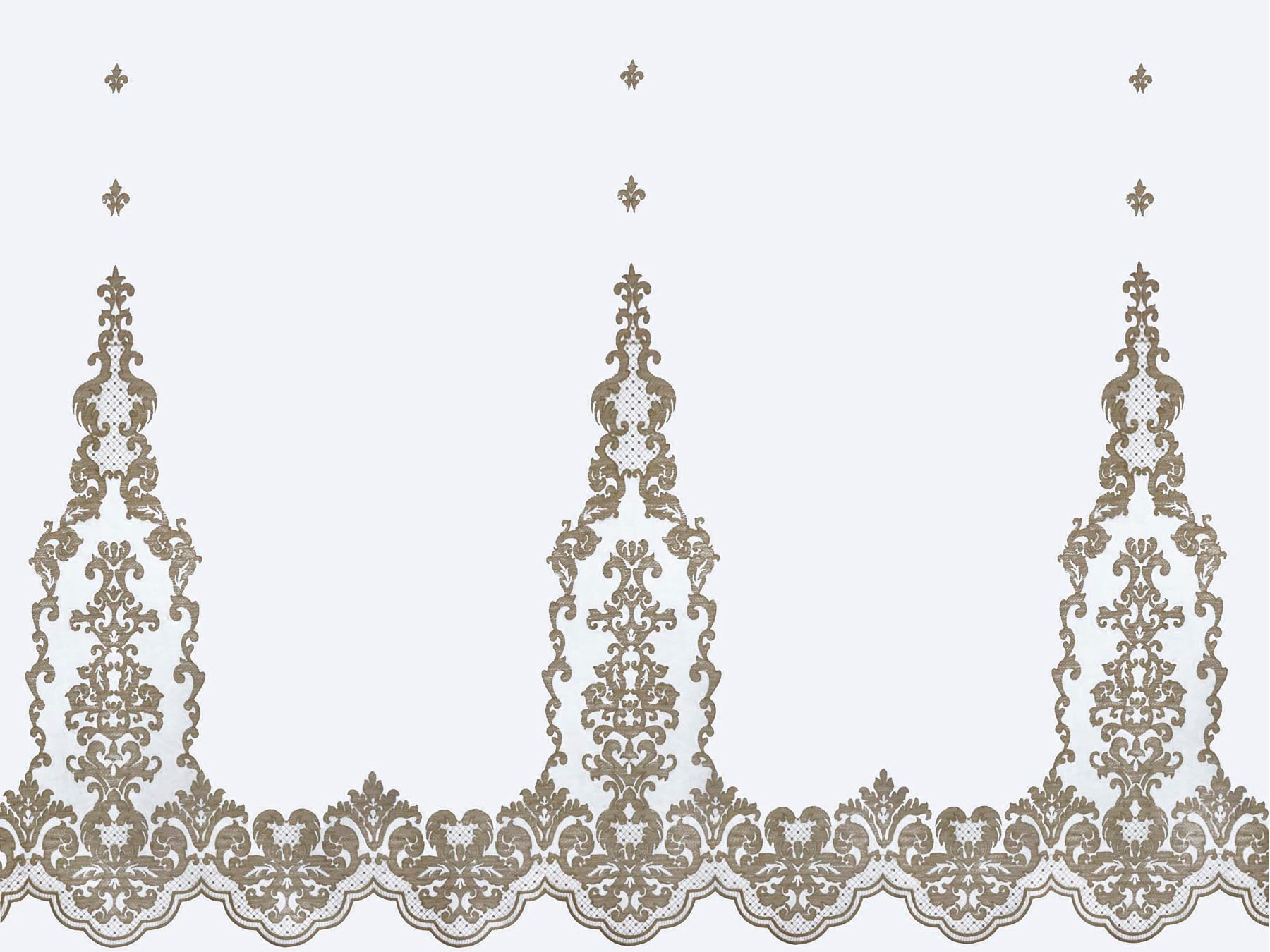
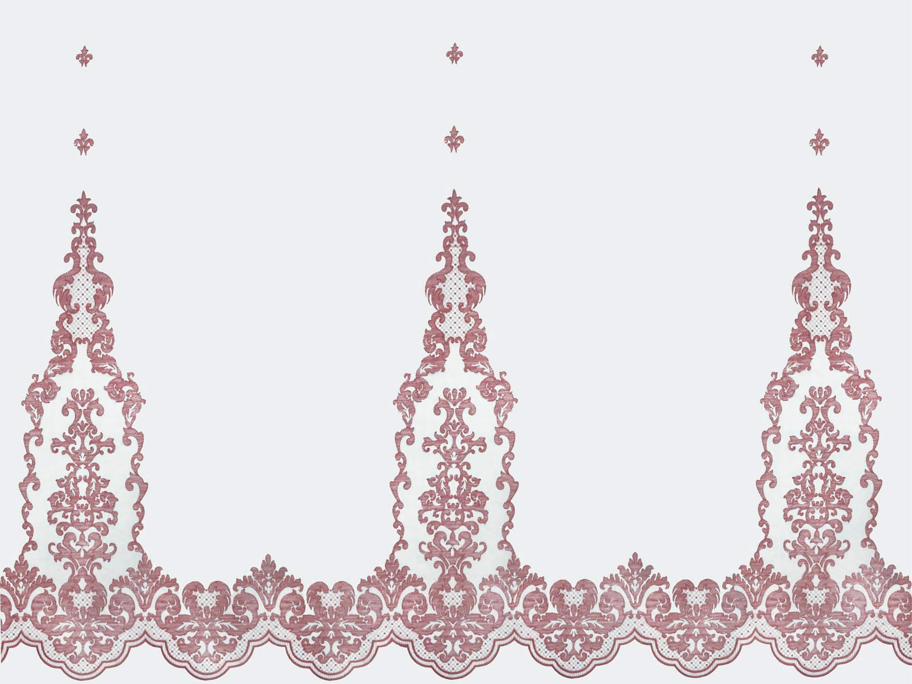
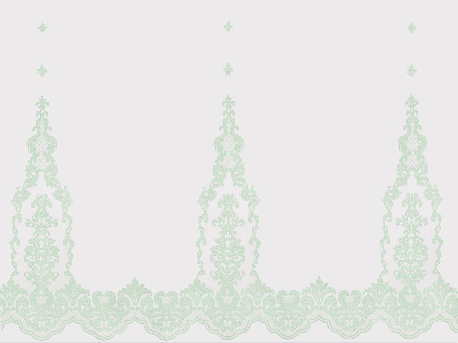
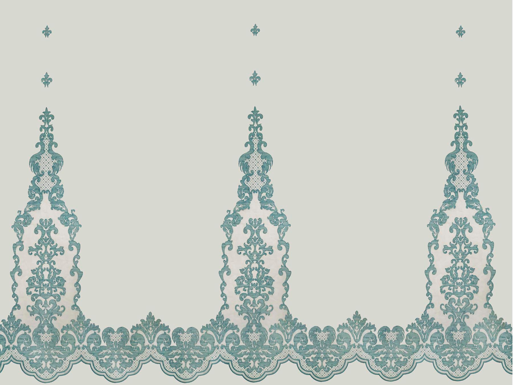
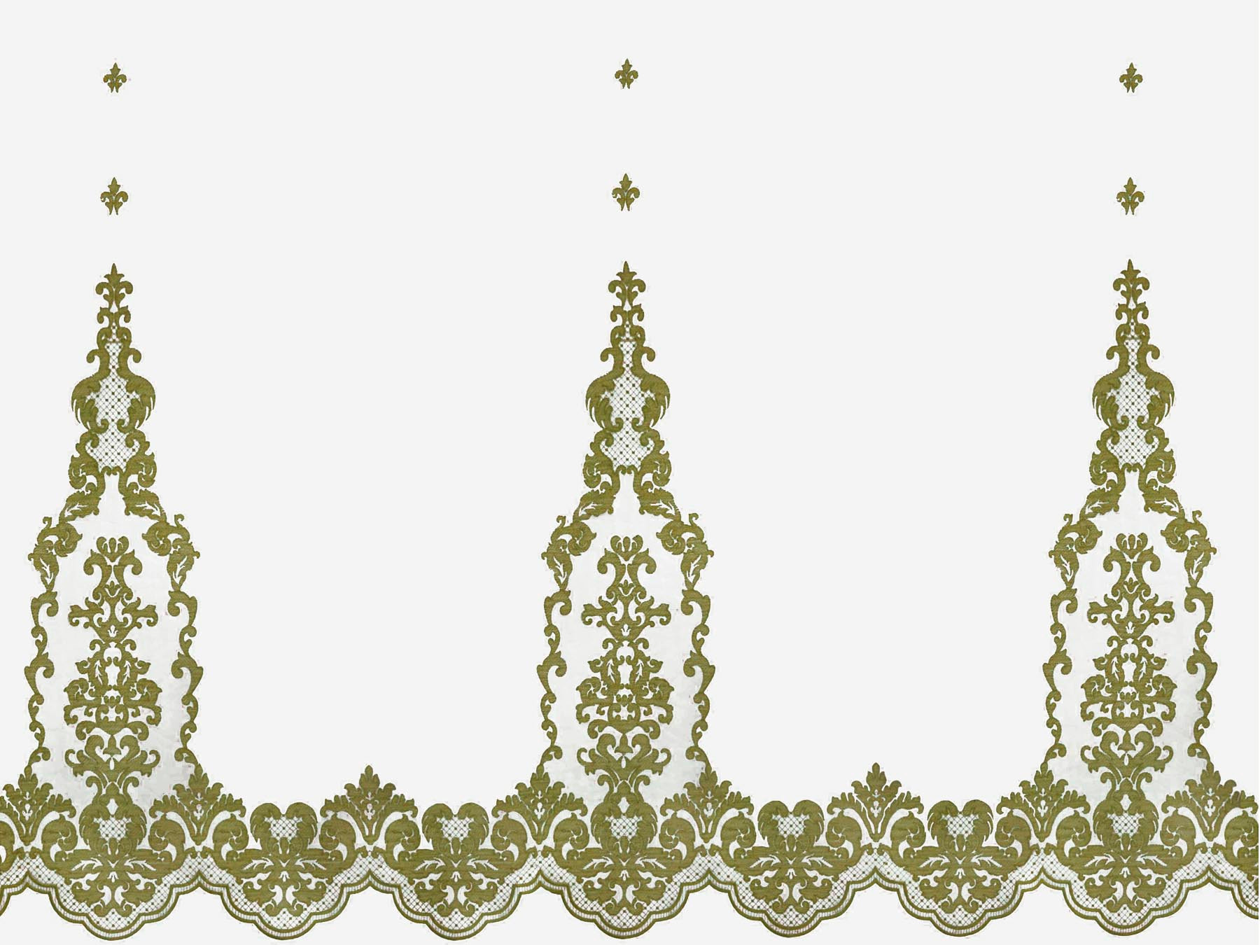
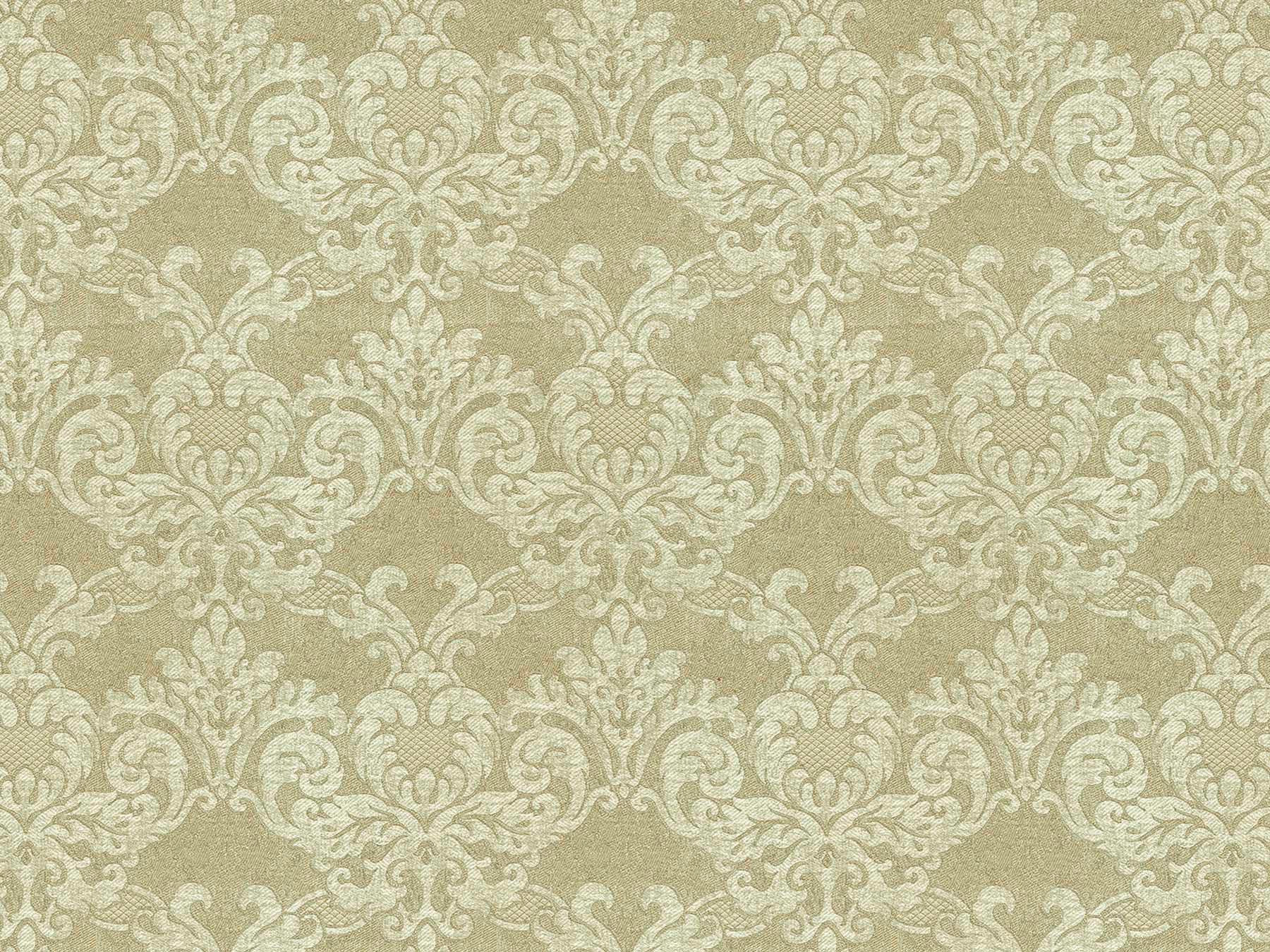
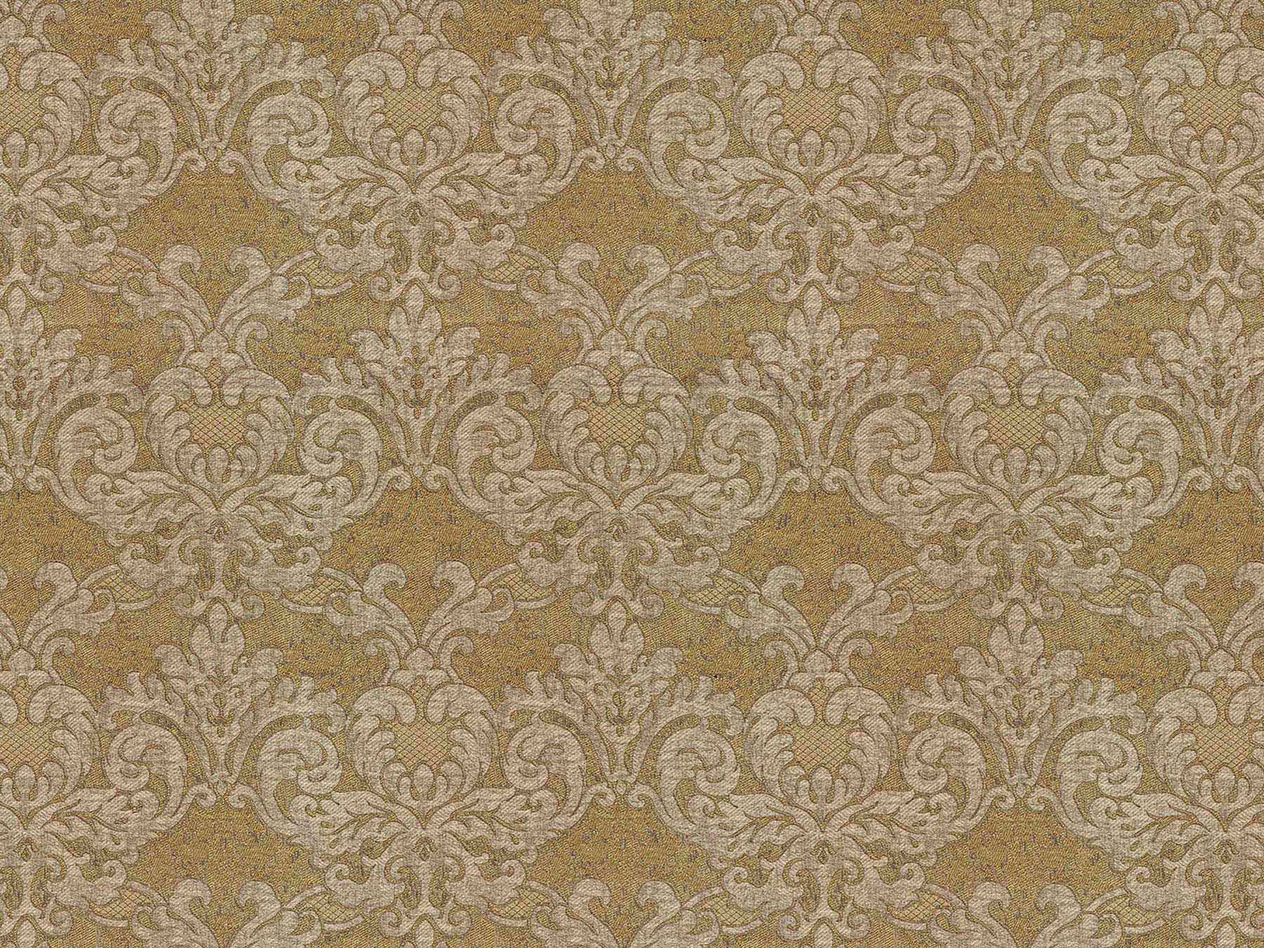
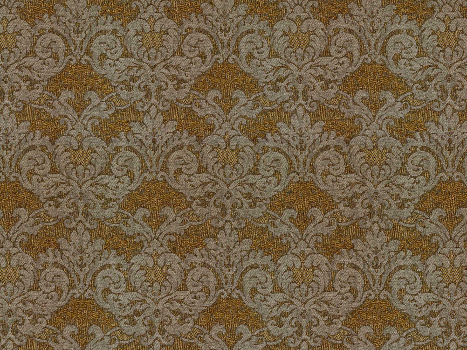
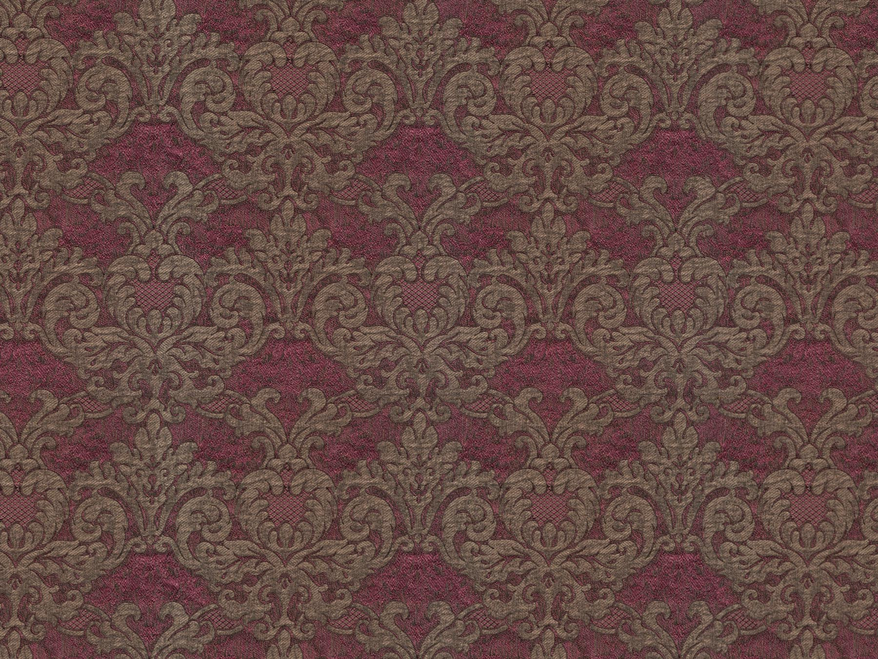
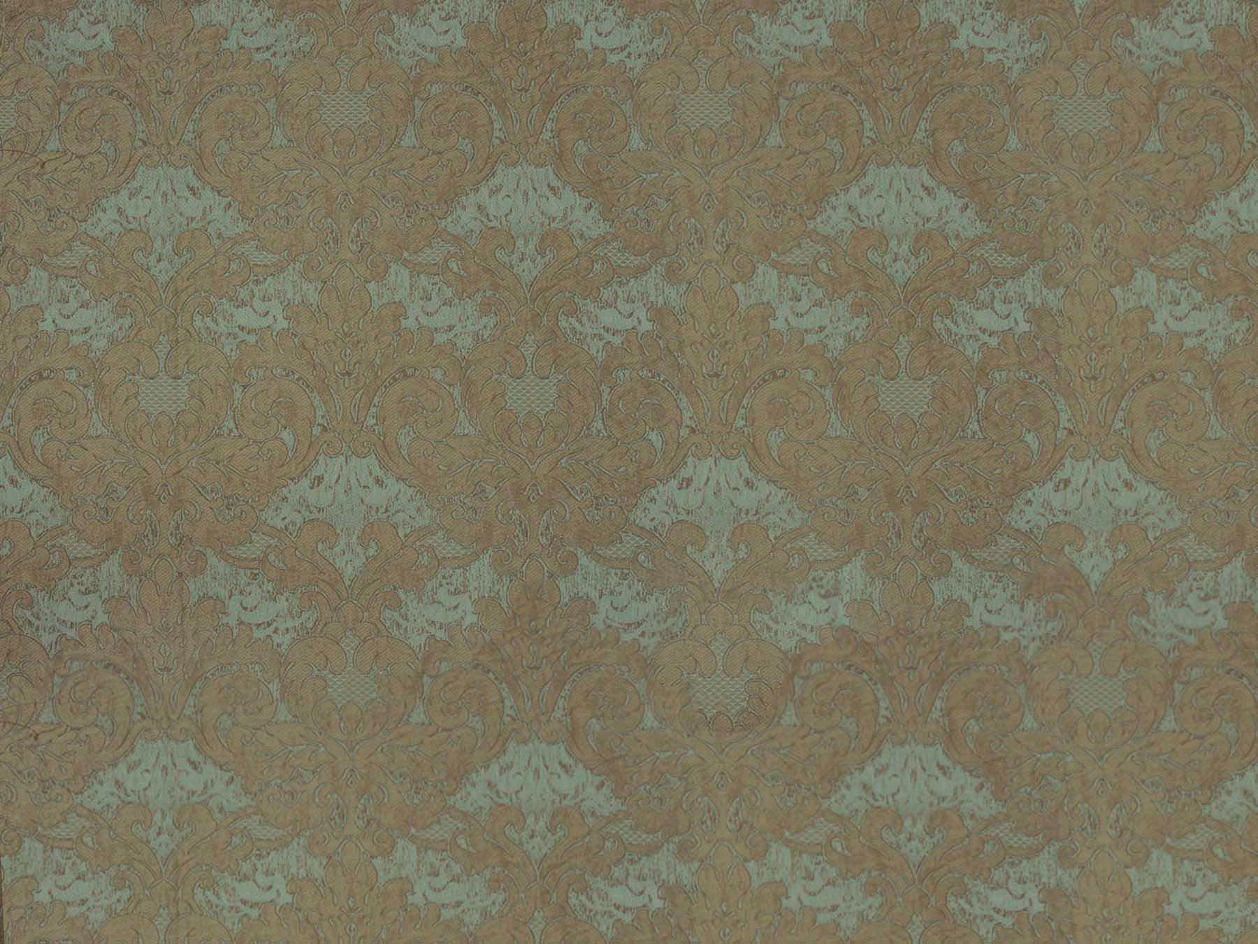
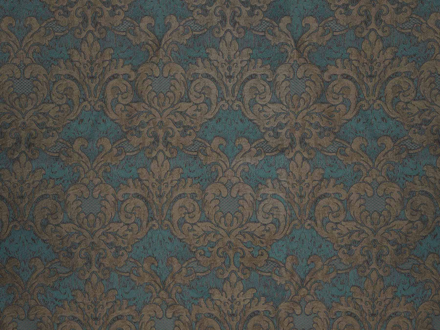
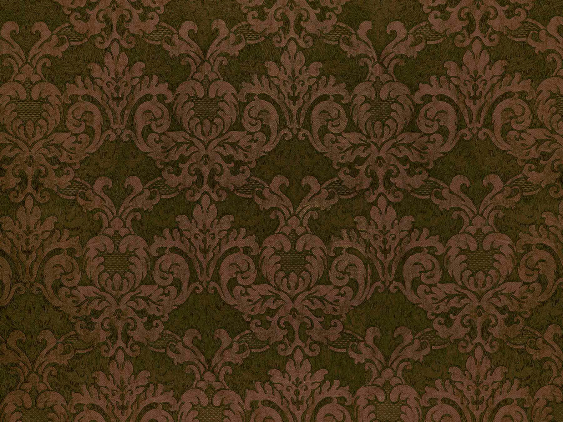
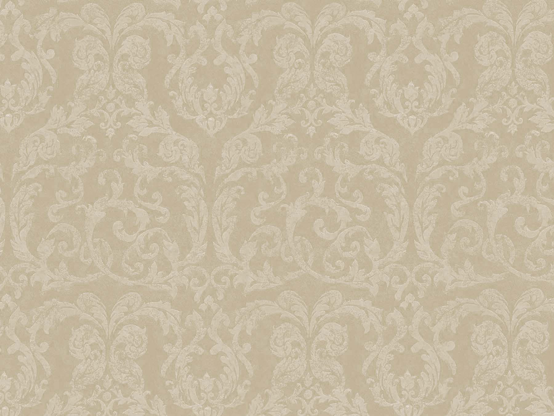
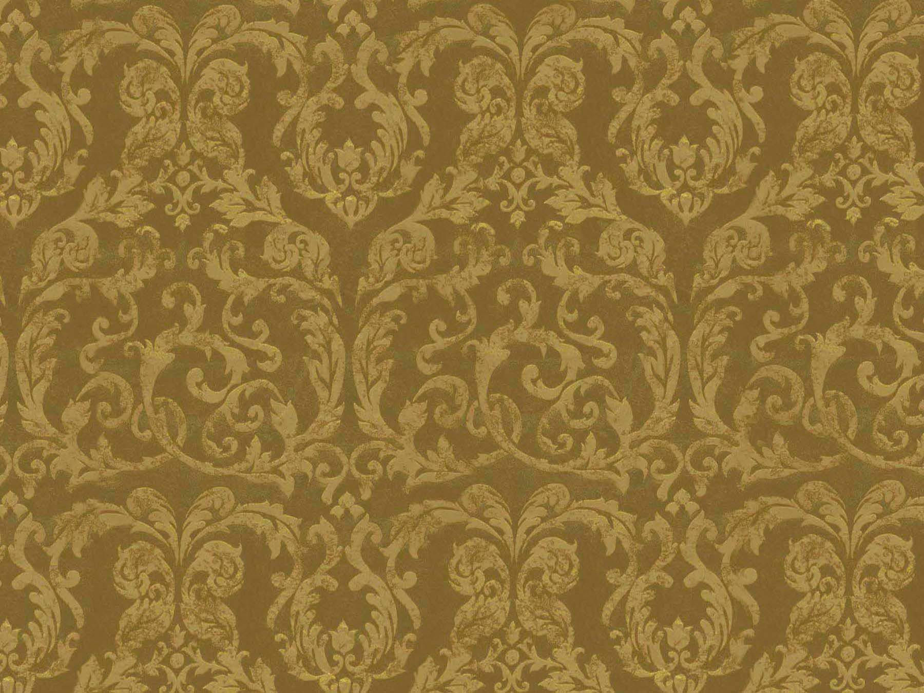
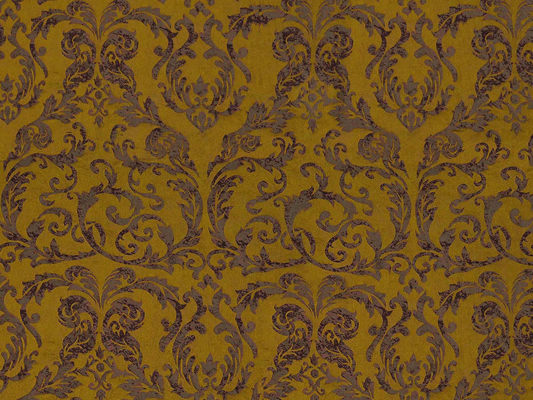
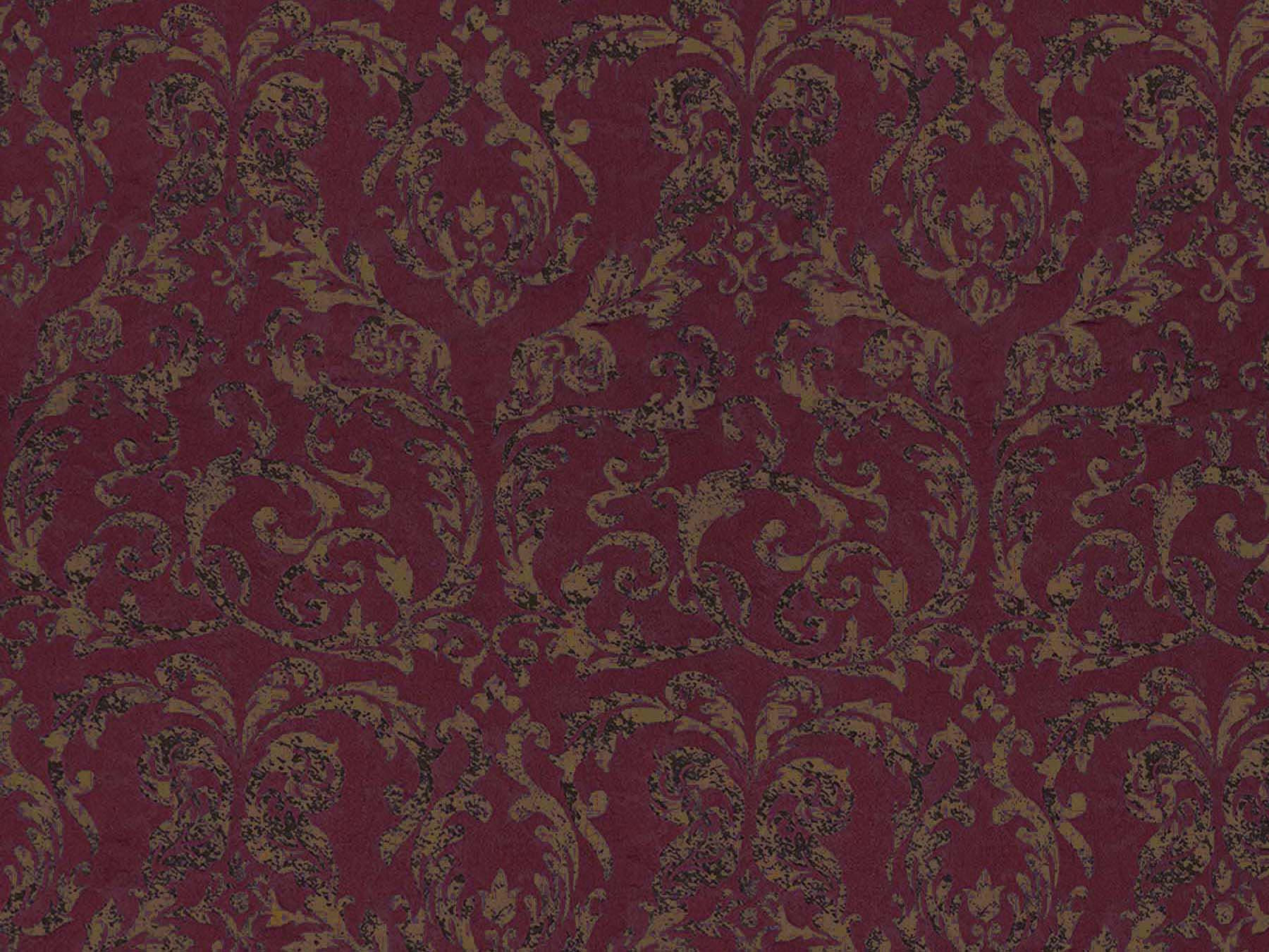
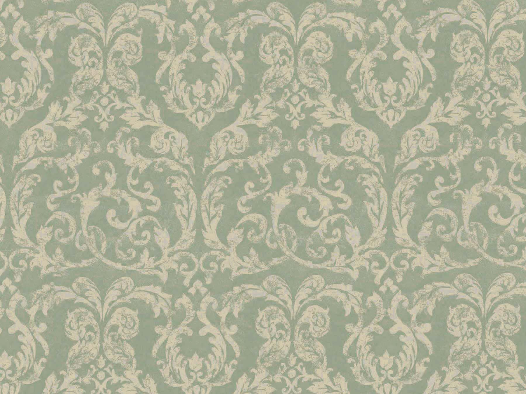
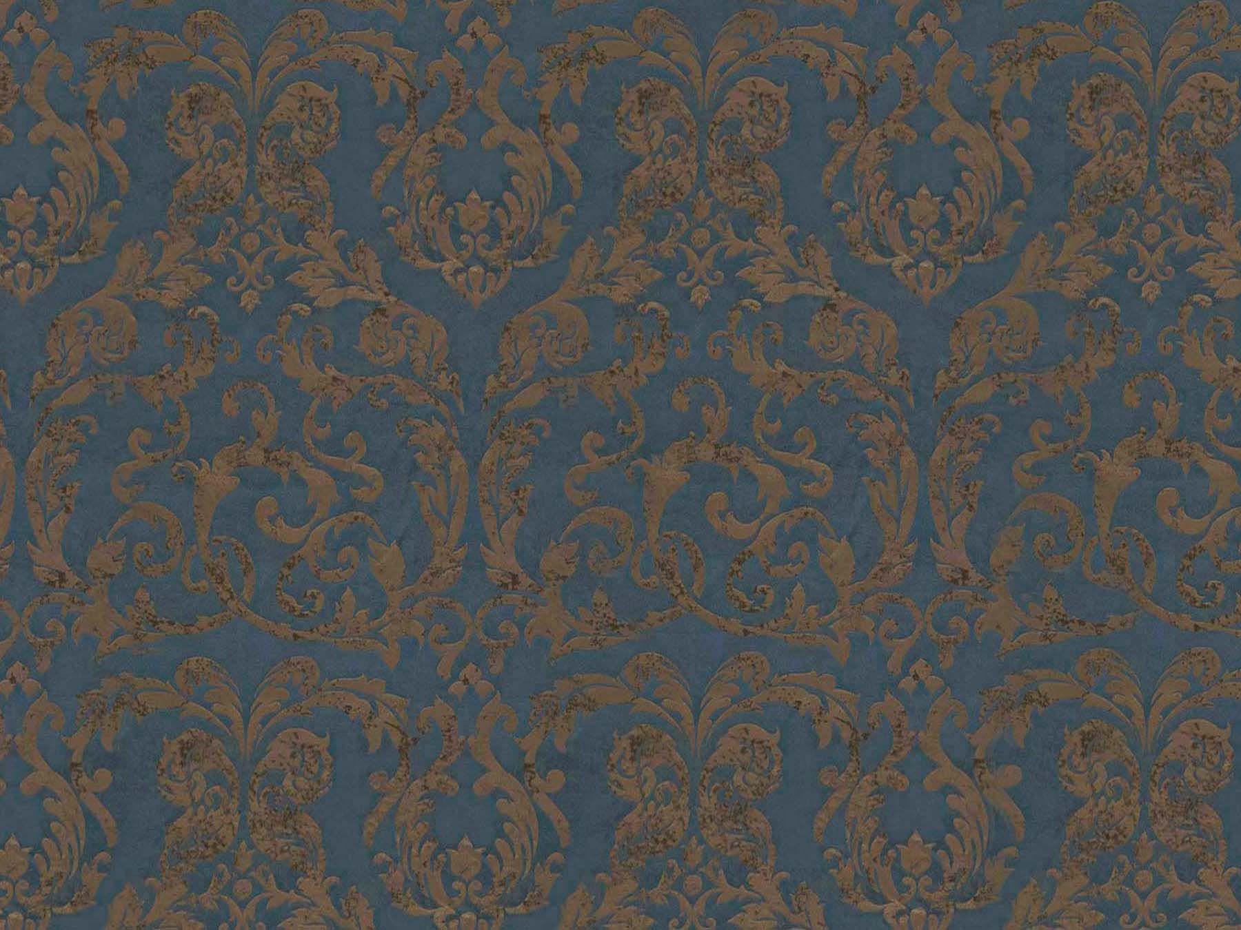
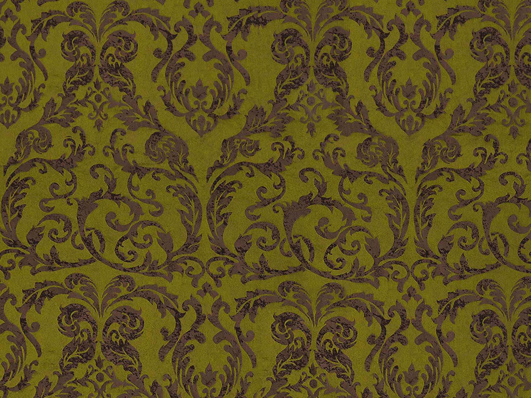
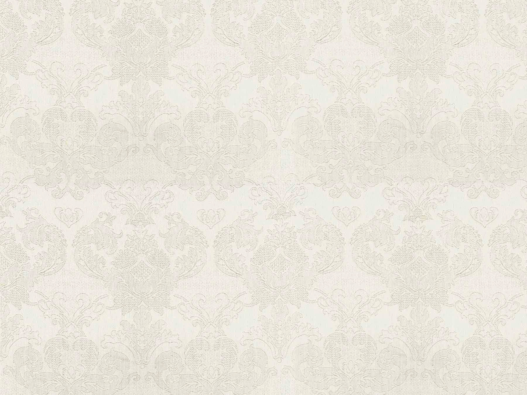
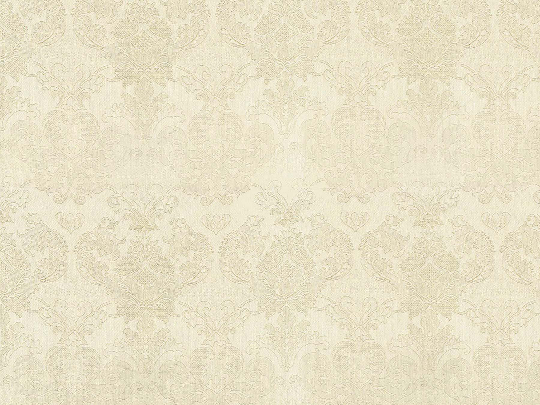
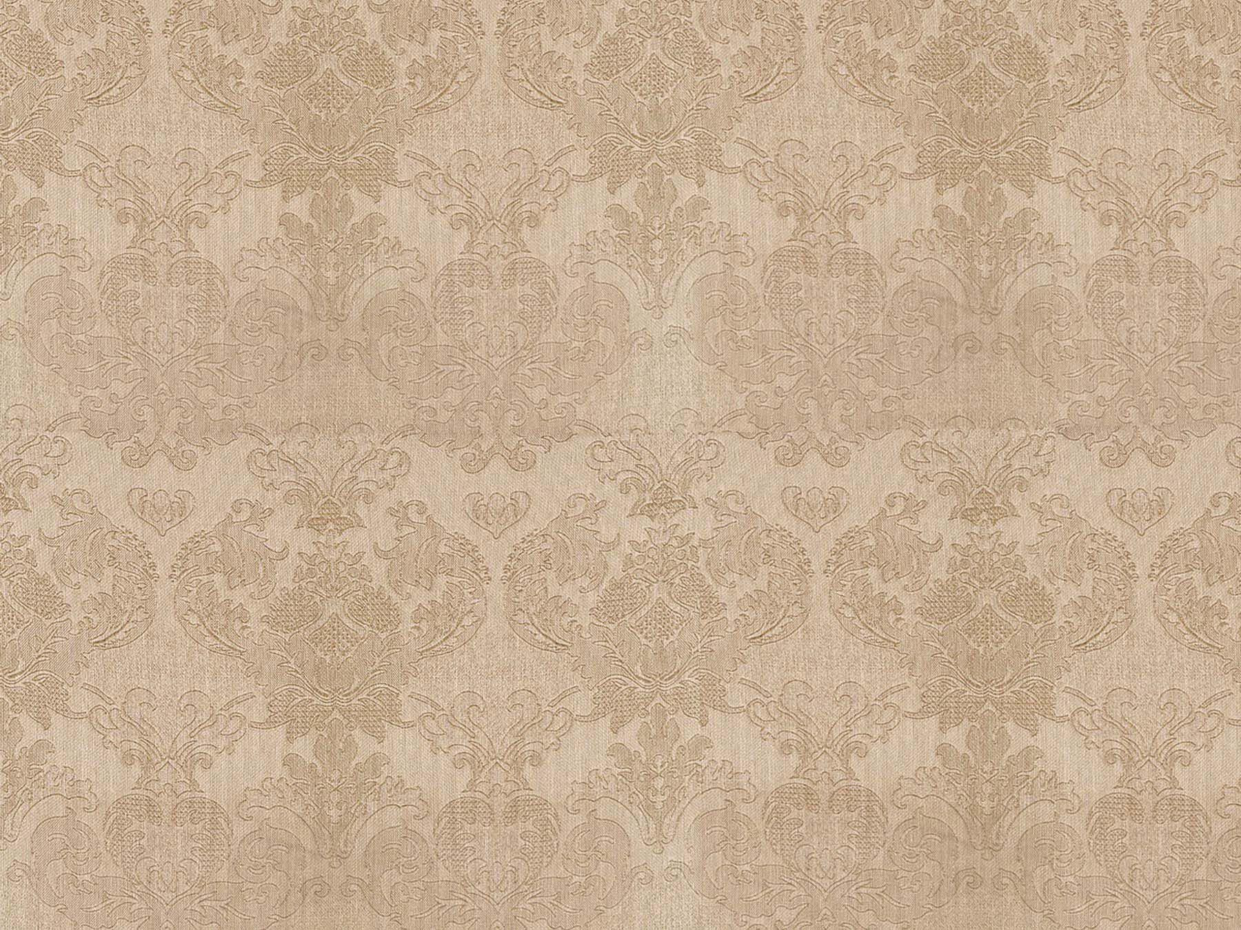
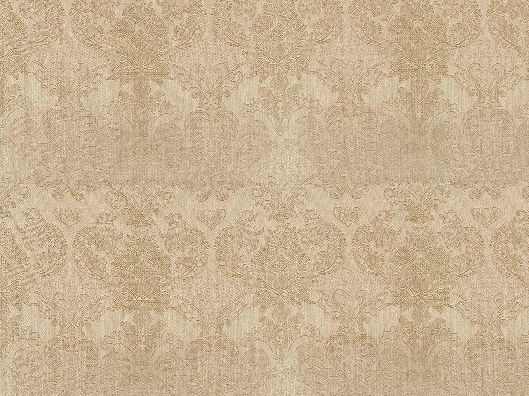
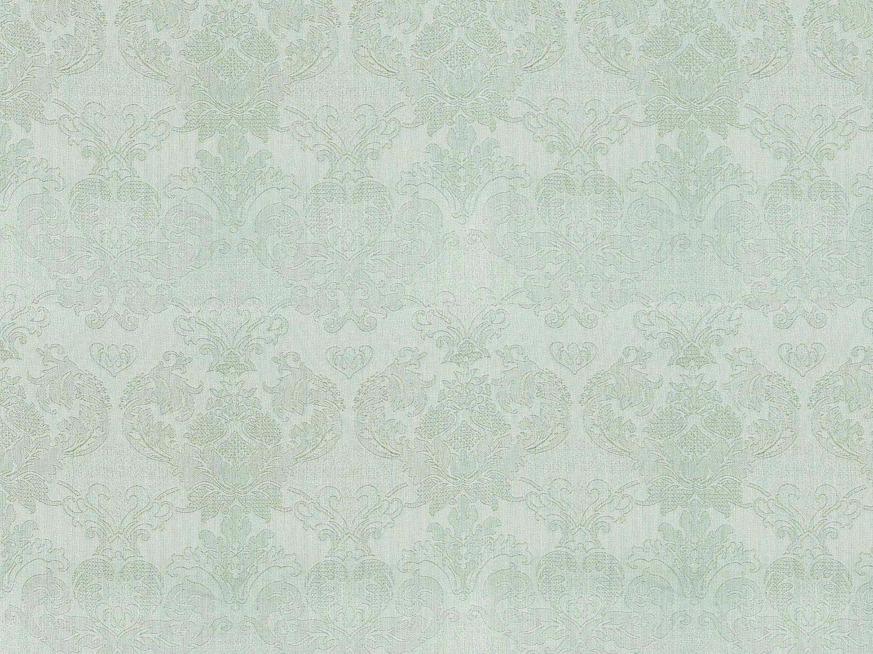
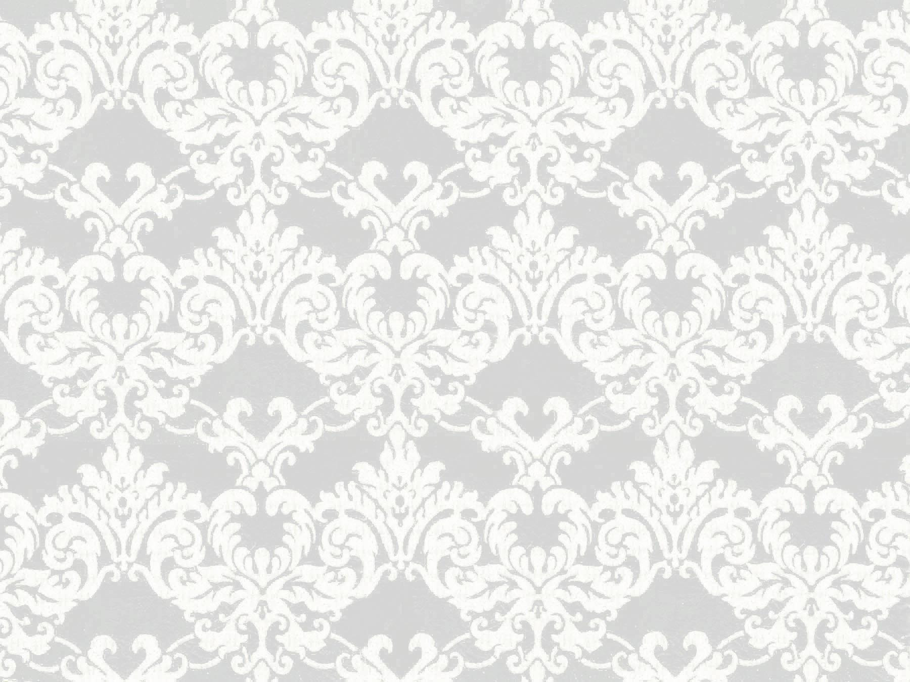
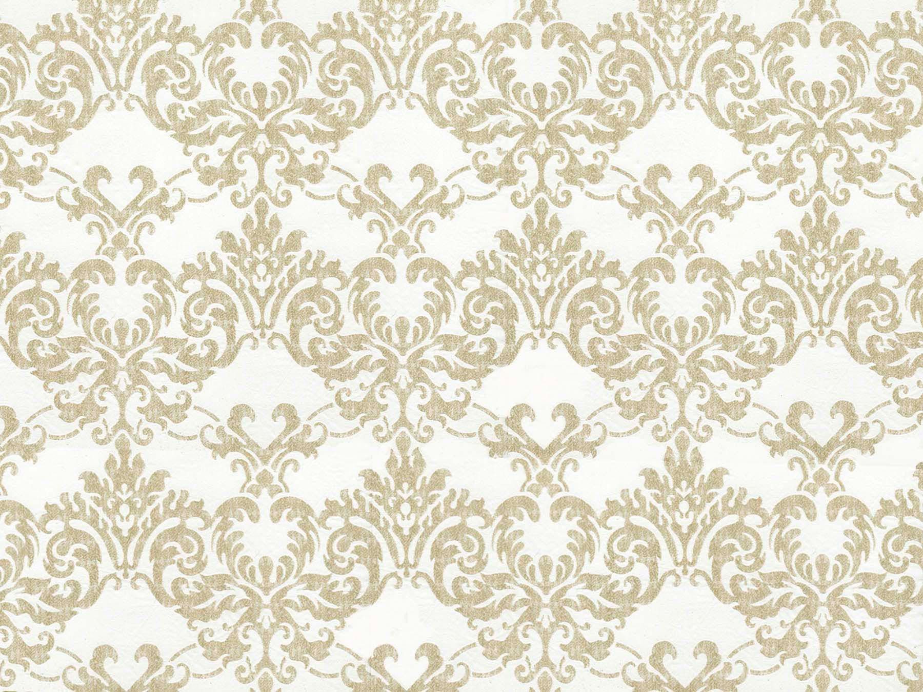
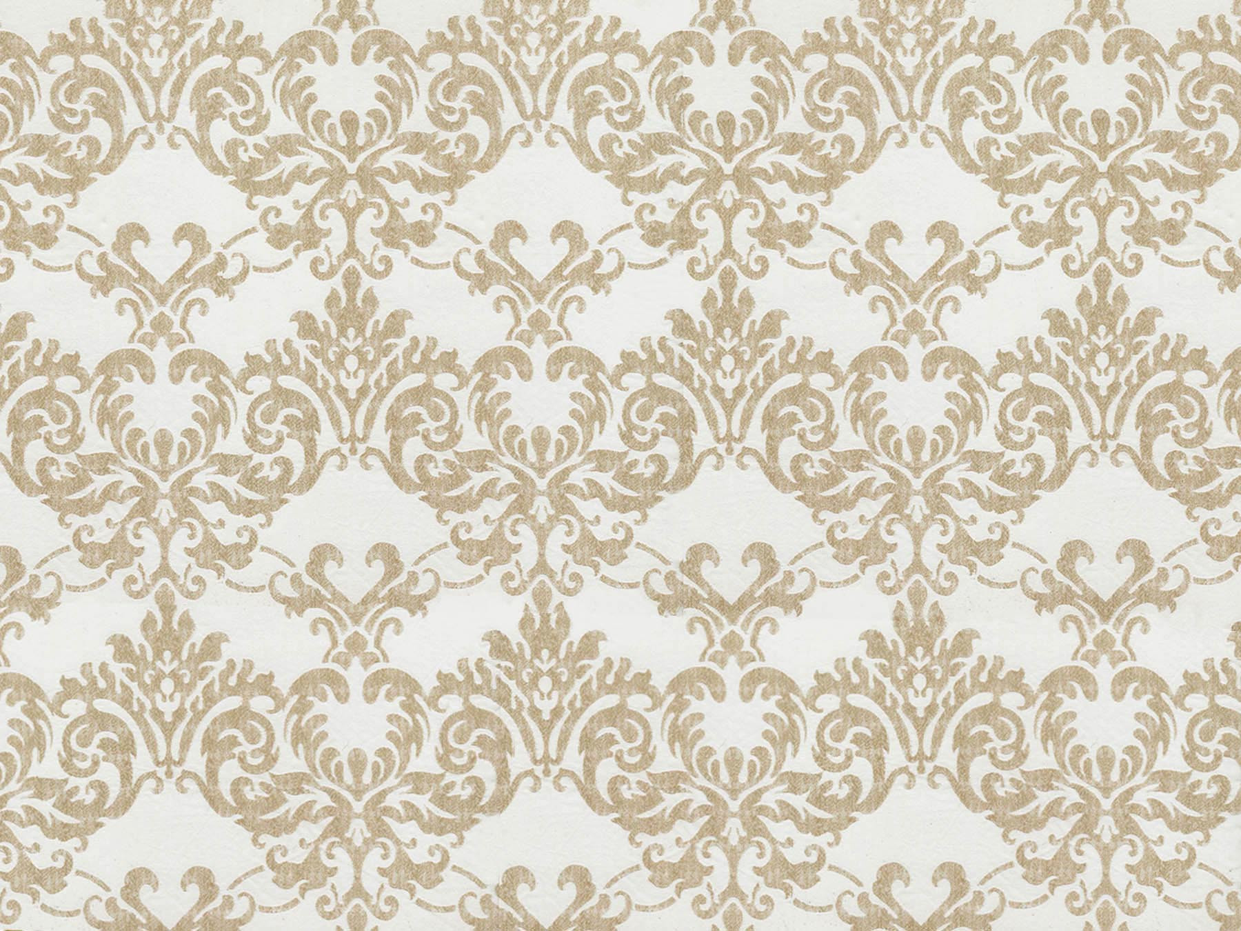
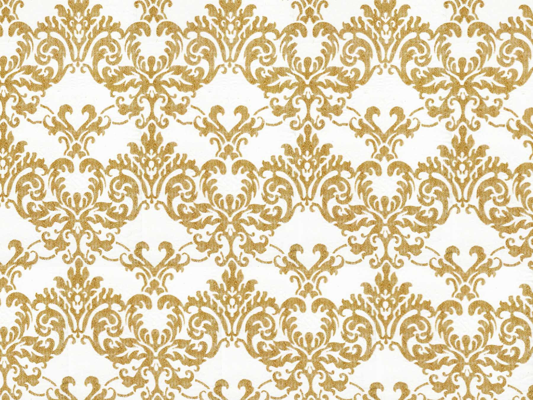
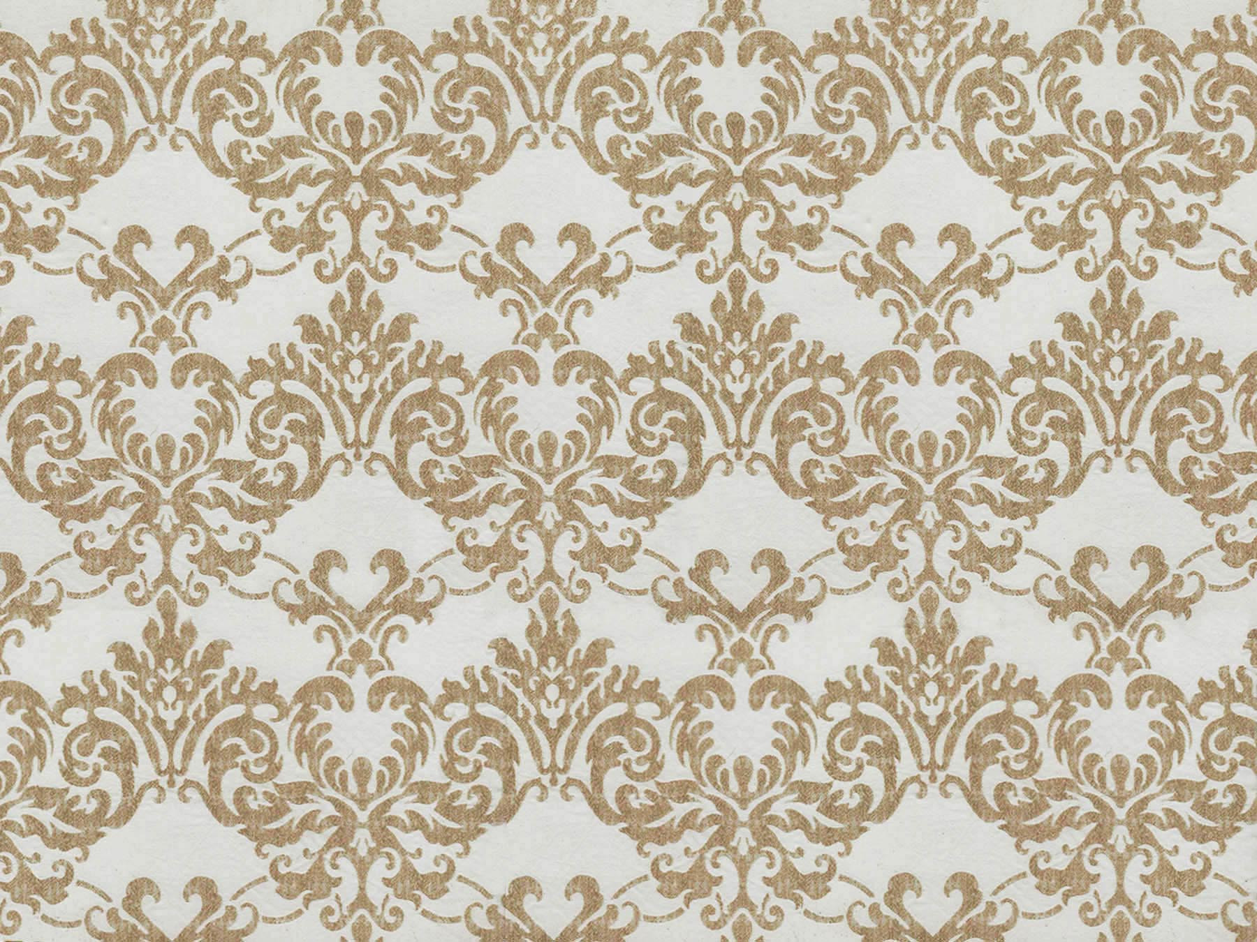
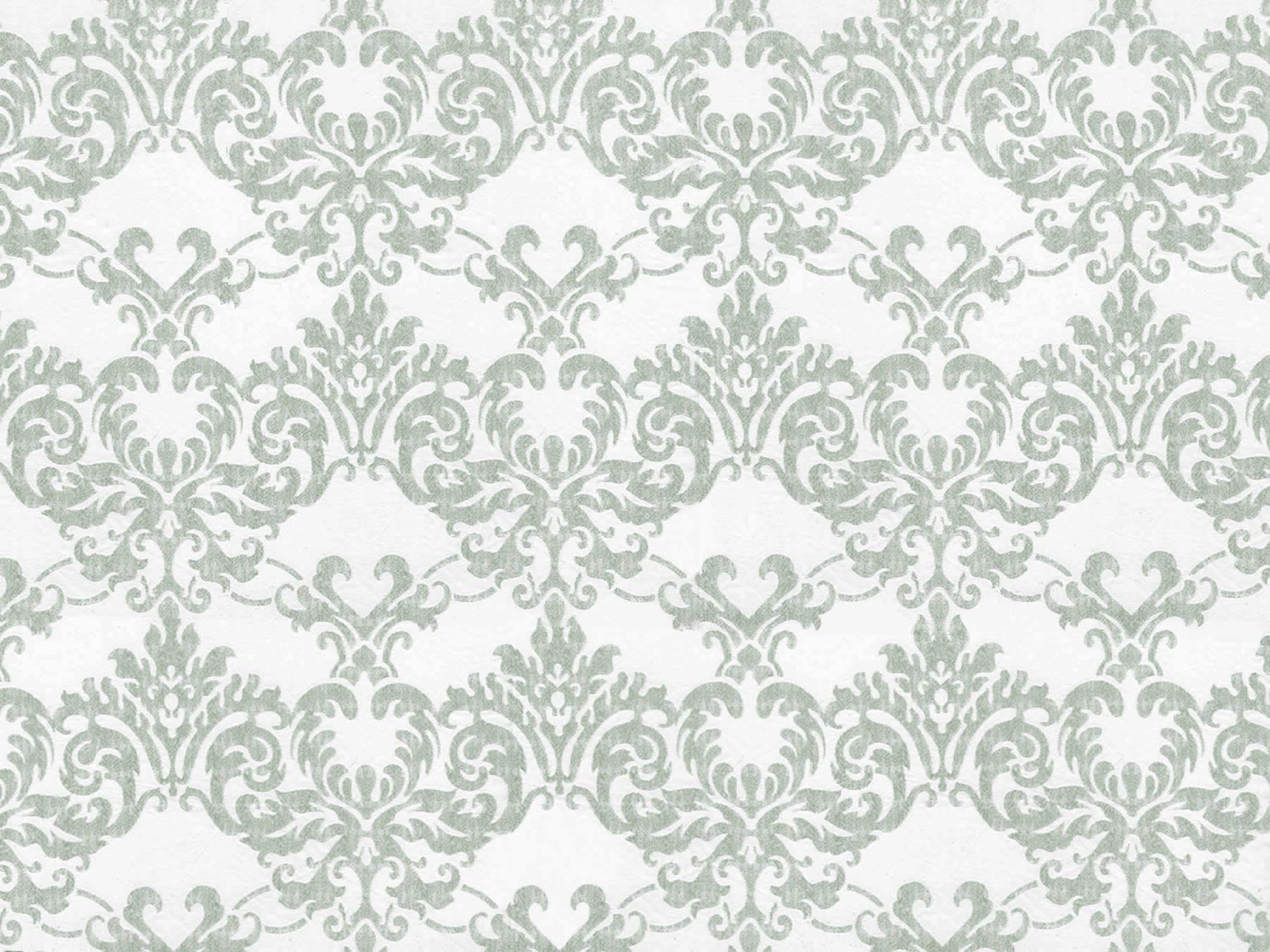
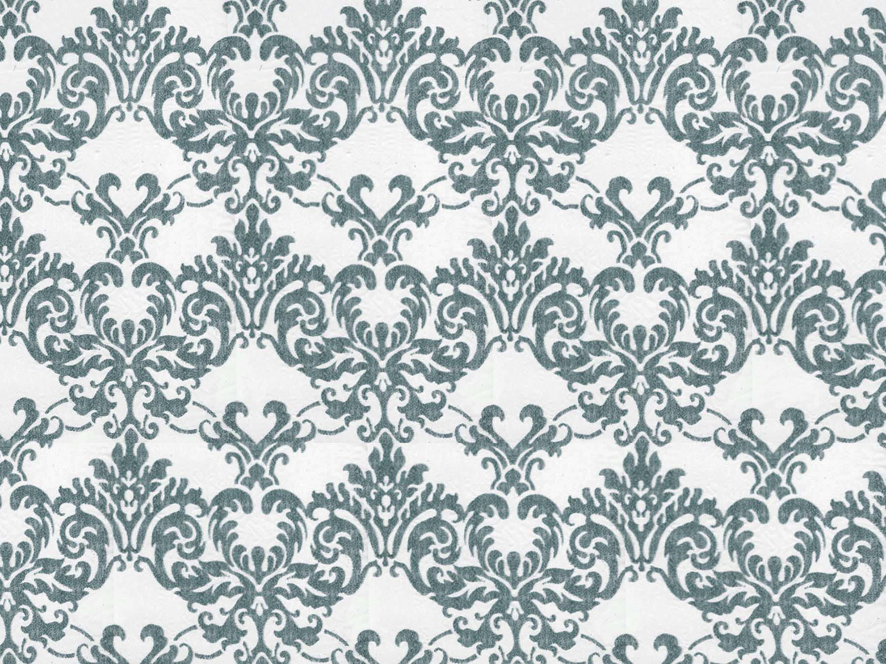
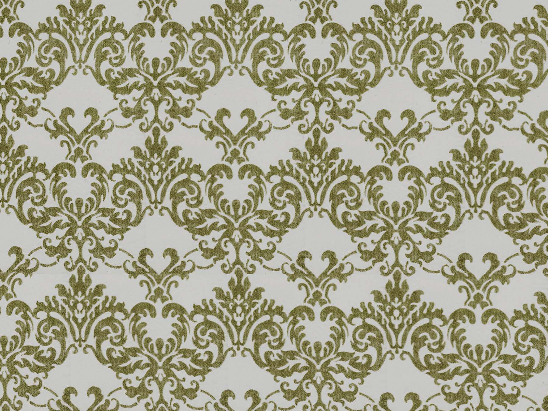
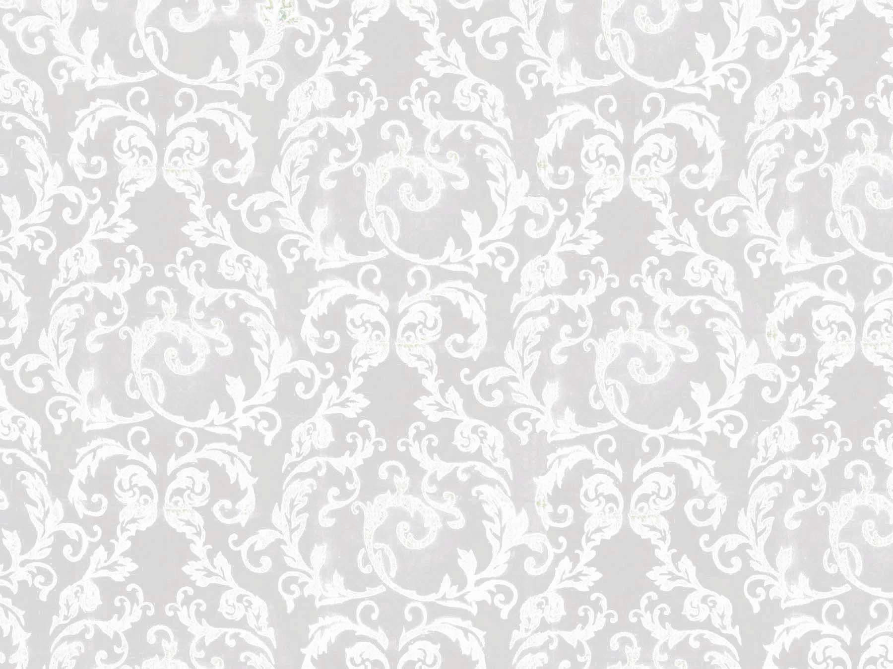
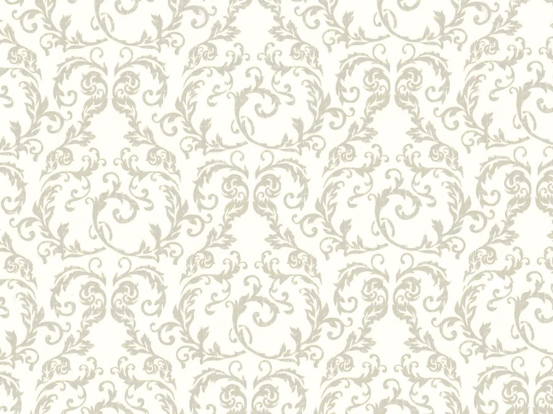
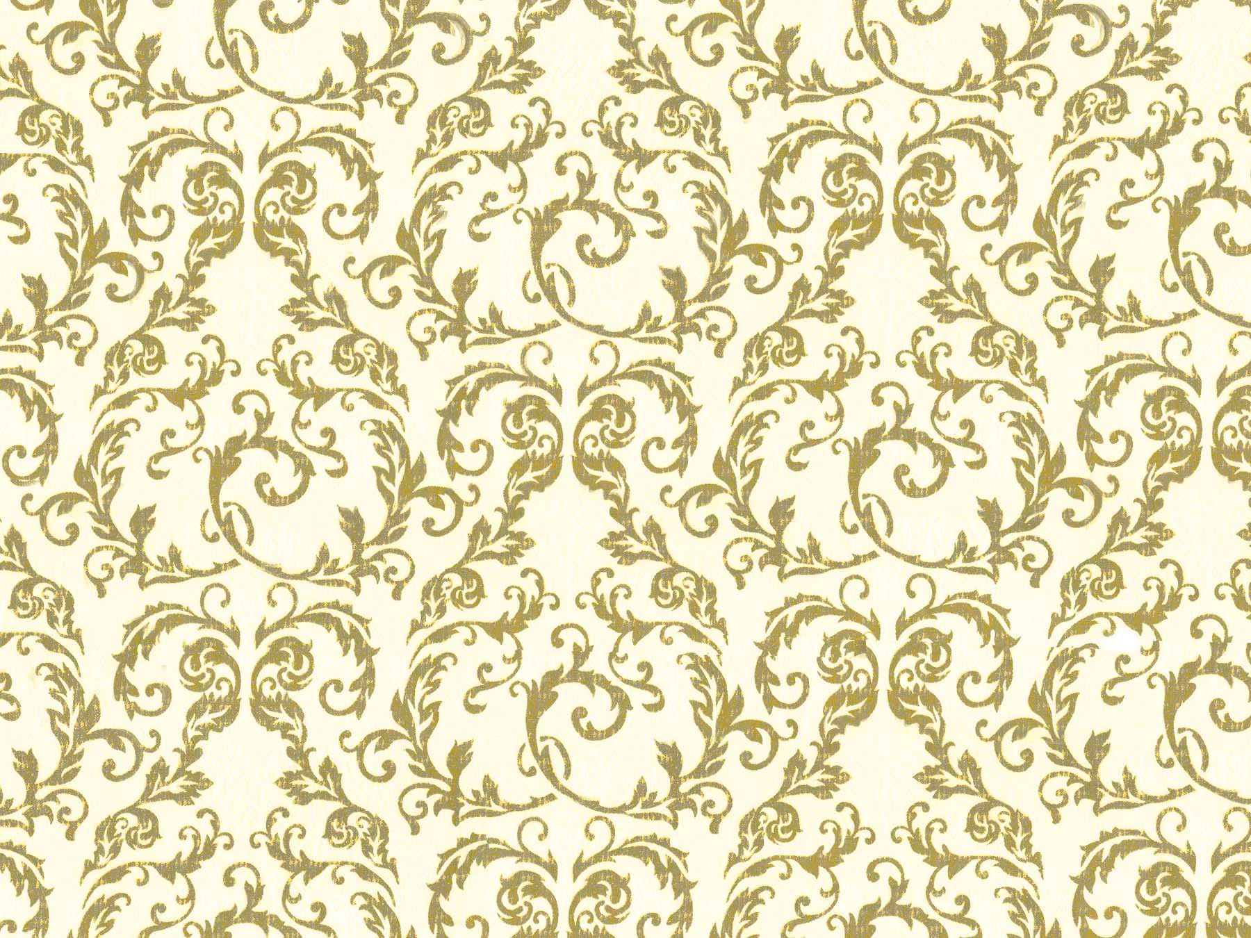
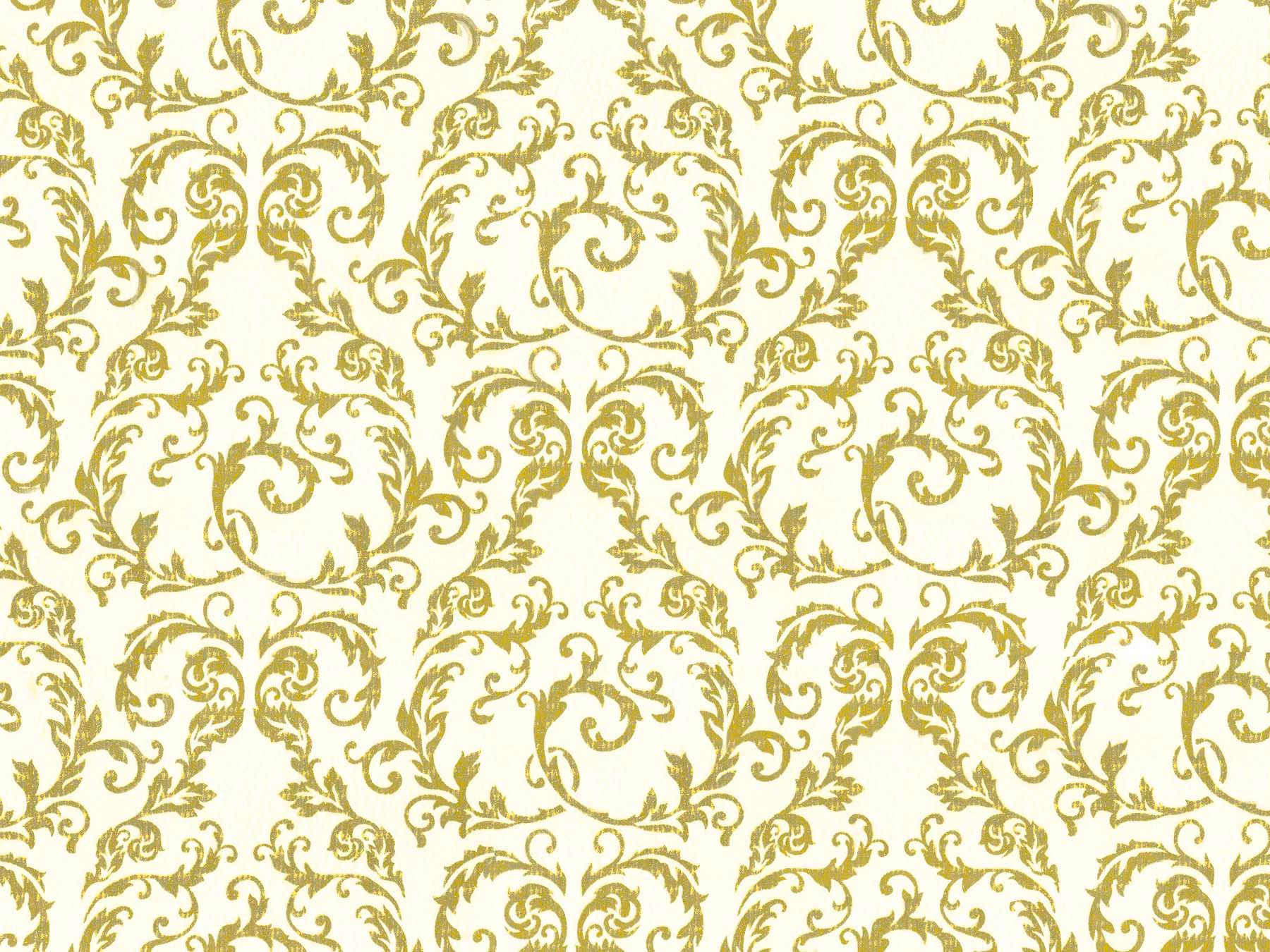
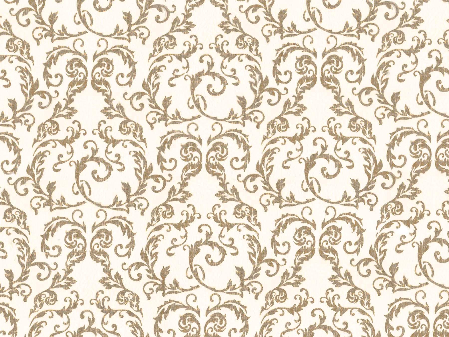
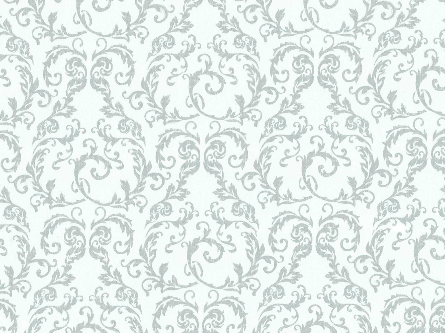
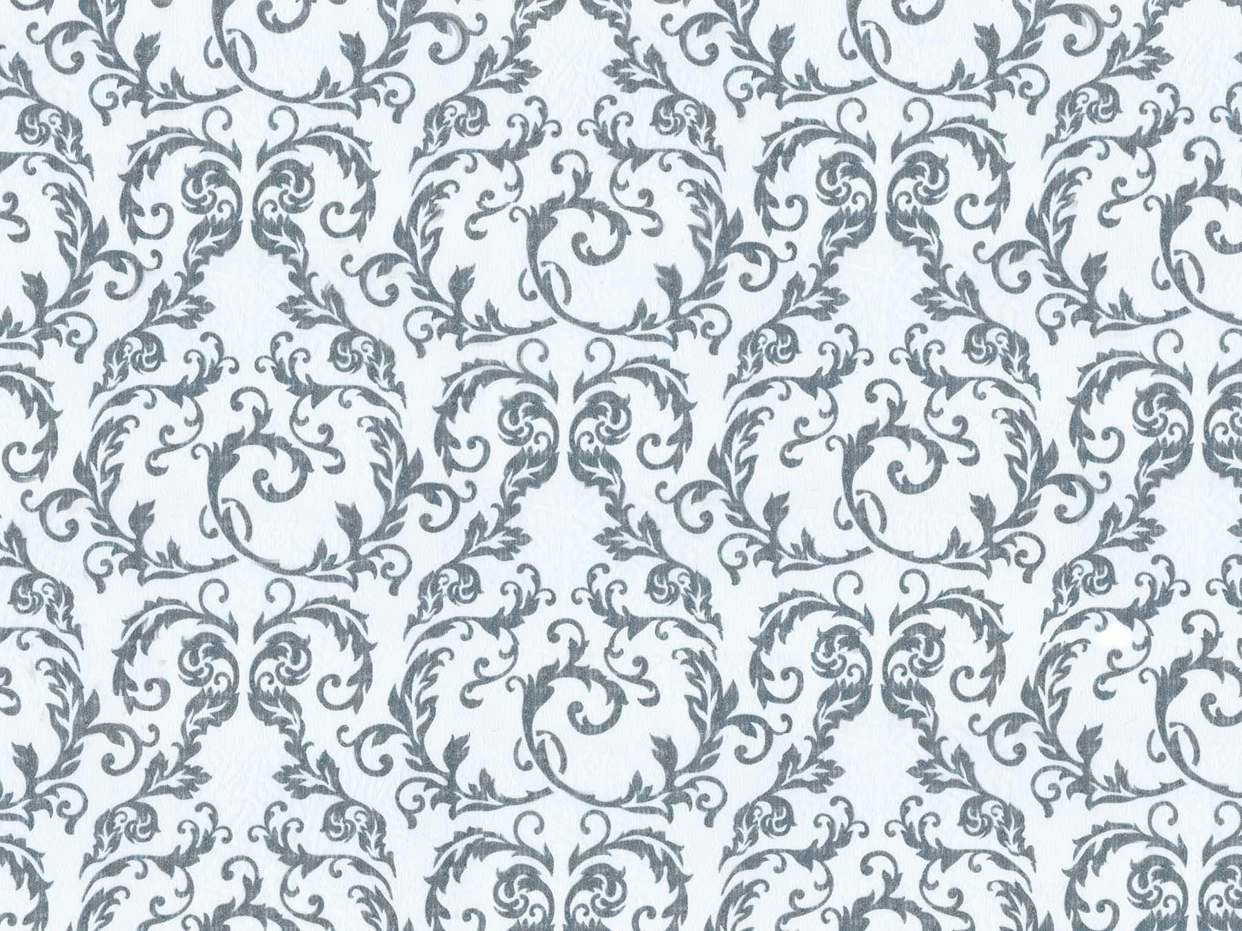
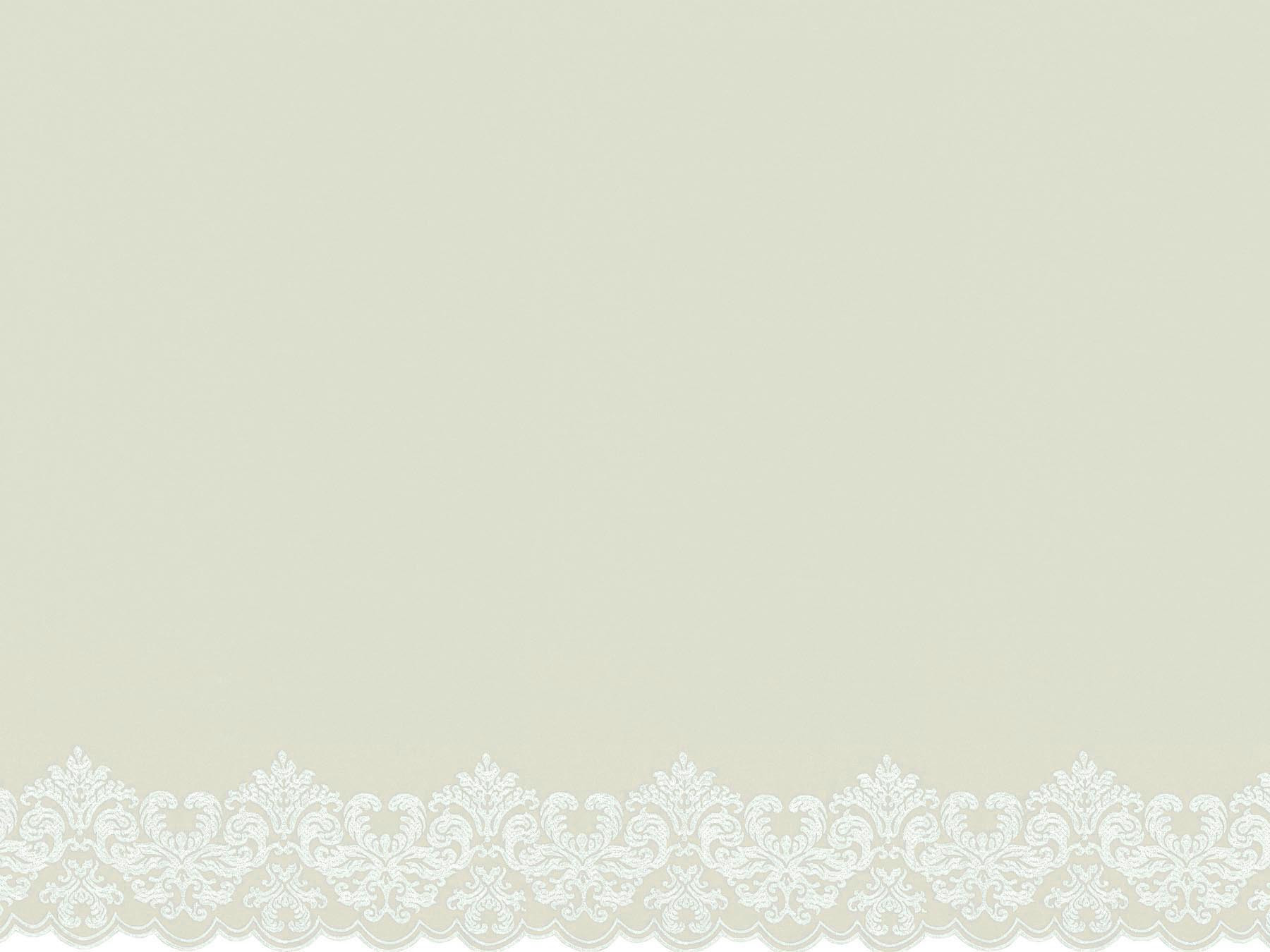
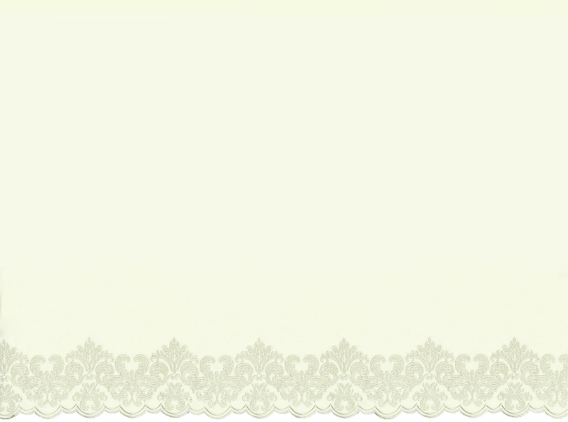
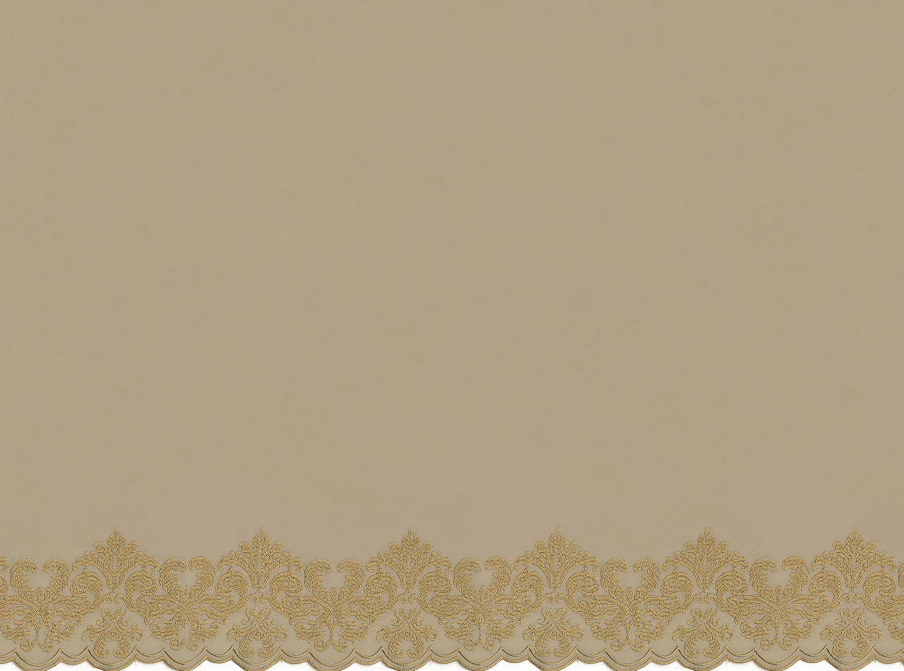
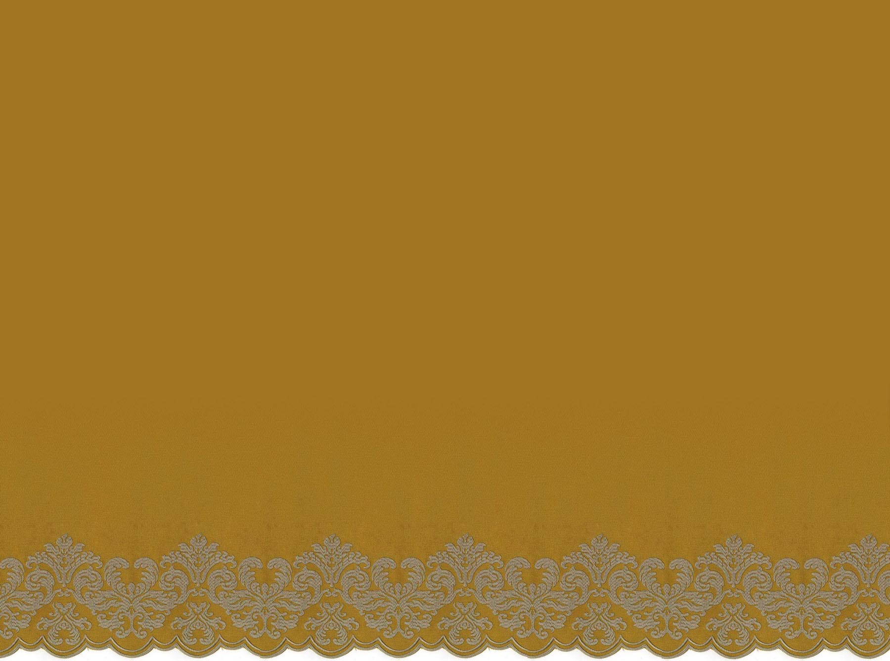
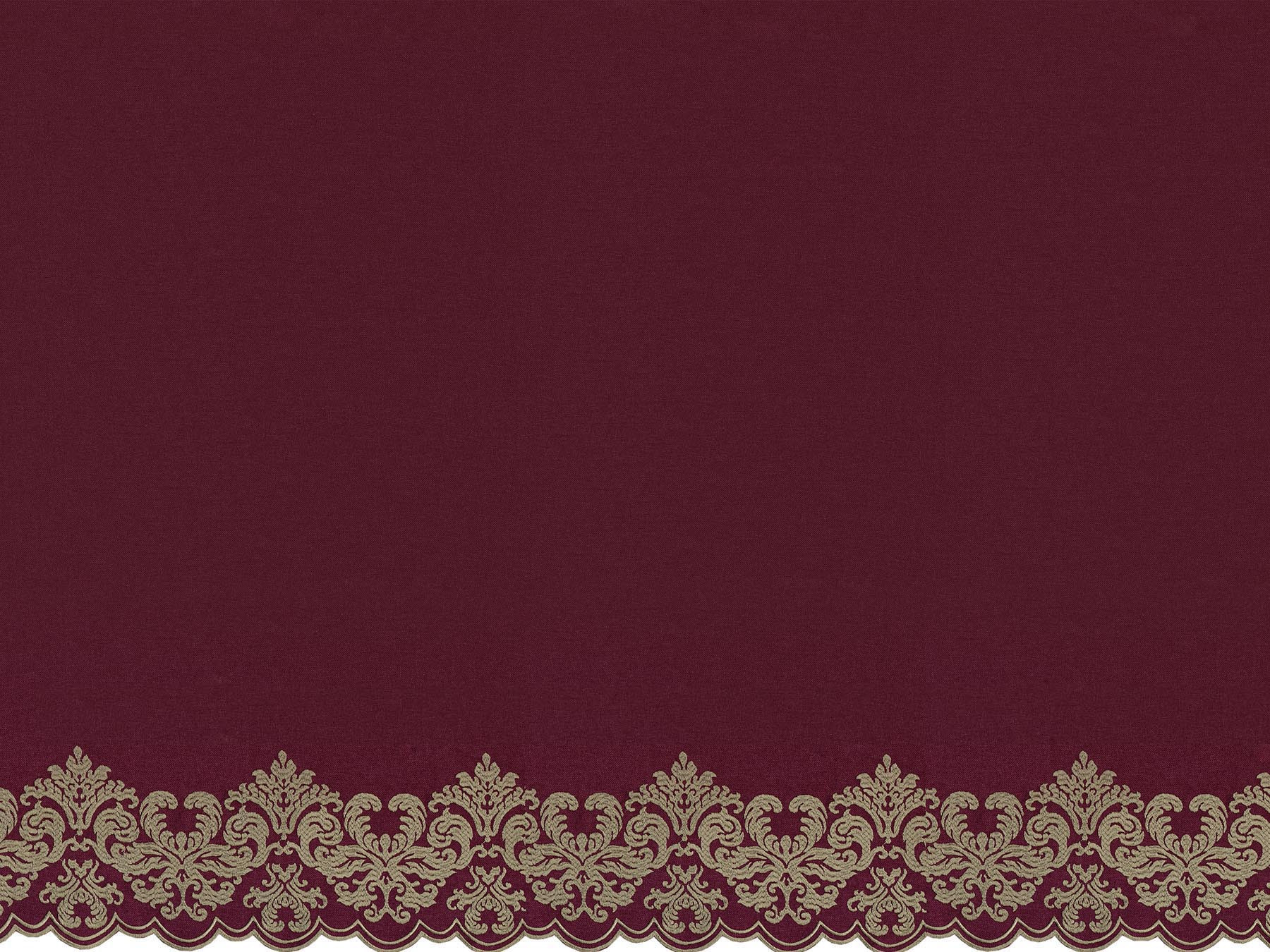
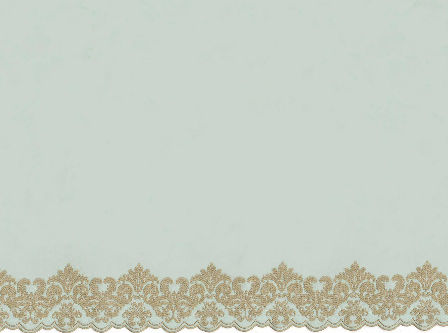
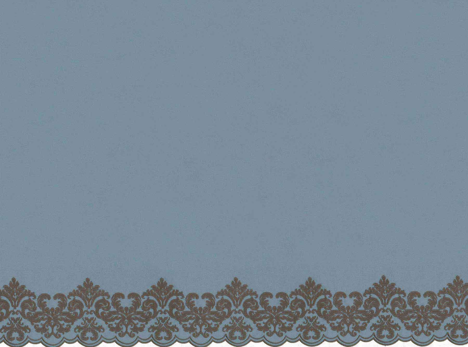
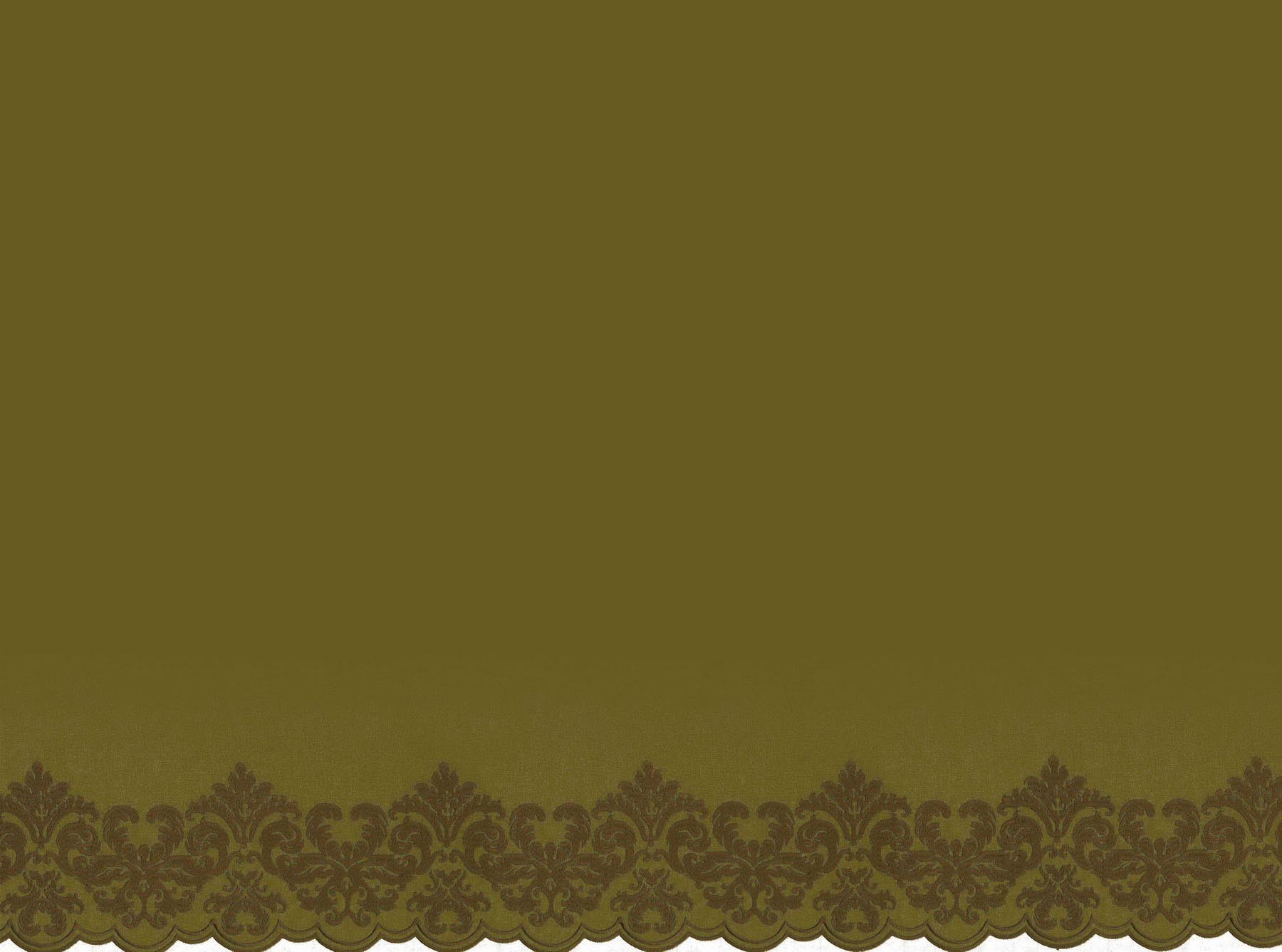
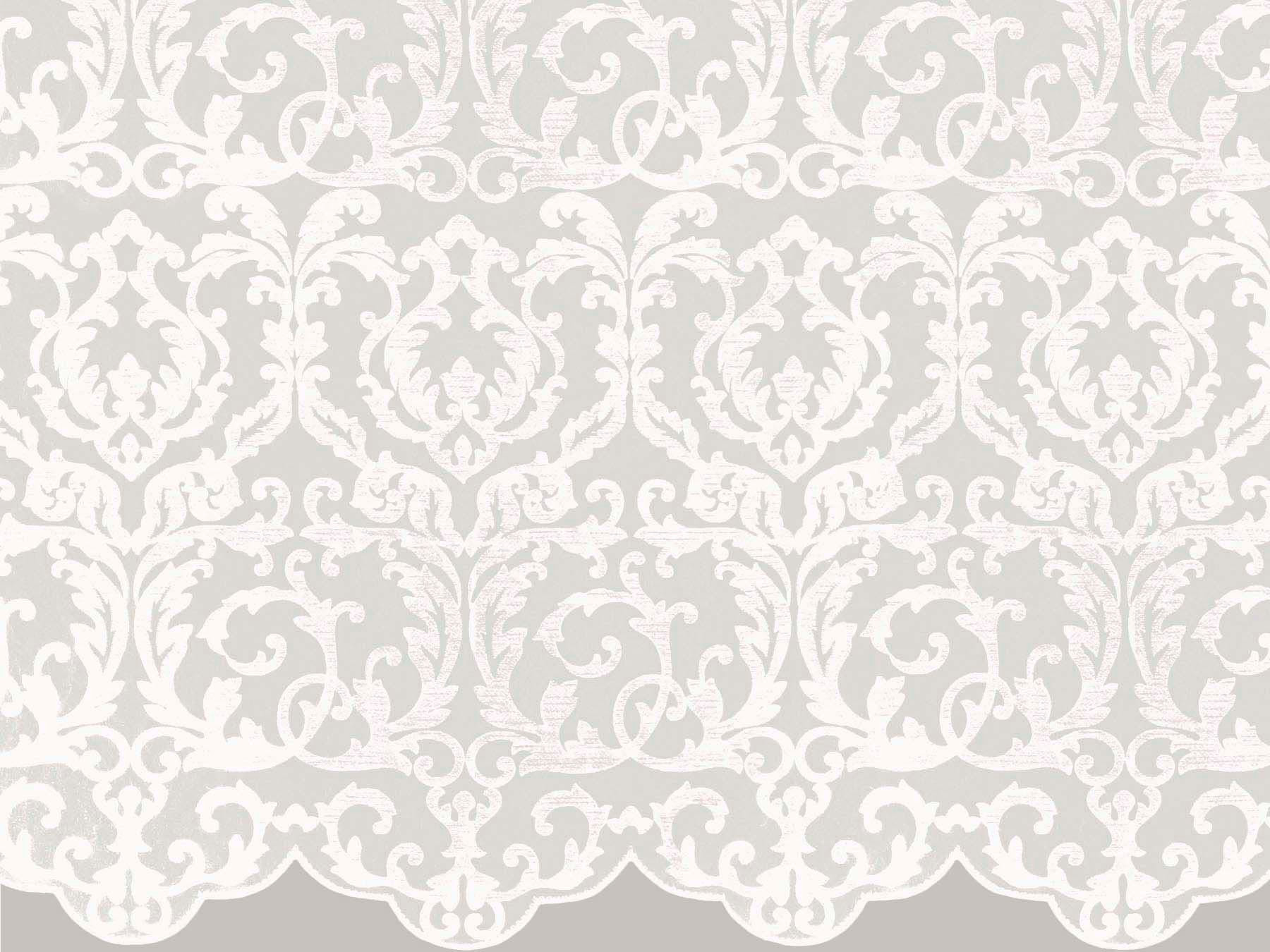
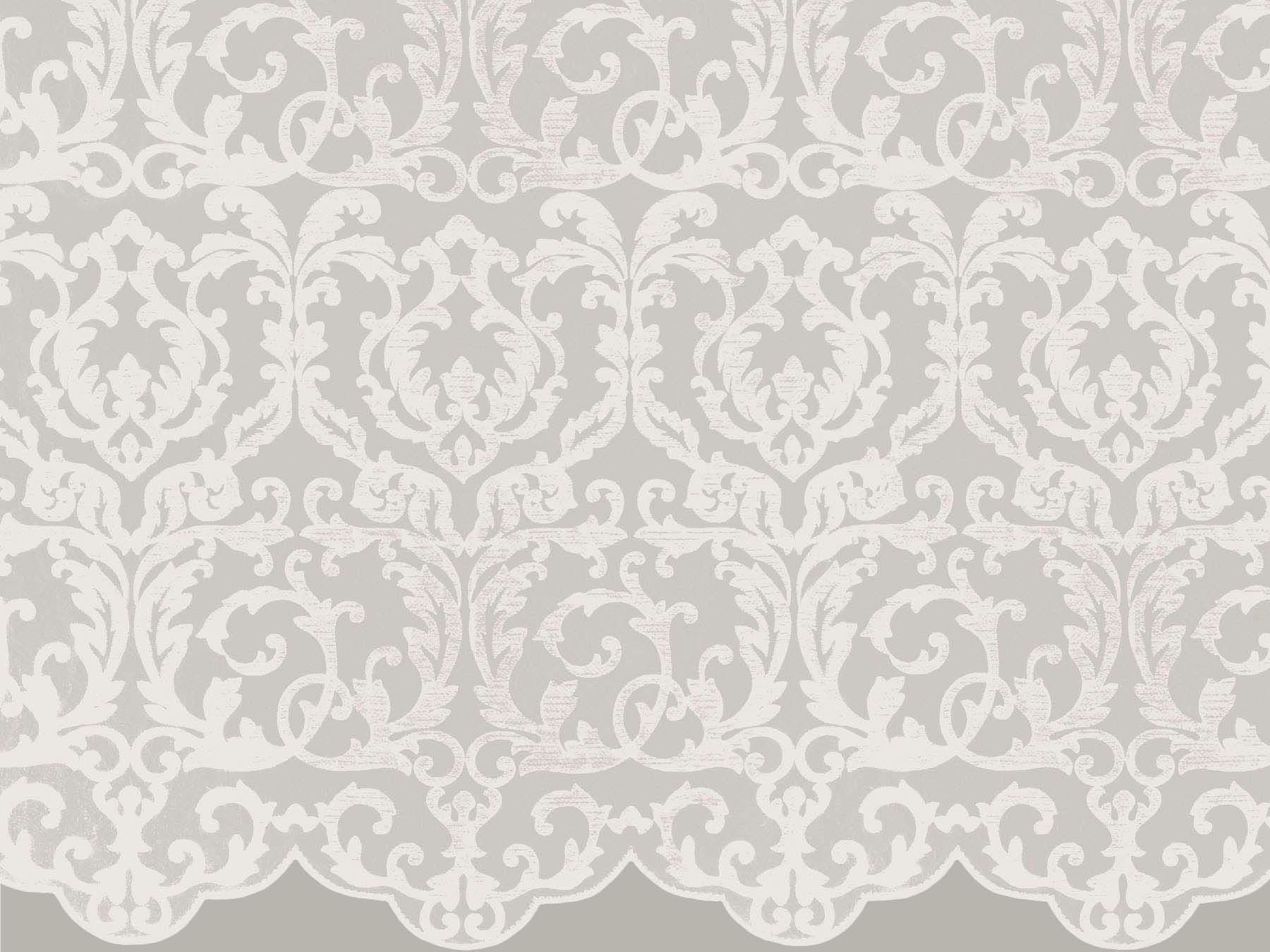
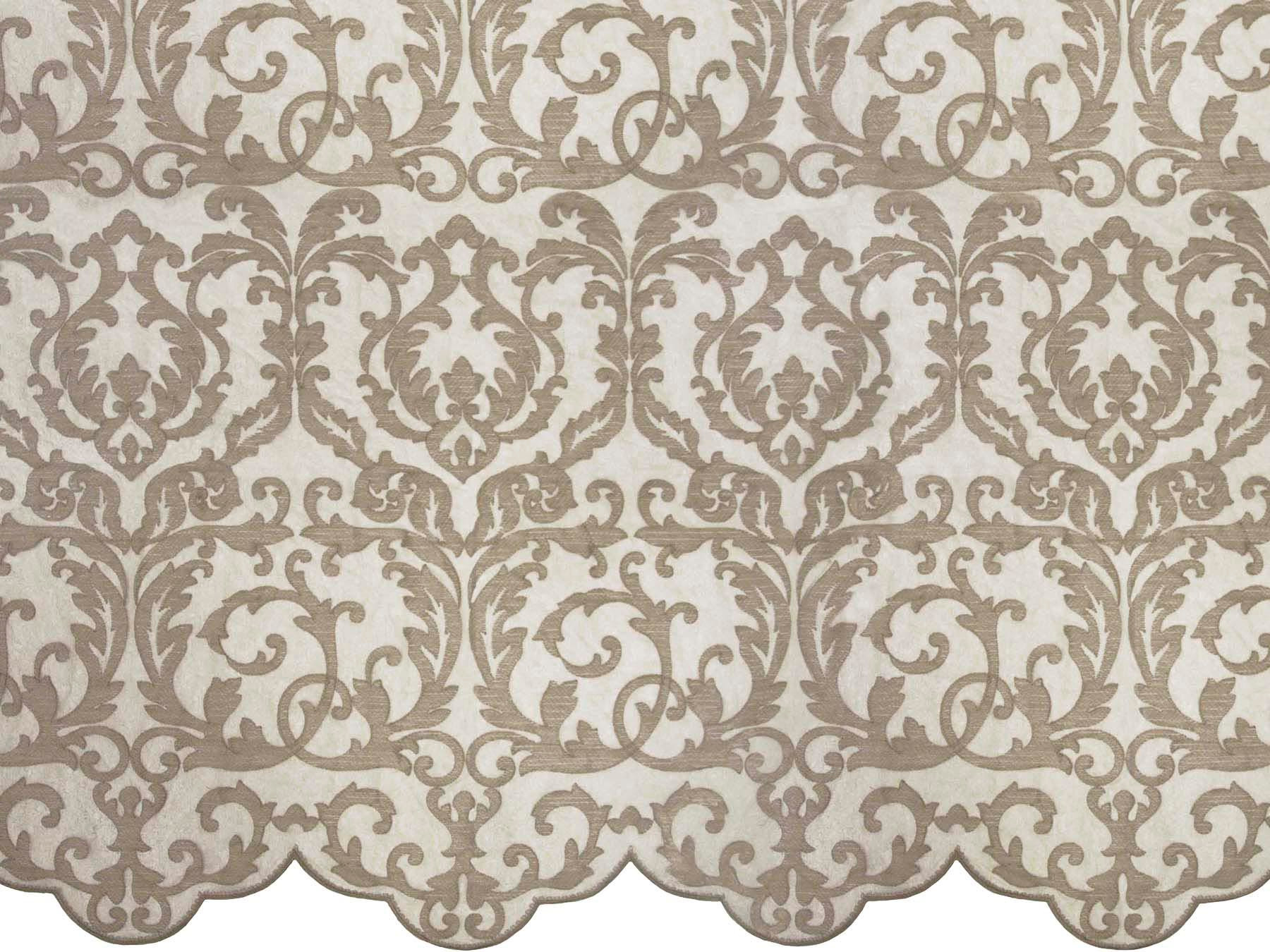
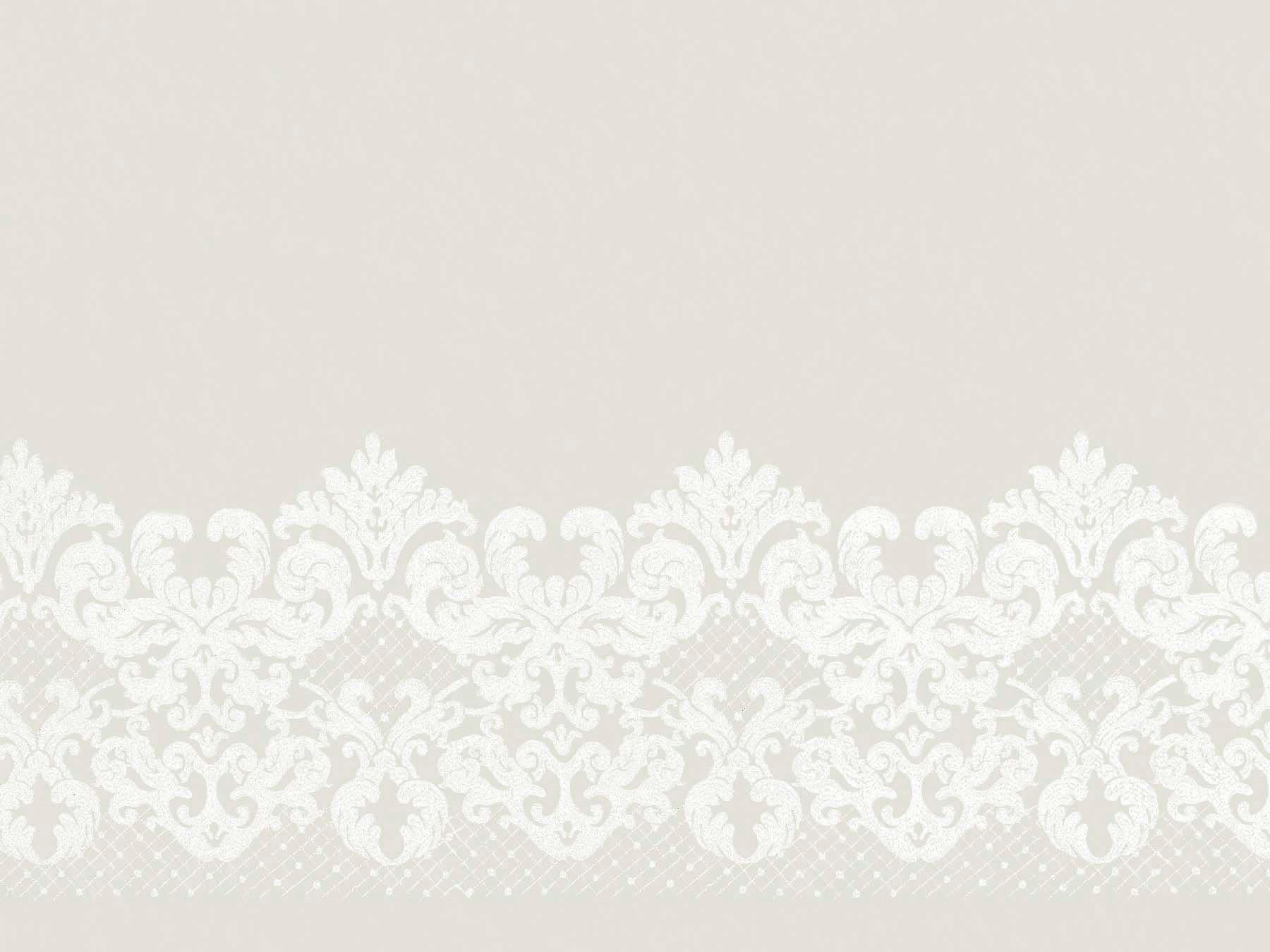
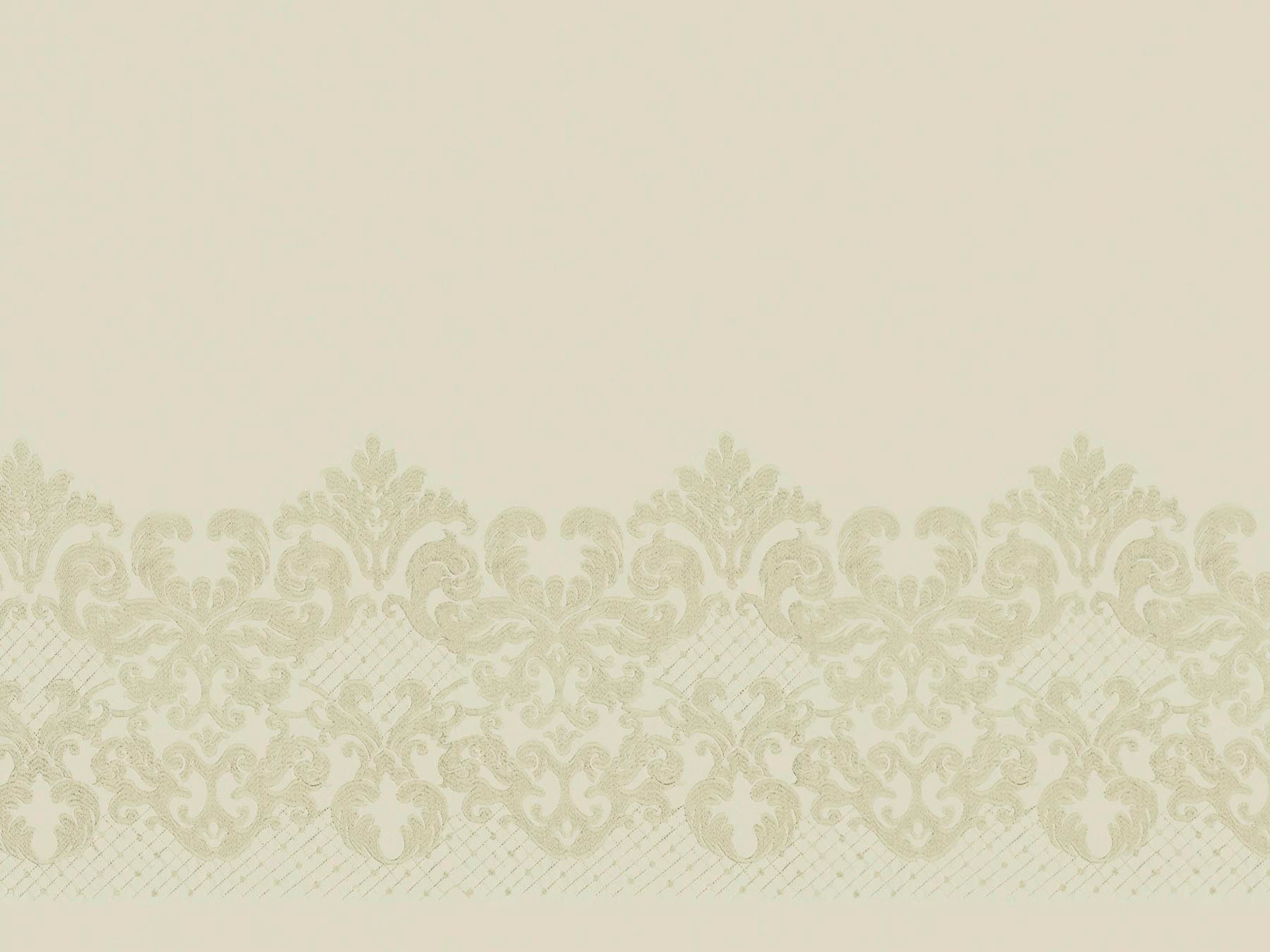
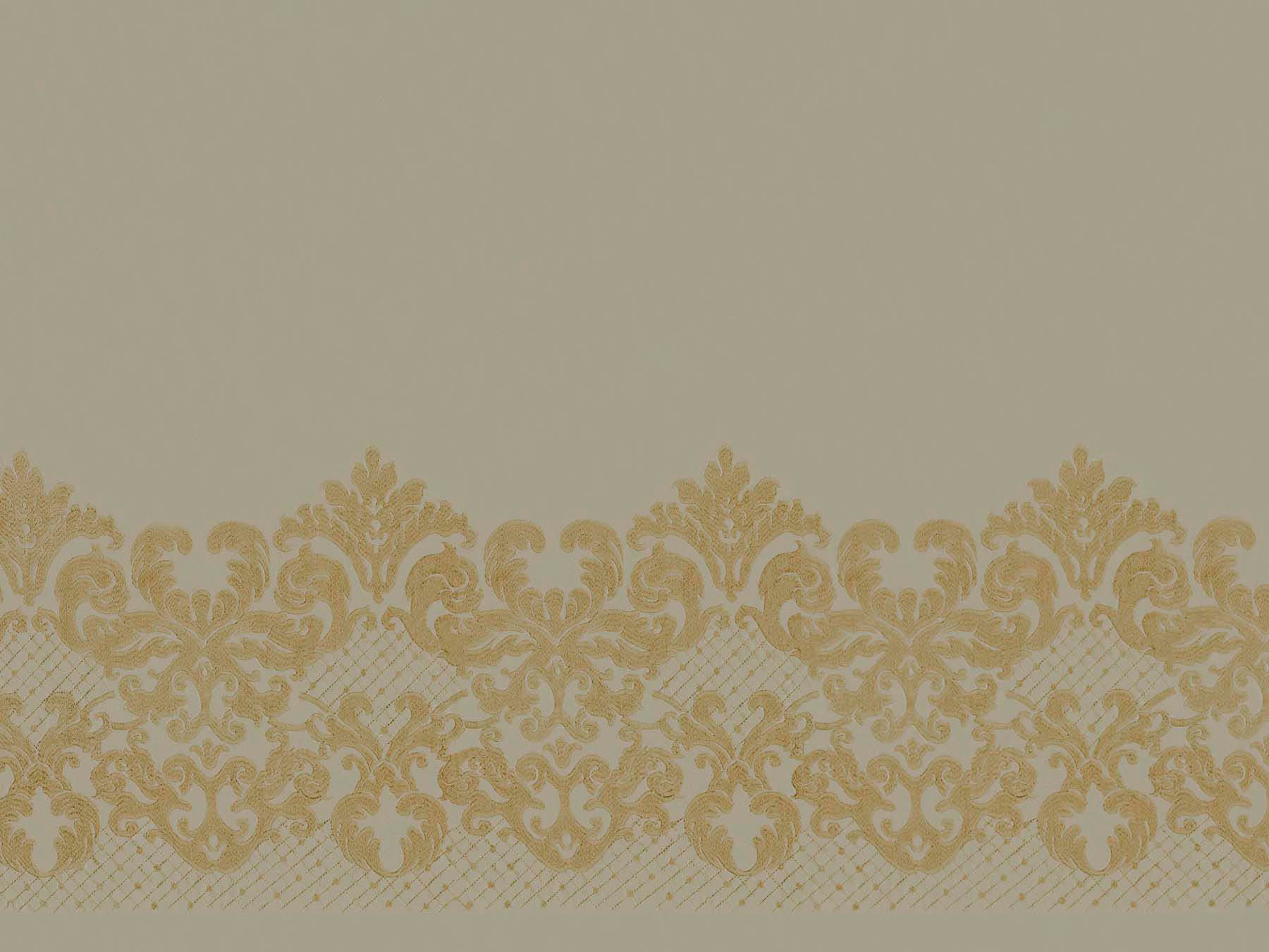
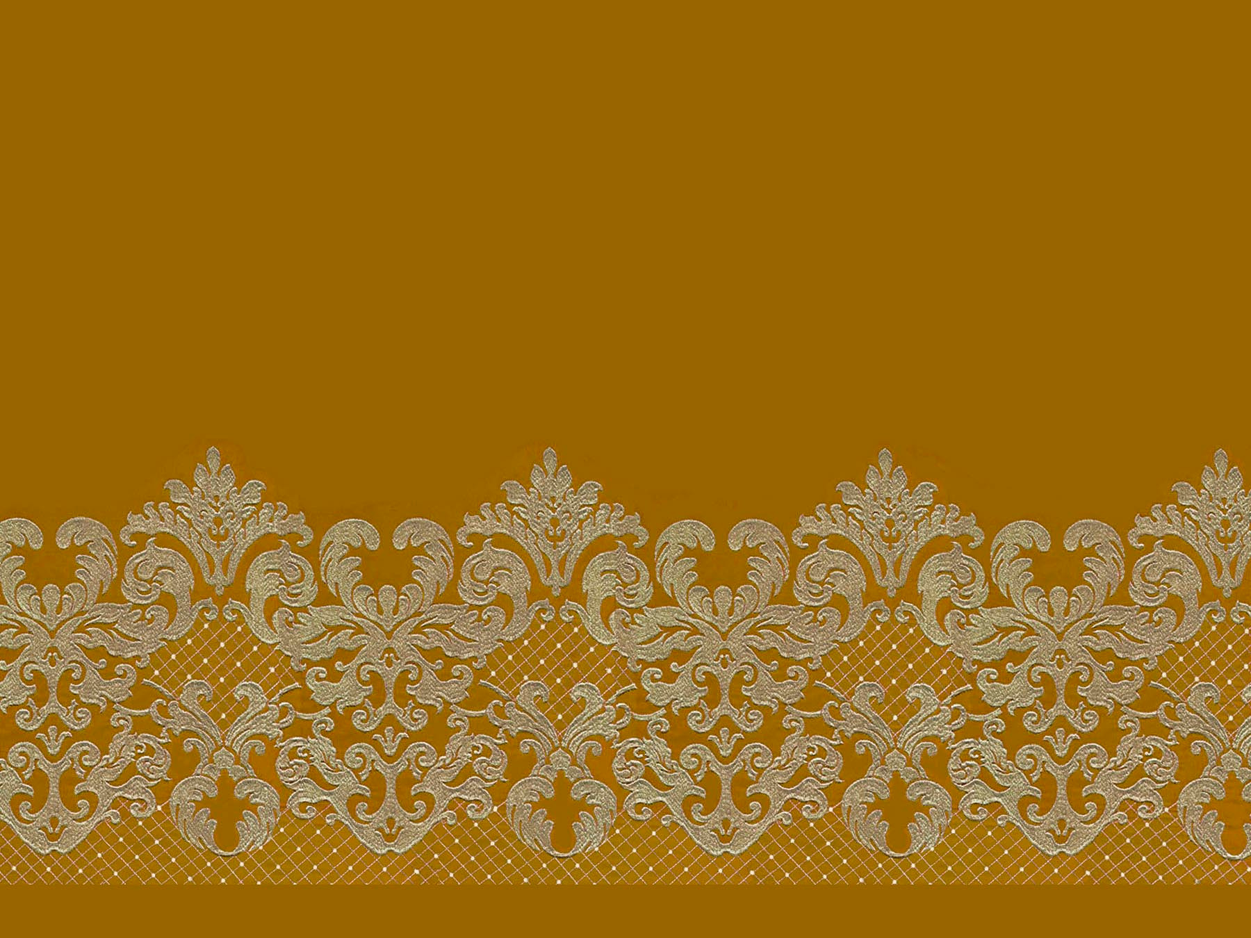
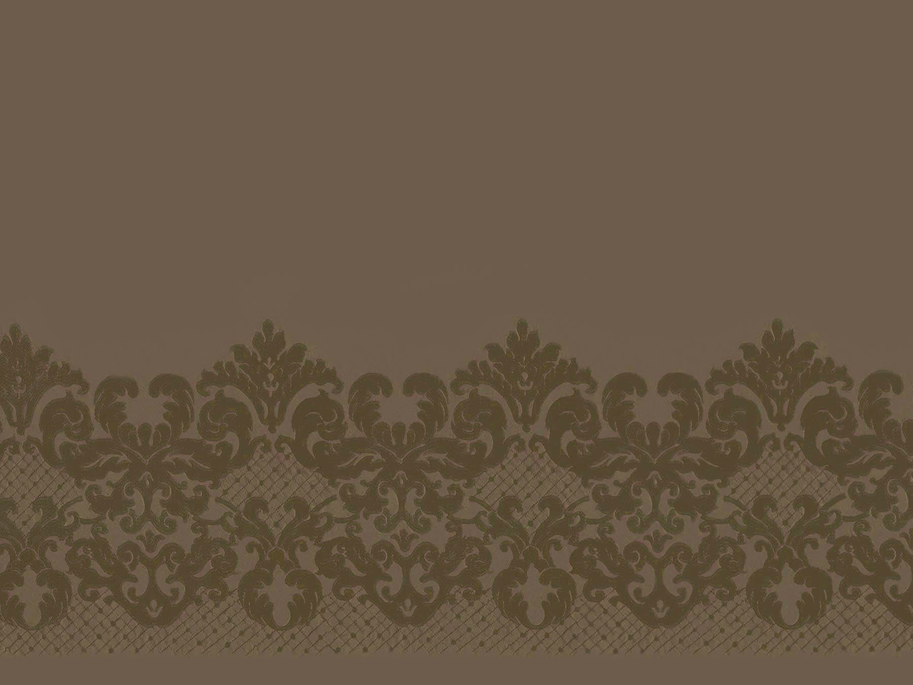
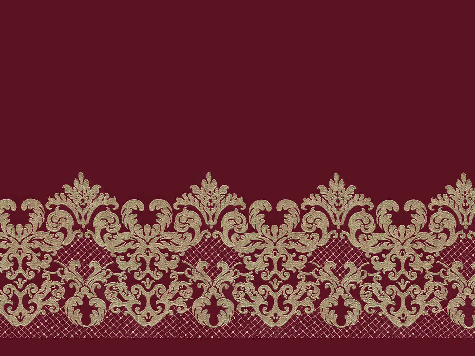
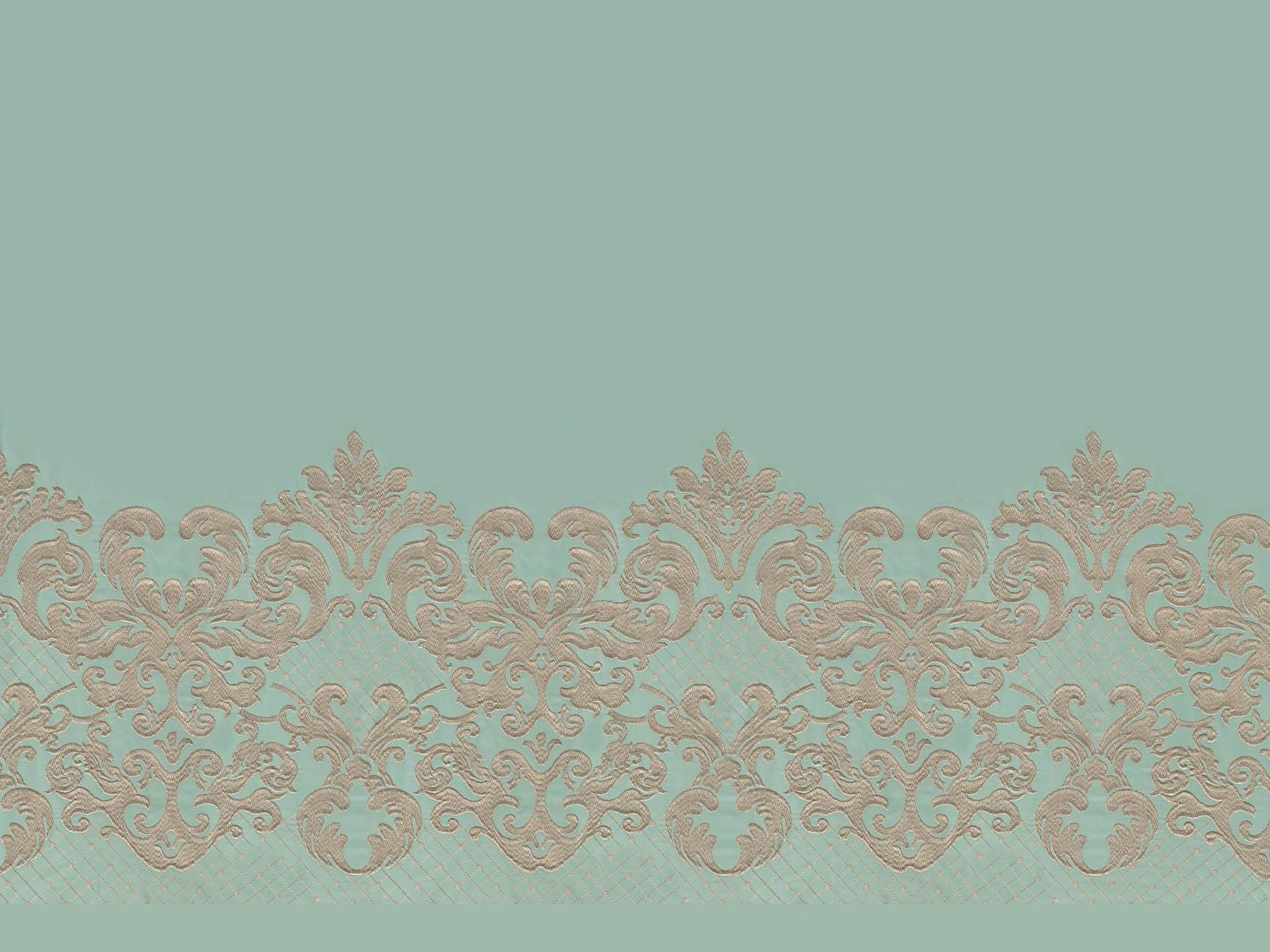
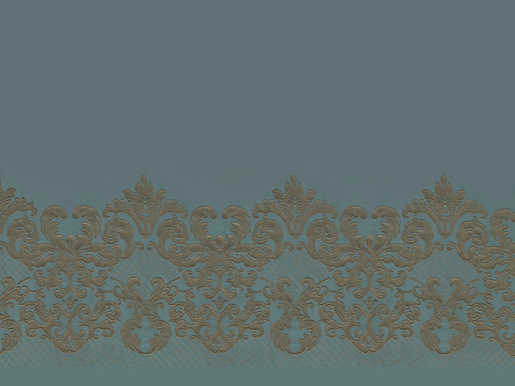
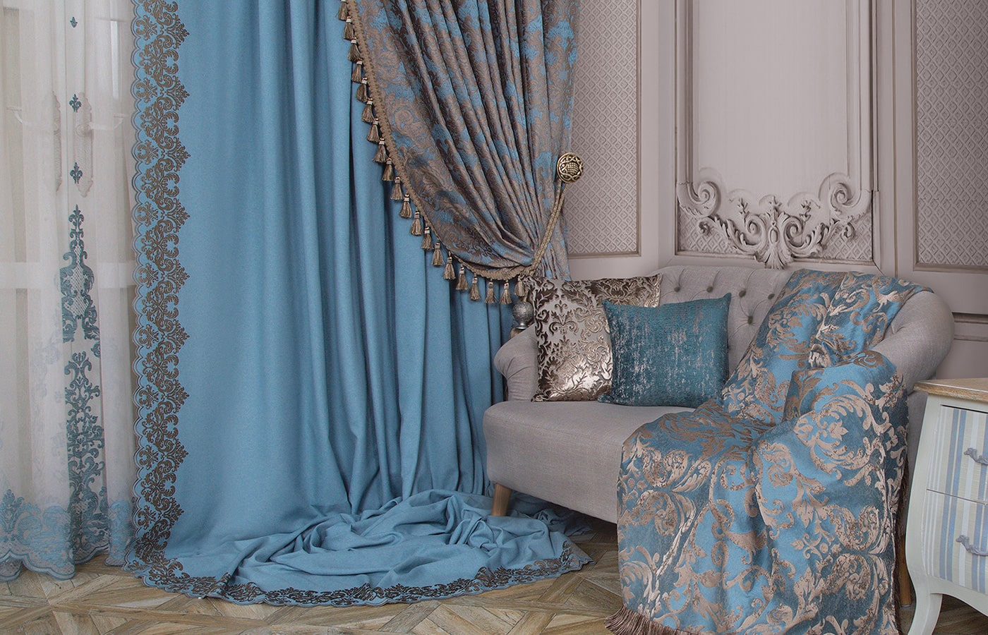
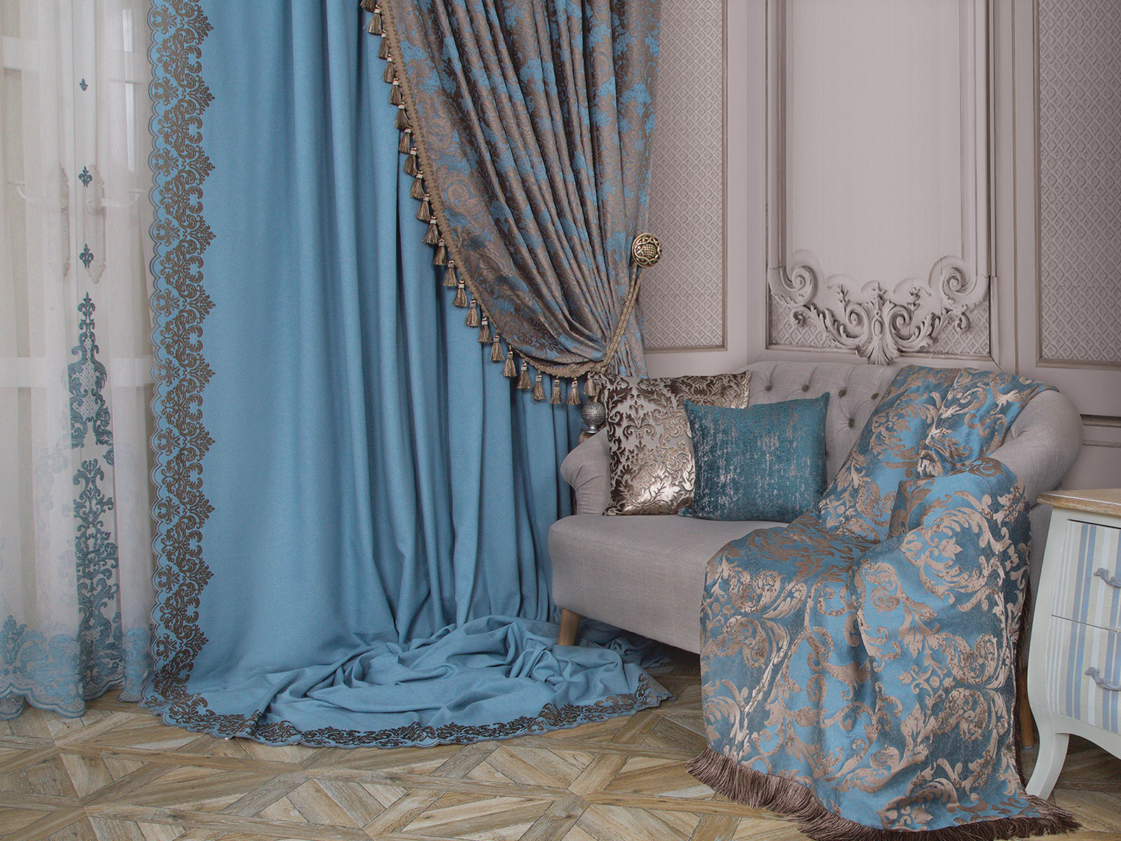
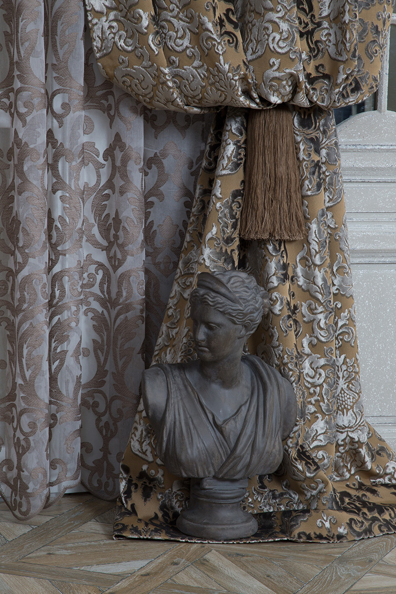
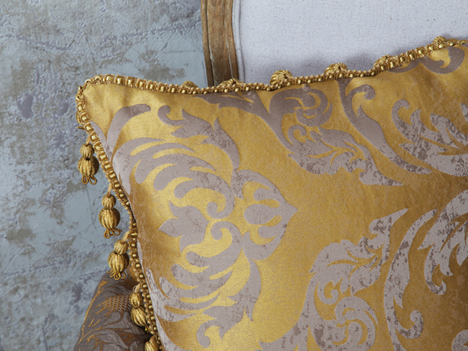
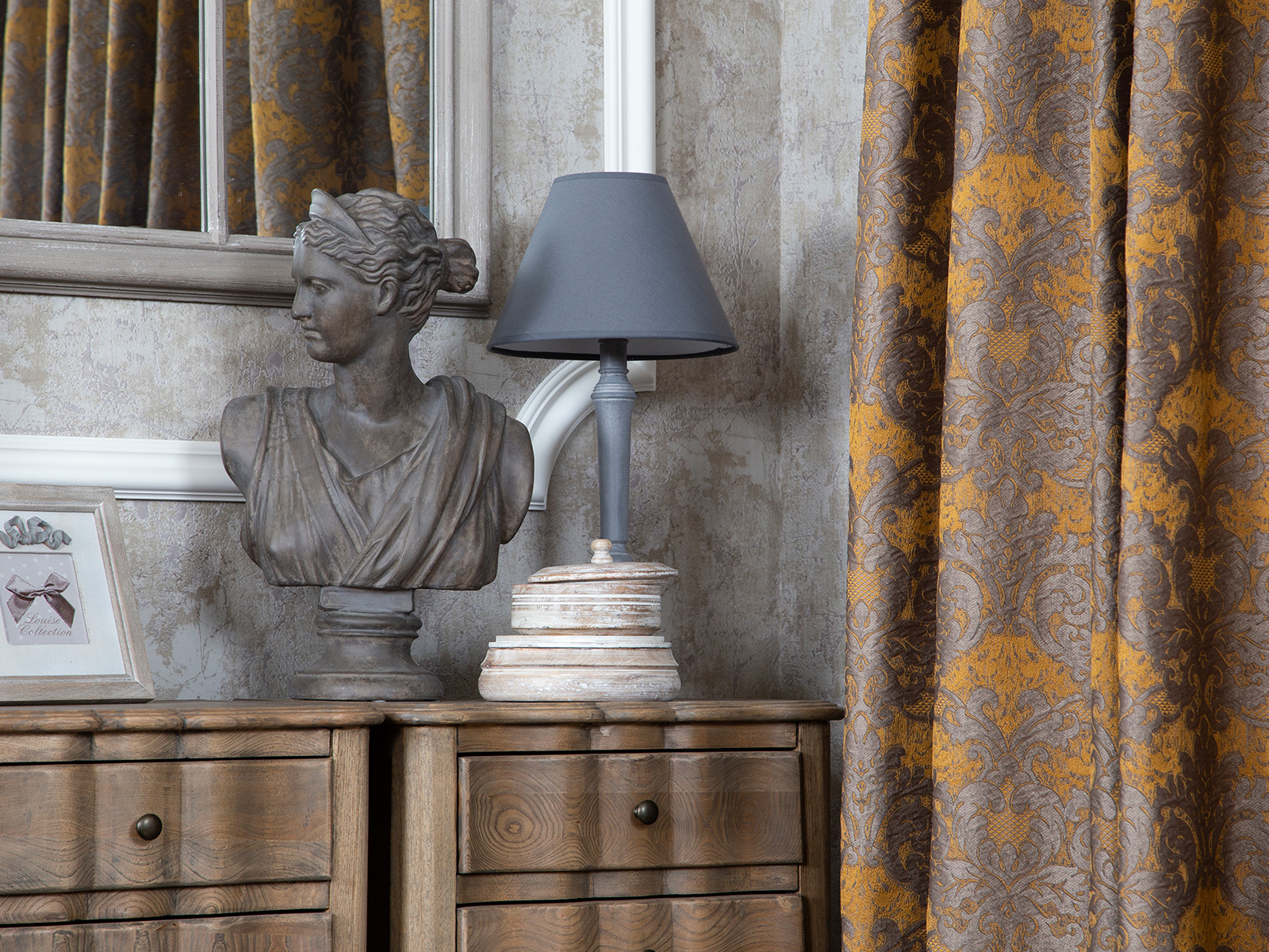
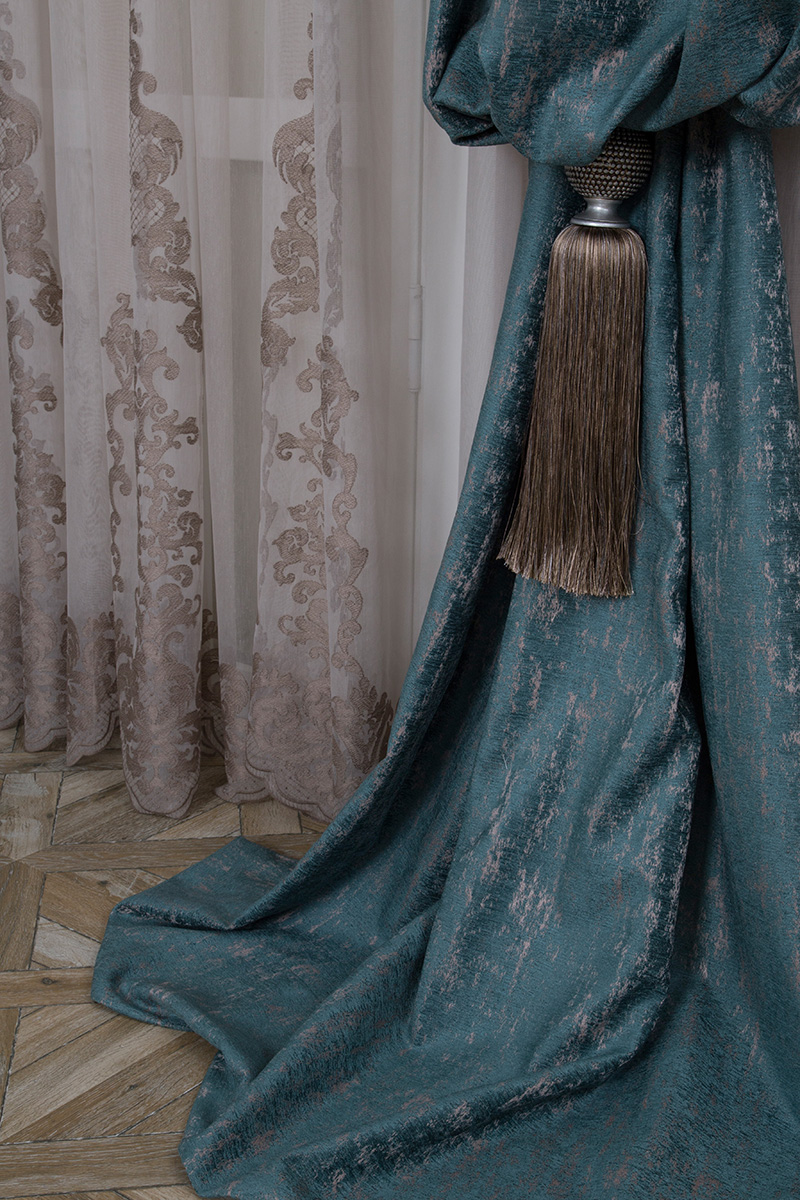
The flagship fabric of the collection is a dense jacquard, based on the design of late Renaissance. At that time the emphasis was on symmetry, and details were borrowed from the decorations of Ancient Rome. The frescoes, patterns, geometric ornaments and richness of the drapery all resonated with the Opera collection. The peculiarity of the book is that all the elements are reworked by Eustergerling’s designers, taking into account modernity: the pattern reminds of oak leaves, and shabby textures are used. The pattern is repeated in the tulle companion with an etching effect. Embroidery is also used in the collection, with an elegant festoon.


Authentic emotion
Understanding the art of opera is not for everyone, but those who have once experienced its beauty will appreciate the incredible emotions that opera singing evokes. The soul shudders with delight, catching the vibrations of the voice, and dissolves in the classical instrumental music. The seven colors of Opera encrypt seven emotions and symbols of our time: naturalness, eternal youth, mystery, wealth, optimism, power and perfection. Which of these would you choose right now?

Game of Colors
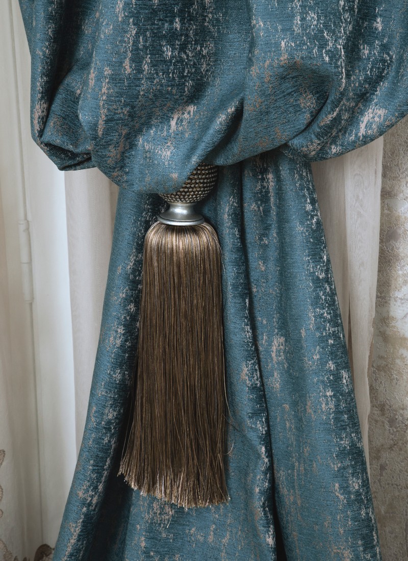
The collection is designed for daring customers who have high demands to the aesthetics of rooms and are not afraid to make bold experiments with color and texture. Eustergerling designers used a provocative shade of purple in combination with classic designs, getting a completely different interpretation of the classic, as many are accustomed to. They also added mint and blue to give the collection a soft and aristocratic feel. Beige and white softened the contrasts and balanced the saturated shades of the book.