Phantom

The magnetic allure of misty tones

The soft colors and velvety texture of Chenille envelop the mind and senses. Phantom magically transports you into a ghostly world, which is shrouded in a mysterious veil of dreams.

An enigmatic universe

Immerse yourself in a dream that you miss in your everyday life. Find your way to the land of dreams where the colors and textures of the Phantom collection rule.
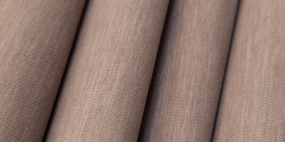
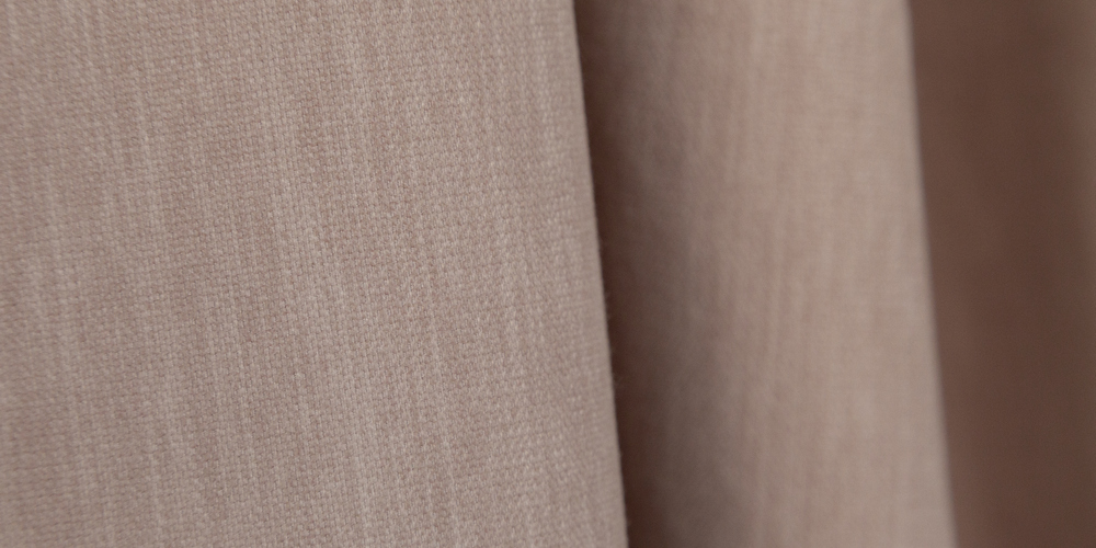
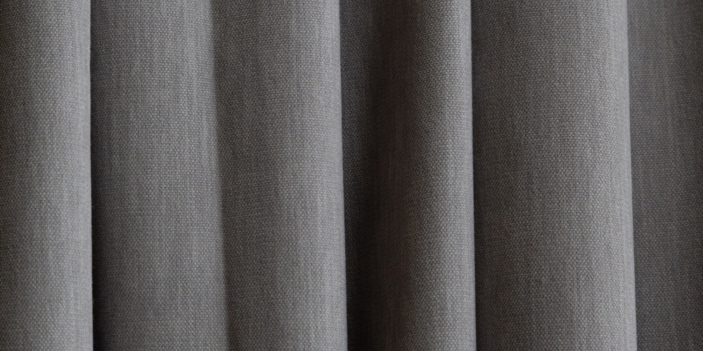
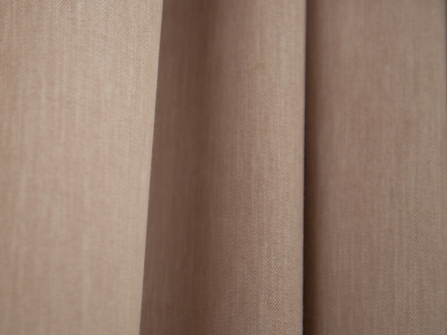
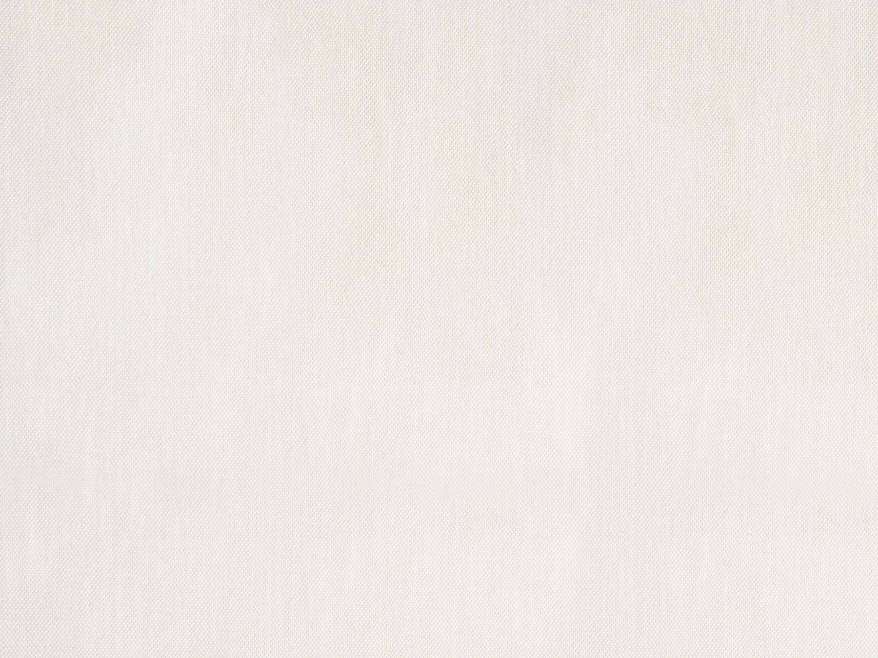
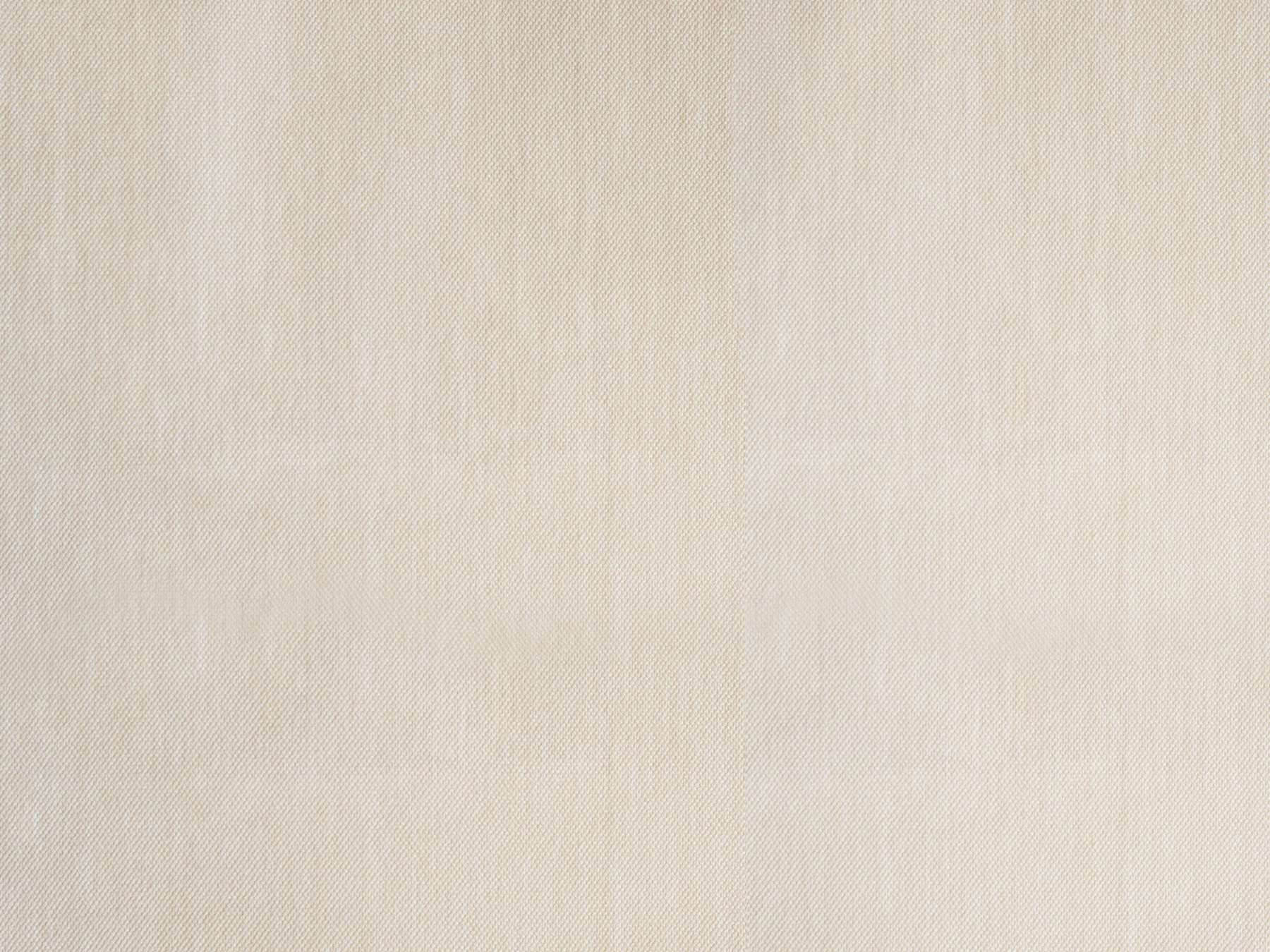
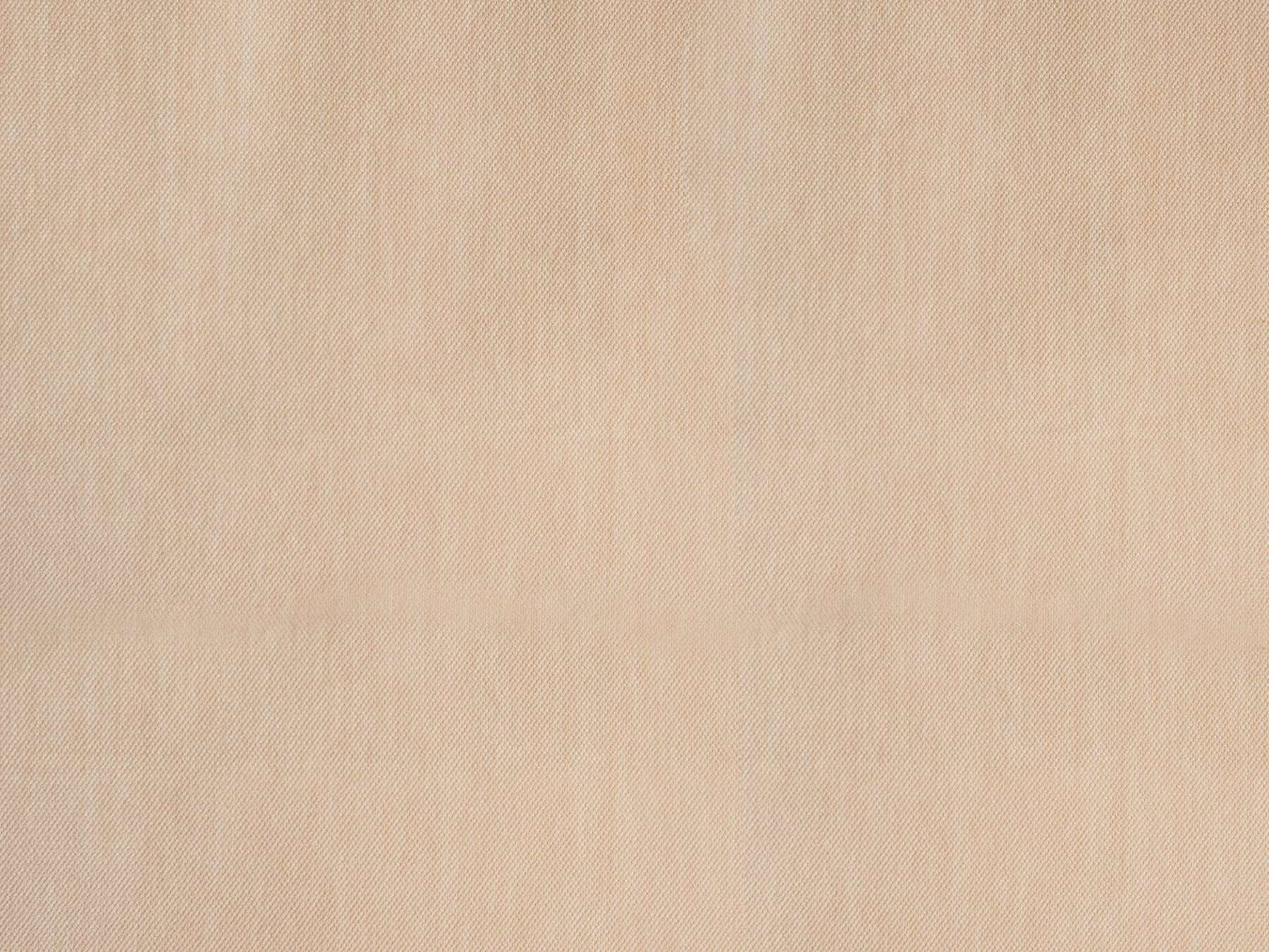
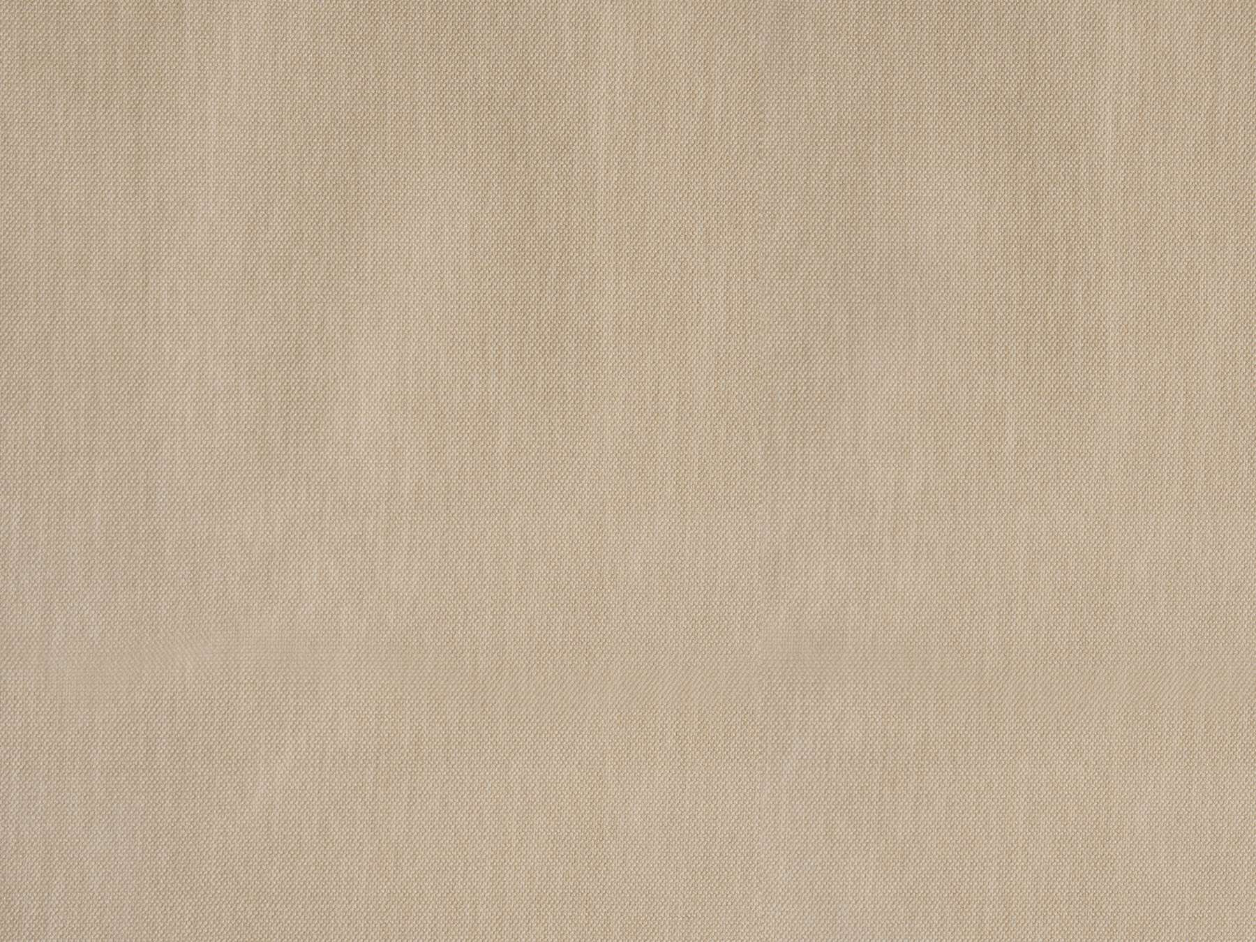
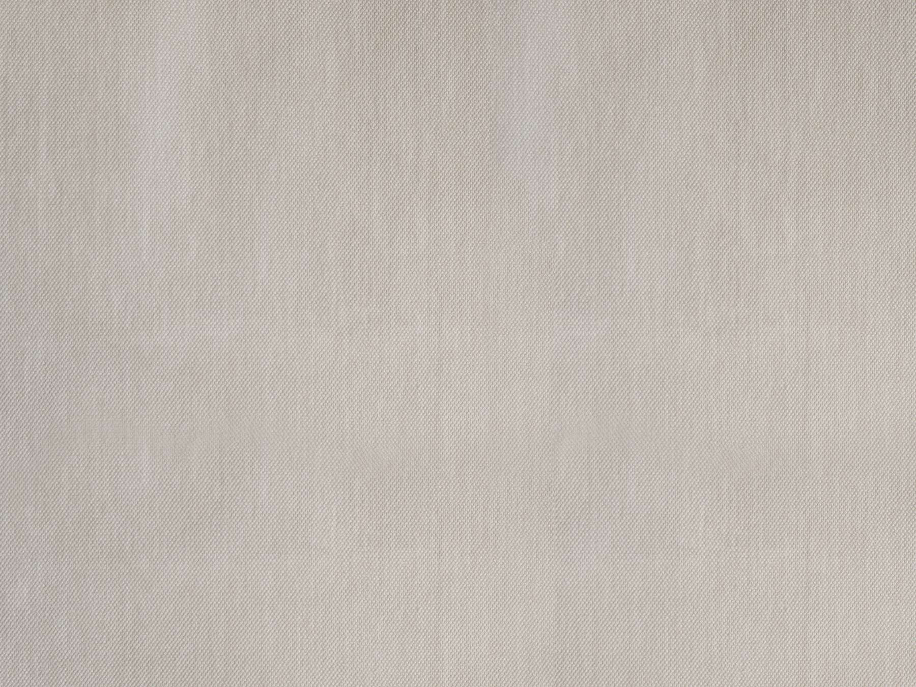
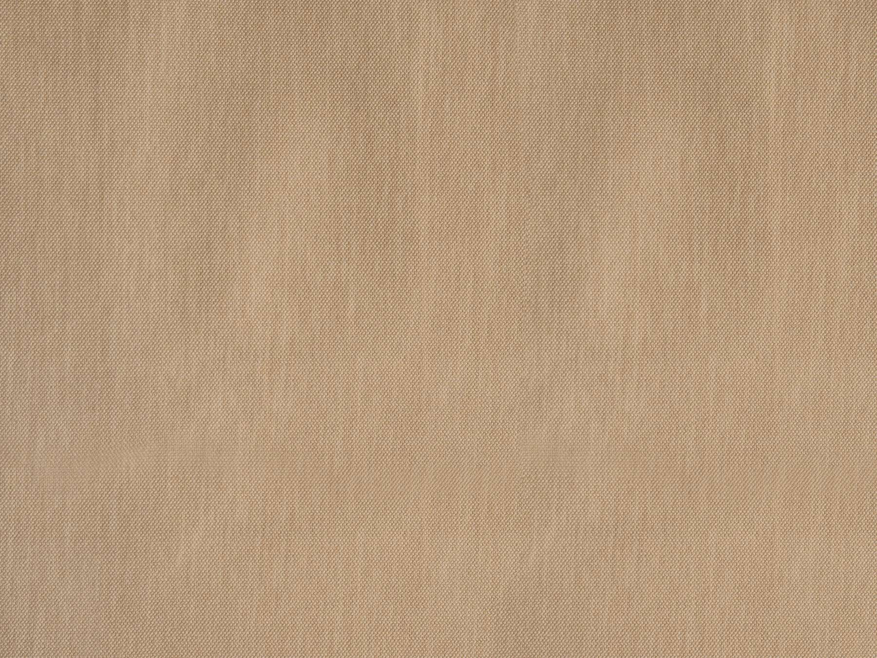
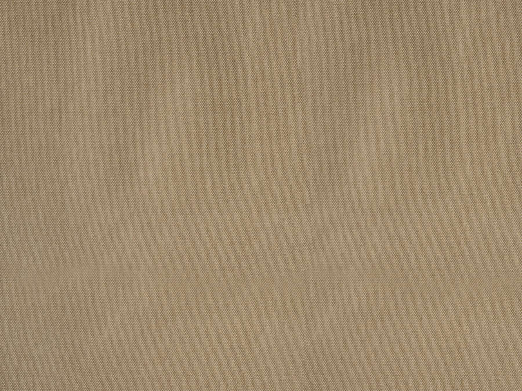
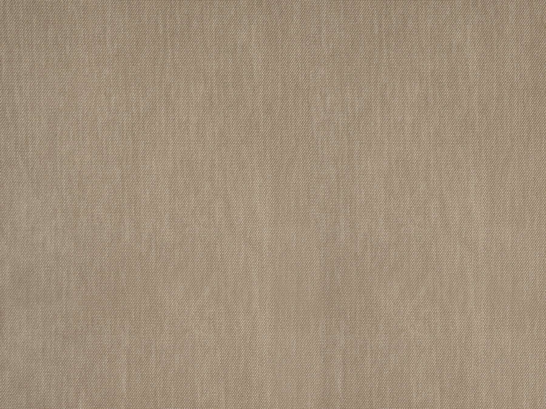
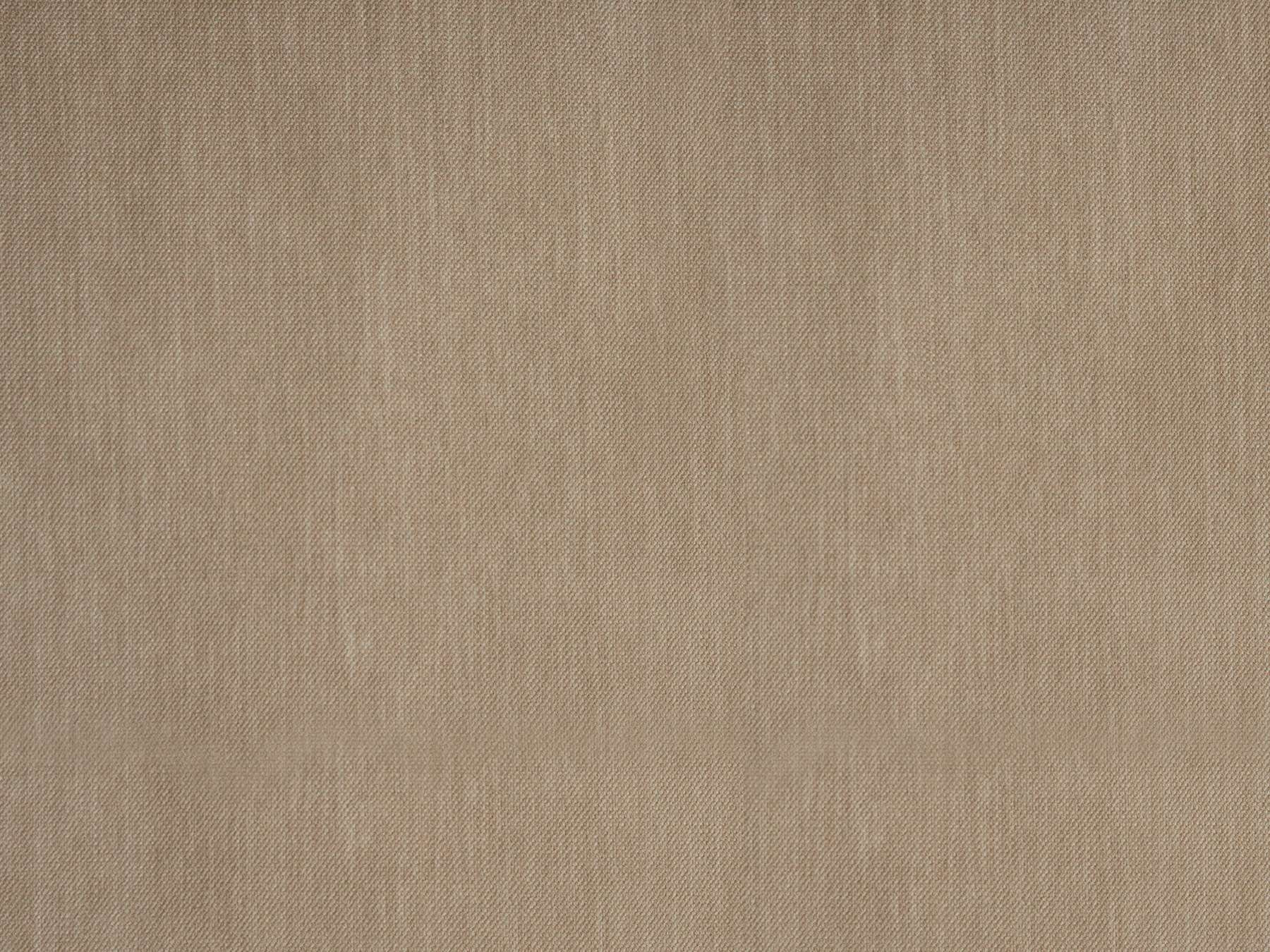
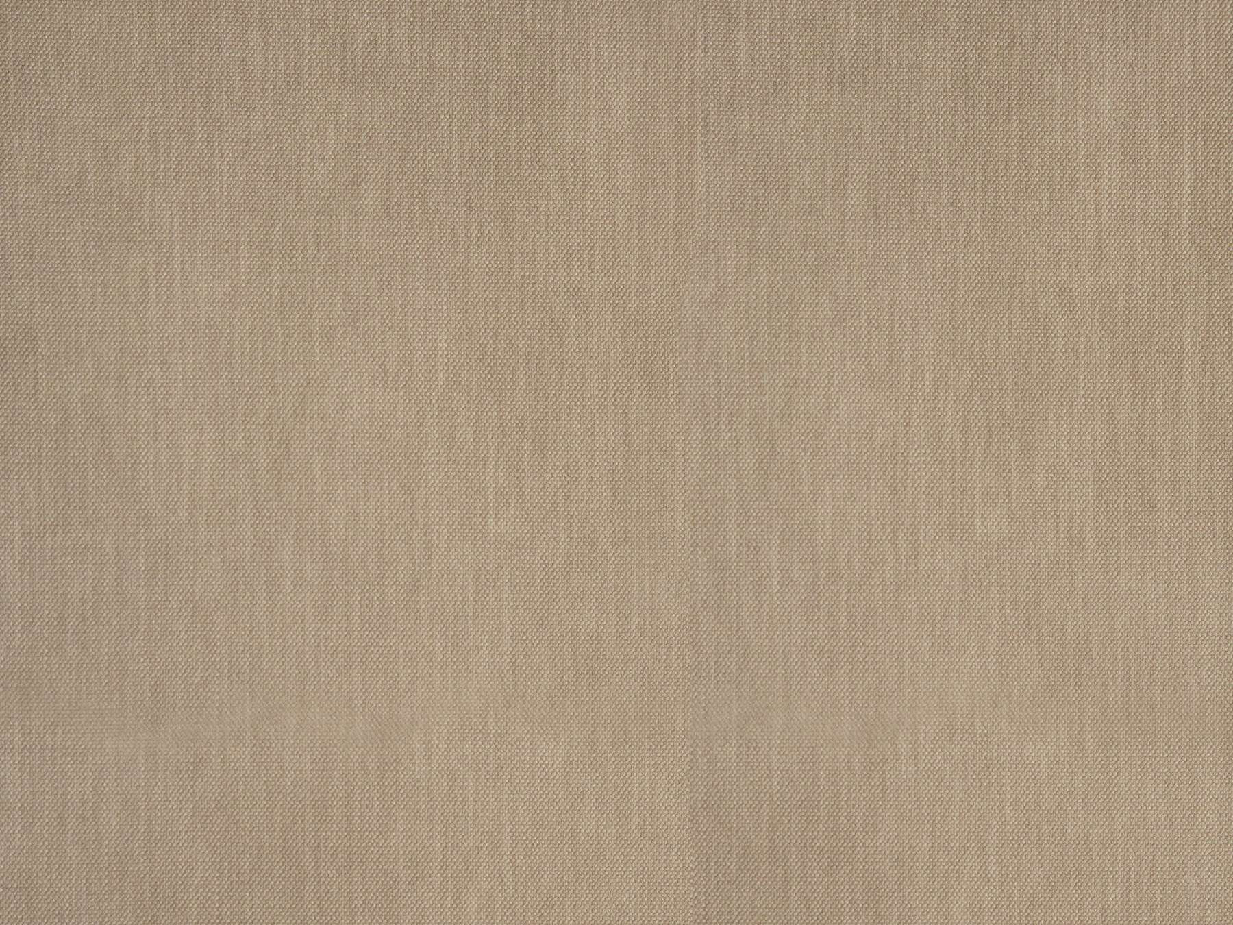
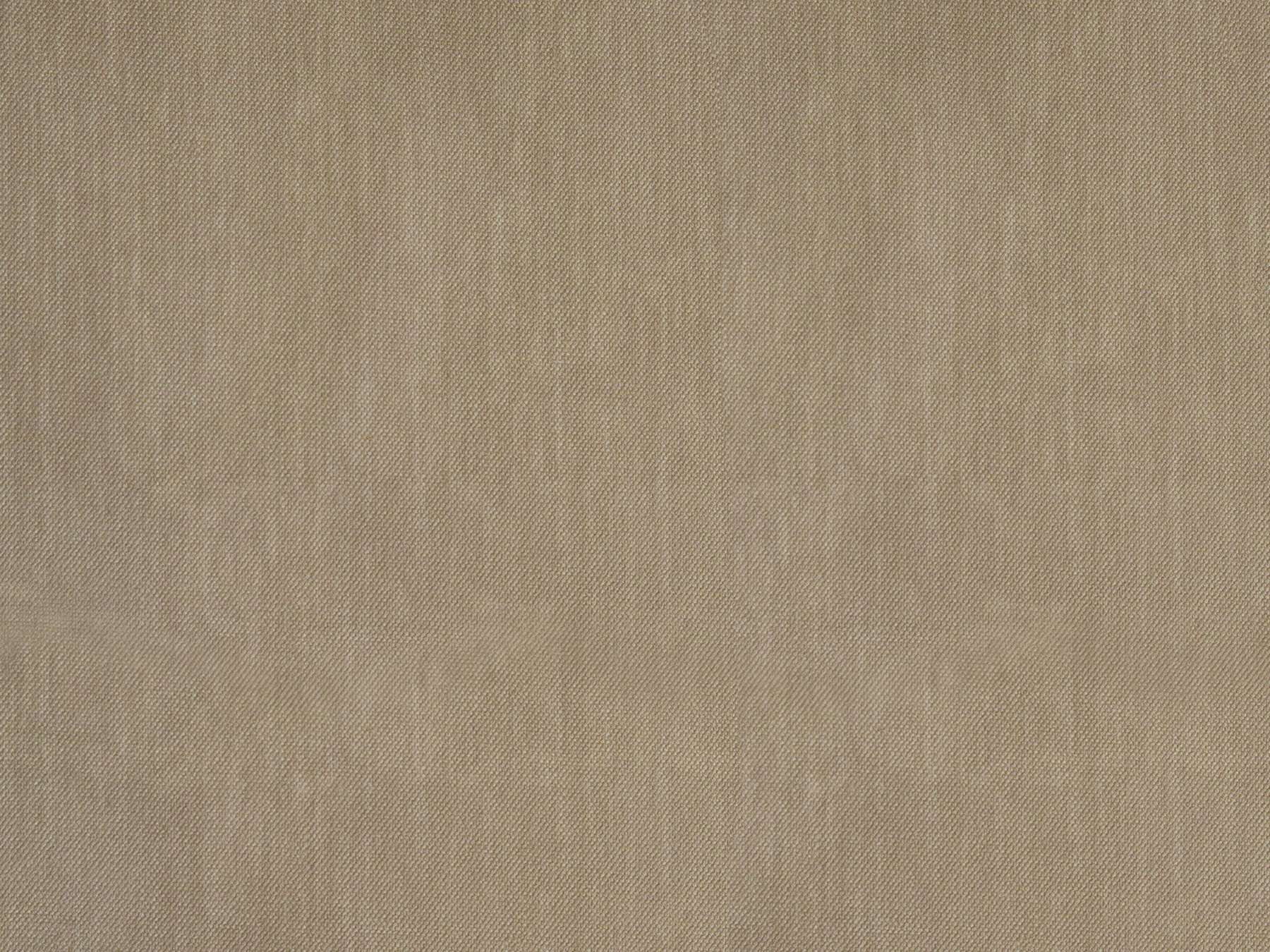
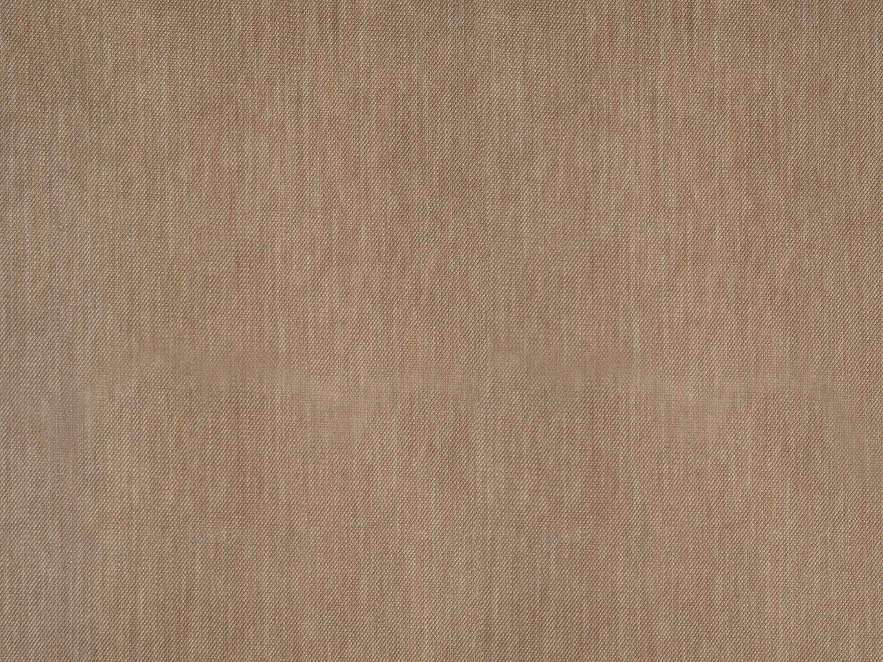
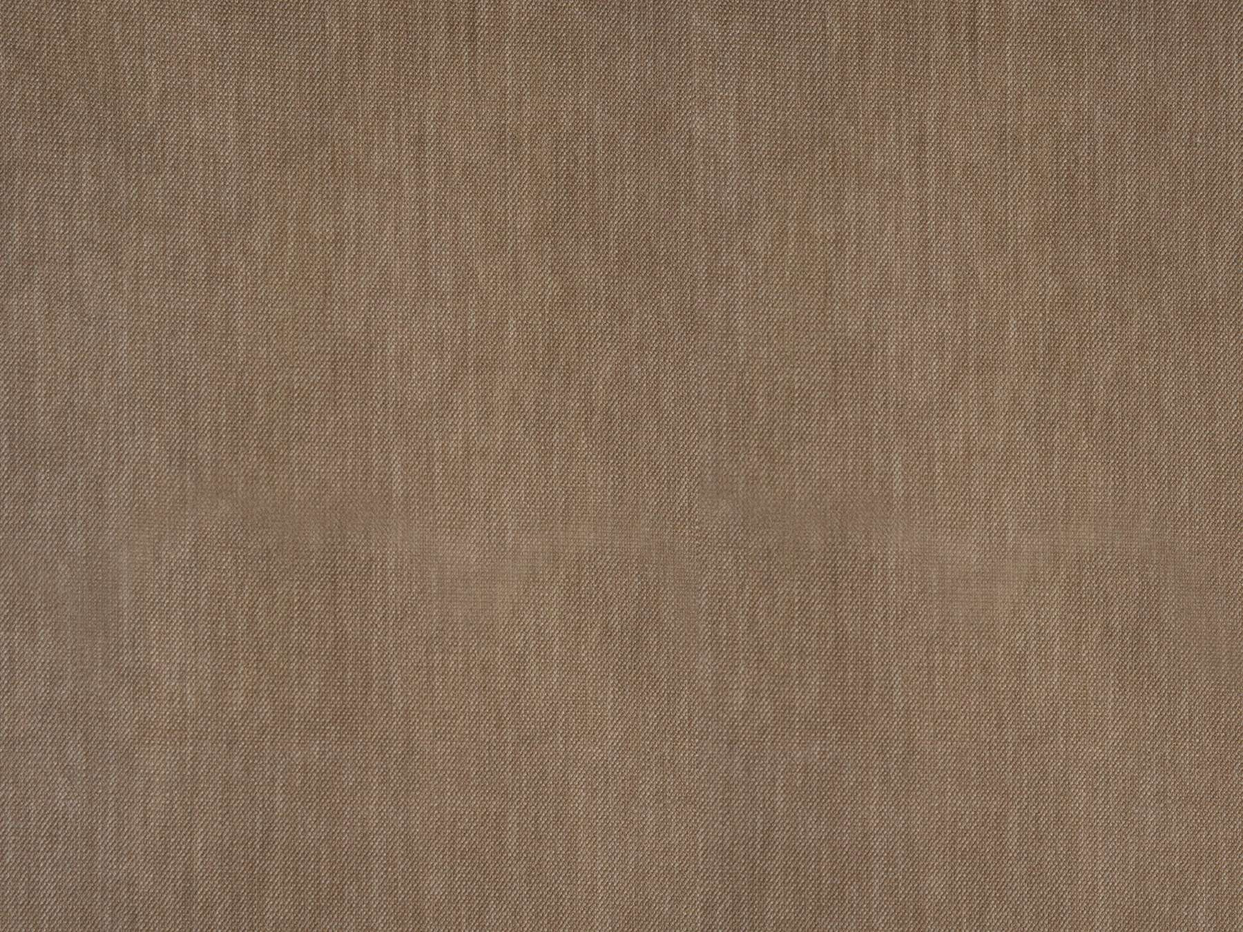
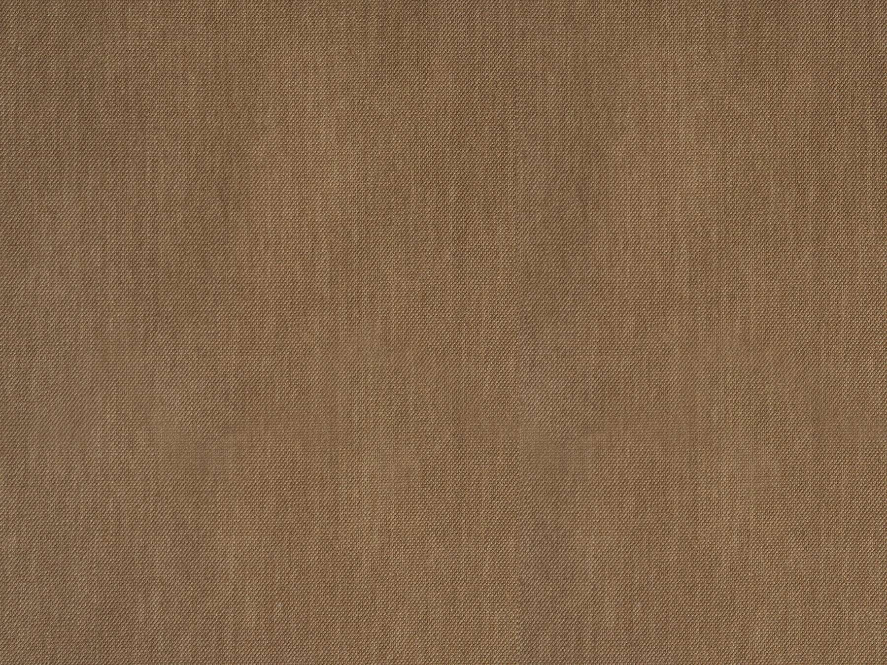
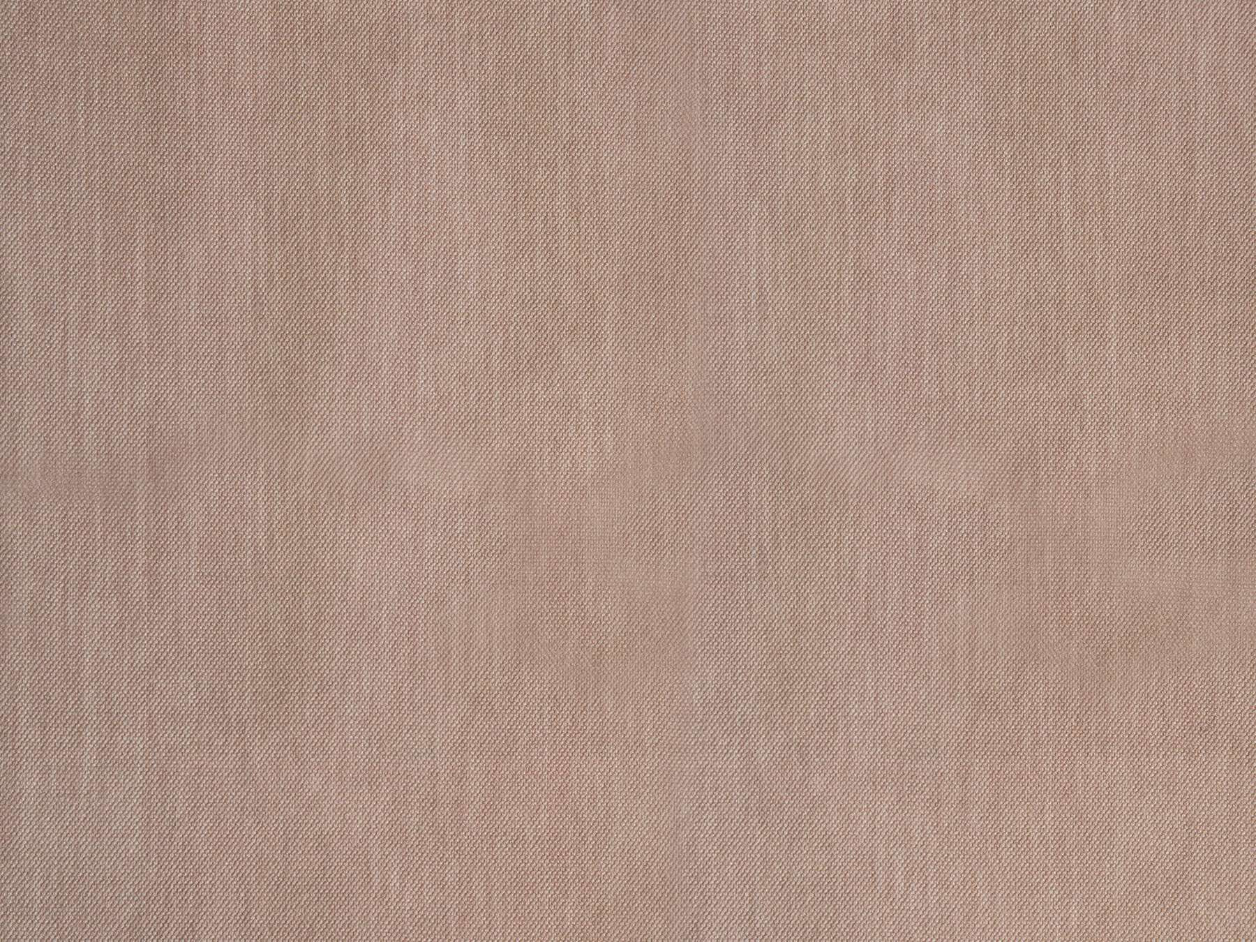
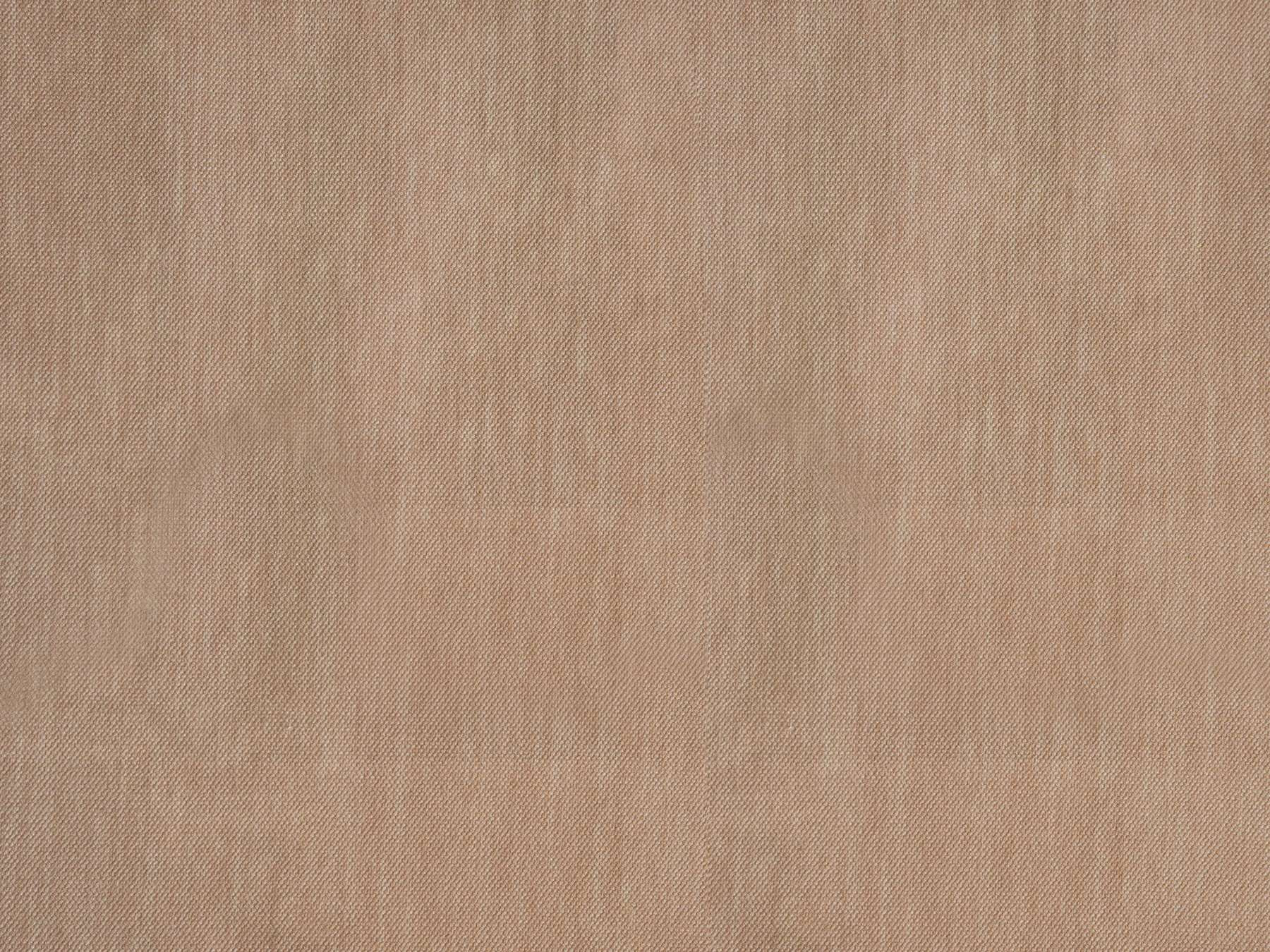
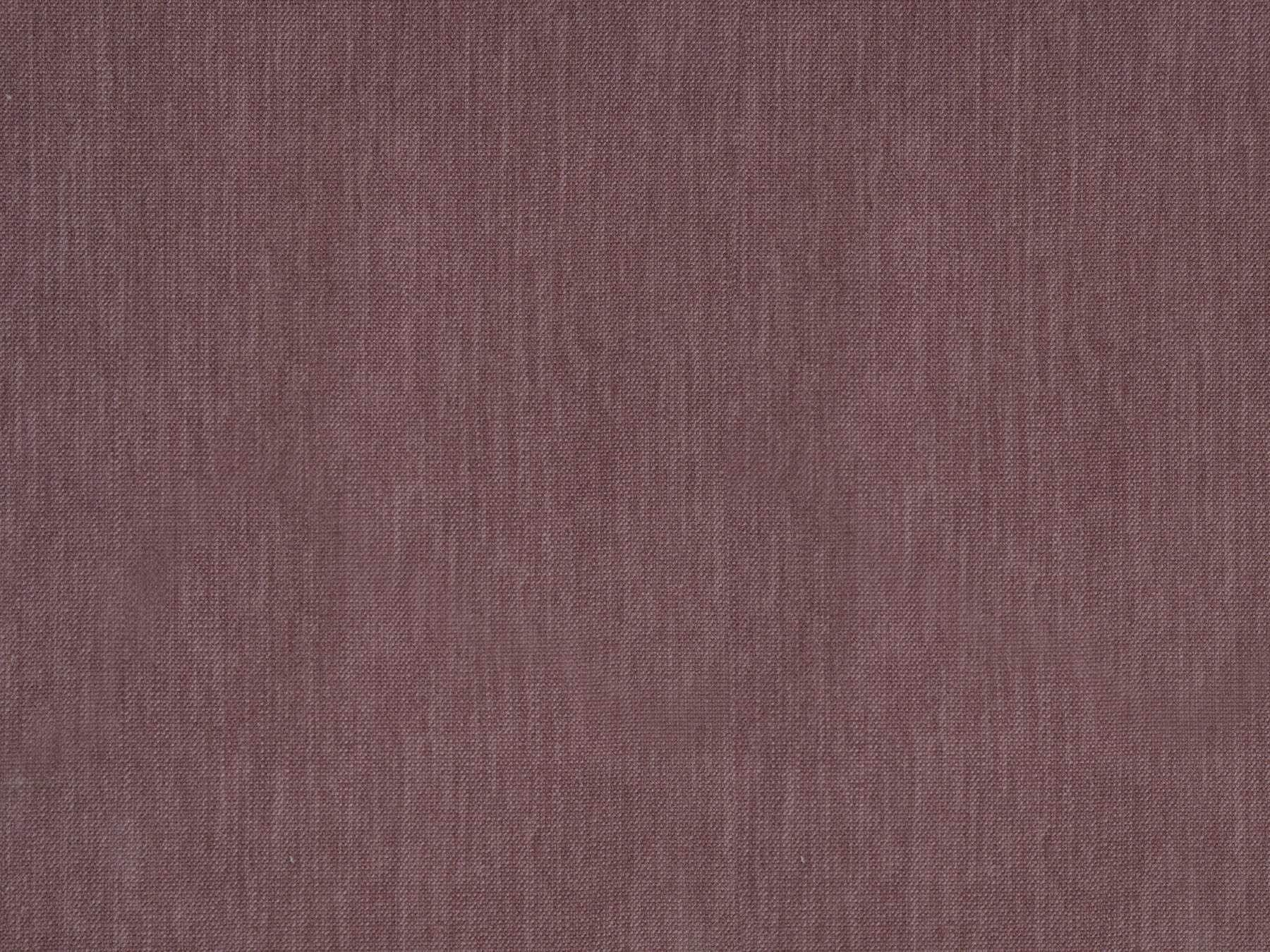
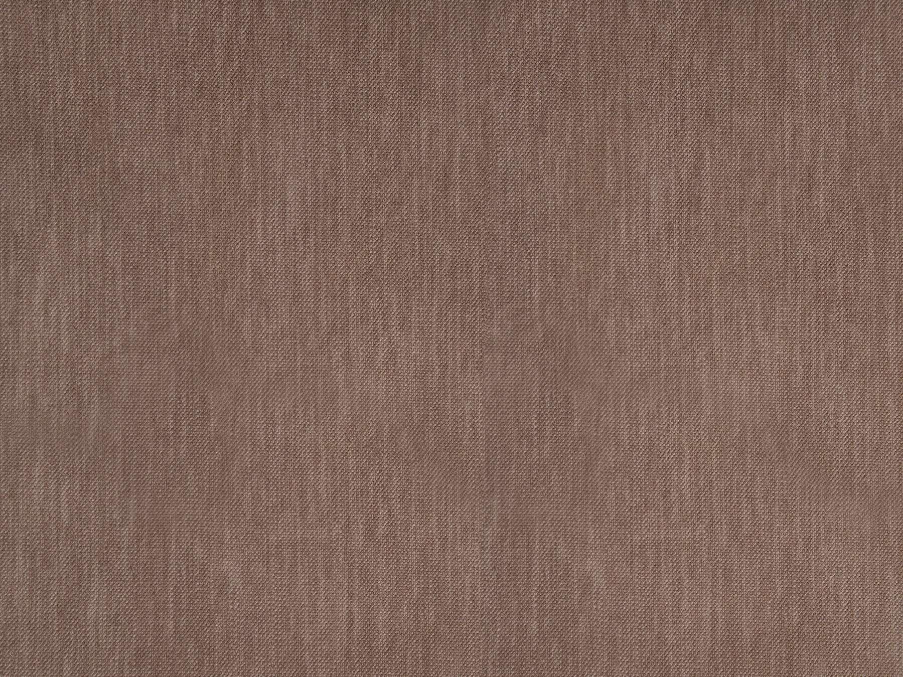
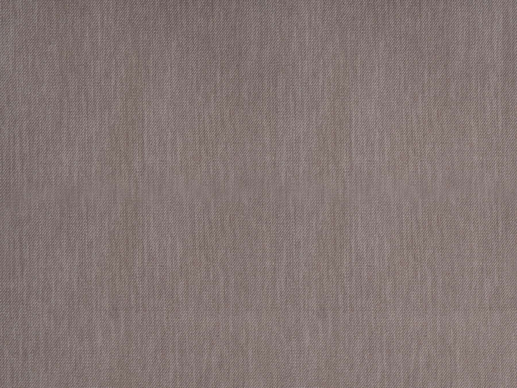
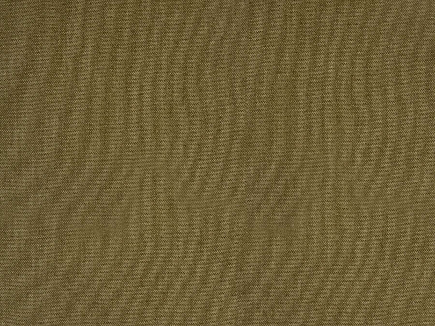
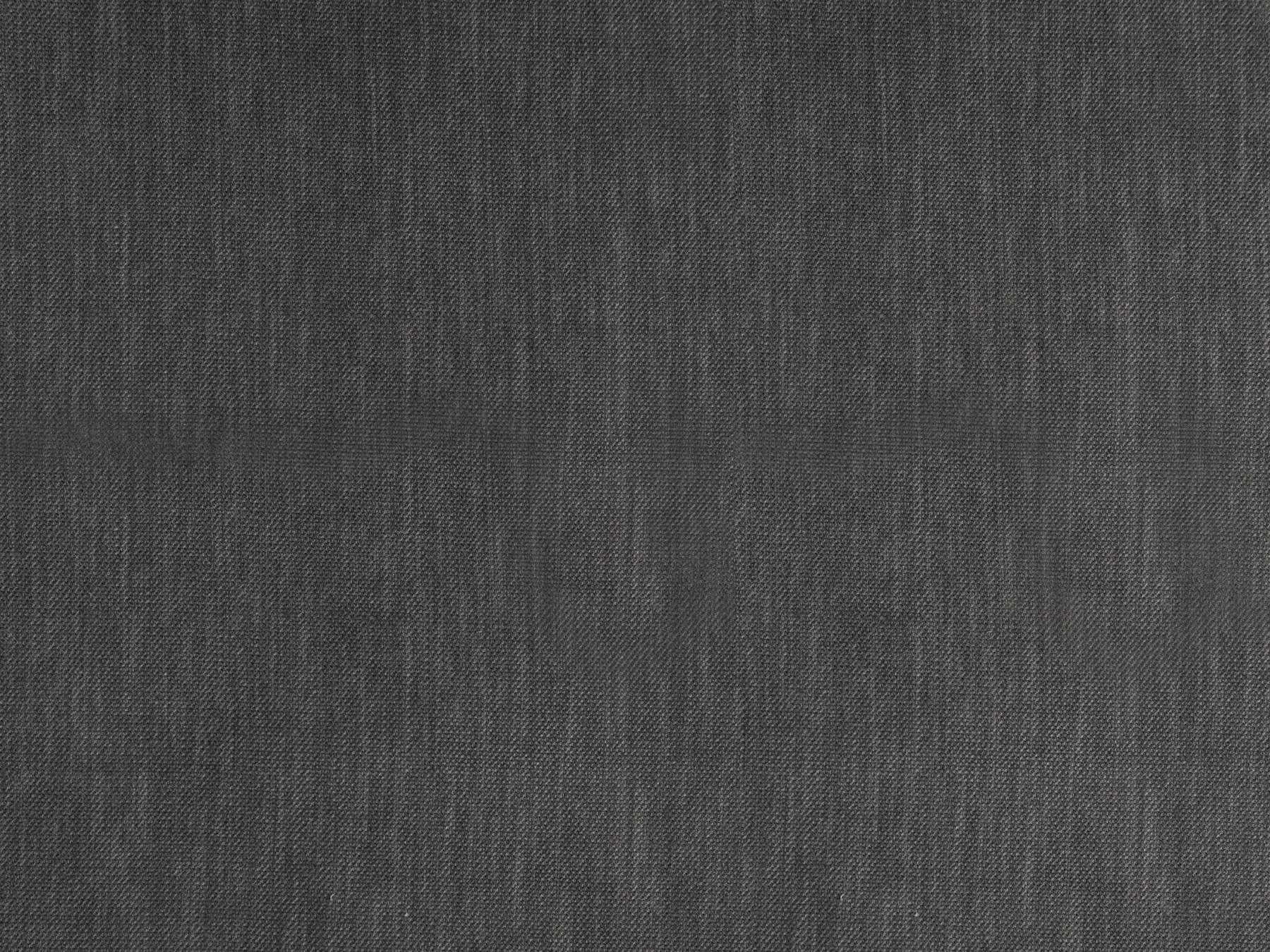
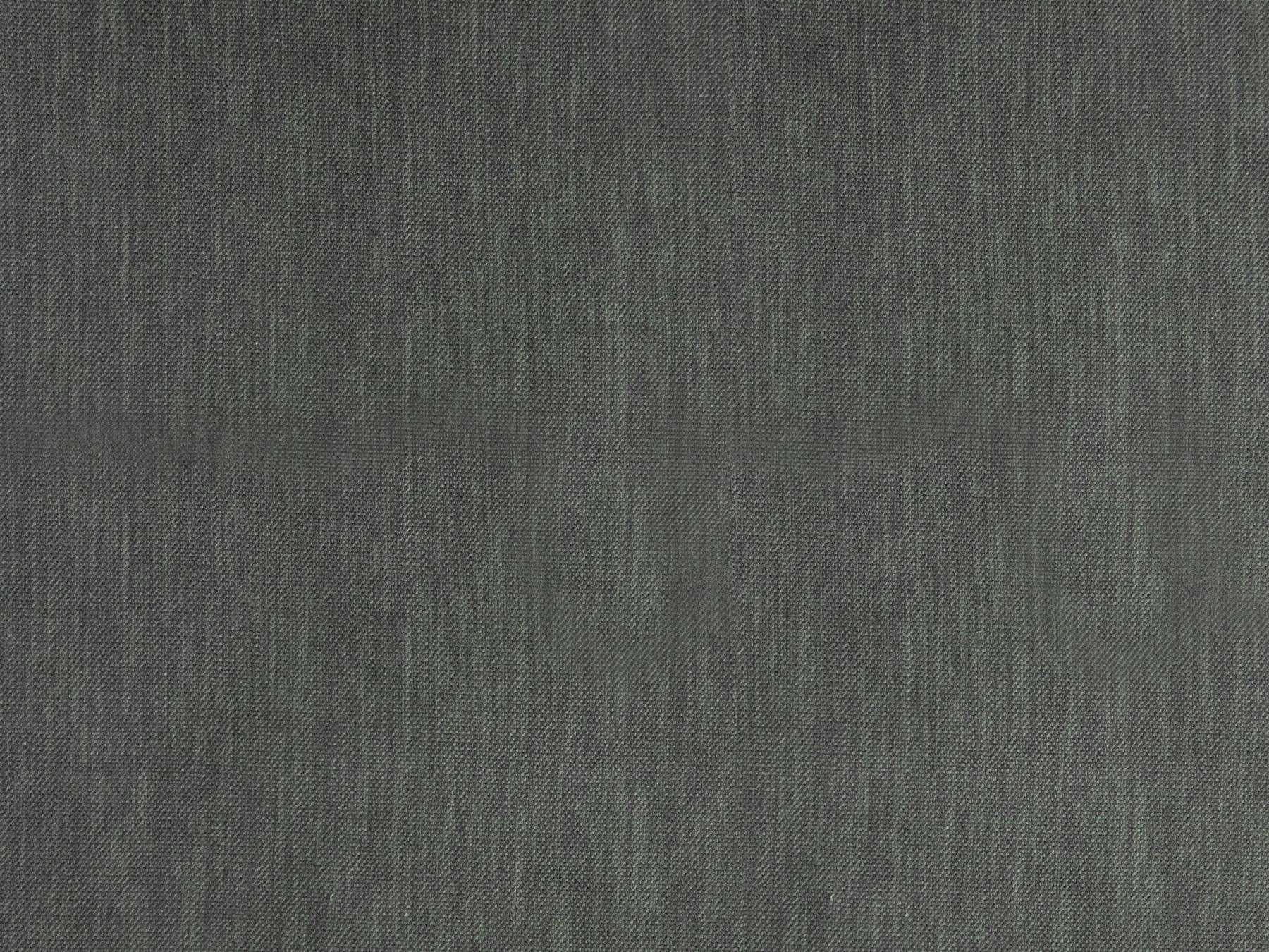
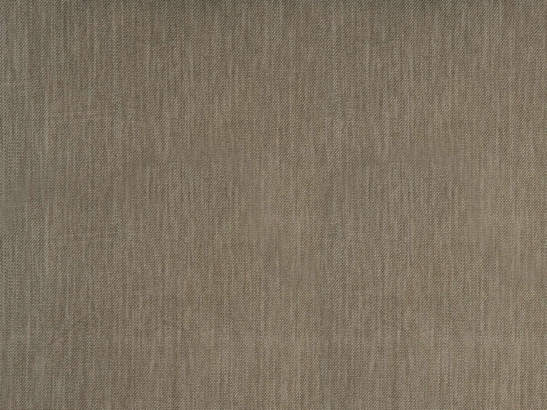
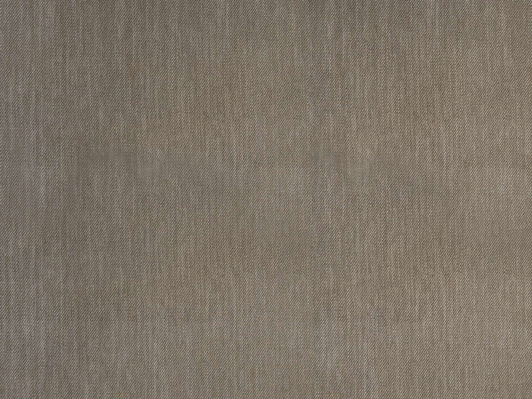
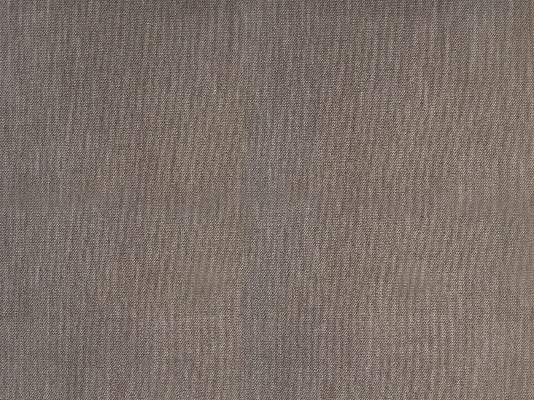
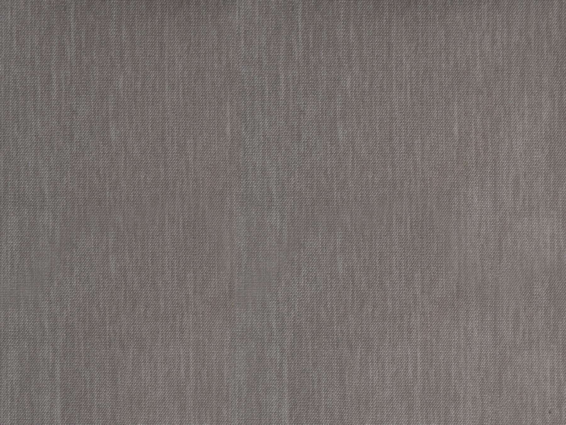
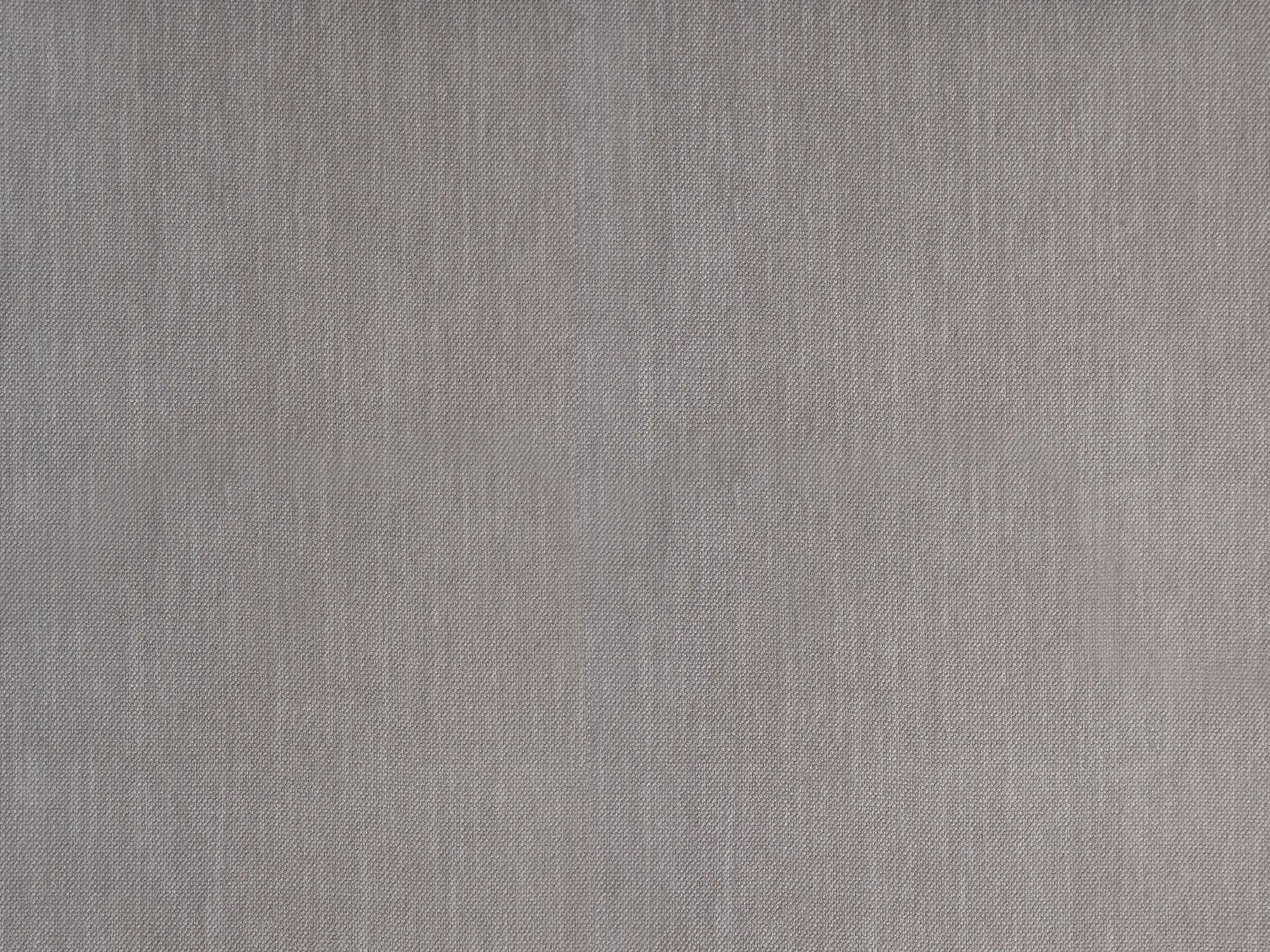
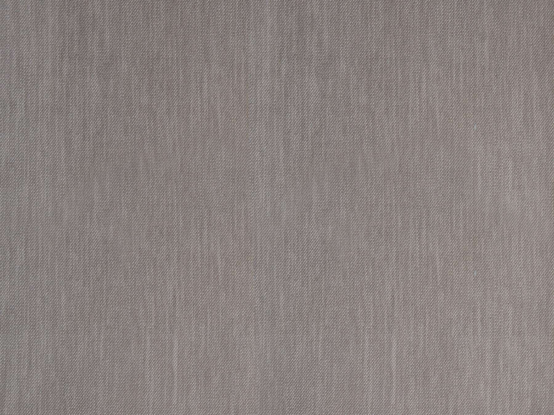
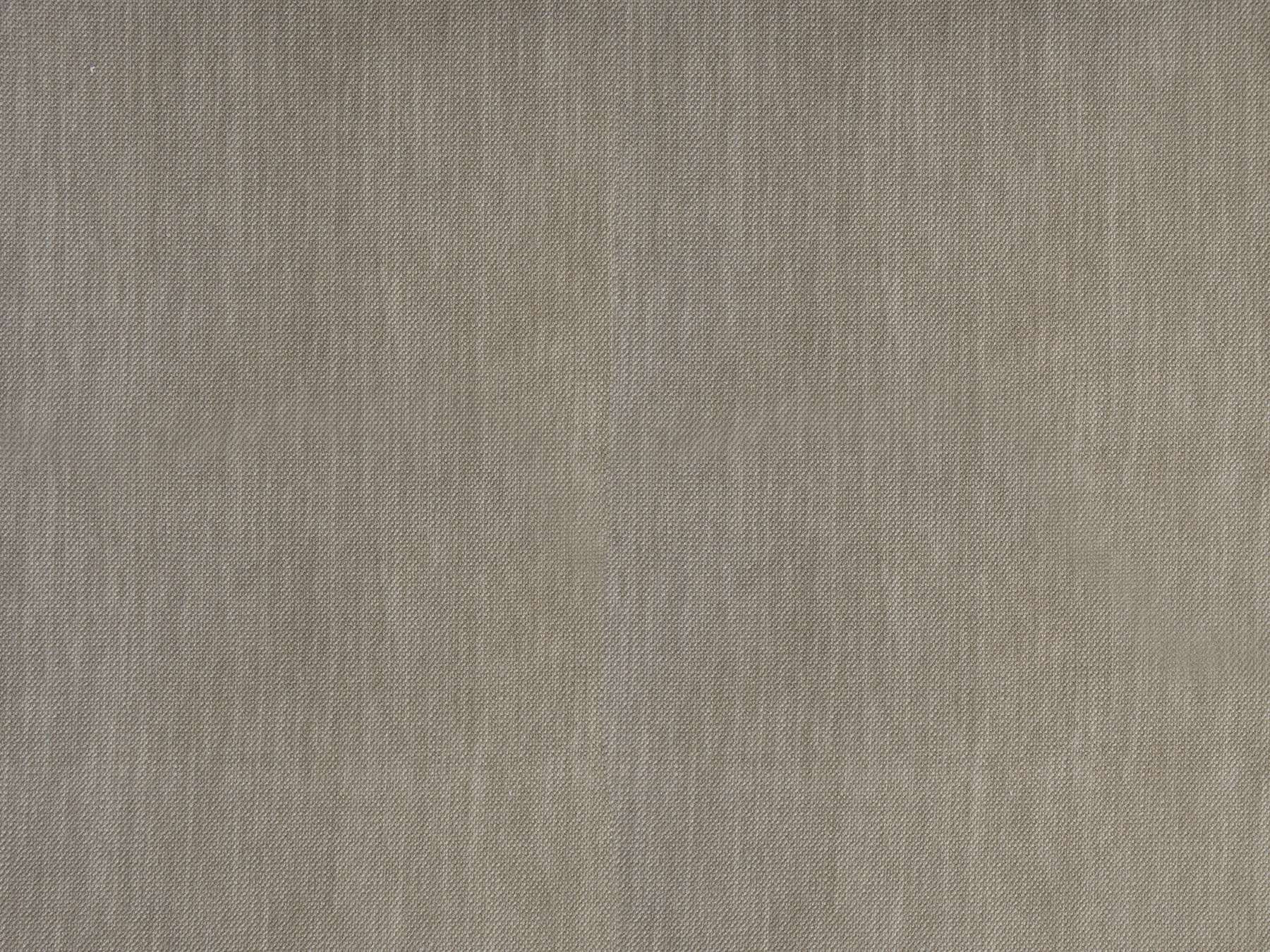
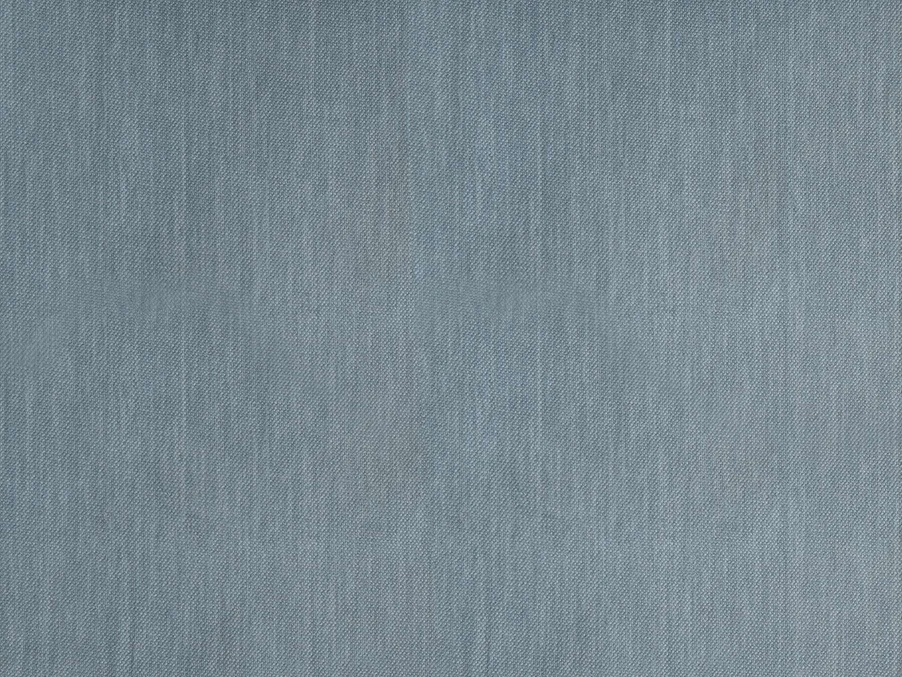
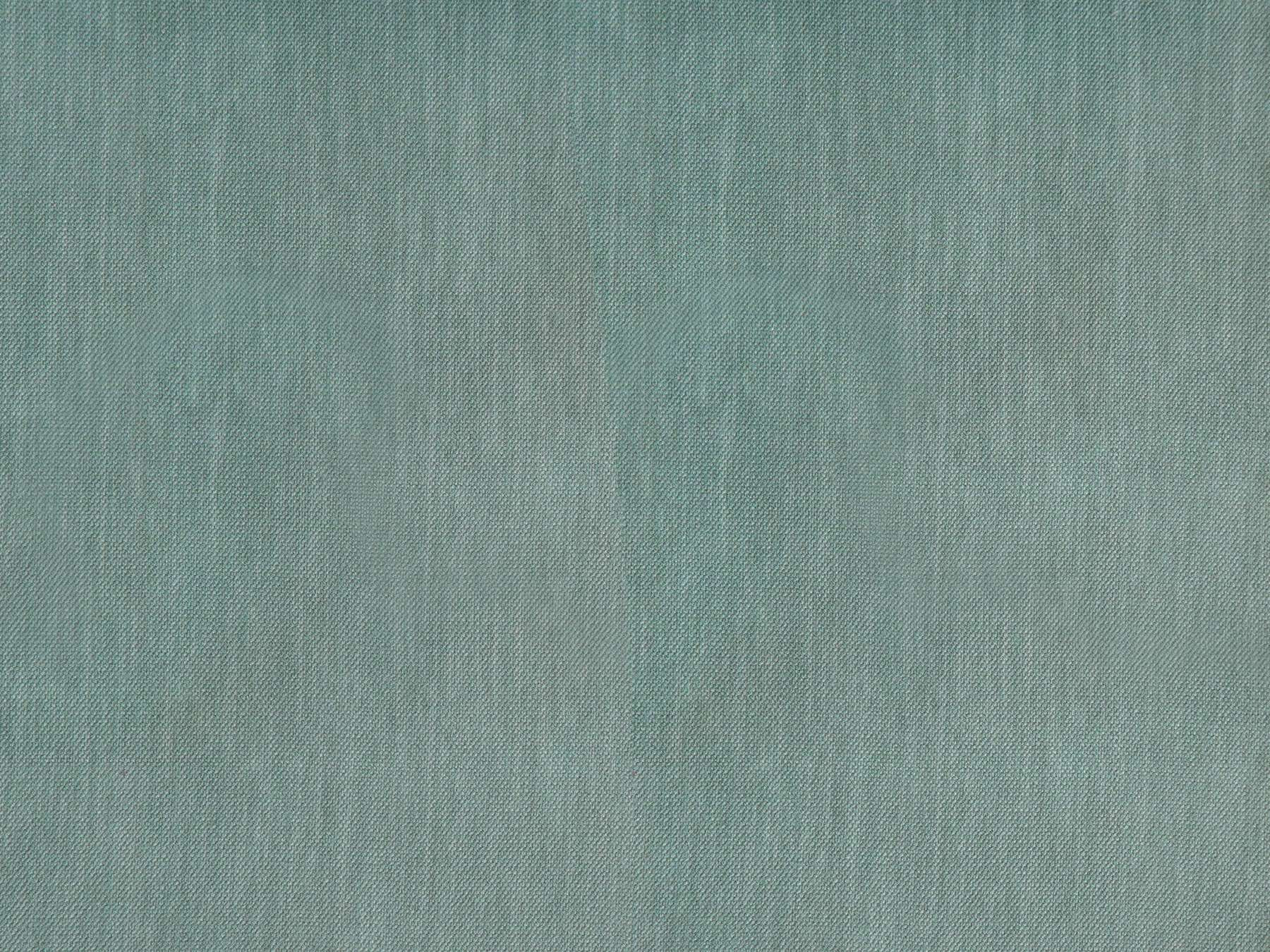
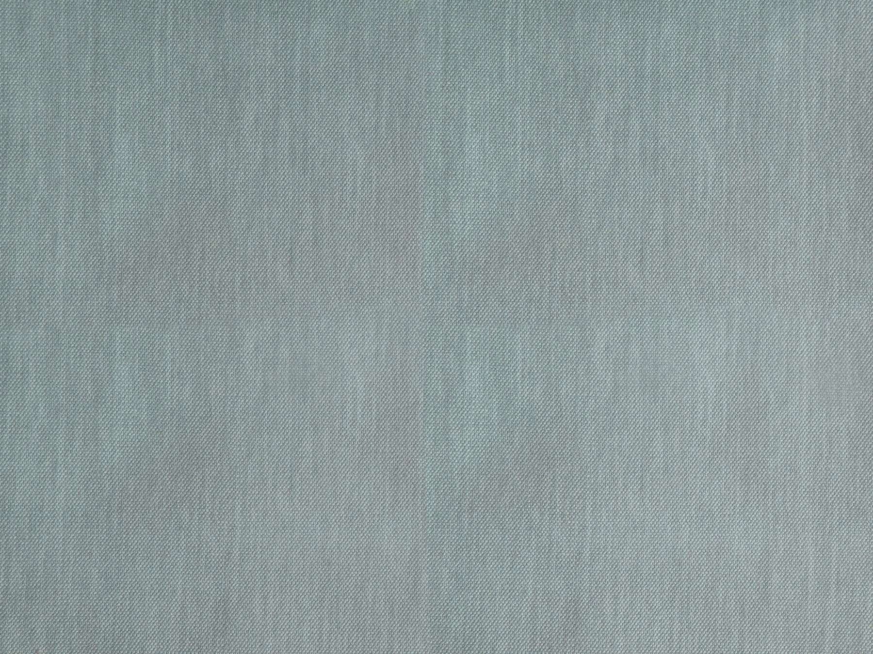
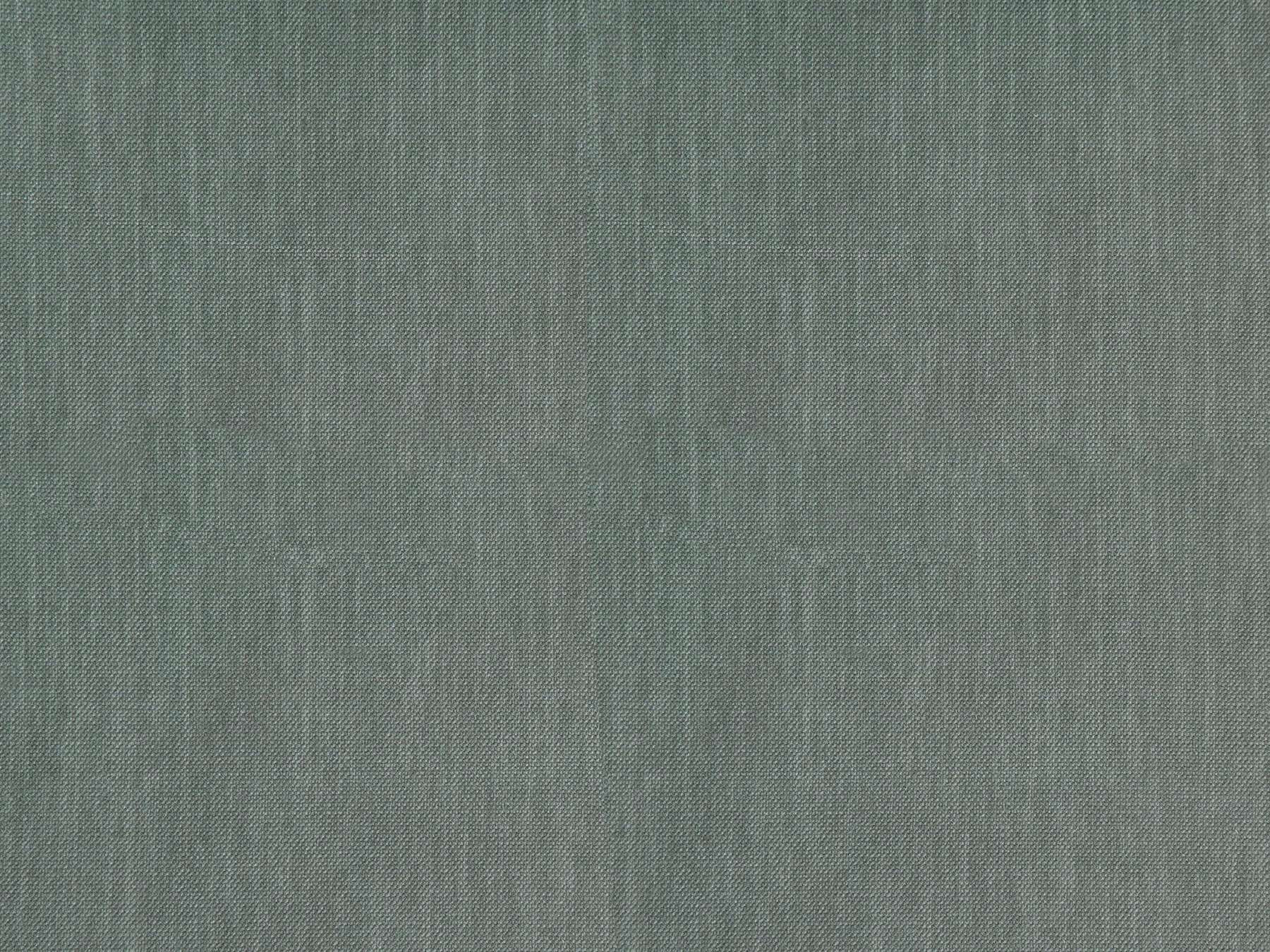
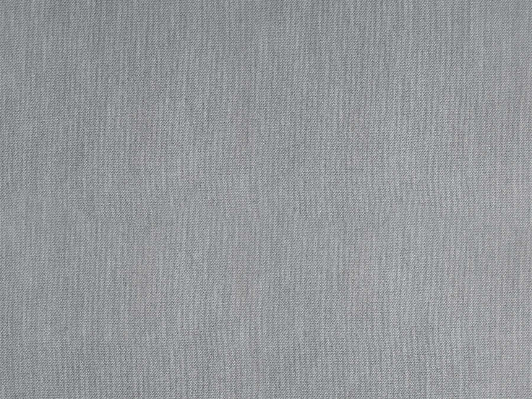
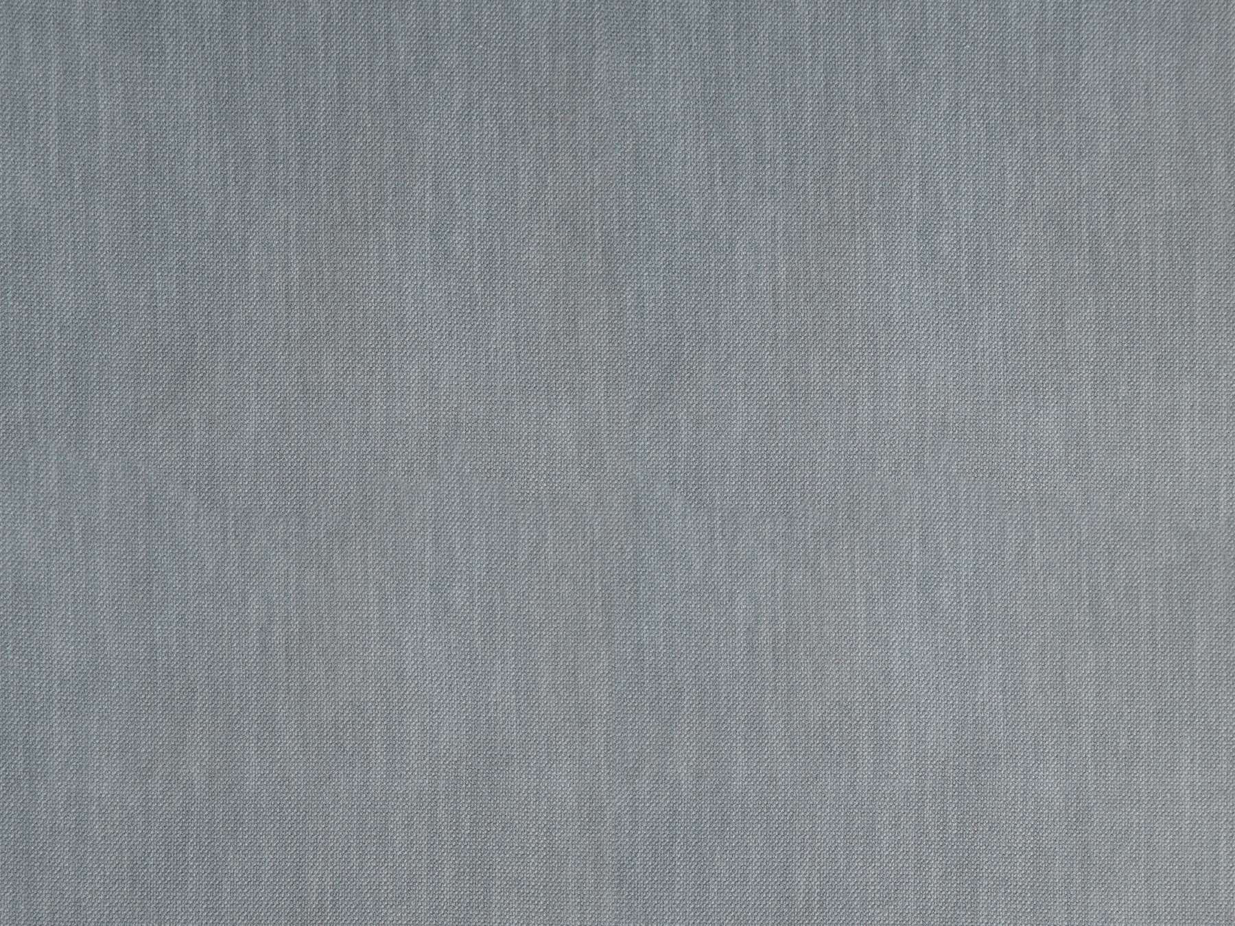
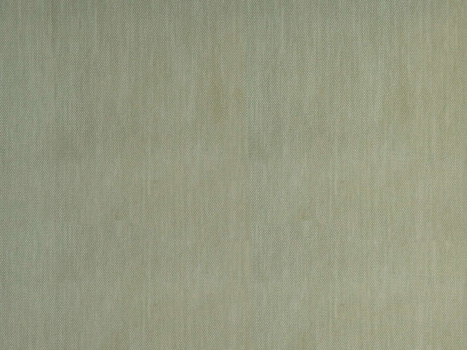
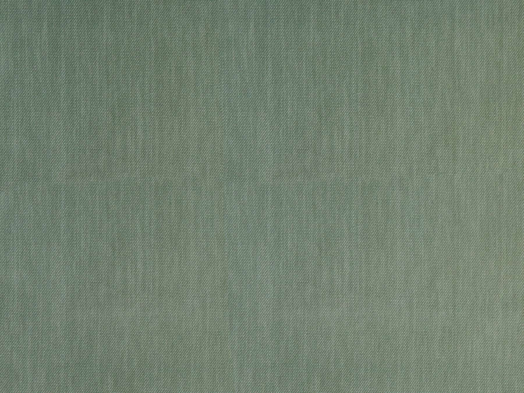
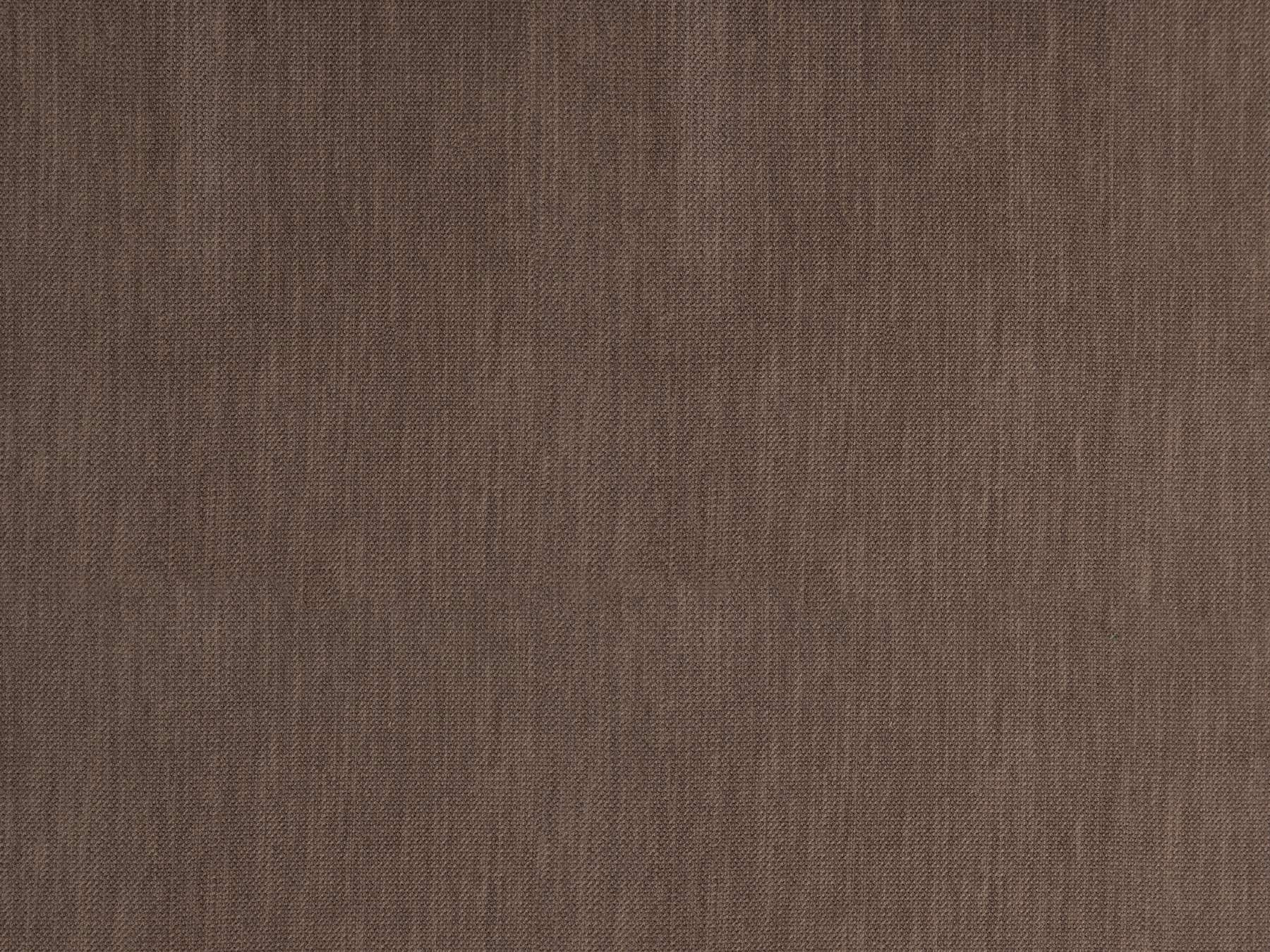
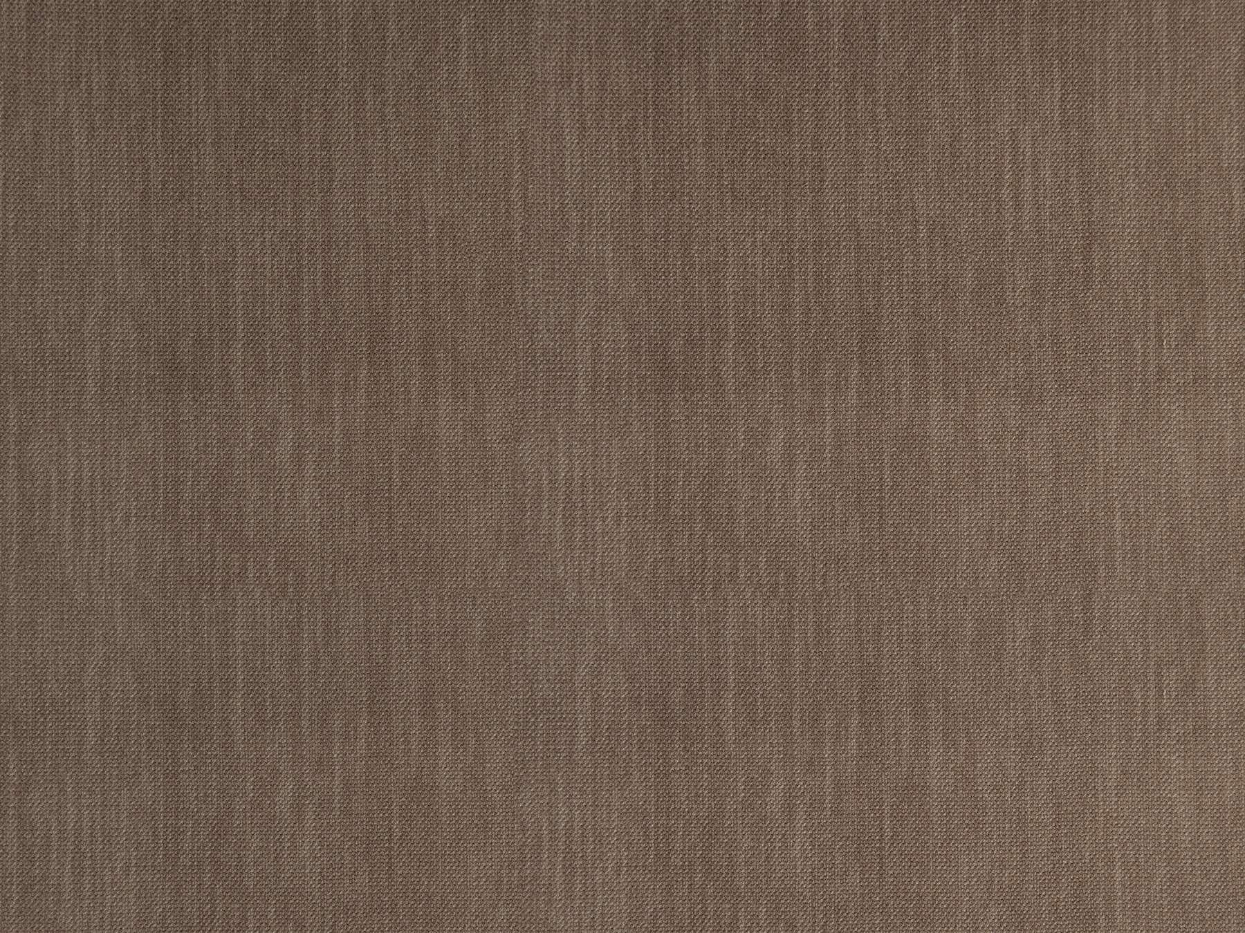
A soft accent

A plain fabric enhances the character of the space without changing the accents or the general idea.
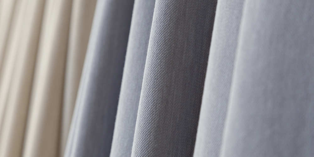
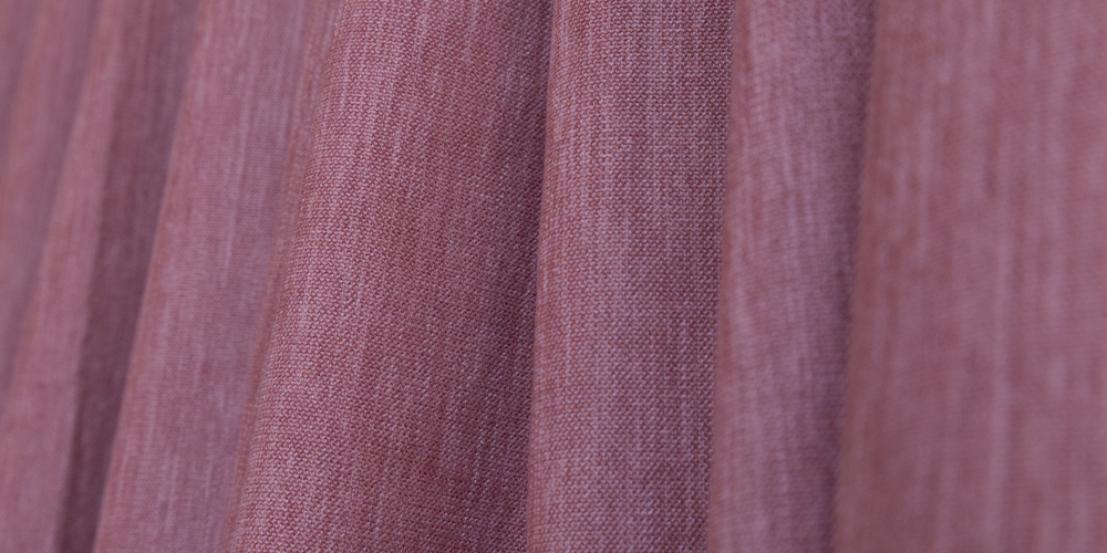
A perfect match

Phantom can be used to furnish both modern and classic interiors in the baroque or empire style.
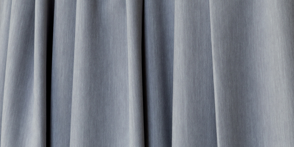
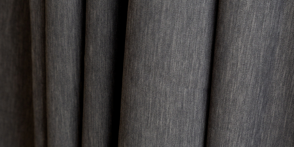
A new reading

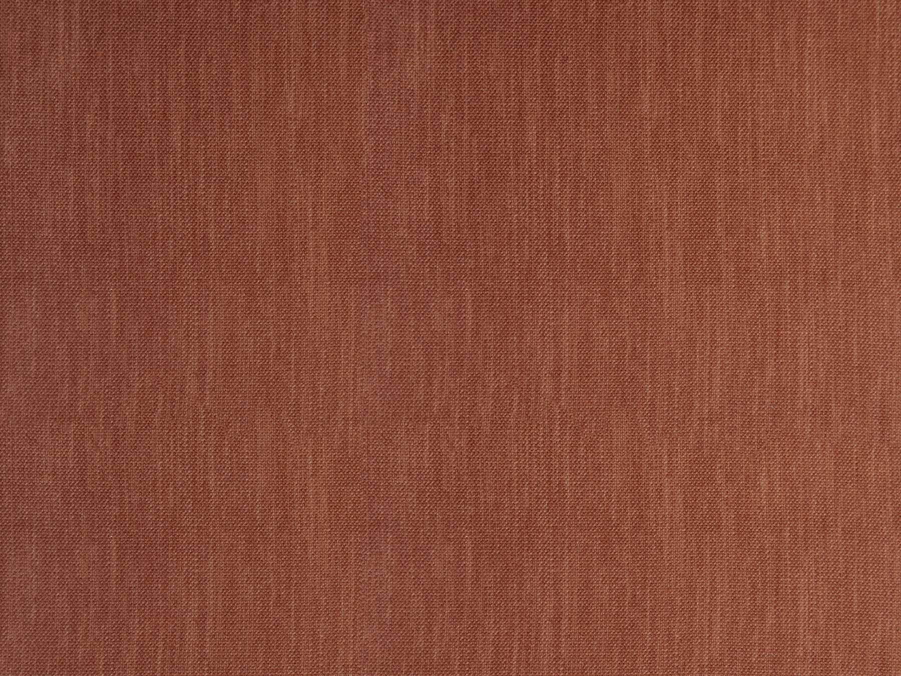
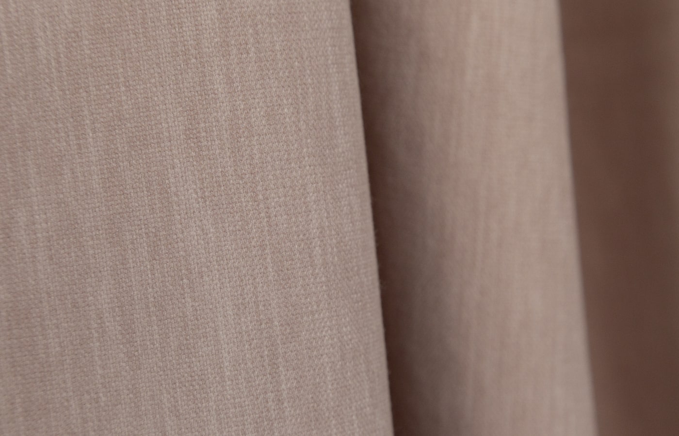
The catalog rediscovers the delightful velvety texture of Chenille. Designers have enriched and complemented it with light scuffs and mélange effect.

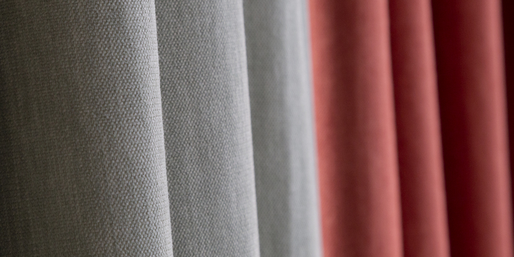
The choice that changes everything

Dense chenille with a rich touch has replaced the well-known fabric (item 2262) from the Palazzo collection. The Phantom collection is the perfect complement to the City collection, which is textured and has the same practical width of 300 cm.


Phantom palette

A new take on texture enhances the fresh look of the color palette. One Phantom shade blends seamlessly into another, creating a subtle gradation of nuances from which a continuum of color and emotion is born.

41 delicate shades expand the perception of color. Elegant and perfect white flows into the muted, almost watercolor gradations of beige, which dissolve in gray and dusty graphite. Topical rose quartz, turquoise, mint, grassy green, sky blue and Rust (the same color is in Dune collection) were added to the basic scheme.

The white range

A breath of freshness in the interior. Conservative at first glance, it goes well with any shade of the palette.

The Beige Gamut

Warm shades are always associated with coziness and care. It is like wrapping the room with the first glints of the dawning sun.

The brown palette

Stability and wisdom, the color of the earth. It will make you relaxed and in harmony with your environment.

The red-orange color scale

Sunny, cheerful, like shades of oriental spices, will give the space that very zest and color accent.

The purple and pink range

Delicate, delicate combinations, suitable for both strict, classic interior, and for trendy projects.

Turquoise gamma

The color of the sea wave, the color of the spring sky. Due to its versatility, this range has become a favorite for many designers.

The green gamut

The flowering of life and nature, which can be guessed from the deep emerald shades. A breath of nature in the midst of concrete structures of megalopolises.

A light blue palette

Moody for dreams of distant wanderings and uncharted coasts. A deep and sensual palette.

The black and gray palette

Laconic, calm and stable. Can be the perfect base for bold experiments or an independent hero of the project.

Designs